
My long weekend in Tokyo was simply sublime. Days of friends and food and lots of shopping were just the restorative I needed. The weather didn’t cooperate, but it didn’t really matter. Kawagoe was a bit thin on the ground because of the threat of rain and unfortunately the next two days delivered the promised precipitation, although it didn’t keep us from the markets. It did however keep me from taking lots of photos, so most of the finds recorded are from the first day out. I also broke my own rule of “buy it when you see it” a few times, mulling over the weight and difficulty of transport, which meant I lost out on a few things, although as usual, there is a funny story attached to one of them.

There were some things that didn’t get away – like these swirling blue and white dishes – and others that did – like these kutani lidded teacups – so beautifully painted they looked like brocade.

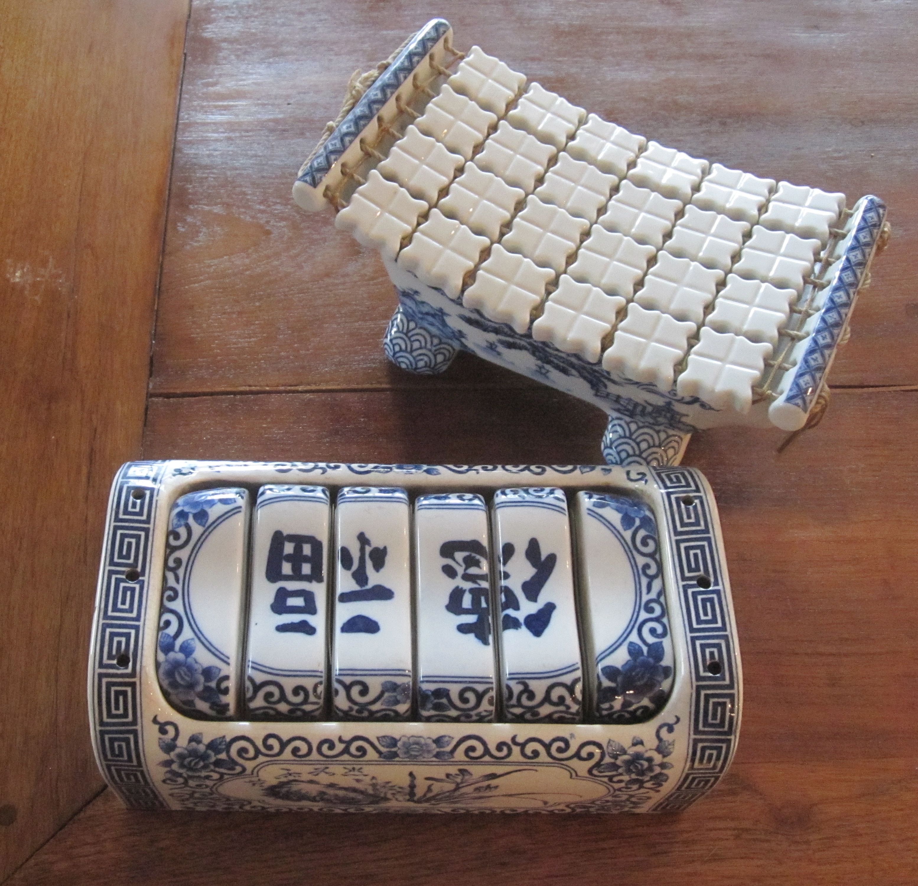
This very fine takamakura, complete with original buckwheat filled pillow went home with a friend.

A search for a tansu was successful, yielding this lacquer beauty for a fraction of its retail price. Tansu at shrine sales are often in poor condition which is why they are a bargain, but this dealer had lovingly restored this piece.

Brought home and placed in the entry it will be a workhorse, holding gloves and scarves and general entry clutter.

Speaking of tansu in poor condition, I also popped in to the The National Art Center to view the Joint Graduation Exhibition of Art Universities. Not sure what the meaning of this installation of destroyed tansu by Shunsuke Nouchi is meant to represent, but I couldn’t resist including it. Student exhibits in Japan, as elsewhere, can be really fun, ranging from discoveries of major talent to down right awful. I can’t help but feel bad for these chests!


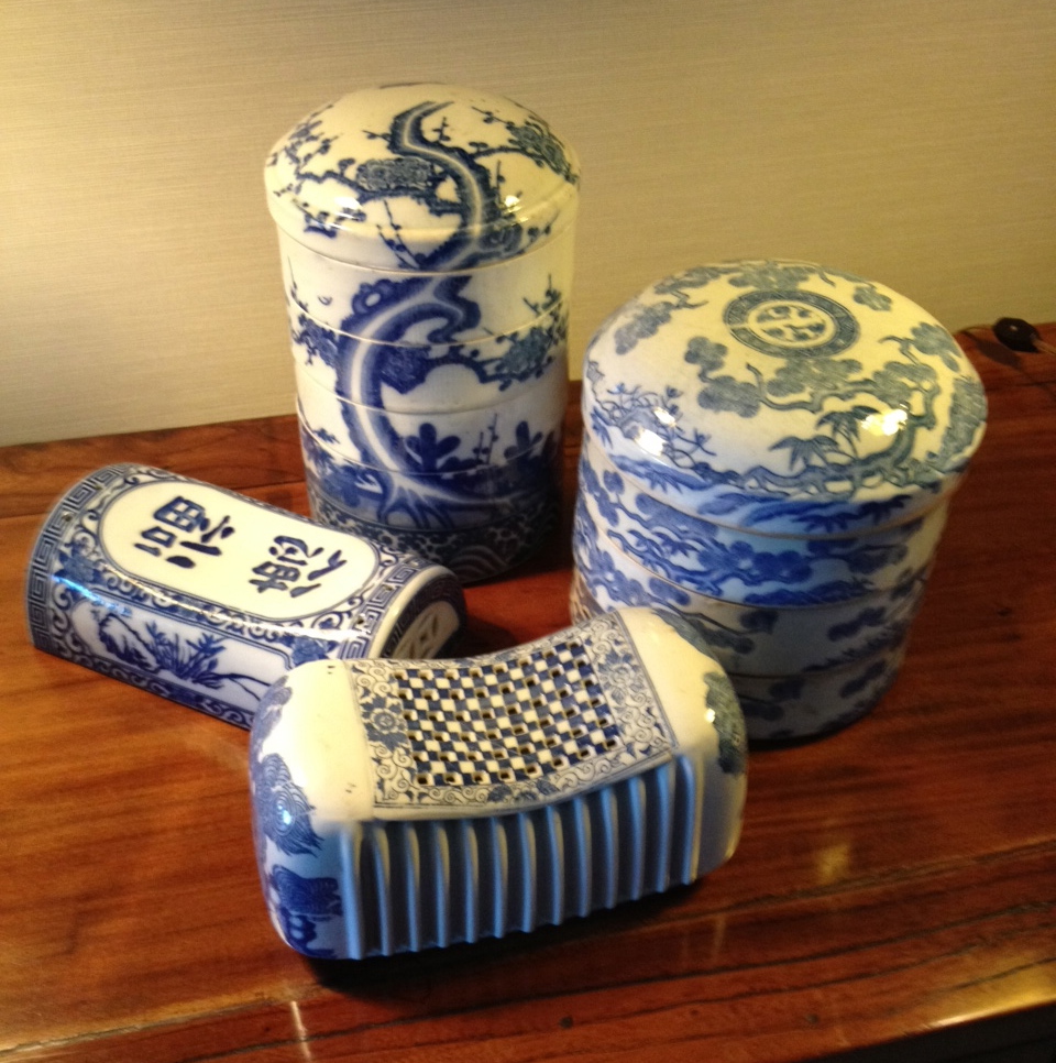
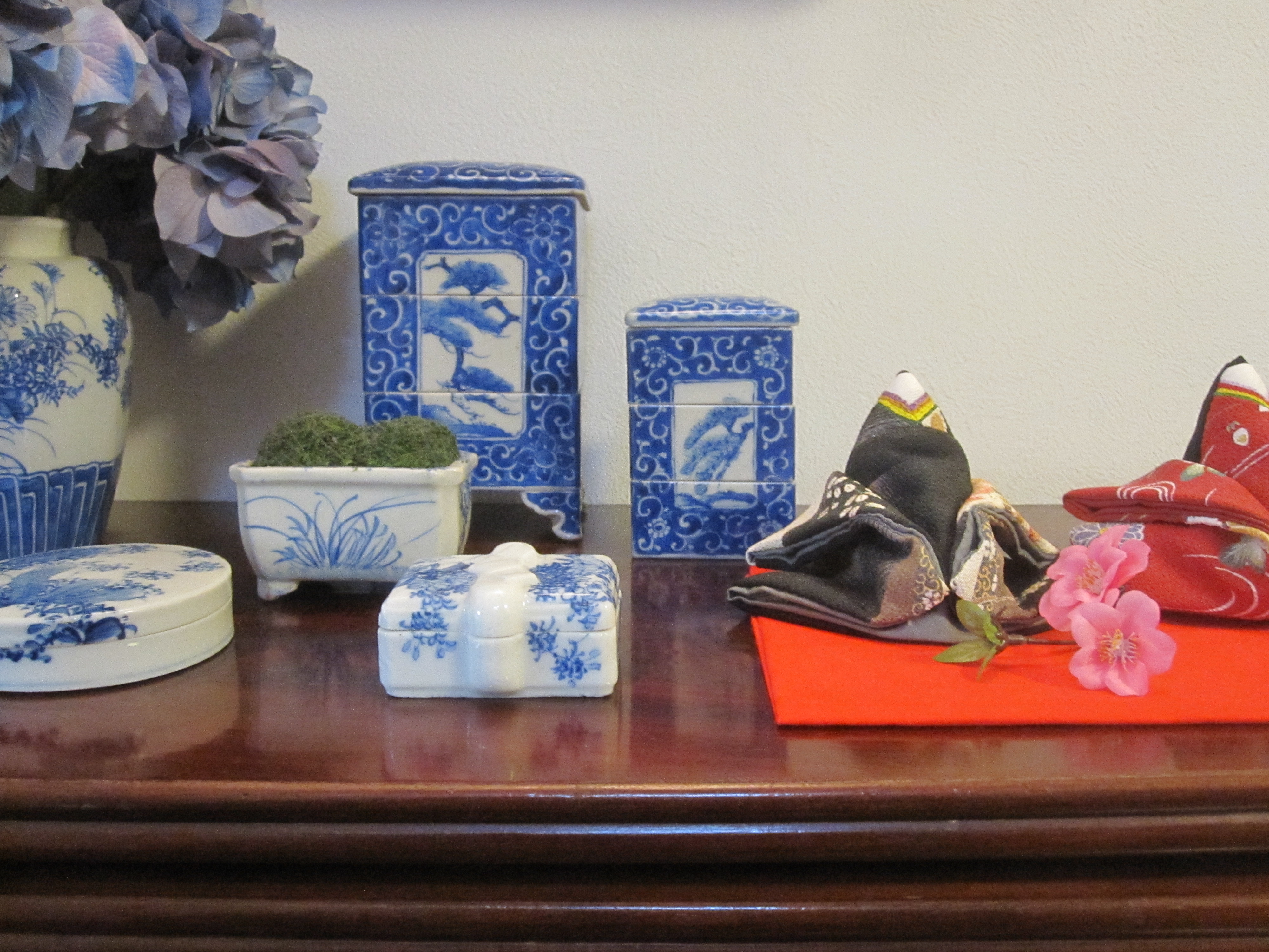
As for my haul, I had to keep reminding myself that I had to carry anything and everything I bought home. So I left behind an entire basket of small fishing floats and even some charming porcelain. I had to have the gray and white bowls – which were likely the more expected blue originally but now faded – because I knew they would look great with the dining table and they are that perfect not too big, not too small size. I picked up a few wooden pieces, a tray and some itomaki, including this unusual long one. A small hibachi with the great geometric asa-no-ha or hemp pattern was also a keeper. But as always, my eye and my wallet are equally lured by non-Japanese discoveries and I fell in love with these bright Turkish glasses and a cut glass jam pot. I’ve been having a bit of a glass fetish lately – wait, aren’t I always having some kind of glass fetish?

The promised funny story is about the glasses, made for serving arabic tea, but I can imagine them holding dessert or even wine. I saw five of them, 3 pink and 2 purple, on a table at one of my favorite dealers at Kawagoe and passed them only because I decided there weren’t really enough to be useful and their fragility made them hard to transport. My mind kept returning to them over and over (those silver mounts!) as I wandered so I went back only to discover they were gone – massive bummer!

Imagine my surprise when later that evening I walked into the kitchen of the dear friend I was staying with for the week. Long my partner in crime and shrine sales, SHE had bought the glasses and they were now sitting on her kitchen counter. It was one of those moments of fierce purchase jealousy, but the truth was if I couldn’t have them, better she did than some stranger. Or at least that’s what I kept telling myself while contemplating going to the mat for them.

The surprise continued when we saw the same dealer the next day and once again he had 5 of the glasses out on his table. It was a confusing moment of déjà vu, but we at least had the good sense to ask if he had more and it ended up he had an entire box! So all’s well that ends well and one day we have to have a massive party together and use them all!
Related Posts:
Shrine Sale Stories…Recent Treasures
Shrine Sale Scorcher…Vintage Mirrors on an Extremely Hot Day
Shrine Sale Stories…Vintage Matchboxes, Frank Lloyd Wright’s Imperial Hotel and The 1948 London Olympics
Shrine Sale Stories…Yamamoto’s Steamer Trunk
Shrine Sale Stories…My French Moderne Bar Cart


")

