Every year for the past 7 years I have been part of a core team of women who get together to design and hand sew a special quilt for the American School in Japan’s Gala auction. The quilts have been worked on by scores of women (and a few men) over the years and they are always a big hit, both in terms of community spirit and fundraising. This post is an attempt to chronicle the process and history of the quilts as well as celebrate their making.
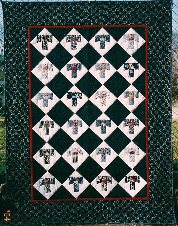
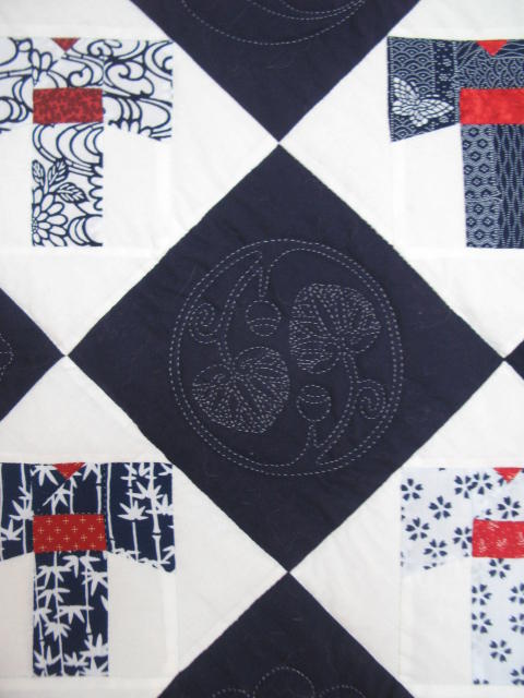
This year’s quilt fits a queen size bed generously. It is composed of yukata pattern blocks, yukata being cotton summer kimono, the traditional Japanese robe. The alternate navy blue blocks are hand quilted, each with a different kamon (family crest), a device we have used in many of our quilts. Made from the casual blue and white yukata fabric that gives it its name, highlighted with red obi (sashes) and bordered by a blue and white checkerboard, the quilt is a graphic triumph, feeling cool and polished. More details on its making will be found below, after a chronological history of the quilts that came before.
The title of the post, “Coming Full Circle,” refers to the fact that this quilt is an updated version of the very first ASIJ auction quilt. In 2004, before I arrived in Japan, this handmade quilt was made by a group of current students’ moms, including Kendra Morgenstern and master quilter Julie Fukuda, whose kids had graduated from ASIJ many years before. Very few photos exist for this twin size block quilt, also made of yukata patches with alternating quilted kamon patches. This was the first of a series of “American” style quilts, made with “Japanese” fabrics. As this pattern is one of the most charming and nostalgic, we have always wanted to revisit it.
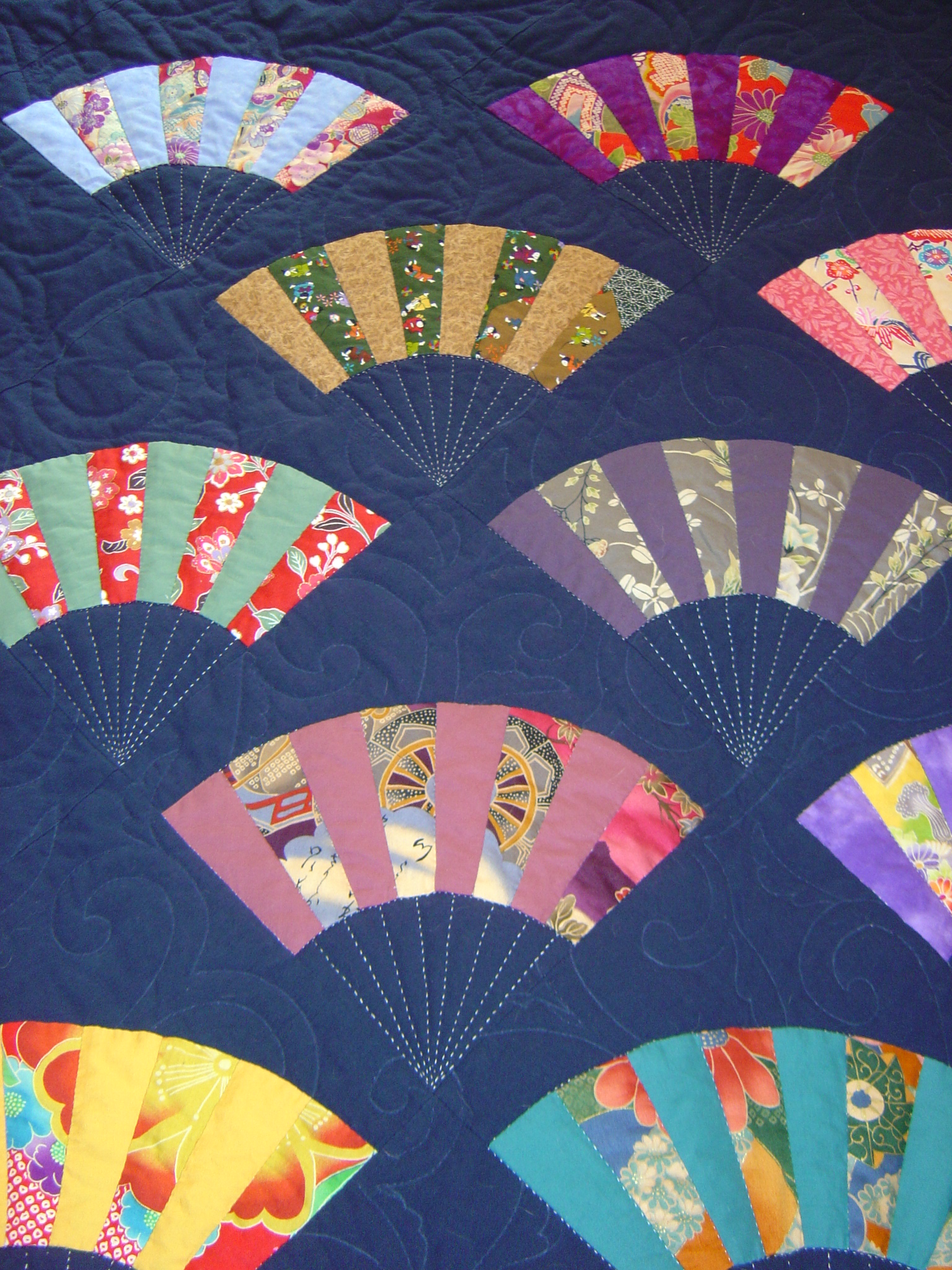
In 2005 I joined the team and we once again made a block quilt, composed of a Japanese motif, the fan. Fans have not traditionally figured in American cotton quilts, but they were popular in Victorian crazy quilts. In our quilt, each fan was composed of a bright Japanese patterned cotton, paired with a complimentary solid in this twin/double size quilt.
Each piece of the fan was “stitched in the ditch,” meaning it was quilted right at the seam’s edge. Sashiko style quilted white lines completed the fans exoskeletons. The solid navy background was quilted with dark thread in a karakusa (arabesque vine) pattern for a subtle effect.
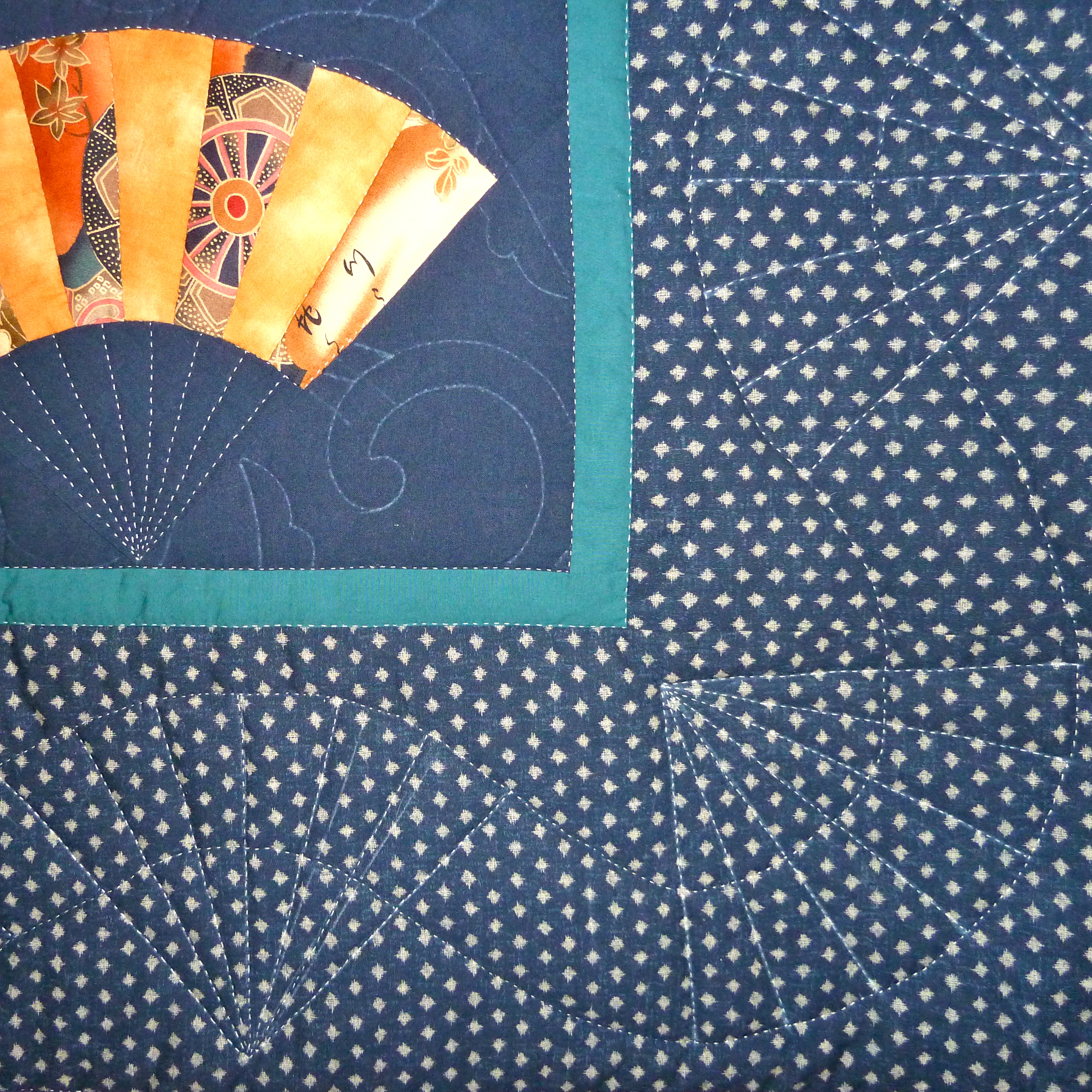
The border was ingeniously quilted in a scrolling fan pattern, as a compliment to the fans in the center. This was the beginning of our thematic border choices and we always tried to relate the border to the quilt as a whole in all future quilts. I think it is one of the features that makes them so visually satisfying.
In 2006 we decided to make a queen size quilt and enlarged the size of the blocks. The design had some features we had used before, such as blue and white yukata fabrics…
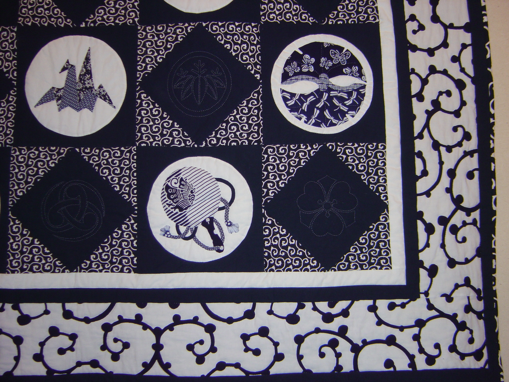
 But this quilt added a new skill to the repertoire – applique. Japanese motifs, cut from variety of yukata fabrics were appliqued onto white circles which had in turn been appliqued on navy squares. Alternating blue diamonds were set into a tightly patterned karakusa background and quilted kamon in their centers were planned.
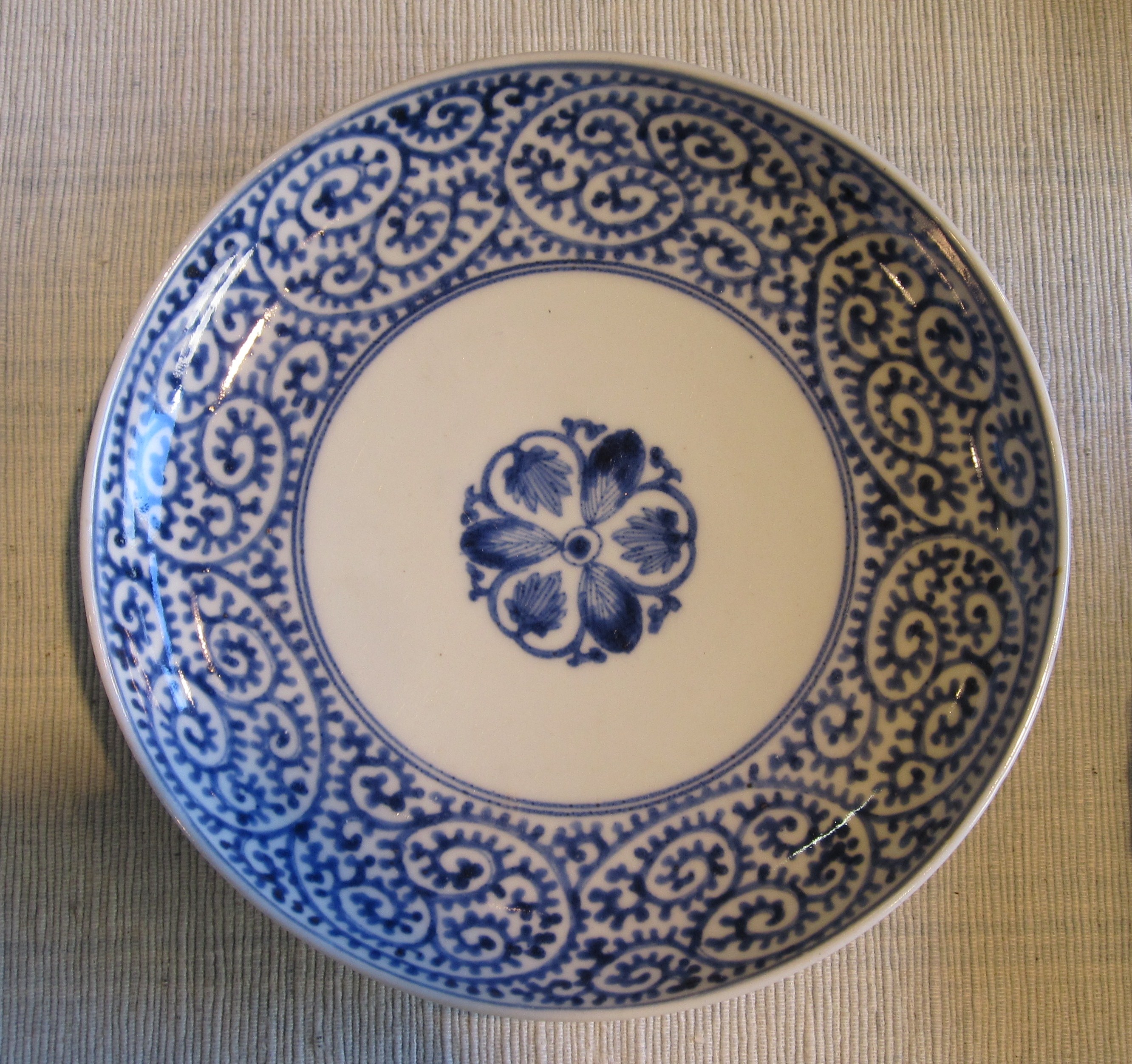
This quilt never started out in the design phase as being an homage to karakusa, but perhaps the background of the fan quilt had subconsciously influenced us. Karakusa is the most quintessential of all Japanese patterns, appearing on everything, but particularly on blue and white china.
Choosing the large-scale white karakusa fabric for the outer border and yet another mid size karakusa for the border edging truly brought this quilt together.
This close detail photo shows all three patterns and the quilted kamon.
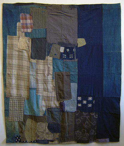
By 2007 we had a hankering to do something different…very different. We had traditionally made typical American-style block quilts, using typical Japanese fabrics. This time we wanted to make a quintessentially Japanese quilt, using antique and vintage fabrics, in an irregular pattern. Vintage Japanese boro textiles such as this futon cover and kotatsugake, provided some of the initial inspiration. A quilt comprised of seemingly random patchwork, highlighting the beauty of the fabric, was our starting point.
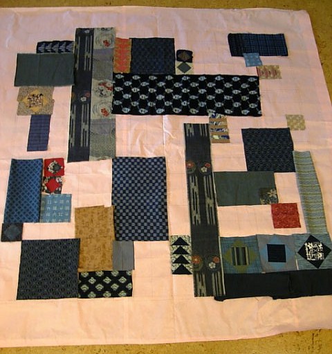
This was an early view of the process, which was spontaneous and quite organic. We gathered everything from vintage kasuri (Japanese style ikat) to modern quilting fabrics. While we were using the color blue again, we were not using pure whites, instead, creamy lights helped add to the vintage feel. When this was shown to the PTA and school director in its early phases, there was a bit of nervousness, but they decided to have faith.
As a nod to the American tradition, we included a few square in a square blocks and strips of flying geese.

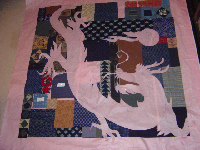
The logo for the Gala materials was a dragon and we decided to add to the quilt by overlaying and appliqueing a dragon on the abstract background pattern. In Asian art, mythical dragons traditionally chase a night shining pearl, which we also added. Ironically, dragons are actually a Chinese motif, not a Japanese one.
The final result was another generous queen size quilt and it was a huge success. We appliqued the kanji for dragon in the lower left corner and used a dragon patterned fabric in two colorways for the border.
Our dragon was the classic long scaly shape, with the horns of a deer and the eyes of a demon – at least we tried to make him look unfriendly. He was further spiffed up with golden trapunto stitching.
In 2008 there were a number of changes to the Gala auction, one being that the date was moved forward on the calendar significantly, cutting into our working time. Once again, we were interested in a change and decided a smaller wall hanging quilt would be fun and easier. Our inspiration was immediate as the theme for the gala was sakura (cherry blossoms) and we decided to create a traditional byobu, better known in English as a screen.
The design included the all the traditional structures of a screen. It would be made of individual panels, linked and bordered by a brocade and “lacquer” frame (to be made with a dark brown fabric). As it would never be used for sleeping, the wall hanging freed us to use materials that could not be washed, such as antique silks and brocades. For the background we used traditional indigo fabrics laid out in a more regular pattern, but still boro inspired. Branches, petals and the moon would be appliqued and details would be embroidered.
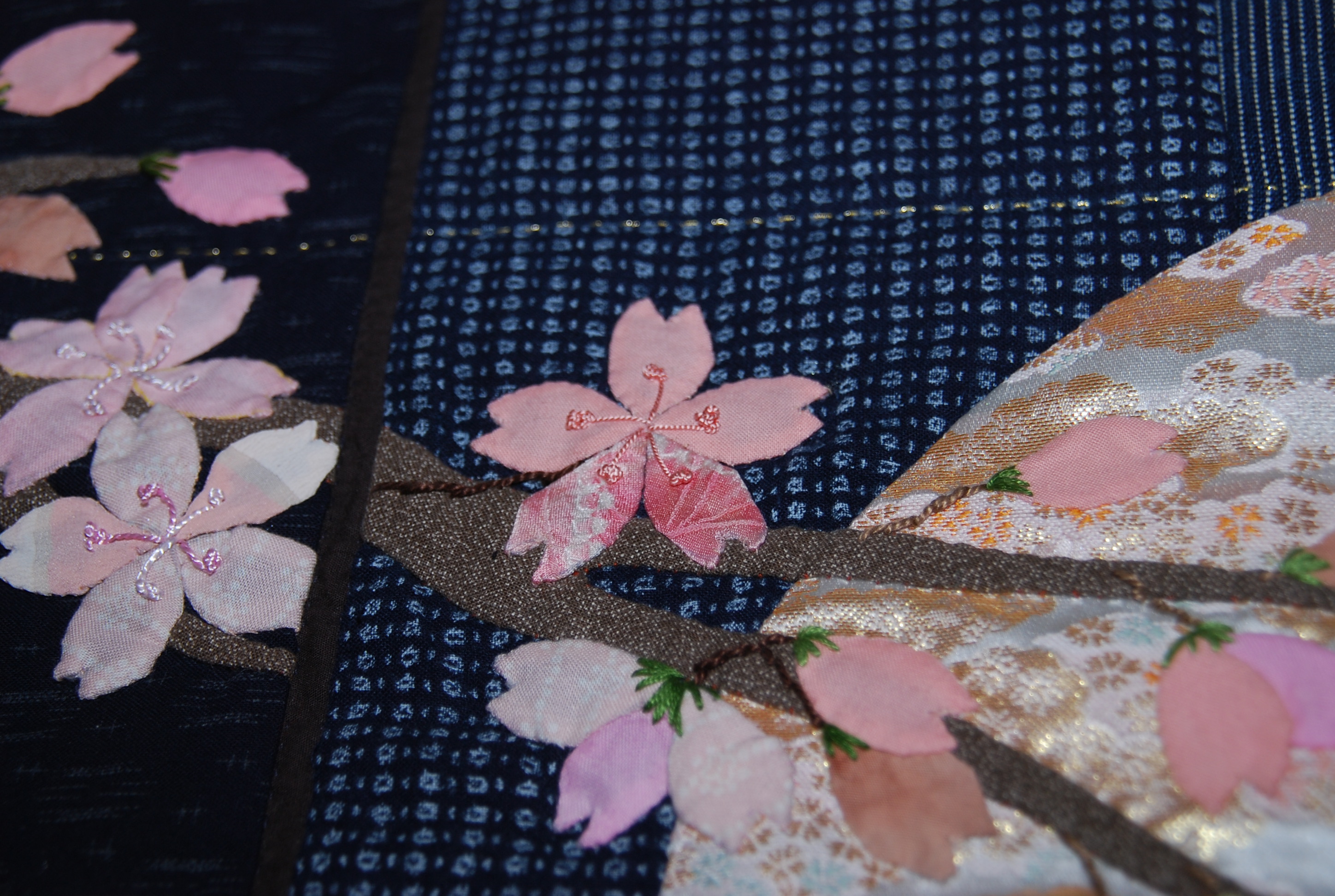
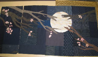 Lighter blues were used under and around the moon, to represent the cast of the moonlight. A softly patterned pinky brocade was used for the moon as it seemed to emit its own light. This luminescence gave a feeling of depth to the quilt. The sakura petals, cut from various fabrics, including antique kimono silks, were hand-appliqued petal by petal onto the quilt — 439 petals in all, and then hand-embroidered. The petal work alone was hundreds of hours of work – so much for an easier quilt.
These photos show the details of the appliqued branches and petals with French knots as the stamens.
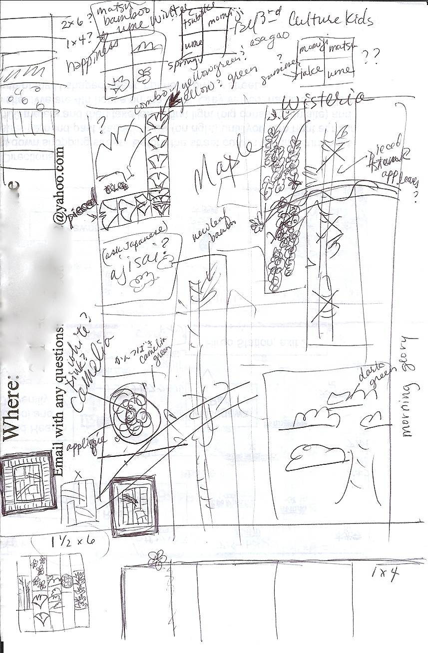
The 2009 quilt was another instantaneous choice. The theme for the year at ASIJ and for the gala was “Going Green” and green we went! This original sketch was dreamed up at the PTA Welcome Coffee at the very beginning of the year! While it looks a bit scribbly, all the major components of the “Four Seasons” quilt are there.
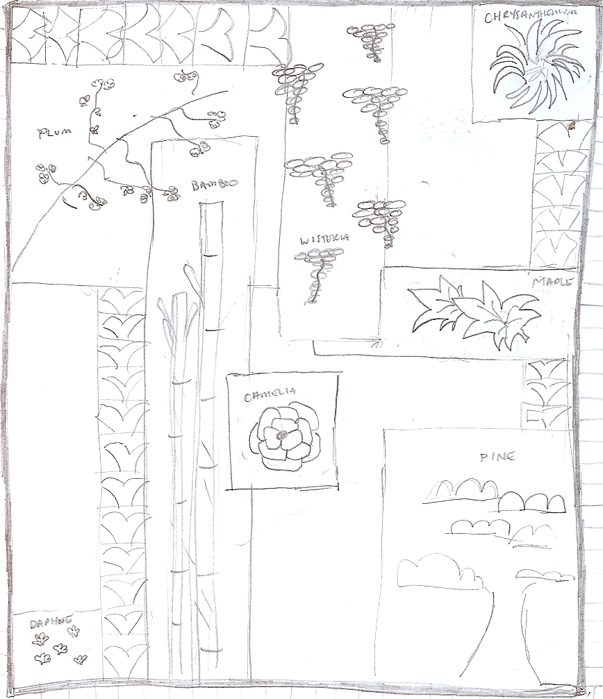
Like the dragon quilt, this one would rely on an irregular patchwork background. Running clockwise around the quilt would be flowers and plants that represented the four seasons. Instead of traditional flying geese, we dreamed up flying ginkgo leaves. This later sketch shows more of the planned details and decisions.
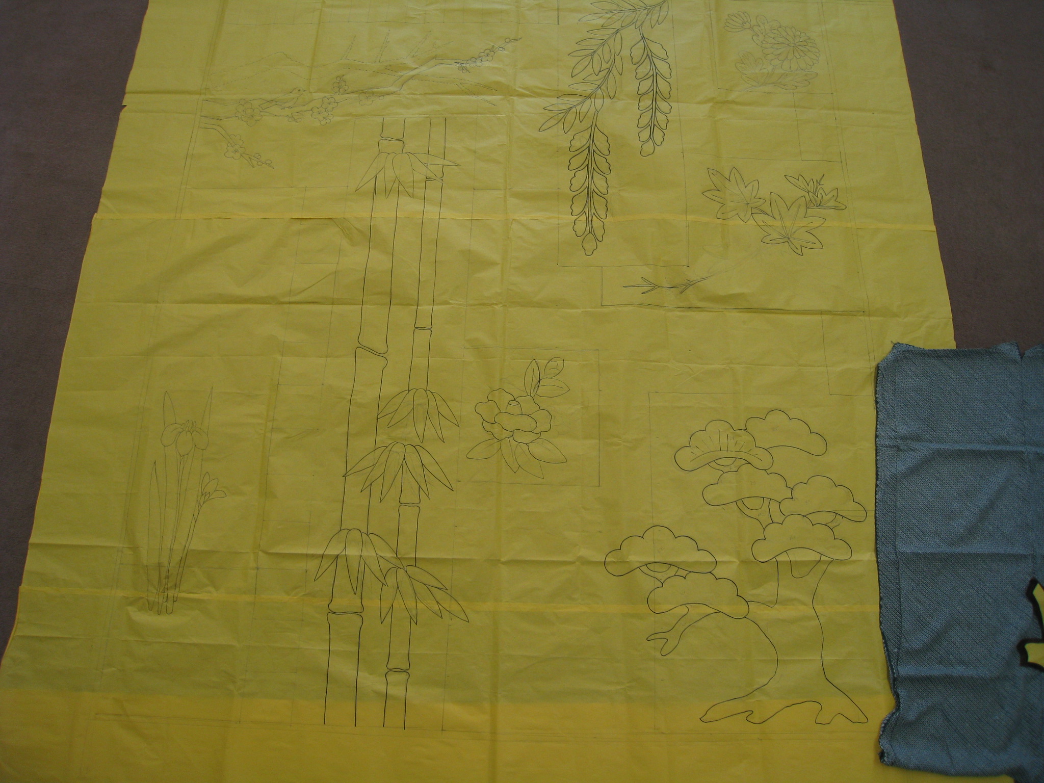
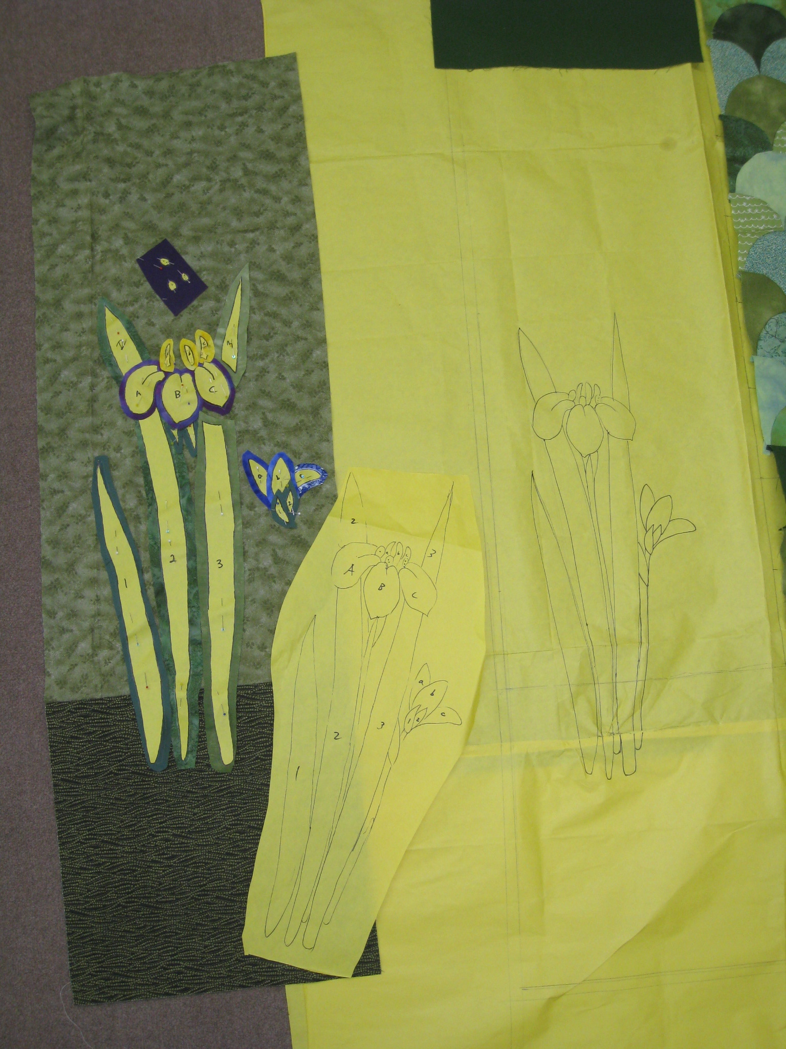
Using large craft paper we laid out the full size design.
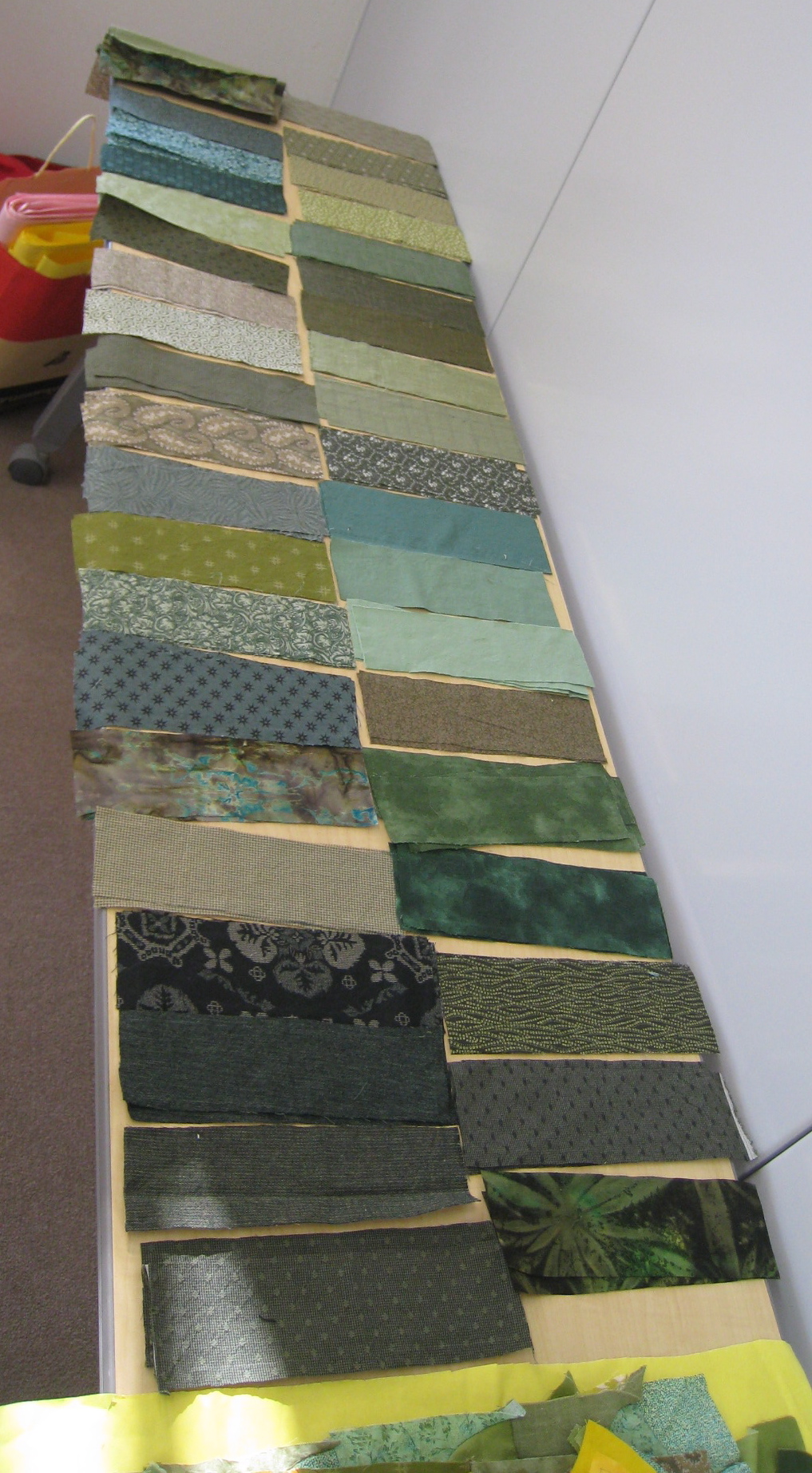
Again, fabric selection was quite spontaneous.
One problem that needed to be solved was how to make a quilt with so much difficult applique work, but still have enough tasks for new members of the group whose sewing skills were more limited. Our solution was to create a border made of strips, inspired by the border on this crazy quilt. This created a lot of cutting and straight sewing for the newer members of the group to work on. We set up a kind of “border bar” where people could choose from a variety of fabrics and start to sew “random” combinations together.
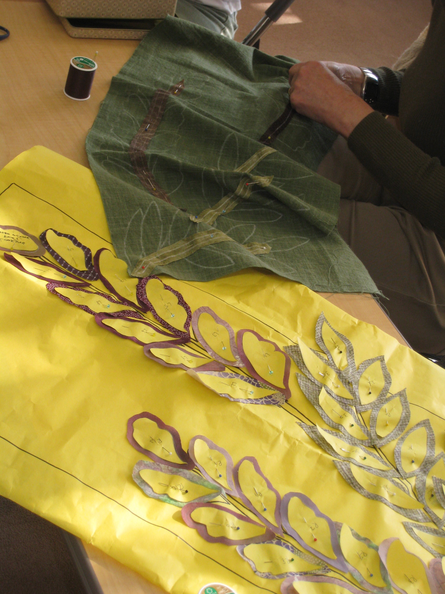
More difficult work included tons of pattern making and many detailed fabric choices for the flowers that then needed to be painstakingly appliqued.
Here you can see the pieces slowly coming together. You will find the auspicious trio of pine, bamboo and plum (sho-chiku-bai), as well as iris, camellia, chrysanthemum, and wisteria.
The fully finished quilt top prior to the borders being added. The changing seasons are emphasized by the colors of the “flying” ginkgo leaves (the symbol of Tokyo) that travel up, around and down the quilt.
Here you can see the quilt basted and ready to be quilted. Basting day is always fun, as many people too afraid to stitch on the quilt for real turn up because they know the basting stitches don’t count and will all be removed.
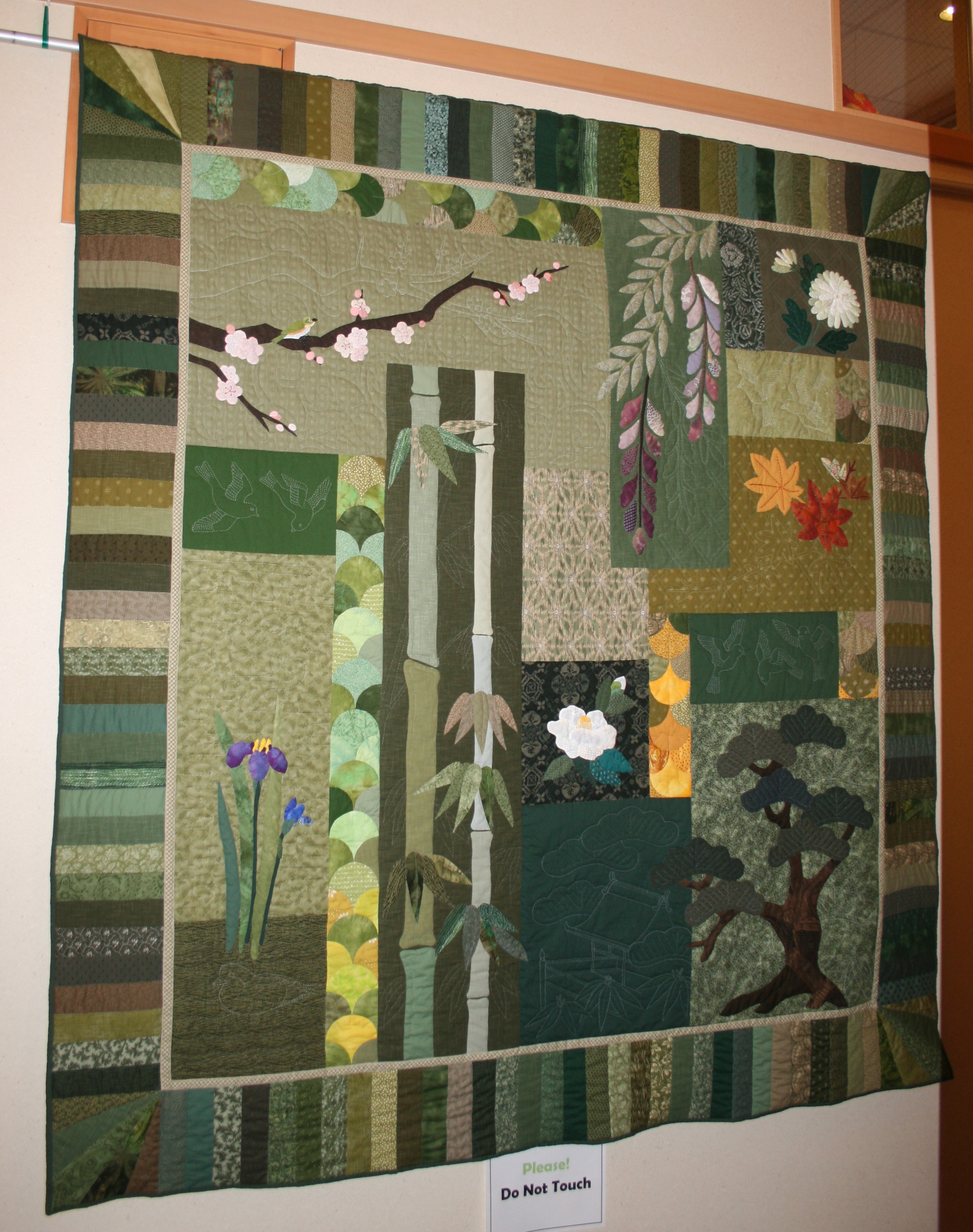
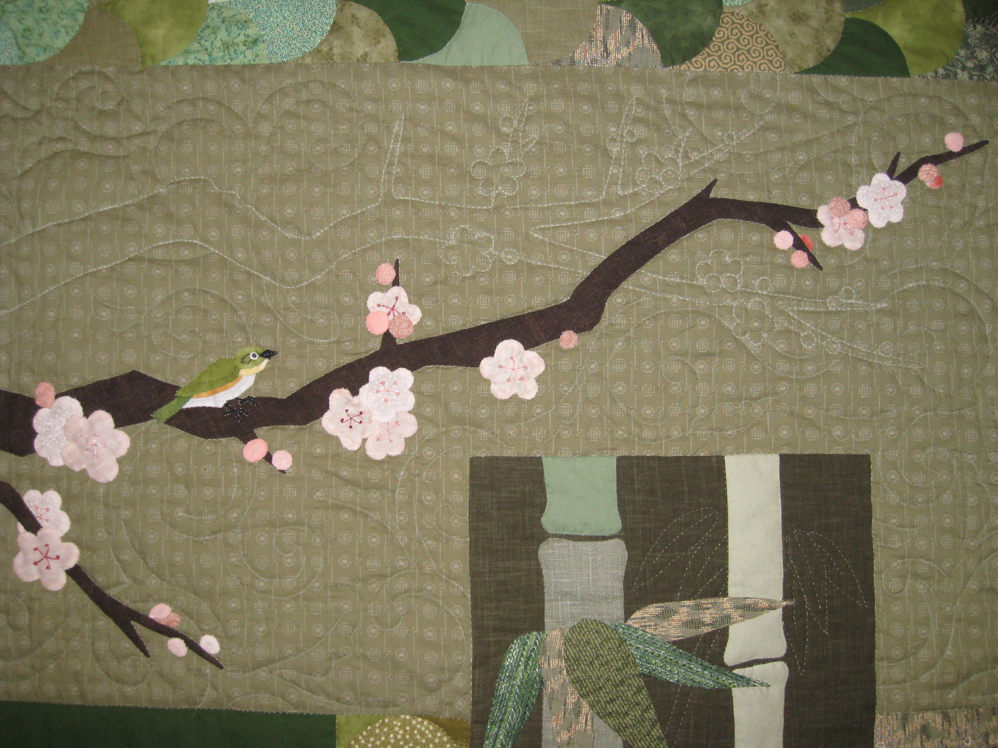
The final quilt! I am using this angled photo instead of a frontal one as it shows the incredible detailed quilting. We had placed that large plain dark rectangle of green next to the pine in the lower right, hoping to put something scenic like the teahouse in.
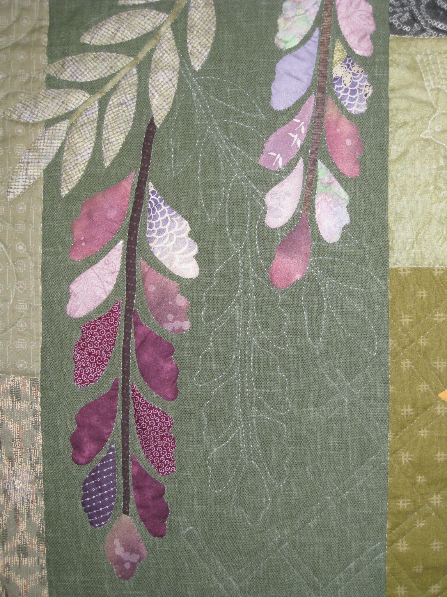
Other gorgeous detail included additional blossoms and branches shadow quilted in, and some special friends like these two darling sparrows. Sitting on the plum branch is a Japanese white-eye (mejiro), a small green friendly bird we often see in Tokyo. Quilted into the background you will find many surprises such as a pair of mandarin ducks hiding in the waters near the iris. Julie really outdid herself on the quilting.
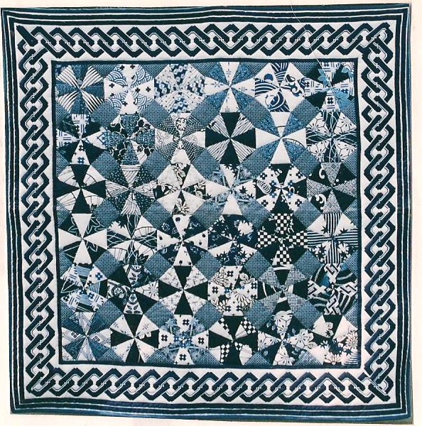
In our never-ending quest for change, in 2010 we turned back to the idea of an American style patchwork quilt, but this time an optical illusion all-over pattern, often referred to as a kaleidoscope pattern. The theme of the gala was Saturday Night Fever and we saw it as a quilt that danced before your eyes. Made with one hundred octagons of different blue and white fabrics, both antique and new, some of which were used in previous blue and white quilts, and many which were shared from our quilters’ personal collections, all part of the quilting tradition of trading and sharing fabrics. You will find dragonflies, fans, umbrellas, dragons, butterflies, kamon, and a myriad of other designs. It was inspired by a smaller earlier quilt that Julie had made.
What is so unusual about this pattern is that it looks as if there are circles in the quilt, when actually every piece is straight! The blocks are just octagons, made of alternating dark and light triangles. They are matched to an opposite octagon (light meets dark, and dark meets light) and then linked by a small square (held on an angle like a diamond) made of a medium blue fabric.
In this photo we are getting ready to baste the quilt top to the batting and the backing.
We don’t often photograph the back of the quilt, which is usually a single simple fabric, but in this case we did and it allows us to see the beautiful quality of the hand sewing. This represents the stitches of multiple volunteers.
This quilt was featured on the blog Quilt Inspiration. They wrote, “it is one of the most beautiful blue quilts – and kaleidoscope quilts – we’ve seen!” They also specifically complimented the border, a wild yukata fabric pattern of circles, chosen to highlight the circular theme. All the white lines of the circles in the border were individually quilted, and every other single piece was quilted in the ditch.
After six years we decided we wanted to give the yukata quilt another go. People had been clamouring for us to do it again and I had never personally had a chance to work on one. We had many new committee members and everyone was excited by the possibility of improving on a classic.
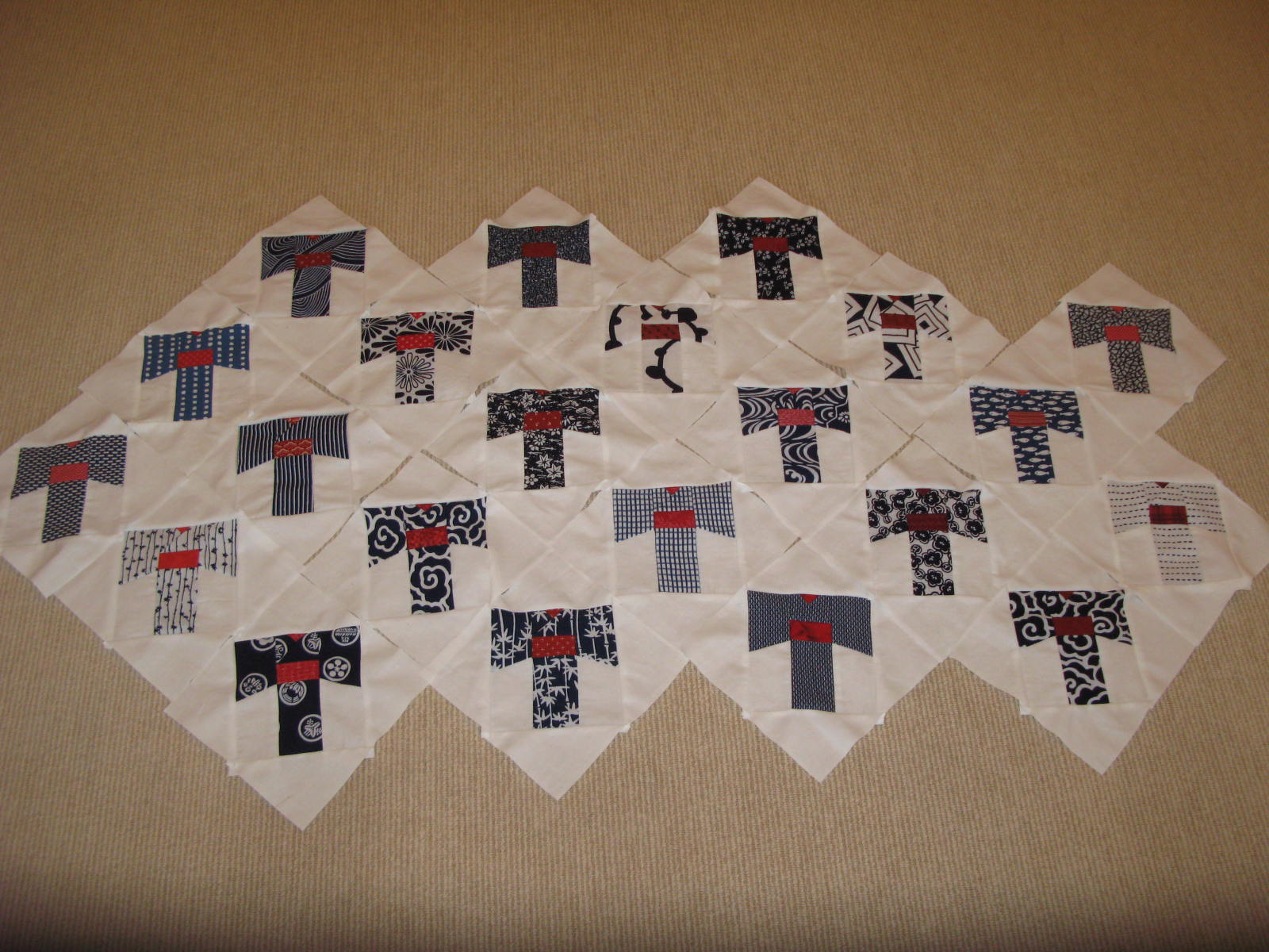
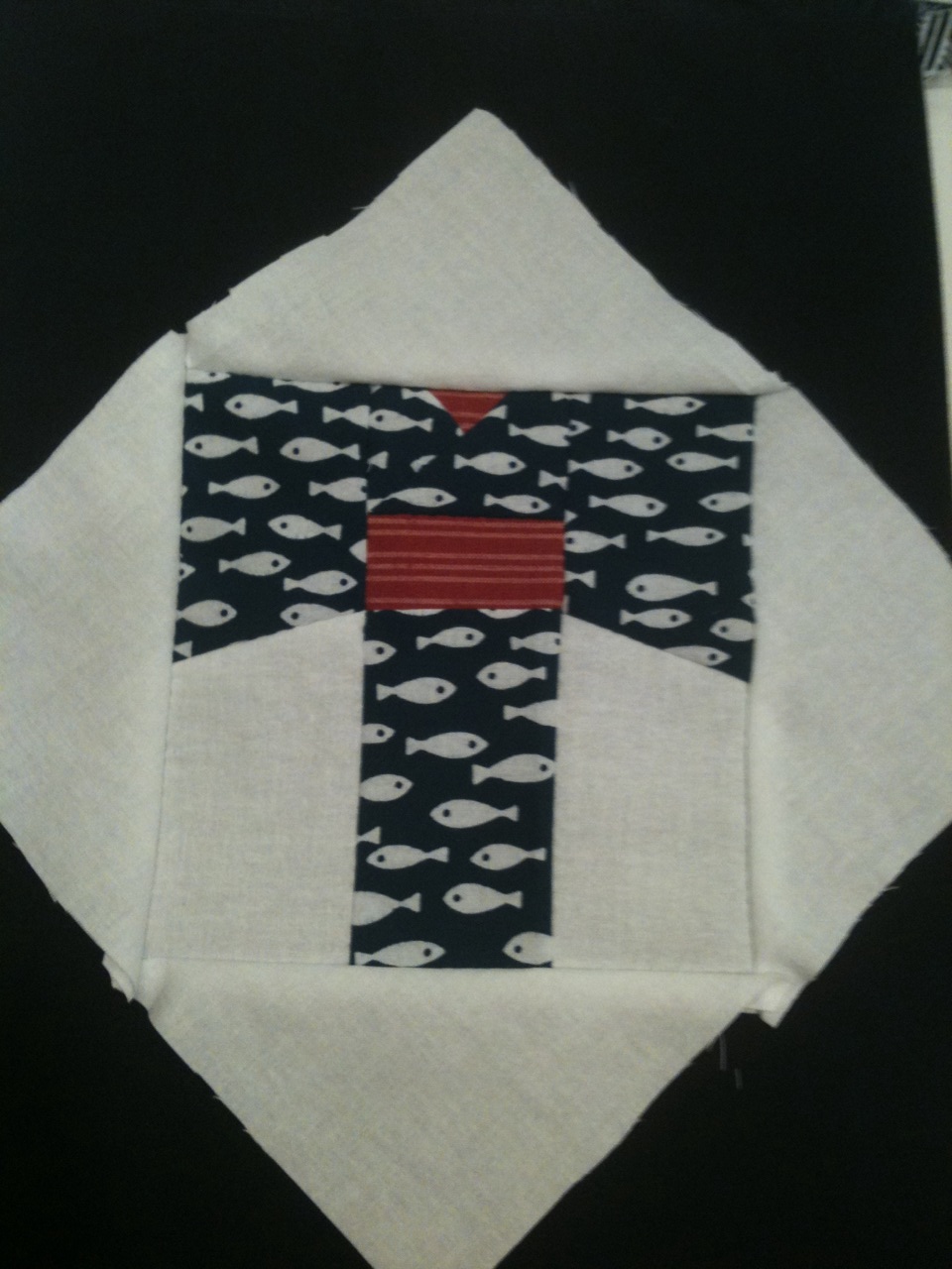 Each blue and white yukata fabric was paired with a contrasting red fabric for its obi. We used templates to cut all 30 yukata, each one being made up of 7 pieces. An additional 6 pieces of white fabric were cut to complete each block. Everything had to be sewn together in the proper order.
Here we have a little more than two-thirds of the yukata blocks finished. We laid them out to be sure we were getting a good balance of combinations – light and dark, linear and pictorial, etc.
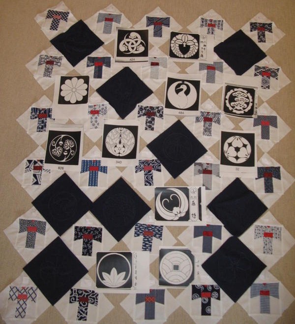
To balance all the right angles we chose very rounded kamon and avoided any that felt sharp-edged. Using a kamon dictionary, we blew the individual kamon up on a photocopier and then traced them onto the navy squares.
Once again, our border found our quilt immediately. We stopped into Blue & White for a look at the yukata fabric and for a chat with Amy Katoh, its lovely proprietor, and the checkerboard was the perfect graphic counterpart to the square block diamonds. A red inner border, created from a soft homespun looking cloth, was also an obvious choice to pull the red from the obi. If you look very closely at this photo you can see the traced, but not yet quilted kamon.
The final binding went though a few incarnations. First we tried a very narrow dark red binding tape, but it was too shiny and red did not give the closure needed. We thought about adding another yukata fabric to the outside edge, but it competed with the simple graphics of the quilt. In the end we chose a straightforward navy border and made sure to line up the checkerboard perfectly.
Bamboo leaves are quilted in the outer triangles and ginkgo leaves in the quilt corners. I can’t resist sharing another photo that highlights these amazing quilted kamons…
…and one more close-up.
I think bidding will be active next Saturday night and I am looking forward to it!
A heartfelt thank you goes out to everyone who has ever participated or supported us in any way. These quilts have been labors of love and friendship.
A special thank you goes to Kendra and Julie for their help in preparing this post and for everything else too!
Photo credits are way too hard to sort out, so I am not even going to try. The two boro textiles are from Sri Threads and the Japanese screen photo is from Okura Oriental Art.



















You covered many years of Gala quilting far beyond my yearly notations. Thanks for putting it all together.Thanks, too, for the friendship that is tied by these threads. I hope I can put a link on my blog because I’m certain some of my friends would be interested.
such a fantastic story and it makes the auction item so much more meaningful. i am awe of all the talented asij moms!
Absolutely gorgeous this year! All the quilts are amazing and I thank you all for the countless hours of work & creativity you pour into these labors of love!
Stunning story and inspiringly beautiful works of art! Some just give me goosebumps! Nice to read the thought processes that went through each creation.
All we can say is: Wow. First of all, your “coming full circle” quilt turned out so beautifully… it is truly magnificent. And what a fabulous collection of quilts, showing outstanding design and craftsmanship; we are blown away. I’ve just been sitting here admiring the quilts, peering at them and enjoying all the lovely details over my morning cup of coffee. You guys are amazing. Thanks so much for this inspiring post.
Jacqueline, what a beautiful history of our quilts! You’re inspiring us to start designing for 2012!
Jacqueline, this is a great write-up/compliation of the history of the quilt, and is beautifully done!
J – So amazing and beautiful! Were you ever the highest bidder? Do you actually have any of them? I had no idea how much work went into the design. All of them really are stunning.
What a wonderful post! When you, Kendra, and Julie get together on a quilt, the results are always creative and beautiful. I also appreciate all the prep work between quilting meetings and the teaching during the meetings that the three of you did. Along with Griselda’s hospitality this year, the welcome you three extended to everyone helped to create a relaxed, friendly group. I’m already looking forward to next year’s quilt!
Absolutely amazing!!!
Each quilt is a magnificent work of art with its own special story! I admire the core group of quilters for their dedication and expertise, but even more so for their ability to keep the quilting a “community” event by making sure that there is always something for novice quilters to do at a session. I am glad I came to a quilting session last year and experienced it firsthand!
Thank you so much Jacqueline for the fantastic look back—I am so sad to miss the quilt and the wonderful women that make it
Hope the Gala was glamourous! And fun!
Thank you to all the talented Moms who have worked on the ASIJ Quilts. What a creative and dedicated group you are! These quilts show the true meaning of the Auction, communtity building and when people come together what amazing things can be done.
Jacqueline, you have done it again with another wonderful article!!! Now, Lights, Camera, Auction!
Well done, Jacqueline, thank you for taking the time to get this history in print. Your work and Kendra`s and the whole Quilting crew, means so much to the ASIJ Community every year! The quilts have been amazing and it is an honor to see them all here on-line now. Thank you all for your support, dedication and for your many talents;)
As a newcomer to the ASIJ quilting circle this year it was so nice to finally see the quilts you guys have been talking about. What amazing creativity and craftsmanship! I am really looking forward to working with the group on another quilt next year.
Jacqueline, your site is so well done. I really enjoy it.
What a terrific post! Working on the quilt this year with you exceptionally talented ladies has been a real treat. Looking foward to next year’s design…can we get started now?!?
Wow. You tell a great story. The quilt is beautiful.
Dear Jacqueline,
I cannot tell you how much I LOVED reading the quilt history. I allowed me to reminisce over all the lovely quilts and all the lovely quilters who made these remarkable pieces of art. Every year, I say, “My favorite ever!” Each has been spectacular. I love having the story told so that we don’t lose it!
Sincerely,
Judy
Oh my goodness.. these are all so amazing! So much to take in my brain is in creative over load! Love this post!! Well done Jacq getting it down in black and white! It is a great read. Super inspirational.
I am in awe of the groups your accomplishments, truly amazing, I want to start one now!
Thank you so much for putting this history together. As a newbie to ASIJ it was great to see the final quilts that I heard stories about. I look forward to working on next years quilt!
Spectacular and inspiring! I imagine these quilts are the most coveted auction items each year!
I want to thank everyone for their wonderful comments! It has been a joy to work with so many of you over the years! Here’s to next year…I have an idea already….
What a wonderful history–this is a fascinating, heartwarming story.
Thank you!
Jacqueline
Glad you are back in Japan. Your postings continue to fascinate me.
Clear, thought provoking, and intelligent.
Loved the Vincente Wolf this time. His displays are masterful.
This quilt blog needs to be expanded into a book !
Or maybe just do a book of your blogs.
In the meantime, could you be persuaded to speak to a small group of quilters from the US who are coming for the Yokohama Quilt Show in the beginning of November? They are led by Susan Faeder of Quilters’ Express Japan. This is her 20th tour and she would be delighted to share your wisdom with her small group.
Hope to see you one of these days.
amy
Great to hear from you Amy!! And thanks so much! I would be happy to speak with your group of quilters and I’ll stop by the shop one day this week to see you and talk some more!
I worked with Julie and Kendra on the first quilt in 2004, and loved the whole experience. Thank you to Julie for all you taught me. I’m thrilled to see that the tradition is continuing, and am fascinated by the history of these fabulous quilts. Well done! They are truly inspiring. I can’t wait to see next year’s beautiful creation!
Lori- We would love to have you come back and work on the quilt again! Keep your eyes peeled – should have a pos about this years quilt up at the end of next month.
________________________________
The ASIJ Quilt…Summer Breezes: Furin in the Rock Garden « Tokyo Jinja
[…] Related Posts: Coming Full Circle…A History of the ASIJ Gala Quilt […]
What amazingly beautiful art! Thank you for sharing your inspiring work. My mother is a beginner quilter and would like to try to make a dragon quilt for me. Any ideas where we could find a pattern for a dragon that large and beautiful?