Feeds:
Posts
Comments

Archive for the ‘DIY’ Category

Each year after the ASIJ Quilt is completed, I am left with a crafting hole in my life. Last year, the lovely and talented Erin Leong brought her hand sewn iPad case to one of our last quilting sessions and the oohs and aahs were deafening.

IMG_6119

Using vintage and antique obi, kimono and haori lining fabrics, coupled with obijime as closure ties, she fashioned cases pretty enough to stand on their own as small clutches in addition to their proscribed use.

IMG_6120

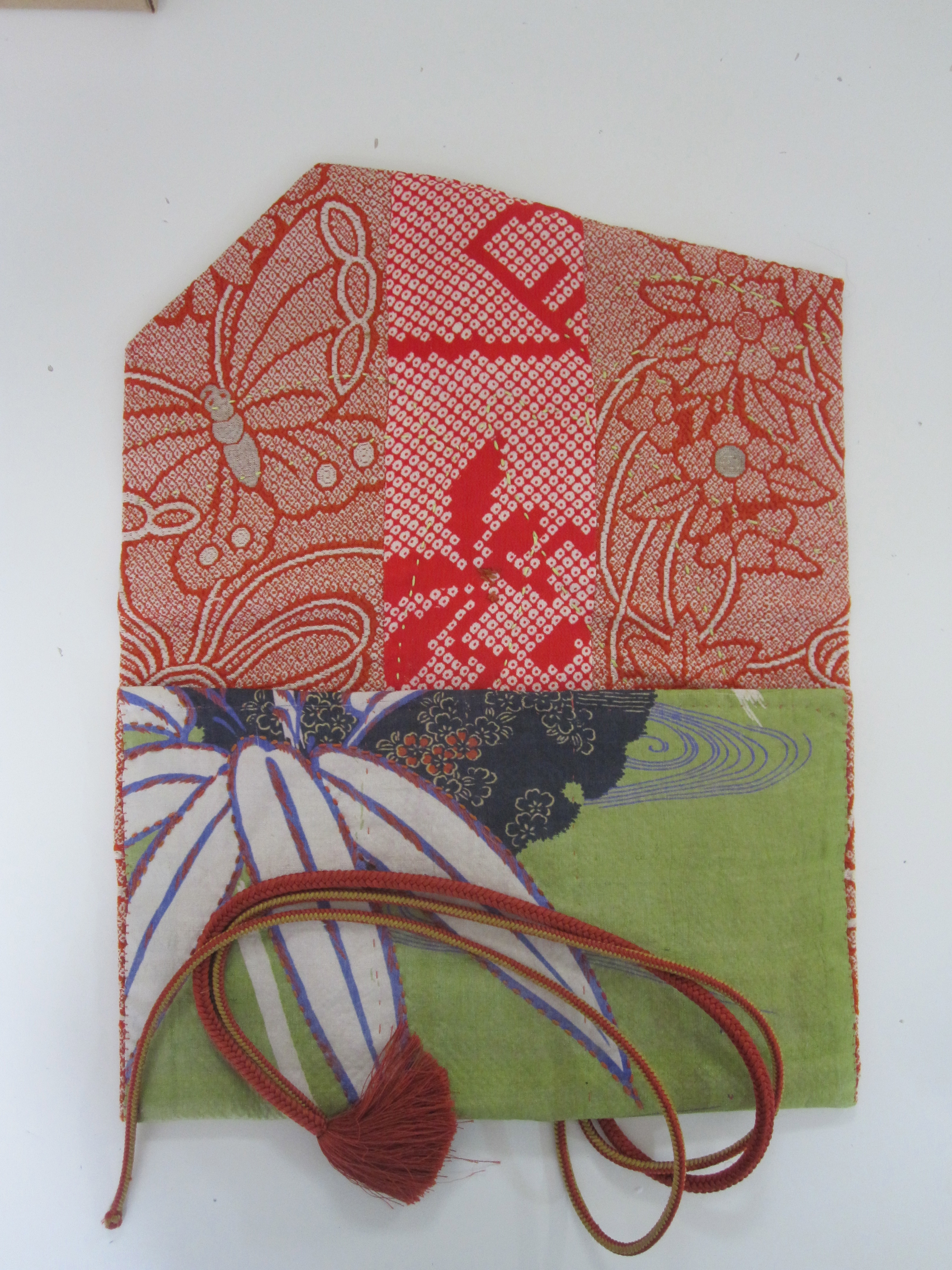
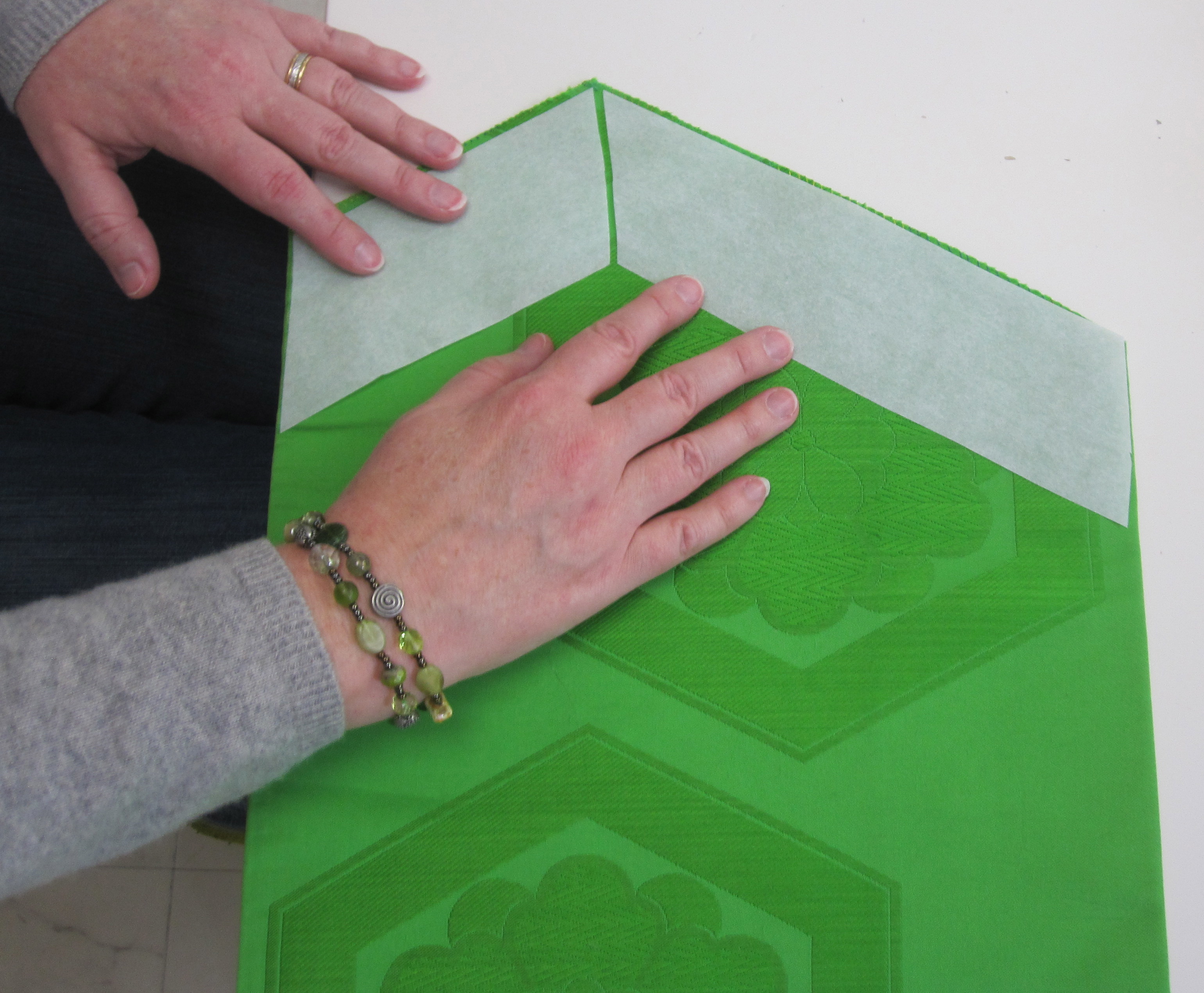
We decided to meet and all make a case or two for ourselves. Erin brought a sample that she had just begun (click on photos throughout this post for details). Obi brocades are just thick enough to provide some soft cushioning for electronics and they are just the right width for a standard large iPad. For a Kindle or iPad mini, the width needs to be cut down to fit. Since obi are thick and reinforced inside, she takes them apart to cut the outside layer of the bag. Soft silk, rayon or cotton lining fabric is perfect for the inside.

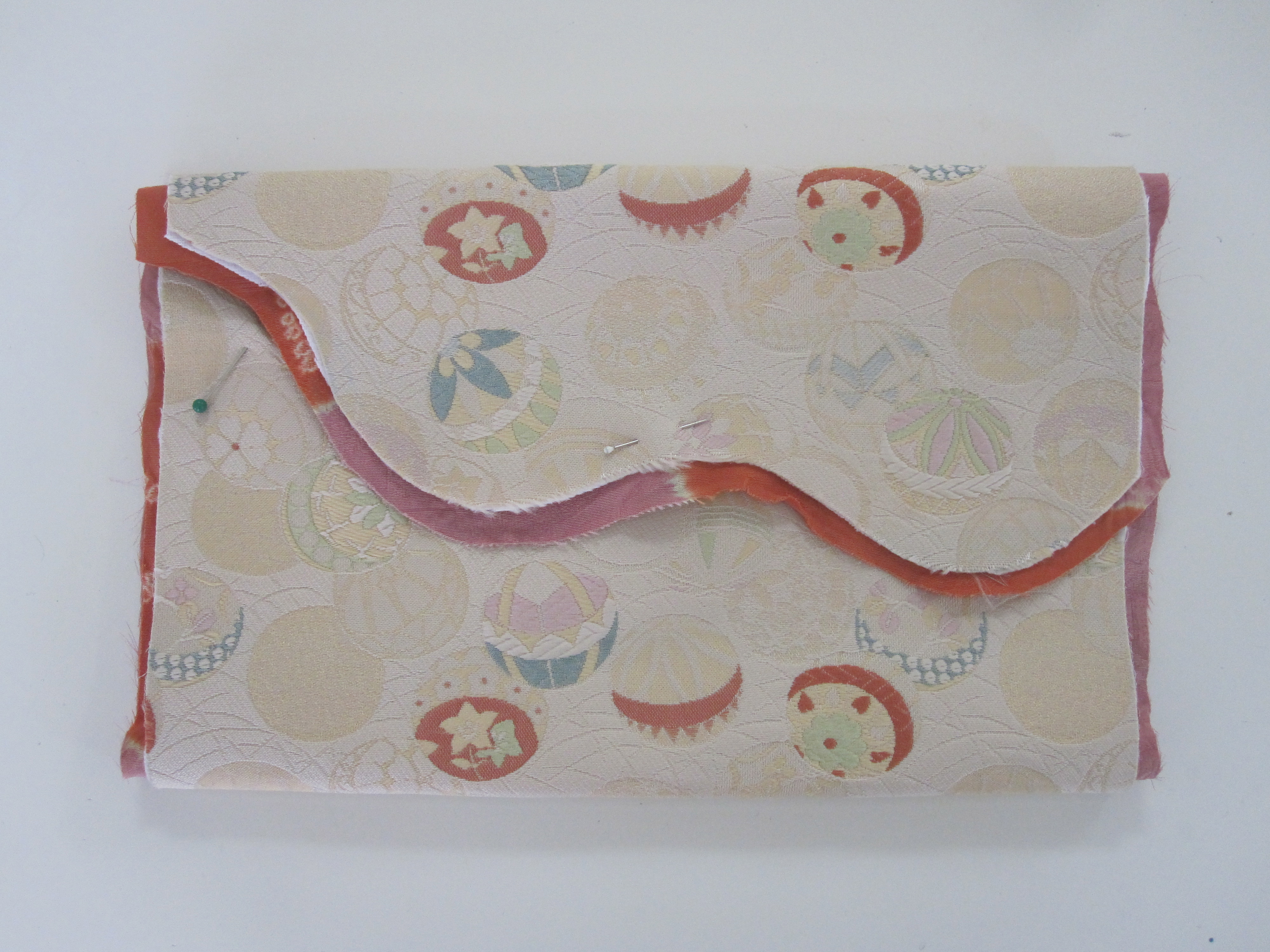
Each one is simply a long rectangle of fabric, folded in thirds, with two sections sewed together to make the pocket and the third section left free as the flap.

IMG_6124IMG_6123

The play between the colors of the wrapped detail edge of the lining and the obijime, contrasted with the outer obi fabric is what makes these bags so fun to design. Erin has also included a bit of sashiko embroidery on her two bags, giving them extra depth and detail.

IMG_1294

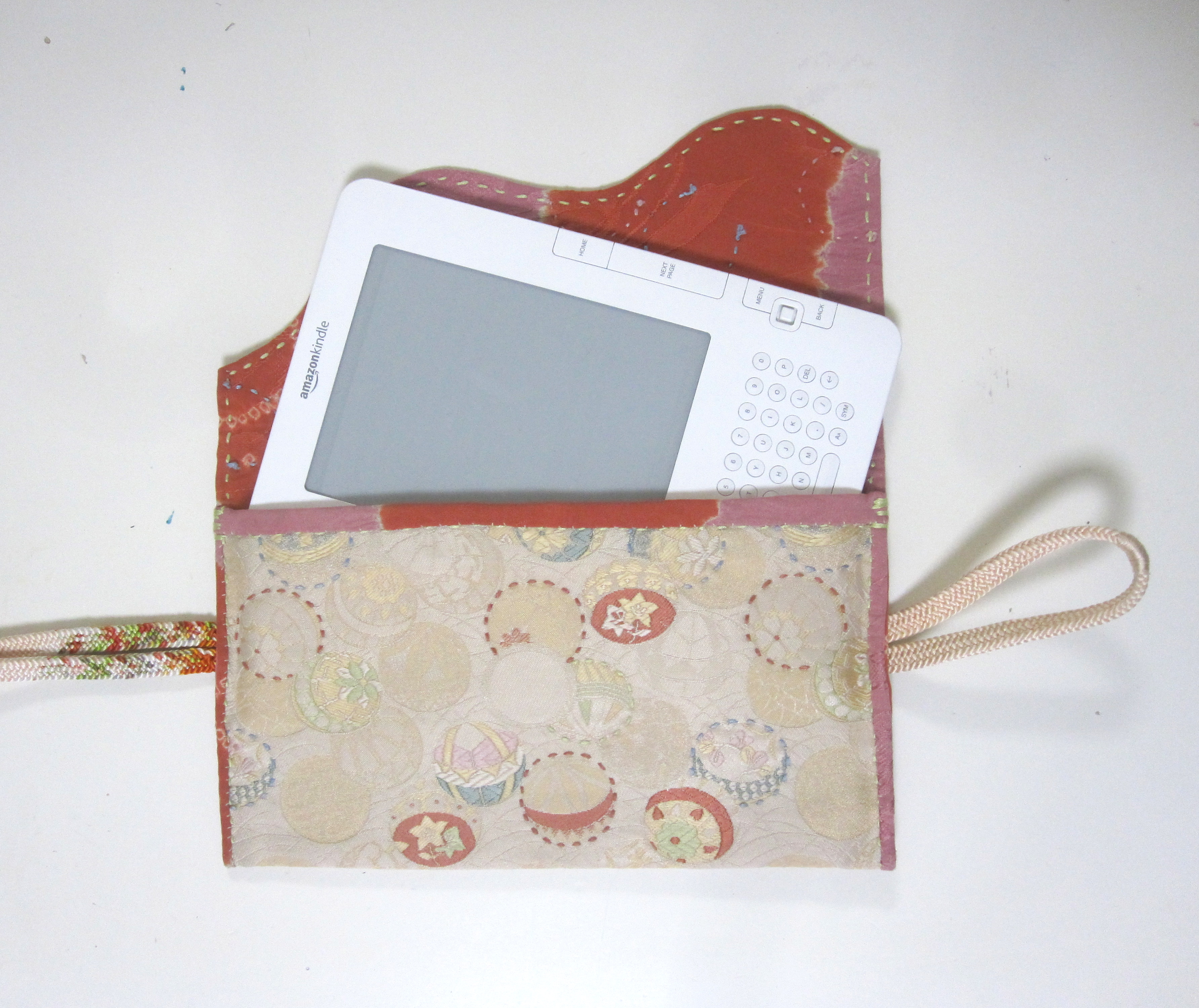
This one was custom sized for a Kindle.

IMG_1298

She and I pooled our stash of non-valuable obi for the group and the creativity began. Combinations were tried out and tested.

IMG_6130IMG_6128

In the end, this traditional brocade on the left looked best paired with the indigo cotton in a stylized bamboo pattern on the right. We decided that a curvy flap went best with the pattern too. If you compare Erin’s two bags above, one has an angular flap, while the other a soft scroll similar to this one.  Aesthetic decisions were left to each person and dependent on the fabric and taste.

The outer fabric is cut to be about half an inch wider on each side than the object you want stored in it. The lining is cut with about an additional quarter-inch seam allowance. If you cut it too big, it is too bulky to sew along the outside edge.  Cut it too narrow and you can’t fold it under to make a clean edge before sewing. There are no exact instructions for this project – it is kinda do as you go.

IMG_6135

This case looked a little blah when finished and closed, so a bright orange obijime and some sashiko stitching were added. You’ll notice that small cases look and work best with the obijime running horizontally, while on the large size it is best vertically.

IMG_1296

Erin’s detail work is lovely – she did all the sashiko stitching on this one.

IMG_1297

This is another that I made and love the play of the watery green lining and the bold mauve obi. The cases are designed to look handmade, and to counteract the formality of this piece I sewed the lining edge with a blanket stitch, done in a very casual style.

IMG_6132IMG_6136

In the end, the case had some issues.  I had decided I wanted the extra thickness of the obi and did not dismantle it.  The net result was that it was almost impossible to get the needle through to sew it. Does that sound familiar? Without Erin’s assistance it would never have been done! As it is quite formal and very pretty, I think it will be kept to use as an evening clutch – I can’t quite see dragging it around as a case.

IMG_1295

Another friend could not resist the idea of making an evening bag and chose a formal silk obi and silk lining that matched and contrasted at the same time.

IMG_6126

IMG_6134

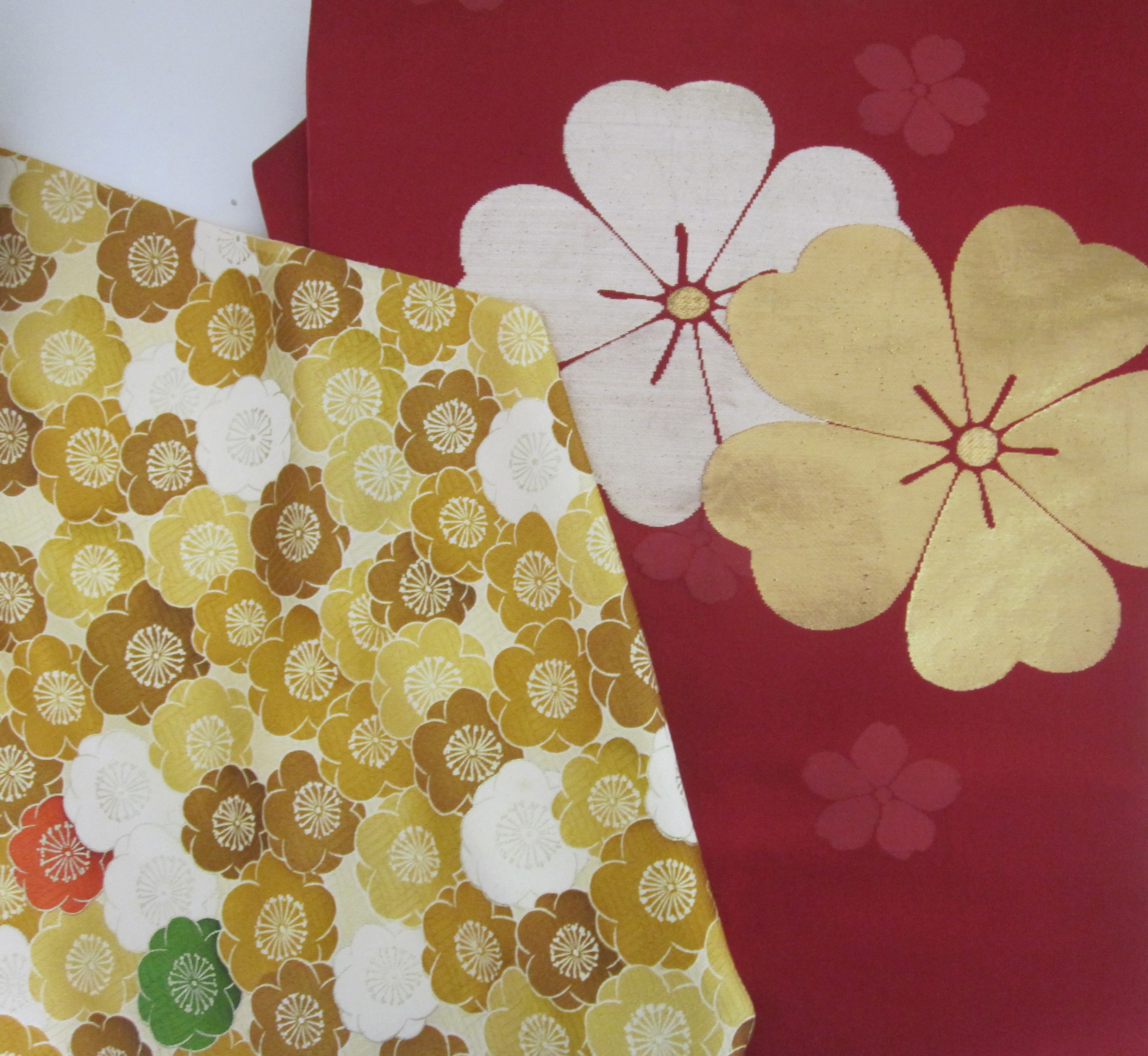
She never got around to finding an obijime for it so I believe she simply used a hidden interior fastener. I think that one green flower in the lining is what makes this so perfect and so Japanese!

obi ipad caseobi ipad case inside

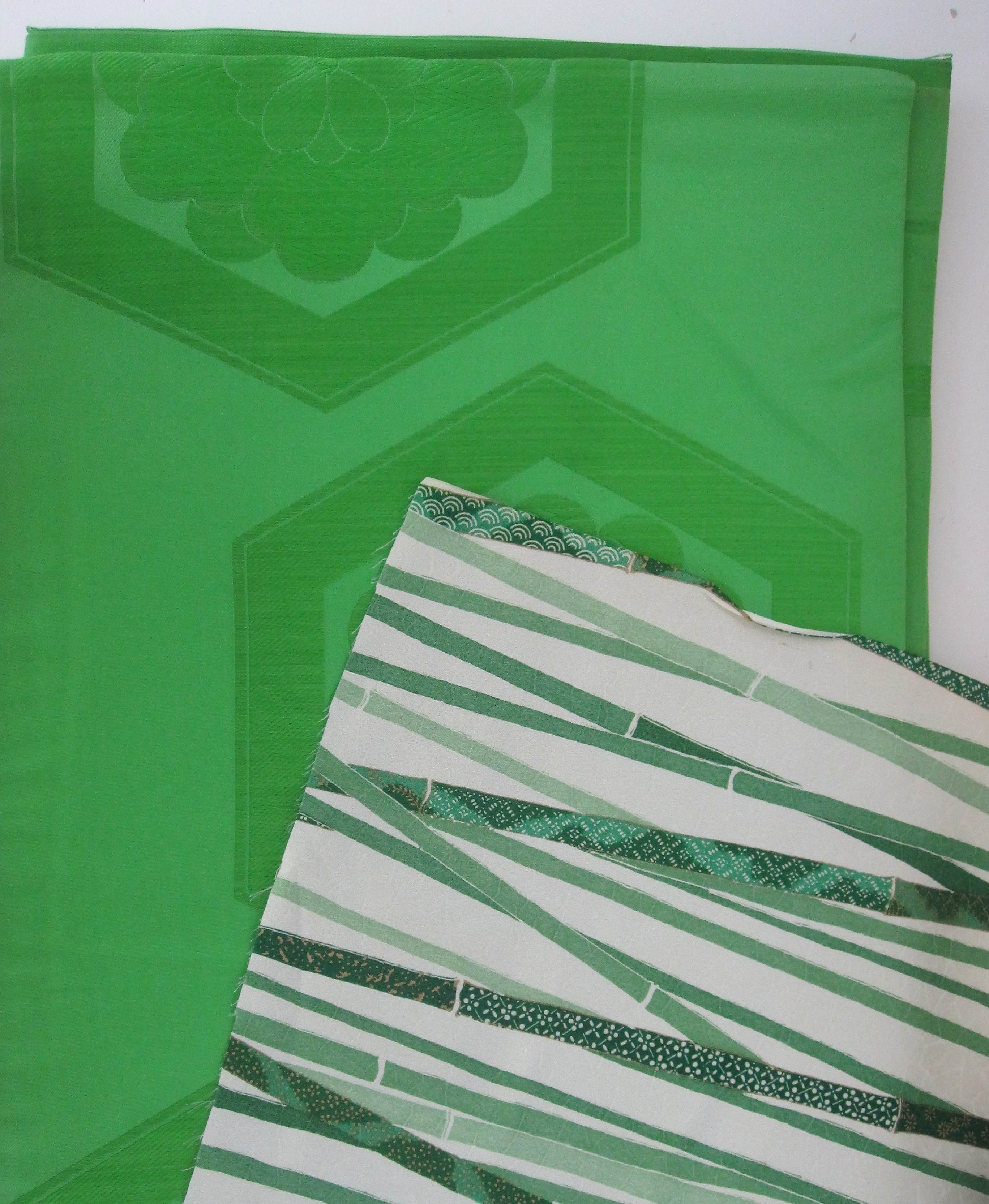
Yet another friend went all green – fancy brocade exterior with silk lining in a realistic bamboo pattern. After taking apart her obi, she found the fabric to be too soft, so she reinforced it with some iron-on interfacing. You can see how each project evolved a bit differently. She also chose to follow the shape of the hexagon in the brocade when cutting the shape of her flap. I’m not sure she has progressed much beyond this point.  Like I said, sewing through obi fabric is a huge pain!

IMG_6125IMG_6133

We are trying to convince Erin to start making these for sale, so if you would be interested, please give a shout out in the comments or send me an email.  They are absolutely gorgeous – the combination of antique and vintage textiles with the hand sewing is so unusual.

Related Posts:

A Not Quite DIY…An Obi and Quilt Block Pillow Tale
The Magpie Gene…Vintage Kimono and Judyth van Amringe
Saving Coral…Finding Treasure in Shrine Sale Junk

About these ads

Read Full Post »

If you didn’t follow my bathroom re-do last summer, you might want to read this post, before starting this one. As a quick recap, my master bathroom at the shore went from this to this…

master bath from rental listingimg_0097

…and this to this, for almost no money and a just lot of sweat equity, including me personally hand stamping an Indian block print for what felt like a million times.

toilet view master bathtoilet side master bath

The thing that didn’t get finished and thus does not appear in the photos is the vanity which was not changed out. One of the choices I was really interested in was using some kind of mother of pearl or bone inlaid chest or table as the sink vanity. It was complicated, because I couldn’t find one the right height or size and many were absolute budget busters anyway. After I left at the end of the summer, it went on the back burner, but still simmered all year. Well, in this month’s House Beautiful, Rebecca Minkoff did just what I was talking about, converting an inlaid dresser to a vanity by adding a sink. It got me to thinking…

fae27247146db4d786e9347db49fa1ef

A number of favorite bloggers – all master DIYers, though, unlike me – have painted the most extraordinary trompe l’oeil inlaid pieces lately using either stencil kits or in some cases painting free hand. Camille at The Vintique Object painted and stencilled this small chest after practicing on a small stool first. She used a stencil kit from Cutting Edge Stencils, designed by Kim Myles, who also has a great how-to on her blog. Would you ever believe this piece wasn’t actually inlaid?

vintique object painted inlay

Jenny over at Little Green Notebook free-hand painted this dresser for her girls room. It has a more relaxed look, but still that great Moroccan vibe. Visually, she used the same technique, with scrolling floral pattern inside borders.

Little green notebook inlay painted dresser

Marian at Miss Mustard Seed goes even more free form with this hand painted art deco era dresser (you would never believe the before photo!). If she can convert that dresser, then I have to be able to do something with my vanity!

hand painted dresser via miss mustard seed

So I am wondering if I might accomplish a few things at once if I try this on my vanity. One, I won’t have to look at its ugliness anymore until I find the right thing to change it to, and two, I can check out and “practice” having an inlaid piece in the space to see if it is worth the splurge to get a real one. Now, mine has more of a bombé shape, but I am thinking there is potential!

img_1008

What say you all?

Master Bathroom Related Posts:

Renovation Report…The Finished Master Bathroom (Almost)
Renovation Report…Vanity Dreams or Vanity Reality?
Renovation Report and a DIY…Using Indian Wood Blocks to Create “Wallpaper” in the Master Bath
Renovation Report…Do You Throw Good Money After Bad? Thoughts on Fixing My Master Bathroom
A Day Too Late…One Perfect Bathroom Photo
Renovation Report…Pocket Door Progress


Read Full Post »

Sorry to be so MIA, but I have been constantly in motion for the last month – both physically and geographically, but also emotionally, quite frenetically. Not quite ready to talk about any of that yet, but it, along with jet lag and poor internet access, has led to an inability to get posts out in a timely manner. It hasn’t helped that we landed at JFK the morning of the Newtown massacre and that subsequently left me utterly too disheartened to write.

Recent posts on ami, the Japanese fish net pattern, and even a photo in my last post of a great glass fishing float perched on an itomaki silk spool, reminded me that I had an unfinished post on one of my most popular topics still in the hopper. I realized I had a lot of images that pertained to the holidays, so what better way to add a little cheer than some vintage Japanese glass fishing floats for Christmas?

Small floats look wonderful lined up along a windowsill to catch the light, highlighting the variations in color and form.

NYTimes floats in kitchen

The sun streaming through the colors is magical.

fishing floats senbei canisters wi

Look at how it lights up this pair of rare amber ones I recently found.

amber floats

Bottle and float pairings are always perfect and the glass was designed to be exposed to the elements, so catching the sun’s rays outside is another great way to display them.

floats and wine jug via dirty deets

Colorwise, vintage ball jars make great companions.

floats and ball jars via scambledpreservedfriedcured

Here they have been grouped to great effect for a gorgeous holiday display!

fishing floats christmas

I know this is actually the powder room mirror in this photo, but doesn’t it look just like a sparkly silver modern wreath?

Small floats were designed to be strung together in their nets for use.

Seeing these working photos makes me think they would make great garlands on a tree or strung in front of a fireplace.

As ornaments anyone? Amazing photo, no??

hanging fishing floats

Of course it turns out there are a number of great DIY tutorials on how to turn simple glass Christmas ornaments into ones that look like floats, from this one at Sand and Sisal

Glass Float Ornaments (1024x739)[4]

…to this one over at Matsutake.

home made float ornaments

Can’t resist including this photo that has been circling the internet all month – a fairly “alternative” tree in a gorgeous glass bottle!

christmas tree in glass jug

As for upcoming parties and hostess gifts, if you are in a float mood, how about bringing your wine in a bottle net from Alder & Co. They’re even made in Japan and knotted in the traditional manner!

Alder and co net bottle carrier

Obviously I have tons of older glass fishing float posts – just click the glass category on the right if you’d like to read them!

Have the Merriest Christmas and a wonderful New Year! I’m headed to (hopefully) sunny warm Florida, where there are always great antiques and design shops to report on, so you may as yet be hearing from me before 2012 is out.

Image credits: 1. The New York Times, photo credit: Bruce Buck, 2-3. me, 4. via The Dirty Deets, 5. via Scrambled Preserved Fried Cured, 6. via Patina White, 7. Coastal Living, 8-10. from my files, no credits available, 11. Sand and Sisal, 12. Matsutake, 13. via Remodelista, 14. via Alder & Co.

Read Full Post »

To quickly review, how does one make a silk purse out of a sow’s ear? Well, I am not sure if I have done that, but I have done as much as I can to the master bath with what I already had to work with and a tiny budget for change.

With a better structural choice –  changing to a pocket door – we gained square footage, ambient light and a utilitarian feature that turned into a show piece.

We changed the color scheme of the room entirely, from a bright peach box to white and blush, without changing the existing tile work or plumbing fixtures, using paint magic from a textile inspired block print technique on the walls…

…and the simple charm of Benjamin Moore’s White Dove, one of the most perfect whites around, which while being truly white itself, can also make an existing almond toilet look white. Magic!

With a change of metals in the lighting and fixtures from faux this…

…to this, Pottery Barn’s Florence Collection in polished nickel with its fleur-de-lis backplates, elegant glass rod and scrolled brackets…

…and this, Pottery Barn’s Covington Hotel Triple Sconce, also in polished nickel, with its simple, almost Moorish design. There was simply no reason to go to higher end, more expensive fixtures with these well made, well designed ones available at such reasonable prices.

Antique accessories and inspiration are a must, in this case a small collection of pink lustreware, which set the tone and color for the entire room…

…and a vintage mirror from my larger collection. I’m not sure it is quite big enough, but it has an ethereal quality of light and I look softer, younger and prettier in it, so it is staying! And if you were wondering what happened to the gilded French oval mirror that was here before, be sure to check my next post.

And never forget the softness of fabric, which performs its own magic, filling dead space near the ceiling and covering an unusually large and unsightly header, while adding some dressiness. Pottery Barn Textured Cotton Curtain and Cafe Curtain used as the valence.

You’ll note the key thing I am not showing, thus the “almost” in the title. What is it? The vanity, of course. That will have to wait for winter or next year. The vote from all was a resounding yes to a vintage marble-topped wash stand. I could have stopped and painted the one that is there, but I don’t want to get lulled into keeping such an impractical piece. I’ll be keeping my eye out for one, hunting on Ebay and with local dealers around here. Thanks to everyone for all your comments and input!

Master Bathroom Related Posts:
Renovation Report…Do You Throw Good Money After Bad? Thoughts on Fixing My Master Bathroom
A Day Too Late…One Perfect Bathroom Photo
Renovation Report…Pocket Door Progress
Renovation Report…Vanity Dreams or Vanity Reality?
Renovation Report and a DIY…Using Indian Wood Blocks to Create “Wallpaper” in the Master Bath

Read Full Post »

So this is the lovely Madame de Montreuil wallpaper from Les Indiennes that I wanted for the master bathroom. No real reason not to get it, other than its high price and its durability in a small bathroom with poor ventilation, but I also liked the idea of a challenge in creating something similar on my own.

So those of you who have been following for a while know that in Singapore in March of 2011 I purchased these traditional floral Indian wood blocks designed to print fabric with the intent of making my own “wallpaper” in the bathroom. Like any project, there is always some other work that needs to come first and I had been waiting on the installation of the pocket door in this earlier post.

So with that finally done and the sheetrock repaired and painted in BM White Dove as the base background, I bought paint and poster paper, set up a workspace and got to work practicing my block printing technique. Wow, it was so much more difficult than I had imagined and my first attempts were just awful! I had too much paint in the tray and trouble figuring out how much blotting I needed to do before stamping. I was looking forward to an irregular organic look, but not this organic!

I wanted to try out different patterns so I did a dense one, which was waaaay too busy, but more importantly, made me realize that as this isn’t wallpaper, I don’t have a partial block print option and need to leave space between each row so it can finish cleanly around wall edges and the ceiling.

Aha! Now this was starting to look right. And I liked the idea of a band of the small flowers above the tile and bisecting the wall behind the toilet. We even considered a square border of the little flowers all around on each wall – a fillet à la the Dowager Duchess of Devonshire – but discarded it as the room is just too tiny. I did this just casually eyeballing it, so luckily my sweet and very mathematically smart husband decided to help by figuring out the exact spacing and placement for the walls.

Hours of work went into these documents and the success of the project really hinges on his work more than mine.

While the design had started to come together, the quality of the actual prints was not so good. Here’s a close-up of one of the practice flowers – you can see the paint is very thick and three-dimensional.

Then late that night it finally occurred to me to actually research how this should be done and lo and behold, I discovered I was missing one essential piece, a small rubber roller called a brayer. So day two and off to the craft store we went! The brayer solves the gunky paint issue by controlling how much goes on and keeping it on the design part of the block only and out of the deep recesses. You can see from the practice below how much better the printing looks.

We took turns and painted the bathroom all in one evening. Sweet husband would work with a T-square and level and make tiny pencil registration marks (which were so small I couldn’t photograph them) on one wall and then I would paint there. Then we would switch off for the next wall. I didn’t realize how physically exhausting this would be, but it was like an extreme workout with a few hundred lunges and squats – squat and roll the paint, climb the stepstool, push with my arms raised, climb back down, squat again. Days later and I am still extremely sore.

Here is a little video – totally unrehearsed and you can hear how tired I am as I am almost slurring my words – but in the heat of working we forgot to take any more footage. Painting on the wall was very different from painting on the poster board as the wall was much harder and absorbed less paint and I needed to really work it on by pressing, rocking and banging. I even got adept at making repairs by adding paint to the block only in the spots that hadn’t printed well.

As I said before, having the design perfectly planned and marked on the wall made this project much easier than it would have been and guaranteed a great result.

We even went so far as to plan out the exact location and dimensions of the towel bar and did not print there, leaving the space perfectly clear.

How pretty and perfect is this Florence glass towel bar from Pottery Barn? The shape of the escutcheon mimics the shape of the flowers. More on all the accessory details in the final reveal post!

I am holding back on photos for one final post showing the whole bathroom, so just keep in mind that none of these photos do justice to the room or how fabulous the painting came out. It is softer and prettier than any actual wallpaper would have been!

Master Bathroom Related Posts:
Renovation Report…Do You Throw Good Money After Bad? Thoughts on Fixing My Master Bathroom
A Day Too Late…One Perfect Bathroom Photo
Renovation Report…Pocket Door Progress
Renovation Report…Vanity Dreams or Vanity Reality?

Read Full Post »

One of the best things about our charming beach town is the plethora of activities available all summer. From the Junior Lifeguard program, library book clubs, drop in tennis clinics, sand castle contests, movies on the beach, and regular fireworks to the crafting workshops sponsored by the local Historical Society, there is always something for the kids to do on any given day at any given time. On Monday, the girls and I participated in a wonderful paper flowers class, run by teacher and artist Laura McHugh on the lawn at Centennial Cottage in town. It was a glorious day – mid 80s and dry.

We learned how to make a number of kinds of paper flowers, including my favorites, made from vintage book pages, scrap booking paper and any other interesting ephemera – such as maps – that we had available. Both luck and my subconscious steered me towards making flowers in the soft colors of my downstairs rooms, and I am dying to figure out a way to use or display the big group above. Ideas anyone?

The basic technique was easy. A square paper was folded in a triangle, then folded again into a smaller triangle, and then the corners were folded back on each side to make yet a smaller triangle. A petal shape was cut into the top open edge of the triangles and voila, a flower upon opening. See the quick video tutorial below for details. We also used some flower punches and press rollers, all available at local craft stores, for some of our flower shapes, but I prefer being creative with the hand cut ones.

We also made classic Mexican tissue paper flowers, which I hadn’t done since I was a kid. Talk about easy and big bang satisfying! Hours of rainy day fun but we have even been continuing on sunny days! Check out the video tutorial below.

Hey, Felt So Cute, she’s hot on your trail to make the best headband ever!

Laura has written a great post on the class  - featuring lots of photos of my kids and their handiwork – which also gives a sense of the charm of the town. Take a look at her blog Vintage2Glam. We can’t wait for her July 25th class on macrame!

Last summer we did a paper cutting workshop with Mindy Shapiro that is being offered again this summer on July 27. Some friends were visiting and we all had a blast. I think she has a new project for her class this year, so we may just have to do it again.

The full calendar of events is attached here. It includes everything from this workshop to crazy quilting classes.

Read Full Post »

OK, I actually wanted to call this post “I’m A Genius” but out of love my best friend wouldn’t let me. Do you know when you are so excited about the smallest accomplishment that you want to crow about it ridiculously? Home almost two weeks, I still feel sluggish and am beating myself up for not getting more done at the house. The truth is that the more you near completion, the harder it is to find and finish those details, as in, “will I ever have night tables in my bedroom?” because they need to be such a specific height and size and work with everything else in the room.

So my moment of joy comes from a good idea mixed with some luck. I am slowly organizing and styling the Sonoma bookcase in the TV room that I wrote about previously here. One conundrum concerned the cable box, DVD player, modem and the millions, yes millions, of cords that connect them all (which are even worse than they look here). As you can see in the photo below, even stacked one on the other, the components look skimpy and the cords are an eyesore. I had thought of hiding the players in a basket, but the remotes don’t work.

Yesterday I made the rounds at all my Point Pleasant antique shops and found this vintage delivery box, much like the one I featured here last year, but larger, at what I believe was the Summerhouse booth of Joanna Madden, who I wrote about here last summer. I forgot to take a photo of her display at Canvas House Antiques, but it was just what you might expect – peely paint furniture and glass bottles, lots of charm and patina. An idea of how to use the box was forming in my mind, but I wasn’t sure if it could be done. I stopped off at the local hardware store for some twist ties – no black, only green gardening ones which will have to do right now – and set to work.

Voila! How fabulous is this? The box was just the right size to sit the cable box on top of the open side. This gives the electronic components enough vertical lift that they fill the shelf space nicely (and keeps the “Fancy Print Butter” label right side up). Better yet, all the power cords have been bundled inside the box at the back. The ones stretching down from the TV have been tied to the iron X bar that supports the shelves – I’ll need to improve on those but I was in a hurry.  I plan on disguising the modem on the shelf below with a storage basket on one side and some large books on the other, or perhaps I will stumble across some other fun and funky object.

I promise the whole bookcase soon. I just have to get to the Ladies Auxiliary Book Sale next week to beef up on my reading material!

Related Posts:
A Television Solution From My Notting Hill and Ballard Designs
Living Large in Small Spaces…FDR, Home Relief and Cream Cheese Boxes at the Tenement Museum of New York

Read Full Post »

As a child in Japan, I used to go to a temple and write out a wish on a piece of thin paper and tie it around the branch of a tree. Trees in temple courtyards were always filled with people’s wish knots, which looked like white flowers blossoming from afar.”

Yoko Ono: “All My Works Are A Form Of Wishing”

Yoko Ono has picked up on and modernized a 2000 year old tradition called tanabata wherein people write their wishes on tanzaku (colorful, small strips of paper) and hang them on trees. These temple wishes can be seen throughout Japanese art history, from this circa 1675 byobu (screen) by Tosa Mitsuoki now held by the The Art Institute of Chicago, to this 1852 woodblock print by Hiroshige, from his Thirty-six Views of Mt. Fuji series.

Ono’s project, begun in 1996, is to have wish trees placed all over the world and those wishes for peace gathered together for her Imagine Peace Tower. From the courtyard of the Museum of Modern Art in New York City…

… to the United States Ambassador’s residence here in Tokyo. It was my first viewing of this wish tree that inspired me to do something similar for my daughter’s Bat Mitzvah. How about a wish tree for her, and while we were at it, why not have it be cherry blossoms, in tune with both the season and event?

As the idea progressed in my mind, I thought it would be lovely to actually have the tags be shaped like sakura blossoms. Unfortunately, no matter where I looked I could not find any already made and thus this became a DIY project. Luckily for me, the uber-talented Alisha of Felt So Cute had moved to Tokyo this year and become a great friend! She is a crafting maestro and has all the tools that go with the title including some kind of vinyl cutter called a Silhouette. She found a cherry blossom shape and set the program to cut out the blossoms from three shades of pink cardstock.

We used a pretty hemp twine to make the tie strings and put a sign (using our logo again) in a silver photo frame.

I used one of my antique Seto porcelain planters to hold the pot and bought some moss to cover the not-so-attractive soil.

Here’s what it looked like set up before the party.

And here is what it looked like about halfway through the evening.

So pretty!!

We are going to harvest the wishes tomorrow and plant the tree behind our house. I thought about sending them to Yoko, but we may just have to keep them for our scrapbook.

Related Posts:
A Little Bat Mitzvah Inspiration…Sakura Season in Japan

Image credits: 1. via The Art Institute of Chicago, 2. via Wikipedia, Dominique Browning, Slow Love Life, all other photos by me.

Read Full Post »

For the very first time in almost two years, I actually didn’t post for about ten days as this past Saturday was my elder daughter’s Bat Mitzvah. With 18 guests from the US, plus other friends who came in from Hong Kong and Singapore, all the last-minute party planning details and everything else going on, there simply wasn’t time. Since this event has been occupying so much of my attention for months, I thought it would be fun to share the party design details!

The theme of the party came quite easily. As springtime suggested sakura (cherry blossoms), my daughter’s favorite color is blue, she loves Japanese kamon (family crests) and the party would be held in the evening, we decided sakura at night would have just the right feel and that we would use a kamon in the party logo.

Lovely invitations from Karissa at Kiss and Tell Cards on Etsy were custom colored to navy and pink.

I had noticed that kids seem to love these cinch saks, using them for everything from their gym clothes to everyday bags. I also thought they would be perfect for carrying home any loot from the party. Using a classic Japanese sakura kamon (that also might masquerade as a soccer ball if the boys didn’t look too closely), the lovely Kristen Hager helped me create a logo for the party. Jeff Ward over at Rach Inc. supplied the bags and the printing and made the whole process easy, including shipping directly to me here in Tokyo.

We used the logo again on the cover of the program. Thanks to blogger Aimee Weinstein of Tokyo Writer for her help with that!

I had long had the idea of using traditional Japanese fabric for the yarmulkes, the traditional head covering worn by men in the synagogue. I had thought about sending them out to be made in Hong Kong by my seamstress, but we all know how long she took to make my quilt and obi throw pillows. In the end I found a company back in good old Brooklyn called Zion Judaica, bought and shipped the fabric to them and they shipped the finished product to my parents who then carried them over. I chose a simple indigo with scattered cherry blossoms, not wanting to worry about large-scale repeats and pattern matching.  It is also reminiscent of…

…petals floating by on the water or the wind.

As the things I ordered started to arrive, I loved the way they coordinated!

I ordered pink and blue M & Ms and bought small organza bags in the same colors for the candy toss. For the other old fogeys out there, this is a new tradition that didn’t exist when we were kids.

The amazingly talented George of PaperGlueBamboo painted dozens of paper lanterns for the table centerpieces. These tiny ones with battery operated votive candles we put inside were for the kids tables…

…while these larger andon shaped lanterns had real candles in them on the adult tables.

Lanterns lining the banks of the Meguro river are a staple of sakura season. We also had garlands of sakura draped on the two interior trees at the restaurant, but as it was raining, all the beautiful lanterns we had planned to hang in the trees on the outside terrace did not get used.

For the kids (and plenty of the adults who could not resist) there was very hard to get American candy favorites on the candy bar, all served in my vintage senbei canisters! You can see the rest of the pink and blue M & Ms made it there too, but the Swedish fish were the most popular!

My daughter loves the fabulous photo booths, called puri kura, that they have here in Japan, but we were not able to get one brought in to the restaurant. Luckily, the crafty Tai Dirkse of Darksea Studios created his own DIY photo booth. I spent weeks trying to figure out how to get a cherry blossom backdrop as custom ordering one was prohibitively expensive. I had started contemplating tearing down some giant advertising posters with sakura on them when I found these great cloth photo banners in Asakusa-bashi, the paper district. We strung two of them on a pole and voila, a perfect backdrop…

…for these adorable photo strips.

We are all still on a high from the party and I want to thank everyone who helped me make it possible!!

More details on a Yoko Ono inspired wish tree to come in a following post.

Special thanks to the talented writer and photographer Kit Namagura for the use of her sakura season photos!

Read Full Post »

This is one of those posts that I can’t help start with the punch line. Compare the date on the receipt to the left (9-6-2007) with today’s date and it will give you an idea of just how long this project has been in process. Actually, in truth, it has been in process for many more years than that, but its “active phase” has been over these past 5 years.

At some point many years ago I found a group of antique quilt squares in a standard pineapple pattern, but made out of classic crazy quilt fabrics including satins, silks and velvets. I can’t quite date them, but they must be late 19th to early 20th century, part of an unfinished quilting project, that found their way to an antiques fair. With no clear idea of how I would use them (pillows perhaps?) I purchased them and put them away. Years later I unpacked them from my shipment when I arrived in Japan and was happy to rediscover them.

For the non-quilters out there, the pineapple pattern starts with a central square to which narrow strips of trapezoidal fabric are sewn, creating a saw tooth effect. It can be a very busy quilt block by varying the color every row, or different effects can be achieved by holding the colors steady or shading them progressively. If this part of the post particularly interests you, there is a nice overview and example of pineapple block making here.

The ease of finding vintage Japanese textiles and the link between crazy quilts and Japan inspired me to design pillows with the quilt squares at the center and a border made of vintage obi (kimono sashes). I spent months searching out the perfect obi for each square, both in terms of color and variety of pattern. In addition, I needed a different trim for each pillow to cover the juncture where the quilt block met the obi. For this blue one I was lucky to have some antique French velvet trim, another of those purchases made years ago (in this case in Paris at Port de Clingancourt) with no clear use in sight.

The odd colors in this square, a golden honey and pale seafoam mixed with burgundy velvet center and corners proved challenging, but this large-scale repetitive obi pattern proved perfect.

For the varying shades of chartreuse and green in this pillow I went with a pale obi, thinking it would make a nice contrast.

Somewhere along the way I pulled out this old embroidered Chinese patch and paired it with a kaku-obi (men’s obi). While the other pillows would have log cabin corners, I planned for this one to make use of the graphic stripes in the kaku-obi and have mitered ones.

And there was one in a completely different colorway, which I could use in my bedroom with a plain velvet border and pretty ribbon trim.

After numerous broken needles on my sewing machine, I decided professional intervention was necessary. Therein begins the story of the receipt. On a trip to Hong Kong in September of 2007 I brought them to my usual seamstress and asked her to make the pillows, along with some curtains for my house in Tokyo. I paid her and left, sure I would see them within a few weeks. The curtains came promptly, but somehow the pillows never came. I called her repeatedly in the beginning, but she could not seem to get any of her regular workers to make them.  I offered more money, but she wouldn’t take it. She just kept saying she would get them done.

In the months that followed I remembered to call intermittently. Over time, the calls became further and further apart, until I had just about forgotten entirely about them. Then an article in the January 2011 Martha Stewart Living about log cabin quilting, in particular the photo of throw pillows below, reminded me of them and made me determined to get them finished. As Hong Kong was a stop on our evacuation-vacation last spring after the earthquake, I visited the tailor yet again, persuaded her to complete them and left my very kind friend who lives there to follow-up.

I am not the first to use obi to make throw pillows. Many designers and pillow makers take advantage of the heavy brocades and gorgeous colors and patterns available. More often than not, the obi is run down the pillow vertically, bordered with trim and fabric on either side, much like these from Stephen Miller Siegel. And having seen the price tag on these babies, I am all for the DIY or semi-DIY version – these would not be at all difficult to make – as the obi could be sewn on top of an existing pillow.

Here, an obi has been used on a chair in a similar long fashion, reminding me a bit of Muriel Brandolini‘s signature chairs. Just a gorgeous application!

In other cases, the long narrow aspect of the obi is used to make a bolster shaped pillow, often without any additional trim, much as in this iconic 1969 photo of Cecil Beaton’s London home.

My friend D has recently whipped up these similar obi pillows, adding the perfect accent of color and comfort to her deep sofa. It took her no time at all as obi are double-sided and hollow – all she did was cut, stuff and sew up the short side seam with an invisible stitch!

By far the most beautiful obi pillows I have ever seen are these in Candia Fisher’s New York library. I can’t imagine the room without them.  Be sure to note the amazing Japanned linen press – by the time I get around to writing that post I have long been promising I will have used all my photos already. More photos of this amazing apartment can be found at Elle Decor or Habitually Chic.

As for my pillows, thanks to my ever vigilant friend, they finally arrived finished. It took me a few months to find some down pillow inserts here in Tokyo, but even that is now complete. The question that remains is where to use them, although in the meantime I have deployed them to the Chesterfield. I love the way the sawtooth edges, which look almost like pinwheels, pick up on the angles in the kilim rug. Click on the photo to see the details up close – they really are spectacular!

And here is the pale pinky one on the velvet settee in the master bedroom.

And speaking of pillows, we have chosen a winner for the ZAK + FOX pillow giveaway. Drumroll, please! The lucky entrant is number 8, none other than Angela, a reader from Belgium who loves all things linen and all things Japanese. Congratulations!

Related Posts:
A Curtain’s Leading Edge…a New Idea for Kaku-obi
Japan-a-mania…Cracked Ice and Crazy Quilts

Image credits: 1, 3-7, 13-15. me, 2. via Get Creative, 8. Martha Stewart Living January 2011, photo credit: Ditte Isager, 9. Stephen Miller Siegel via 1st dibs, 10. via Eclectic Revisited, 11. Architectural Digest Fall 1969, 12. Elle Decor November 2009, photo credit: Pieter Estersohn

Read Full Post »

Older Posts »

Follow

Get every new post delivered to your Inbox.

Join 423 other followers

%d bloggers like this: