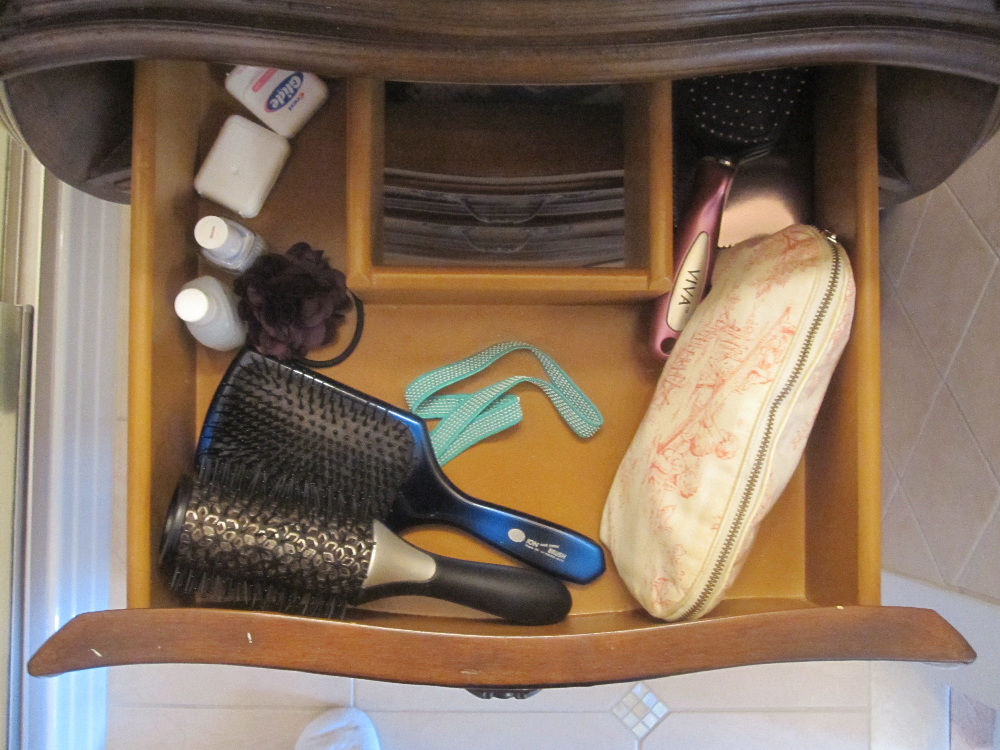
 For the last few days I have been here at our beach house in New Jersey pondering the age-old question “Do you throw good money after bad?” which really is a tough one to answer. Consider the following…a brand new master bathroom, with nothing “officially wrong with it” other than the fact that I hate it. For those of you unfamiliar with my house, it is a simple Victorian beach cottage, full of pale soft colors, vintage furniture and thick white original moldings. The previous owners carved out 2 bathrooms upstairs from what may have been only one. The hall bath is simple white subway tiles and small blue and white checkerboard floor, with white fixtures – just right for the period of the house and my taste. I have also renovated the downstairs bathroom in a similar fashion, with white hexagons and a vintage pedestal sink. The connundrum of this post is what to do about the master bath. For me, it has major problems of both form and function. The photo is from the sale listing almost two years ago now. While the bland colors and finishes are there, it is harder to see the silliness of the design, so I am going to try to draw a literal and a verbal picture for you. First, in terms of function, there is an unnecessarily small vanity with no counter space and about six inches of unused and therefore wasted space on either side. It has 3 ridiculous little drawers, each cut out in the center to accommodate the plumbing, so no real storage to speak of, even though it is a reasonable size cabinet. This photo is taken looking straight down into the drawer – you can see the space for the plumbing cut out – and the storage gets less and less as you move down.
Added to that is an oversized modern mirror/medicine cabinet that projects out from the wall, rather than being set in and recessed. It sticks out so far it actually makes a shadow over the sink and you bump your head into in when you lean over to spit out toothpaste.
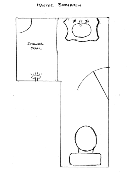
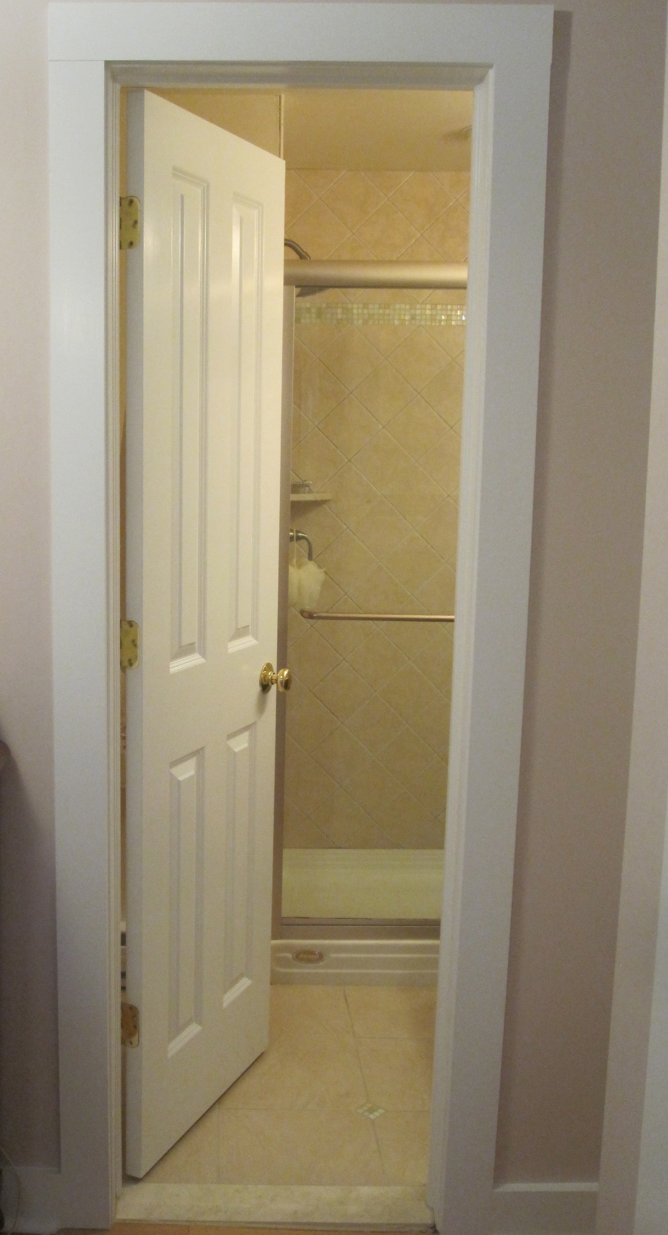
Next take a look at the floor plan. You have to open the door inwards to enter the bathroom, then move all the way towards the shower in order to close it to get near the toilet. Now this bathroom was entirely new construction, so there were other options when building it, such as a pocket door. While I am no real fan of the pocket door, if ever a space called for one, than this is it. I hit my head on the door edge all the time, when turning from the sink to move towards the toilet, and not realizing the door is partially open. This architectural change is a must, whether or not I visually tweak the bathroom.
If you are not a floorplan lover, the photos below give a sense of the awkwardness.
And finally, the aesthetic part, which shouldn’t matter so much to me, but it does. The vanity is the worst kind of “faux French” and could not be less in sync with the style of the house. Stylistically, the modern mirror looks all wrong with the ornate vanity. The color in the room is all an unpalatable pinky peachy beige – the tiles, the walls, the ceiling – everything. Now, I love pink, and actually the master bedroom outside the door is painted Farrow & Ball’s Calamine, a wonderful dull grayed pink, as soft as it is pretty. But when it comes to bathrooms, I am a white tile and fixture kind of girl and I have just not been nor continue to be sure what to do with this mish mash. There is simply no way to pull it all out as it is new and clean. I just have to find a way to make some functional and cosmetic fixes. But the big question is when do “small” fixes cross the line in effort and expense? Would I be better off leaving it and living with it and going whole hog at some later date?
My actual fantasy bathroom is this well-known “English Bohemian” one from the beloved defunct Domino. But as the budget doesn’t call for a full gut and frankly, I can’t make the square footage materialize out of thin air, I’ll just sigh and file it away. (I will note that my bedroom has 2 beautiful threadbare Laver Kirman rugs, much like the one on the floor here.)
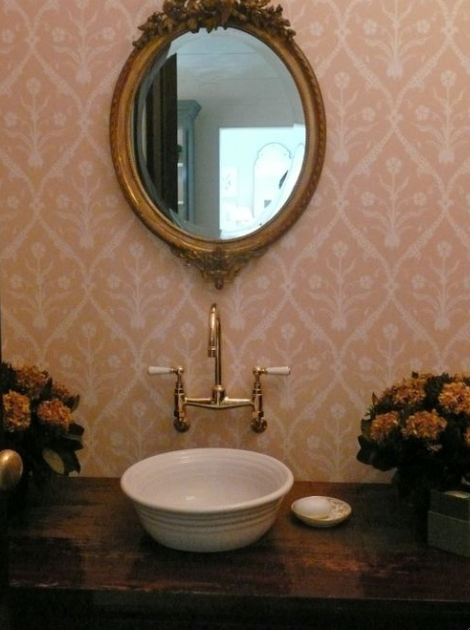
I had stewed on it endlessly, but still had no ideas on how to manage some kind of smaller improvement to the space. And then, voilà, just like that, I stumbled across this photo in my files of a bathroom decorated by the renowned Phoebe Howard and it gave me just what I needed. So here is the usual pitch I always give people – save inspiration photos whenever you find them. You just never know when you will need them. They give visual language to unformed ideas and can clarify and communicate thoughts that would otherwise be impossible to relate.
For me, there are a few key components here. The French mirror, pinky Indian inspired wallpaper, and jewelry faucet. I have to skip the mounted bowl sink as it is powder room friendly, not master bath friendly, and sweet husband has used his rare veto. Frankly, it doesn’t go with the house either. But I am not looking to slavishly copy this photo anyway, just to use it for exactly what I have named it for – inspiration.
First, the French mirror.
This turned put to be an easy fix thanks to a gift from a friend. Her mom runs a small antique shop in the old icehouse attached to The Gatehouse Country Inn in Shawnee on Delaware, PA. The mirror is in great condition – the circle in the center is just from the flash. In this photo you can really see clearly how silly the vanity is and how much space is wasted. (And I know some of you are thinking it is pretty, but trust me, in person, it truly is not!). One of the immediate practical improvements is the mirror sits directly against the wall and does not get in your way or cast a shadow. And if nothing else, it goes stylistically with the vanity below, unlike the former modern mirror. What is humorous though, is how the French mirror feels right – it feels eclectic – while the faux French vanity still feels wrong.
Next Wallpaper.
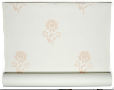
I keep thinking I can ignore the floor and shower tiles and think of them as a neutral background, which would work, except for the fact that they come around and line the area behind the sink, rising high to about 4 feet. In trying to simply ignore the tile work, I need a wallpaper with a white background, and some soft pink. Since the whole house has a bit of “Out of India” meets “The Orient Express” what better than spying Les Indiennes‘ new Madame de Montreuil wallpaper in a Vogue feature in February of 2010, soon after we had bought the house. I carried the photo around all winter and ran right into John Derian‘s as soon as I got home to see it in person. Loved it!
Here you can it featured in a room on remodelista. I just adore the feel of this and think it might actually look OK with that tile.
But alas, my sweet husband was a spoil sport. Our first priority upon taking possession of our house last summer just could not be wallpapering a perfectly good bathroom. There were serious things to fix first, including changing the bathroom door to a pocket one, which does actually involve tearing out the sheet rock and would need to be done before the wallpapering. His further point centered on the practicality of very expensive wallpaper in a bathroom with no window or ventilation.
I was not discouraged though! My new budget plan was to make my own woodblock print “wallpaper” by stamping directly onto the walls. I had long admired the hand printed canopy the talented Lauren Liess of Pure Style Home had made for her son’s nursery. I believe it was actually a stencil, but somewhat the same idea.
And everyone had been talking about stencils including the second issue of newish online shelter magazine House of Fifty. Courtney over at Style Court had actually block printed a pillow by herself, and it came out beautifully.
So while in Singapore on my “evacuation vacation” last spring I made sure to buy a few pretty floral woodblocks, a bit like those in the Les Indiennes’ wallpaper. I had huge dreams of the best DIY project and post for the summer of 2011 but life got in the way. And as we still hadn’t put in the pocket door…
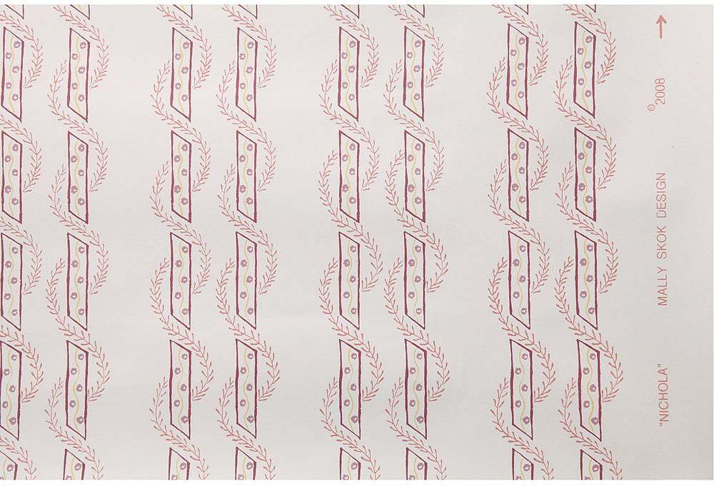
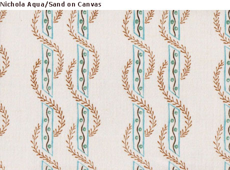
I also came across this extremely pretty Nichola wallpaper by Mally Skok, which feels both 18th century and modern at the same time and is less expensive than the Les Indiennes paper. I adore Skok’s entire line of fabrics and wallpapers and promise a full post in the new year!
Definitely Change the Vanity
From both the form and function point of view, the vanity has to be changed. If I wanted to stay with dark wood, something like this simple Schuyler Samperton elegance would be ideal. (Note another favorite of mine – the butler’s trolley.) But in this photo, the lovely wallpaper extends behind and around the vanity. In my bathroom, the tile work extends up the wall behind and to the side, so ideally I would like to remove it. When I checked with the contractor, assuming it would be easy, he pointed out that it created a chain of events, all the way to having to take out the shower doors, cut new tiles and locate some extra bullnose tiles. That seems to be getting awfully close to actually re-doing the bathroom, which is what I was trying to avoid in the first place.
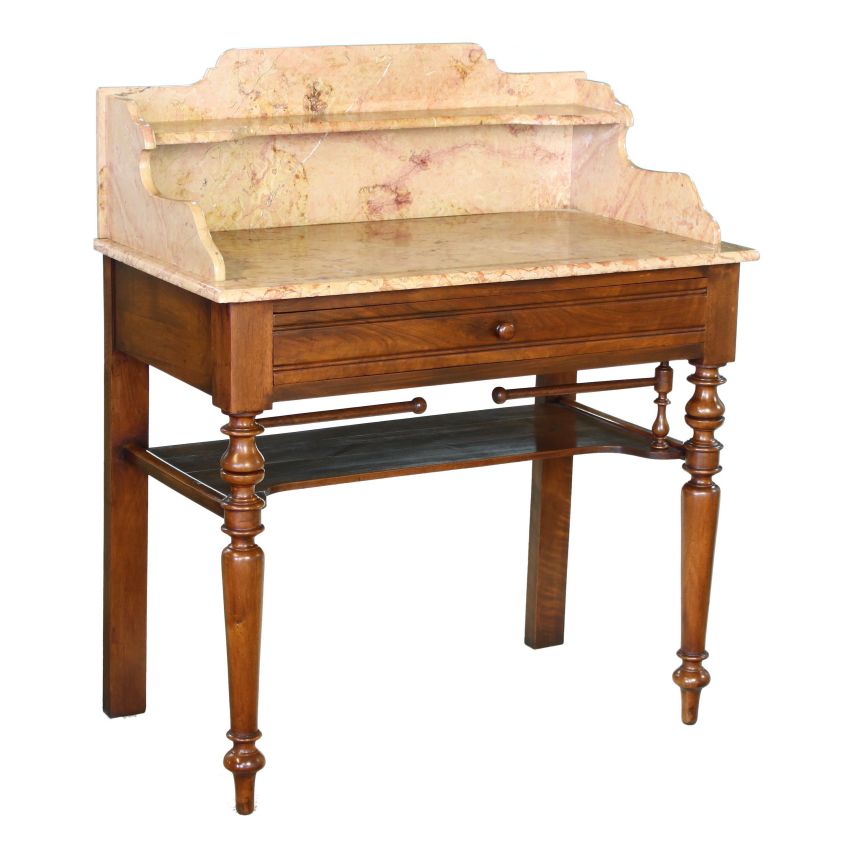
So what about an antique piece like this? The softly colored marble might neutralize the ugly tile work on the wall, although it doesn’t provide the practical storage I need.
But if I don’t take down the tiles, is a dark wood cabinet the answer? Is it different enough from what is there already to make the effort? Might a smarter choice be a neutral painted cabinet that blended into the tile? Well, if I had the answer to that one, then I’d be showing you a photo here. From an aesthetic point of view, I could finally pull out the Annie Sloan Chalk Paint I have been recommending to everyone and use it to paint the vanity, but that wouldn’t change the fact that I can’t store anything taller than 4 inches in those drawers.
The fun and the ease of decorating the room lies in the details. Additional design ideas include using my bits of pink lusterware and pink depression glass that I have managed to acquire over the years. These lustreware displays are from my files, I assume from Martha Stewart Living, but I can’t find the credit.
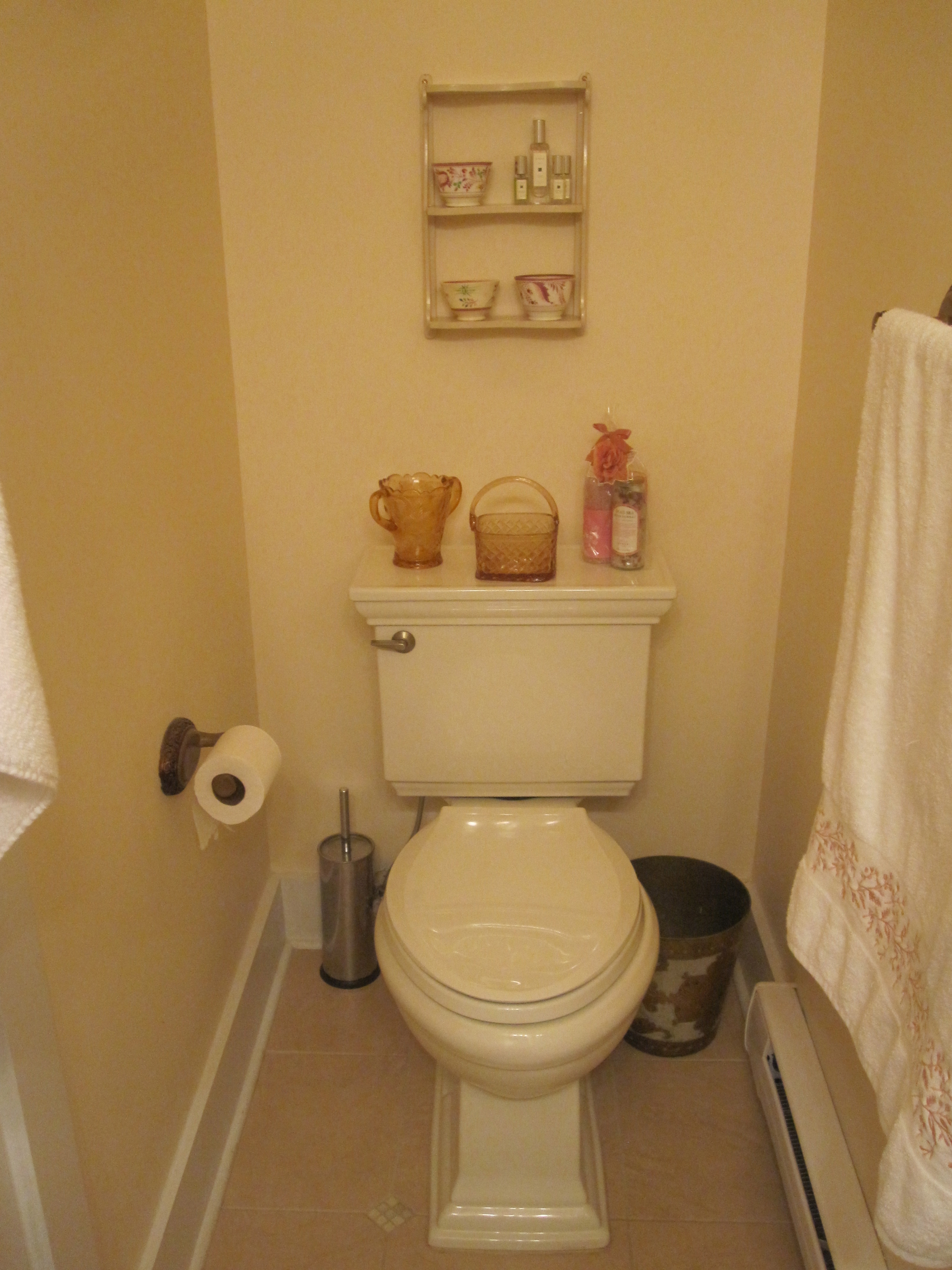
Luckily for me, there is no tile on the far side of the bathroom behind or around the toilet!
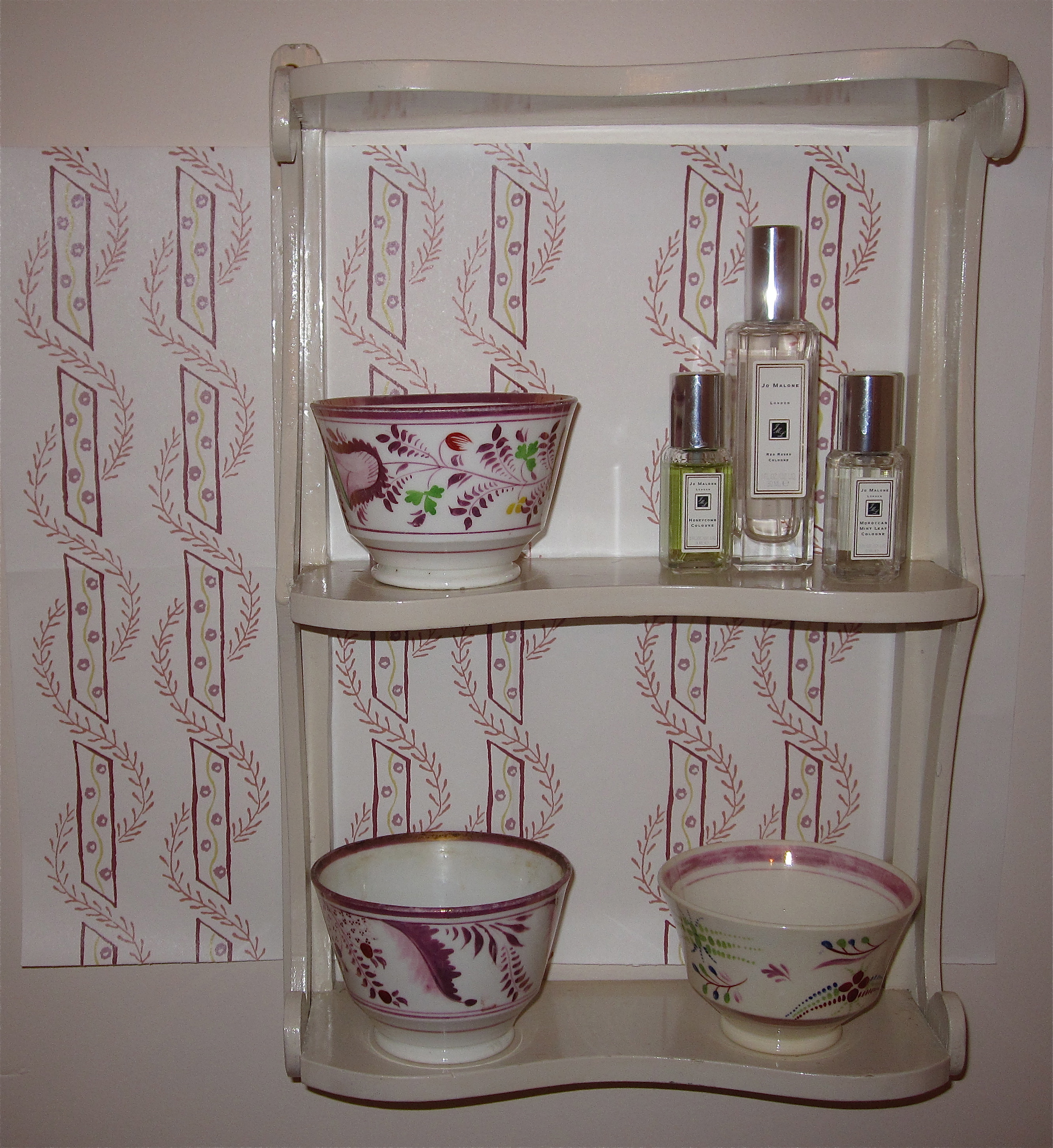
Here’s a little mock-up of the area over the toilet with the Nichola wallpaper sample and some pink lusterware cups on a vintage display shelf alongside my favorite Jo Malone Red Roses summer mixers.
So I am at a loss. To sum up, I need to change the door to a pocket door – that has to be done no matter what – and needs to be done before any other work. I need to change the wall treatment, whether with wallpaper or a DIY block print project. I can add cute accessories. But do I change the vanity? Do I tear out the tile? Do I gut the whole thing and start over? I wrote this post, more for myself than you dear readers, in the hope that it would clarify these issues, but I am still unsure. I would absolutely relish comments!!!
On another note. I am loving Mally Skok’s Nichola so much that I am considering fabric in another colorway for the renovated downstairs bathroom. The aqua/sand color has such a different feel, almost coral-like, a bit like the Min Hogg fabrics and papers I had considered for there too.
Don’t you think it would be perfect for a soft roman blind in here?
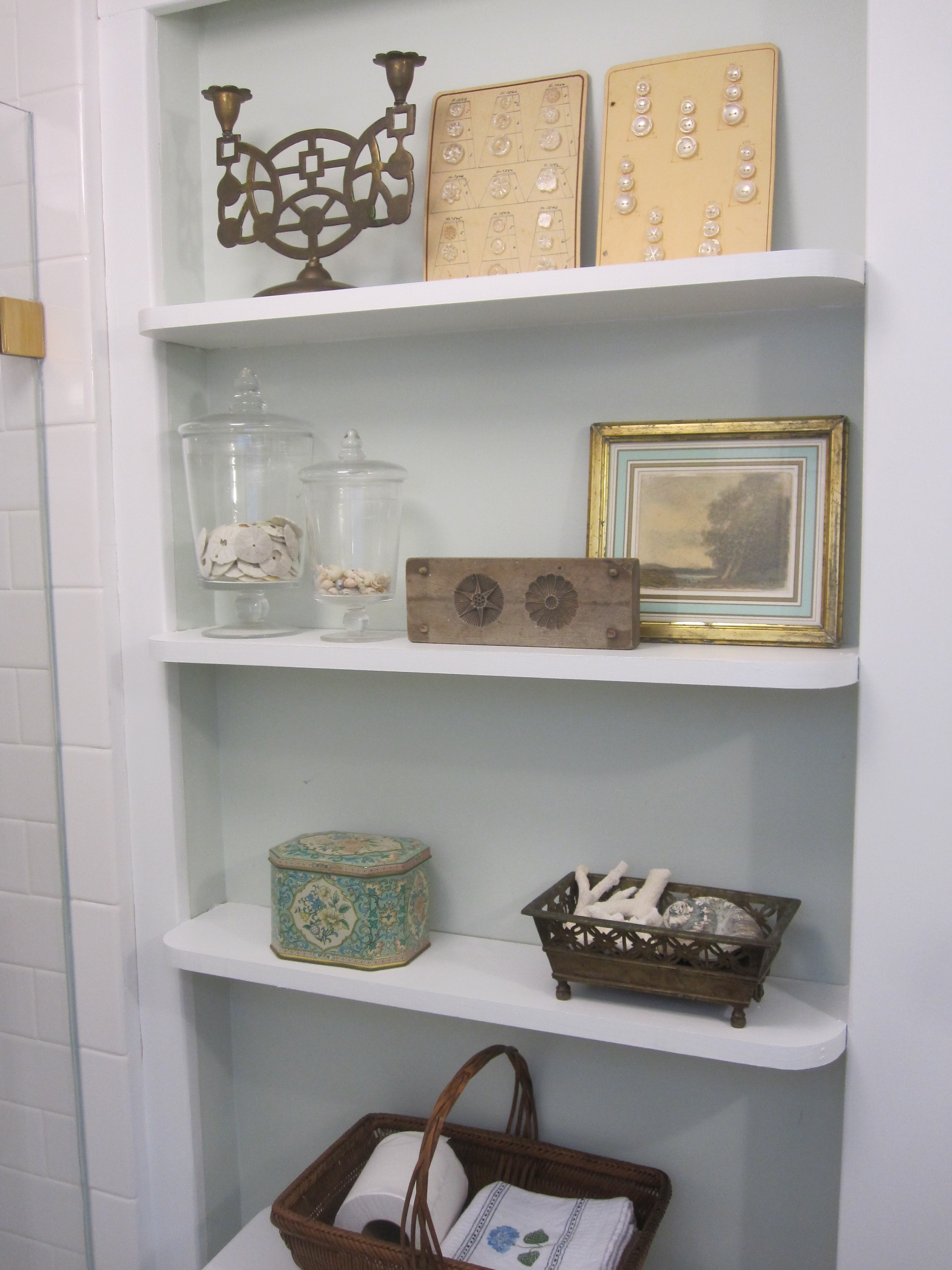
And while the shelves are not fully built yet, I couldn’t resist styling a few accessories for a sneak peek in there.
This is truly a plea for help! I hope someone out there has the bit of inspiration I need!
Related Post:
Renovation Report…”Oldating” the Beach House Bathroom










Renovate :)…you won’t be happy with the little fixes, and you’re so good at finding the perfect things! Love the Malone Red Roses on the shelves above the toilet. And, I like wallpaper in bathrooms.
I vote, with 132% confidence (to be specific), that you should go whole hog. I say this as a person who bought an old Victorian, gutted and renovated it top to bottom. Then 5 years later, partially gutted the SAME HOUSE in order to be able to put on a huge addition (in San Francisco, so extension had to go straight up, and therefore required retrofitting — aka gutting — all the way to the bottom). And neither of these renos were done with us flush with cash. We borrowed (heavily) for both. Still worth it. And, in the course of these renovations, we did of course have uh-ohs where we had to choose: leave the mistake, or throw good money after bad? In every case, we were happy where we chose to fix what we would hate to look at day after day. Especially a master bath, something you see/use constantly. Once you’re tearing up walls to do the pocket door, you’ll almost certainly damage some tiles and need bigger fixes anyway; that’s the time to do it all! I speak from experience, do it right the 1st time (if you at all humanly can) in order to avoid having to do it the 2nd time. And even if you have expensive taste, it’s still a very small room: It just can’t be THAT expensive to re-do. At least it’s not a kitchen. My two cents. Which cost me a lot more than two cents to learn.
It doesn’t make sense to work around things that you don’t love…styling around an unwanted piece. The less than lovely things that remain will continue to bug you. Would you use that antique mirror if you installed the vanity of your choice? It is beautiful but if you ever change the vanity (when you finally cannot tolerate looking at it for one more second), then you will end up needing another mirror, ie. more spending. It may feel expensive to renovate completely now, but it will cost less in the long run. You already know you want to change everything! If you must pace the renovations, at least get what you want without tailoring it to the pieces that you don’t want. It might not match in the interim, but you will be working toward your fab bathroom. I am also speaking from experience too.
Hi Jacqueline, I tend to agree, if you’re going to do it, do the whole thing, otherwise you will be less than happy, maybe then you can re-jig a little, but this is a very small space indeed! Would it be feasible to swing the shower around across the whole wall where the sink now is and put the sink in the left hand corner, so it would face you as you enter the toom (looking at your drawing?) It might give the room a more open feeling. I think I would tend to go for something with open shelving below as a chunk of furniture might just make the same statement as the little vanity you have at the moment. You could add baskets to store things underneath. Or, how would a corner piece work, sometimes you can give the illusion of more space that way? As you know, I am attempting to renovate two bathrooms (finding people to do what I want is my challenge here in Belgium and the cost, mama mia!) and will not put any tile where it is not necessary, I do not like tile period! I wish you luck and hope I have been a smidgin of help. By the way, love the wallpaper and lustreware. For now, careful thinking is in order. Big hugs from Antwerp. Angela xx
p.s. sorry it’s a bit garbled, I am busy here, leaving for an overnighter in Dusseldorf tomorrow and then England next week to see the family. Have a wonderful break.
Hi, it looks like I just missed you at the shore — I was there until Dec. 12!
I would switch the toilet with the vanity. That would allow you to have a cabinet wall to wall at the other end of the bathroom instead of having to be careful about butting up against the shower door. Lots more storage!! And yes, I would definitely go with the pocket door if possible. Or else: switch the door to open out instead of in — really, it’s safer to have a bathroom door swing out in case you fall inside the bathroom and someone needs to get in to help.
Best wishes for a wonderful new year!
Carol
Personally, I like the contrast of a dark period piece against the paler tile….albeit not the one you currently have in there. You will be so happy with the pocket door, and once you have that in you might have an epiphany on the rest as it will enable you to see the space in a different “light”. On a totally unrelated note to this post, but follow-up to another….CORE BAMBOO is currently on sale on OKL! Happy Holidays – looking forward to reading many more posts in 2012!
I was thinking if you want to make a cosmetic change that is inexpensive, how about installing beadboard. It can be installed over the tiles and then extended around the back of the toilet area. I think it would be appropriate for your Victorian era home.You could get a contractor to do it but I think it’s quite simple to install, so you could do it yourself with minimal tools. Just get the people at the DIY store to cut everything for you. I loved the mock up you did with that Nichola wallpaper but I think I have to agree with your husband about putting wallpaper in an area that is not well ventilated. I think your idea with the woodblocks is great and it would be so easy to change if you got bored with it. So I’m envisioning white beadboard and white walls with a block printed design in pink. The tiles in the shower area could be left and changed to white at a later date. But if you really didn’t like looking at the pink tile every time you went in there you could add a floor to ceiling curtain on the outside of the shower partition.Something simple like in the Remodelista photo. I think Angela’s idea of replacing the vanity with a simple piece with open shelving and baskets is good. Hope you find this useful,
Wishes,
Mary
I’m stunned at what a difference the new mirror makes! HUGE improvement from such a simple change. Honestly, I think the tile up and around is the bigger problem than the vanity (other than the door issue, which is simply logistically difficulty and I agree makes sense to tackle). But knowing you’re thinking about doing a stencil, have you considered painting the vanity? You don’t like it, so it’s not like it’s a great piece you could ruin, right? I think the right color (with or without distressing – with in my opinion!) and totally different handles, and it could become way more lovely. And then to tackle the storage issue do you have the option to have recessed shelves cut in above the toilet? Then no one would hit their head, and you can fold/roll towels and add some baskets for things you need access to. It’d be a pretty small handyman job as opposed to a major reno!
Just quickly re-read this post, you say that two bathrooms were carved out of one original, could you convert back and make it a Jack and Jill and then you would have so much more space to tinker with? Or if this is your master bath, why not open it up into your bedroom AKA Velvet and Linens, think of the extra space. You could always leave the loo in situ and door that area off, never like the thoughts of a toilet in a bedroom, don’t even like them in a bathroom since living in Japan, much prefer their own space! Just thinking. I think we will start ripping off the tiles in Annabel’s bathroom soon, can’t bare the thought of paying almost 2000 euro to someone just to take out all the original fixtures 🙁
xx
Angela- I love how excited you get, but the whole point is not to renovate!!!! I desperately need both bathrooms – one is in the hall and serves 3 other bedrooms. What I am needing to do is find some way to pretty mine up, at least for the next 5 or so years!!!
________________________________
Hi – I’ve just discovered your blog & love it. Having only just successfully completed my own small-bathroom renovation, after living with an awful bathroom for nine years, I feel your pain! (1) Count me as another vote for a simple, open, off-white vanity with baskets – or maybe a closed, off-white cabinet with shelves inside. I’m afraid the high contrast of dark cabinetry could be a mistake in such a tiny space – that seems to be part of what’s wrong with the existing vanity. I would figure out a way of hanging the pretty hand towel from a bar on the vanity and getting rid of the holder on the wall, in order to reduce visual clutter. (2) I wonder if a careful choice of just the right off-white paint could suck a lot of the pink out of the existing tiles – they look fairly close to neutral in the photos. I, too, love the idea of stenciling a widely spaced “Les Indiennes” type pattern on your walls and saving the expense and potential problems of the wallpaper! (3) The toilet is already perfectly nice. With the right sink faucet and other hardware (it would look better if all the metal matched the existing shower door hardware), the space could look clean, contemporary, and easy on the eyes, while you save and plan for your dream renovation. (I’m also going to second the idea of simply flipping the existing door so it opens out, if you possibly can, and only doing the pocket door when you are ready for the full renovation.)
Oh my goodness – you are a mindreader! Since I wrote this post I have basically come to the exact same conclusions. My plan is to do just that, and I am hoping to just bang it out at the beginning of this summer. I’ll be reporting on it from the shore. Thanks for reading!!!
________________________________
Beach House Dreaming…”Rooms to Inspire by the Sea” « Tokyo Jinja
[…] big projects looming at our place are the master bath and kitchen. I think I may have found a good vintage door to use in the bathroom to convert the […]