Feeds:
Posts
Comments

Archive for February, 2013

IMG_0654

In my recent post about jubako, I mentioned that there was quite a story to tell about the soft cloth dolls displayed next to the porcelain in the photo above. As the second anniversary of the Great Japan Earthquake approaches and this Sunday, March 3 is Hinamatsuri, Doll’s Festival or Girl’s Day, I think now is the perfect moment to tell it.

Hinamatsuri is a festival that celebrates the healthy and happy growth of girls. Families with daughters everywhere set up very large traditional displays, with the hina-ningyo (dolls) placed along a red felt covered tiered stand with the Emperor and Empress at the top and the other dolls placed progressively lower based on their hierarchy. The dolls wear costumes of the Imperial Court during the Heian period (794-1192). Realistic furniture, lanterns and toy food complete the display and golden byobu (screens) provide a backdrop just like the real Imperial throne of the ancient court.

hinamatsuri

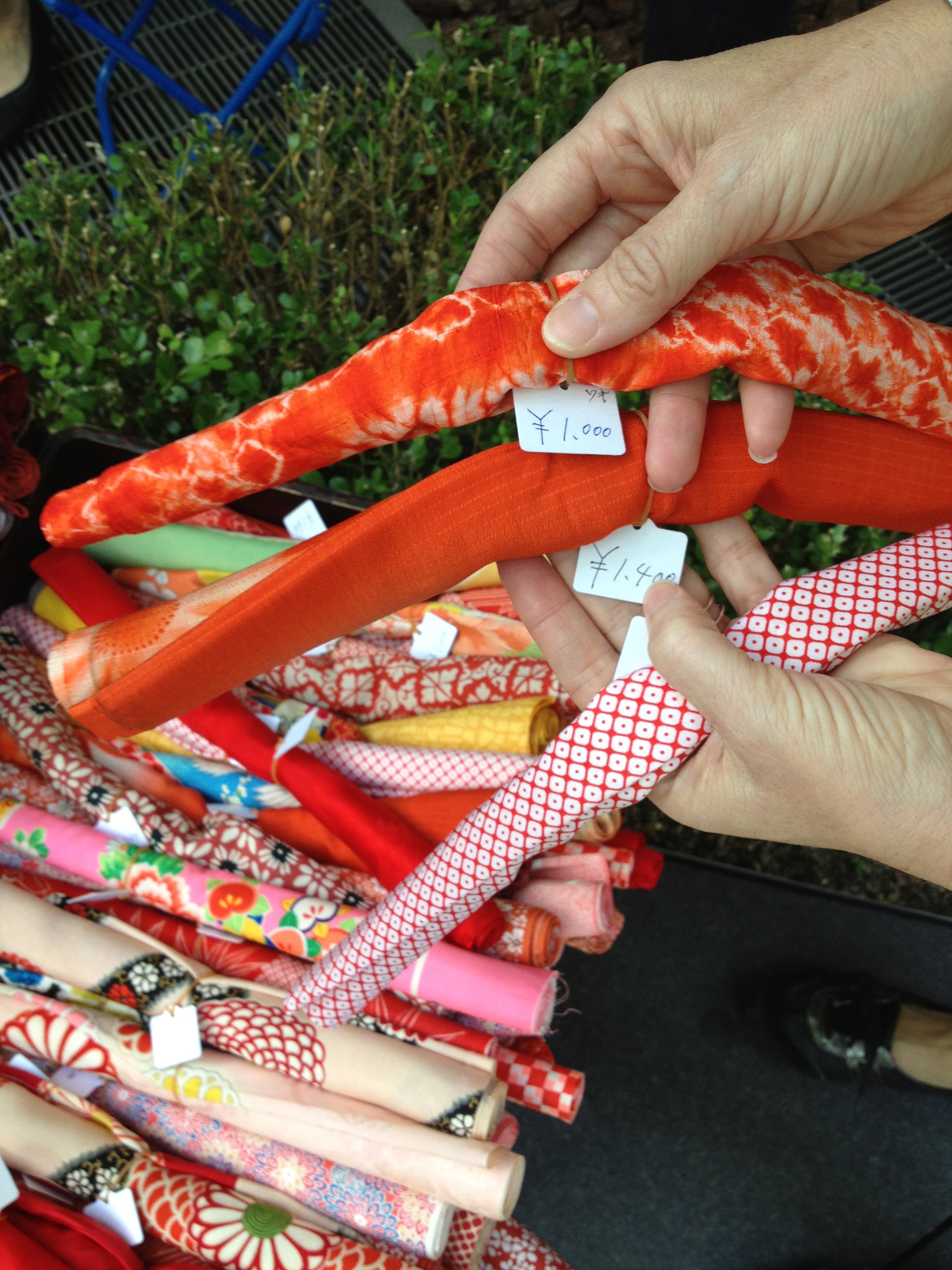
Charming miniature two doll displays are also very common as not everyone has room for a full display. The small peach blossoms are always included as it can also be referred to as Momo no Sekku, or Peach Festival, based on its seasonal calendar date.

tinyhinamatsuri

These huge displays are very expensive to purchase and I am always amazed when I see families buying them new as I come across them at shrine sales all the time. I have to keep myself from buying them as they are so adorable. A little tip – they are great candidates for Western style repurposing as they make really unusual doll house furniture – great gifts for friends back home.

hinamatsuri furniture at shrine sale

Last year around this time – actually a bit later in March – my daughters and I, along with some friends, traveled up to Tohoku in Northern Japan to volunteer with a great grassroots organization called It’s Not Just Mud. Headquartered in a few partially destroyed houses, with little electricity and no heat, it was quite an experience for us as we had never suffered such a level of discomfort before. Just realizing that people had been living like this for over a year was an incredible eye opener.

its not just mud P cold

INJM makes it very easy to come and volunteer and they run a number of service projects that range from heavy labor (rebuilding playgrounds) to lighter but no less important social work.  We were lucky to be involved in the launching of their ‘Tsuna Cafe,’ in which informal tea parties were organized in the communal space of the “temporary” housing complexes (which look more semi-permanent by the day). The parties are a chance for residents to communicate with each other and meet volunteers who bring cheer and friendship.  One of the post-tragedies of the earthquake and tsunami is that village and neighborhood links were lost as residents were assigned to housing units on an ad-hoc basis. No attempts were made to keep communities together and the majority of those unable to rebuild or move elsewhere are quite elderly.

tsuna cafe photos

As this was one of the first times the Tsuna Cafe was being held, the kids went around to all the units and rang door bells and distributed flyers announcing the party. My younger daughter, who was 8 at the time, rang one bell, but as no one was home, she began to walk away. A woman opened the window and beckoned for her to come over. She handed her the flyer and the woman gave her a bag of small bean paste filled donuts and told her that she had very beautiful eyebrows – which happens to be true. She thought no more about it.

We assembled for the tea party, putting out snacks and getting ready to use our best Japanese. My elder daughter had made many friendship bracelets in advance, expecting the children to want them. Ironically, many of the older women were clamoring for them!

friendship bracelets at the Tsuna Cafe

After a while, an elderly woman came in carrying a paper bag and approached my younger daughter. It was the same woman who had complimented her eyebrows! She opened the bag and took out what appeared to be folded cloth. Her Japanese was so colloquial that we couldn’t begin to understand her so one of the very fluent volunteers came to help translate.

hinamatsuri in tohoku

Basically, she told us how after the war, when everything was destroyed and she had nothing, an American soldier gave her an American doll and that changed everything in her life because she had something to play with and love. She never forgot this moment of kindness and sewed these small fabric Hinamatsuri dolls many, many years ago, with a plan in mind to give the Japanese dolls in turn to an American child. She had been waiting and waiting for the right child to come along. As she presented them to my daughter – we were all crying by now – my sweet little one said “Mommy, it’s a miracle!”

IMG_5842

Somehow, in all the excitement and bustle we never got her name. But my daughter will have those dolls and that memory forever.

We are hoping to go up again this spring and perhaps we can find the doll lady. Please remember that the work here in Northern Japan is nowhere near done, even though it has faded from the news. And for a small organization like It’s Just Not Mud, every donation helps.  For more information on volunteering, please click here. For more information on making a donation, please click here.

Related Posts:
The Porcelain is Alright (Kids Too)…My Tale of the Big Japan Earthquake
Hands On Tokyo…A Taste for Volunteering 2012

About these ads

Read Full Post »

So I’ve been making lots of teasing comments about koi and kasuri lately, with a very good reason. This year, our annual quilt for The American School in Japan Gala fundraiser is a deep indigo pool made of kasuri, with three charming carp frolicking in the rain. Koi are the beloved ornamental varieties of common carp that are kept as pets in ponds and the word koi is itself a homophone for another Japanese word that means “affection” or “love”; koi are therefore symbols of love and friendship in Japan. The name of the quilt, Carpe “Triem”, reminds us to seize the day (or seize the quilt!) and is a play on our trio of friends. Inspiration came in many forms, from modern woodblock prints, like this one, ‘Pillow Talk” by Daniel Kelly

2011 Daniel Kelly prints Pillow Talk

…to ‘Whisper whisper 7′ amongst others from Kaneko Kunio.

Kaneko Kunio Whisper

Koinobori, meaning ‘carp streamer’ in Japanese, are carp-shaped wind socks traditionally flown to celebrate Boy’s Day (now called Children’s Day), which falls on May 5th every year. The carp has become the symbol of Boys’ Day because the Japanese consider it the most spirited of fish—so full of energy and power that it can fight its way up swift-running streams and cascades. Because of its strength and determination to overcome all obstacles, it stands for courage and the ability to attain high goals.

koinobori

We also had high goals for ourselves as quilters, wanting to create a very individual and special quilt while at the same time longing to do another boro (rag) background quilt, featuring vintage indigo textiles, a bit reminiscent of the beloved Dragon quilt of 2007. I was lucky enough to come across a few great pieces of kasuri, the Japanese form of ikat, in which the thread is dyed prior to weaving. Kendra had some other gorgeous pieces in her stash and we were easily able to assemble the patchwork background from a myriad of pieces and patterns.

kasuri quilt background

Using some photos of real koi, Julie drew our koi on graph paper free hand – she is so amazing!

IMG_0597

I figured once we were using such gorgeous fabric for the background, there was no chance modern fabric could hold up its head against it. So back out to the shrine sales I went, in search of antique and vintage shibori (Japanese tie-dye), brocades and other silks. While the fabric would be gorgeous I knew the quilters would be hating me a bit as silks are so hard to work with.

orange shiboriorange shibori

The patterns in the shibori was perfect in giving almost a literal effect of scales. And the bold colors – oranges, yellows and golds – against the deep indigo was spectacular. Just trying it out by draping a fish shape had us all excited.

IMG_0535

As we started late this year and the Gala was a week earlier than normal and we planned for the koi to exuberantly overlap the borders, we had to work a bit out-of-order this year and put the borders on early.

IMG_0600

Julie’s husband enlisted the local copy shop to blow up the hand sketched koi, one graph paper square to one inch and we were able to use them as patterns.

IMG_0935

The day we spent cutting the fabrics to create the fish was my favorite quilt day in all nine years I have been working on the ASIJ quilts.

yellow koi

With each fabric we tried to bring out its innate nature…

orange koi fabrics

…and have the details suggest the very details found on the fish.

orange koi

We used iron-on stabilizer to give the pieces some weight and make them opaque.

black white orange koi

We basted the quilt top to a simply patterned dark blue background and placed the fish into their new home in the pond.

basted quilt

As we loved the echo quilting we did last year, we decided to do it again – this time as raindrops on the pond. Here you can see the circles marked out at one inch intervals. If you look closely you can also see the detailed quilting in the fish fins.

echo quilting marking

I just love this detail shot with the shibori circles reading as fish scales and the rain drops quilted into the kasuri.

orange carp 001

The crowning touch was finding a perfect silky orange binding – I don’t know how we got so lucky! Not a perfect frontal photo, but the slight angle brings out the details of the echo quilted raindrops.

2013 ASIJ quilt

This quilt, with its evocative design and meticulous craftsmanship, masterfully captures and conveys our long-lasting affection for Japan.
More in-progress details can be found over at My Quilt Diary and A Quilter By Night.

Related Posts:
Coming Full Circle…A History of the ASIJ Gala Quilt
The ASIJ Quilt…Summer Breezes: Furin in the Rock Garden

Read Full Post »

I was young, newly married, and in need of a table and chairs to serve as both kitchen and dining room table. We had the typical NYC galley kitchen in our apartment in an old 19th century school building. The space had a loft-meets-country feel and I was still pretty firmly embedded in the 19th century Americana that was my original antiques specialty, although my tendency to pull from the Aesthetic Movement was already quite marked. Quite soon after moving in we were driving home from a friend’s house in Connecticut along Route 2 or 202 or something like that, chock-a-block with antique stores along the way, so of course we had to stop. We picked up a few great things that day, including an antique clock case we turned into a medicine cabinet, but the standout find was a bargain set of six black Hitchcock chairs.

hitchcock chairI’ve always had a weakness for Hitchcock chairs, which are so quintessentially American, but also one of the very first mass-produced pieces of furniture ever made in this country. Originally produced during the second quarter of the 19th century by Lambert Hitchcock, a Connecticut cabinetmaker, they are easily identifiable by their black or dark paint, simple Sheraton shape, gold stencilled details and rush or caned seat. It’s estimated that by the late 1820s, Hitchcock’s company was selling over 15,000 chairs per year. After closing in 1852, the company remained out of business for almost a century only to have a resurgence in the second half of the 20th century when the factory was reopened on the ongoing waves of Colonial Revival popularity. I’d date my chairs as vintage – perhaps 1960s or 70s – as the truly antique examples I’ve come across don’t seem like they could hold up to everyday wear and tear.

Once we had the chairs, we needed a table. I knew I wanted something that didn’t match. This doesn’t sound exciting or particularly revolutionary now, but at the time, people were still buying ‘suites’ of furniture, whether matching couches and love seats or entire bedroom and dining ‘sets’. The table had to be practical as my sweet husband was not going to stand for constant coaster/place mat/tablecloth use. The coloring of the rush seats looked great with light woods as did the dark contrasting paint. But the apartment was open like a loft and fairly dressy, so finding the right thing became a bit of a challenge as the obvious choice – a rustic farm table – didn’t seem right.

polaroid of tableDoes anyone else remember the days when the western edge of Bleecker Street was still full of antique stores, before the Marc Jacobsvication of it? There was one great mixed shop called Clary & Co (I think they may be still around on 1st dibs) that I checked in at all the time. Once day I was lucky enough to find this – a finely detailed Danish Victorian scrubbed pine table. I still have the Polaroid (!) they took for me to take home to think about it. If I recall correctly, we tied it to the roof of my parents borrowed station wagon to get it home the ten blocks or so.

We were so excited by the combination but the ultimate vindication came not much later from none other than Thomas O’Brien of Aero Studios when his country house was profiled in the February 1994 House Beautiful. He had Hitchcock chairs (his high school graduation present!) pulled up to a similar pine table. He was even using an antique Empire dresser as a sideboard – as we were and are – my own first ever real antique furniture purchase. He had a glass hurricane lantern hanging above the table, just like we did – although I have to point out that his was nowhere near as beautiful as ours (a Dixie Highway find).

Over the years I started collecting every Hitchcock chair photo I came across. Earlier shots tend to have that more cluttered country feel, but all have a common denominator in that the tables and chairs mix materials successfully, from grey painted wood…

…to white…

…to more pine…

…to speckled paint treatment in a formal dining room…

…to cheery cottage sun porch…

…to cosy dining corner.

For all their country coziness, Hitchcock chairs have a very spare silhouette – and much like paper cut silhouettes which are hugely trendy again now – that old-fashioned black profile can really feel modern. So along the way, as tastes changed, designers began to pull on the simple streamlined form of the chairs and highlight that. One of the first to do so was Victoria Hagan, here with a set that have a Washington Vase back shape…

…and again here with a combo of cane and rush seated versions. Both are all about the dark/light contrast and the sculptural shape of the furniture.

Picking up and running with that same idea is architect Gil Schafer, first at his Hudson Valley home Middlefield…

…and later the exact same table and chairs moved to his apartment in New York City. Again note the combination of dark chair and rustic light table.

Schafer uses Hitchcock chairs again in his other residential projects.

A master of that simplified American vernacular, Schafer has an amazing book
The Great American House: Tradition for the Way We Live Now that should not be missed!

Another master at highlighting sculptural antique forms through light and dark is Darryl Carter, using Hitchcock chairs and a bench in this recent room from the June 2012 Elle Decor.

As a testament to their surprising flexibility, they mix with this very modern white table as well.

So this is where I stand. After long daily use, the chairs are dying. The rush seats are breaking and the art of re-rushing does not seem to exist in Japan. The wood frames are getting shaky too. I have been playing musical chairs with the wonkiest ones. And perhaps, just a little bit, I am visually ready for something new and fresh. Now don’t get ahead of yourself, I’m not talking radically new – I don’t think that is where I am heading, but maybe something new antique.

I can’t remember exactly when or where I got the idea of changing the Hitchcock chairs for Thonet style bentwood chairs, another 19th century iconic choice that has such a stylistic yet functional presence. My instincts are that the idea starts with Tom Scheerer‘s influence. His spectacular interiors are littered with different versions of classic Thonet, but he particularly likes to use No. 4, the Cafe Daum chair.

He mixes them with very modern tables extremely well.

The irony of changing to bentwood chairs is that from a historical furniture manufacturing point of view, Hitchcock chairs and Thonet bentwood chairs were almost contemporaries. Michael Thonet set himself up as a cabinetmaker in 1819 and began to experiment with bending wood, ultimately patenting a steam technique around 1840, allowing his chairs to be mass produced.  Both styles of chairs represent a huge departure from the past – economically, socially and stylistically – in that they created affordable, well made, functional pieces that appealed to the new popular taste.

It wasn’t hard to come up with inspiration examples like this similar table to mine mixed with black bentwood in the Scott Weston designed kitchen of Kirstie Clements.

I’ve found numerous examples of black or dark bentwood chairs looking great with casual light wood tables. These aren’t a Thonet style, but I can’t resist including them, because the whole kitchen is so fab.

Here’s another view – I do love this kitchen.

Here a vintage marble-topped wood table and black bentwood chairs anchor a modern space…

Sarah Story bentwood chairs singaporePenthouse

…as they do in this older version of Muriel Brandolini‘s kitchen.

And I don’t want to rule out the idea of color as they look wonderful painted. Perhaps a Prussian Blue?

Kim Raver Bridgehampton dining room In Style 1010

The Conran Shop sells a version of Chair No. 14…

…while Crate & Barrel sells their own version of No. 18.

A great company called Bauhaus 2 Your House sells almost every version of bentwood chair available today and they are all fully licensed.

bauhaus 2 your house bentwood chairs

The problem is that I need the choices to be readily available in Japan. I’ve been keeping my eyes open for modern examples or vintage ones. Geographica along the antiques hub on Meguro-dori has these dark wooden No. 14 chairs available for sale.

One of the advantages of bentwood chairs is that they are open to the mismatched look – you can charmingly mix a variety of the styles.

So another option might be the shrine sales. There is a dealer at the Oedo Market at the International Forum that always has a selection. And I’m seriously loving the idea of a deep Prussian blue which would allow me to unite a disparate set…
bentwood at oedo market

Goodbye Mr. O’Brien? Hello Mr. Scheerer? What do you think?

Read Full Post »

Koi, the ornamental carp so long associated with Japan are heavily on my mind these days and you’ll see why in an upcoming post quite soon. In honor of their variety and beauty, I can’t help but highlight one of the most extraordinary wallpapers out there, Fishes by de Gournay. Everywhere you turn, de Gournay’s Chinoiserie wallpaper is being used to stunning effect (some great blog round-ups here and here as well as here on the de Gournay site), but lately the liquid movement of Fishes has really captured my attention.

Early projects like this powder room by Katie Ridder highlight how dramatic and daring it is in small spaces. In fact most of the examples I came across were powder rooms, as always the perfect place to cut loose with design.

Katie Ridder fish bathroom via KR

A key to each of these bathroom photo shots is the reflection of the paper in the mirror.

de gournay fishes

This lighter colorway - Blue Pearl design colours on tarnished silver gilded paper – seems to be the most popular – although as it is custom painted it can be ordered in any color under the sun.

‘Fishes’ design in Blue Pearl design colours on Tarnished silver gilded paper de gournay

Stefan at Architect Design recently featured this powder room which used panels and a large mirror to envelop the viewer as if they were under water themselves.

de Gournay fish via architect design

Sarah Story‘s Gramercy Park study has also been featured everywhere and its small dimensions make it a perfect place for this wallpaper, much like the powder rooms above. There are a few versions of this space out on the web including this one with antique desk and klismos chair…

Sarah Story de gournay fish gramercyPark

…and this very different version with white Parsons desk and modern Eames chair. I find it fascinating how light and photography affect our perception of this paper. It’s mutable, like any given day at the ocean.

SaraStory_gramercyParkRenovation-5

Larger scale examples include this staircase hallway with its crystal ship chandelier.

de gournay fish ship chandelier via everything leb

Further down the stairs the fish seem to be racing upstream.

degournay Fishes’ design in Blue Pearl design colours on Custom Silver gilded paper.

Because the design could be overwhelming this is a paper that is wonderful for using along a single wall as in this kitchen by Jeffrey Alan Marks & Ross Cassidy. I find its placement here quite witty.

Jeffrey Alan Marks & Ross Cassidy de-gournay-fish-wallpaper_ElleDecor

And in this dining room, the silver leafing goes all around, but the fish are constrained to one wall.

Fishes’ design in Blue Pearl design colours on Real Silver gilded paper with pearlescent antiquing de gournay

I’m not sure if this is actually de Gournay paper in this design by Wendy Schwartz - it is only listed as being hand painted on red silk – which leads me to believe it may be. I did want to include it as the dramatic orangey-red colorway is quite a change from all the silvery greys. And doesn’t that fixture remind you of a mod version of a netted glass fishing float?

Wendy Schwartz koi wallpaper Rue 3-4 12

de Gournay have recently expanded their Japanese and Korean collection, adding ‘Abstract Pines’, ‘Kiso Mountain’, ‘Cranes’ and ‘Matsumisha Waves’. I’m looking forward to seeing them used.

de gournay new japanese korean designs

Another option, if you can’t take the price tag nor the commitment to wallpaper, would be to buy an antique or vintage Japanese byobu (screen), perhaps something like this one. I’ve featured it before here, and the photo has never ever done it justice (the harsh fluorescents at the Heiwajima antique fair are very unfriendly), but it was truly beautiful.

pale byobu from heiwajima

More on some other special carp to come soon…

Image credits: 1. Katie Ridder via Everything LEB, 2-3, 7-8, 10 & 12 via de Gournay, 4. via Architect Design, 5. via Sara Story Design, 6. Sara Story in Elle Decor, November 2011, 9. Jeffrey Alan Marks via Elle Decor, 11. Wendy Schwartz via Rue Magazine, February 2012, 13. me.

Read Full Post »

There are many modern furniture items that have a chameleon like ability to work in a multitude of decor styles. Some are very famous, like the Saarinen Tulip table (more on that later) or Wegner Wishbone chairs, both commonly used and talked about. Seen less often, one of my favorites is a certain vintage Baker glass and brass coffee table which, while being fundamentally the same table, comes in many variations. Pegged as 1960s and made by Baker Furniture, the table has a glass top with an elaborate pie-crust brass edge and the base is wooden, carved to resemble bamboo. baker brass glass black bamboo table

This is the most “classic” version of the table, shown again below in a Kelly Wearstler interior.

kelly wearstler Baker glass brass coffe table

Beyond that the variations are endless. The top can be the scrolled version of a circle above, oblong, rectangular and even smooth edged. The base can be thick or thin faux bamboo, wood tone or painted. Other base variations exist as well and over the years some of the tops and bases seem to have been separated and remarried to other pieces. The terms Hollywood Regency and Chinese Chippendale are thrown around a lot with this table.

Baker glass brass coffee table rectangle ModHaus 1stdibs baker glass brass coffee table round wood base Homme 1stdibs

Some versions have the tray top set into an octagonal wooden base, giving it a more Moroccan vibe.

bakercoffeetableoctagonal

This version has even been painted to enhance the feeeling.

baker octagon painted via Harris Kratz 1st dibs

The table has also gained prominence in being featured on Mad Men in Betty Draper’s new living room. I don’t even watch the show, but it was big enough news to be featured on Apartment Therapy. It’s hard to see in these photos, but it looks like is is a marquis shape  - a pointy thin oval – with a different base.

Madmen Betty Draper's LR Baker glass brass table

mad men betty draper coffee table

Most of these examples are selling in the thousands on 1stdibs, but with a little hunting the tables can be found for good prices elsewhere, like on One Kings Lane

Screen shot 2013-01-13 at 2.59.31 PM
…or eBay.
Screen shot 2013-02-13 at 2.20.52 PM
The table’s resurgence is no surprise as everyone is in love with vintage brass these days (While the world is catching up to that trend, I’m expecting some blogger to announce it’s over any day now!). And while I love the bit of vintage bling they add to a room, while simultaneously keeping things light and airy, this style can be a bit too fancy for some. My actual favorite has the simple smooth brass edge and a thinner bamboo leg like the one below. I’ve seen this version in a circle and more commonly in a nicely sized oval. The example below is selling for $3250 on 1stdibs.

Baker Tortoise Shell Lacquered & Oval Glass Tray Coffee Table Assemblage 1stdibs 3250

I am currently consulting long distance on two different projects, with different aesthetics, but both of which had living rooms that would benefit from a Baker style coffee table.  Imagine my pleasure when both found the same one! The rooms are only partially assembled and being worked on slowly, but I think there is enough to show how well it works in different spaces.

The first one, located visiting relatives in Tennessee had a real Tennessee consignment shop price – somewhere in the neighborhood of $300.

vanessa coffee table

Here it is now in its new home in Westchester with two newly recovered vintage wingchairs and a reimagined Pottery Barn ottoman. Don’t you just love that contrast piping!

Vanessa living room

The other table was found in urban Chicago, so it had more of a big city price – about double – which seems expected.

Kathleen coffee table shop

Here it is sitting in front of a dark grey velvet sofa from Jayson Home & Garden. You can also see a Saarinen Tulip table (see, we get to it) and some beautiful mid-century Danish chairs, as well as the new french doors and bookshelves we had built to divide the space and create an office guest room. You’ll be seeing lots more of this project in coming months as we make progress.

kathleen living room

A rug is greatly needed and yet to come but we are thinking about something along these lines, also in a Chicago apartment featured recently in The New York Times.

CHicago apartment

So which shape do you like best? Have you seen this table used elsewhere? I’d love to know if you have, as I rarely see it in the design press.

Read Full Post »

I just got back from two quick but wonderful days in Kyoto, traveling with two dear like-minded friends.  We were worried it would be bare in winter, but in the absence of cherry blossoms or fall foliage, Kyoto was a study in green.

Green moss in gardens…

IMG_1260

…and temples everywhere.

IMG_1261

We were utterly and completely captivated by our subway car which felt straight out of the 1940s.  Mint green walls and deeper green velvet upholstery…

IMG_1268

…and even the silvery fretwork on the vents below.  How long would this fabric last in New York City?

IMG_1334

Day two changed hues as we spent most of it exploring the Fushimi Inari shrine and its thousands upon thousand of orange torii gates, each donated by Japanese businesses.

IMG_1309

Walking through the roughly two miles of gates was an extraordinary experience and the jolt of color against the winter landscape was intense.

IMG_1310

Later in the day green and orange joined together in some fretwork at Kiyomizu-dera, perched majestically at the edge of the mountains.

IMG_1311

Good luck offerings were everywhere, from the traditional kitsune (fox) messengers a the Inari shrine…

IMG_1305

…to garlands of rainbow origami cranes.

IMG_1312

Our hotel was most conveniently located in Gion, right along Shinmonzen Street, the main antiques drag of Kyoto.  Imagine that?! As we shopped, our color palette turned to blue from all the porcelain we were seeing, particularly at a shop I believe is called Akando, run by a darling older couple…

IMG_1321

…the proprietor having his likeness on their adorable business card.

IMG_1338

My friend almost bought these amazing Nabeshima dishes, but when we did the math they were well over $400.

IMG_1342

The other shop we spent serious time in I recall from my last trip. R. Kita Old Imari & Kutani has been in its location for over 70 years. They had me at the sign alone.

IMG_1327

In the window was this amazing 19th century Seto porcelain ice bucket, clearly made for the export market. It was the only Seto piece to be had amidst all the Old Imari & Kutani and I really wanted it. Unfortunately, it was a cool 1000 bucks.

IMG_1328

In general all the porcelain and other antiques were extremely expensive. Prices were way higher than in Tokyo and way way way higher than at the shrine sales. That is exactly what I remembered from previous visits.

IMG_1329

So once again, I looked – in this case instagrammed – and didn’t really buy.

IMG_1323

We did better in the soft goods department and my friend Maja of Alegria Design bought some lovely pieces of indigo kasuri to make bolster pillows. I’ve got kasuri on the brain these days, and you’ll see why quite soon as the ASIJ Gala quilt is almost complete!

kasuri

I managed to pick up a very unusually colored plum piece of kasuri.  I am nothing if not predictable! And at a year and a half out, it is starting to seem as if I will never be getting my lampshades from the custom vendor I ordered them from, so perhaps I might use this in another attempt elsewhere or a DIY!

IMG_1320

Gold was also one of the colors of the trip, as you can see from this lucky sun shot in the late afternoon at Kinkaku-ji, the Golden Pavillion.  A piece of Kyoto advice – always go there late in the day so that the sun is setting in front of the building if you want the lighting to be just right.

IMG_1258

One hidden gem we hit was the house and garden Murin-an near Nanzen-ji. Built just before the turn of the century it had that wonderful Anglo-Japan mix that I adore. The wall murals painted in the sitting room were just divine and the garden was a perfect oasis of peace and quiet in the bustling city.

IMG_1333

The Hotel Mume where we stayed was charming, in particular the sudare canopied bed area.

IMG_1335

The vending machines were particularly creative in Kyoto – Cup of Noodles anyone?

IMG_1259

That reminded me of the really interesting exhibit currently running in the Frederick Harris Gallery at the Tokyo American Club. A riff on Hokusai’s Thirty-Six View of Mt. Fuji, Peter MacMillan’s witty prints are well worth a viewing. If you are in Tokyo, it runs until February 24. If you are not, more of them can be found in my Instagram stream.

IMG_1219

And finally to wind down, a bit of black and white. It is quite common for ordinary folk to go to Kyoto and rent kimono for the day along with hair and make-up services.  These girls were not geisha (or maiko and geiko as they are called in Kyoto) but instead just having fun. You’d think they would look better in color, but it took away from their expressions.

kimonogirls

And the most modern white of all? That streamlined shinkansen, pulling in to take us home.

shinkansen

Read Full Post »

OK, no joke. These are what I found at the Tomioka Hachiman shrine sale today! Amidst all the lovely usual things – the textiles, the porcelains, the vintage tools and the general junk – I got these three framed fern botanicals.

IMG_0675 IMG_0678 fern botanical 3

They aren’t particularly valuable, but they are extremely decoratively pleasing. Add them to the herbiers and the katagami stencils and I could open a garden shop!

This story is only humorous if you have read these two recent previous posts:

Botanicals…Eternal History and Science in Art and Decor
An Unexpected Find…Japanese Herbiers

Read Full Post »

Seto jubako

An absolute favorite of mine, porcelain jubako, stacked tiered food boxes, are harder to come across than more standard porcelain shapes such as plates and bowls. That being true, it hasn’t kept me from accumulating quite a few and helping others do the same. I always refer to them as jubako, but it may be that the porcelain ones should be called danju, while the lacquer ones are officially jubako. Shrine sale dealers call them jubako, so for now I will use the terms interchangeably. Personally I’ve never put food in mine. Instead I like to use them for trinkets on night stands, spices in the kitchen and anywhere you need to stash some small valuables.

In my entryway they hold extra keys to the house and car, buttons and hooks that have fallen off jackets and other odds and ends. Mine are unusual in that they are square, much less common than round ones, and the larger one has lovely scrolled feet. The bright cobalt and densely pigmented karakusa (scrolling arabesque pattern) are typical of Seto porcelain, and although purchased at very different times, seem to have been painted by the same artist.  I have enough Seto ware these days that I can see the hand of distinct artists on certain pieces. As for the cloth dolls on the right, they have their own extraordinary tale to tell and will be featured in an upcoming post for Hinamatsuri or Girls Day.

Seto jubako

Over the years I have helped to put together numerous collections.  It seems once bitten by the jubako bug that one is never enough. They look wonderful grouped together or mixed in with other porcelain. It’s always important to vary shapes and heights as well as the density of pigment and painted motif. This collection of five hand painted Imari jubako has a lovely balance of stylized and naturalistic motifs.

Imari jubako

This collection is used in the bathroom to hold cotton balls, Q-tips, make-up, make-up brushes and jewelry. Again note the variety of height, shape and painting style. The three outer cases are inban, Japanese transferware, while the two center ones are painted in a naturalistic style.

jubako

This trio represents three very different styles and eras and you can see those differences reflected clearly in the various shades of blue pigment.

jubako2

Here jubako are mixed with two geisha pillows, the porcelain neck rests used for preserving elaborate coiffures when lying down. I think there will have to be a post on those in the near future too.

jubako and geisha pillow

Blue and white jubako aren’t the only porcelain types out there.  I have a weakness for the prettily painted Kutani ones. This style of Kutani ware isn’t the densely pigmented and almost brocaded paint commonly associated with the best pieces from that region. (It occurs to me that I have never properly written about Kutani porcelain, so that will be added to my check list for spring.) Instead, they have a soft painterly naturalistic style.  The little sake cup warmer in the center makes a great votive candle holder.

kutani jubako

For all the thousands of ginger jars we see each month in the design press, I have almost never seen jubako featured, other than this one in John Anderson’s New York home.

jubako John Anderson

But recently I spied a lacquer one in this Vincente Wolf designed apartment on the January cover of AD – you can just see it on the table in the center of the room. While I am drawn to the porcelain jubako, the most common material they are made of is lacquer and examples of antique and new ones can be found everywhere.

architectural-digest-january-2013

They are used for traditional osechi ryori (New Year’s food) which is served room temperature in the layered lacquered boxes. For more details on the food in this photo check out Savory Japan.

osechi2012.21

The contents and the containers are things of beauty both!

Read Full Post »

visible-empire-bleichmar-daniela-9780226058535

In Visible Empire: Botanical Expeditions & Visual Culture in the Hispanic Enlightenment (University of Chicago Press 2012), [Daniela] Bleichmar uses this vast (and gorgeous) archive of botanical images assembled by Spanish natural history expeditions to explore the connections between natural history, visual culture, and empire in the eighteenth century Hispanic world. In beautifully argued chapters, Bleichmar explores that ways that eighteenth century natural history expeditions were grounded in a visual epistemology where observation and representation were powerful tools for negotiating both scientific and imperial spheres. The “botanical reconquista” spanned fields, shops, gardens, and cabinets across the New World and the Old. Botanists, artists, and others employed images for collaboration and competition, developing distinct styles and practices for observing and representing the natural world.

-Carla Nappi in New Books for Science, Technology and Society

Does that sound as divine to you as it does to me? I haven’t actually had a glimpse of this book, other than the pages I have managed to see on the internet, but it has sent me dreaming…Dreaming of the images themselves and to quote Carla Nappi who interviewed Daniela Bleichmar here, the “possibility of doing history with images, of images, by images.” Looking at Bleichmar’s accomplishments has me dreaming perhaps of all the “might have beens” in my life as well. Krista over at Cloth & Kind wrote a really personal blog post the other day about showing more of herself on her blog and it made me think a lot about mine and myself too. I majored in history – which was the right choice – because the department allowed the most cognates and I could squeeze in all my art and language courses. But the might have beens stack up after that – what if I had actually pushed to write my thesis on a topic that really engaged me and not my advisor? what if I had actually gone back to grad school after my daughter was born and now had all the right academic credentials after my name? what if…

Instead I have found an outlet through this blog and my personal relationships with friends, clients and readers in which we bond over visual and material culture. Sometimes there is meat in the conversation and other times it is a lot of candy. I’m not always sure whether you all want more nutrition or just snacks, but I think I need a balance of both. And perhaps the best part about what I do is not the academic part, but the actual finding, touching and using the art and artifacts I find along the way and sharing that adventure through stories and sales with you all.

There are some folks out there – Steven Gambrel being one of them – that have the link down pat in the interiors they design. In probably one of his most popular rooms ever (does anyone not have this one pinned?) featuring a slew of traditional botanicals framed and hung in a grid, Gambrel creates a space with just the right mix of science and art.

S Gambrel botanicals

Gambrel pushes the envelope and succeeds in the bathroom of his 1810 house in Sag Harbor, lined with pages from a reprint of Cabinet of Natural Curiosities, a famous tome of detailed engravings commissioned by the 18th century Dutch naturalist Albertus Seba.

Steven Gambrel Cabinet of Curiosities ED pc WW

Katie Leede uses the same book to paper the walls in her beadboard clad bathroom, a standout in her standout home featured here. This much science seems to need a vintage home to feel right.

Katie Leede World Travelers Abode curiosities bathroom

A version of this on a grand scale, scientific teaching tool charts, both original and reproduction, are a huge trend right now.

botanical poster twin beds organic block prints via loft and cottage

botanical poster art

Lauren Liess of Pure Style Home used them so prettily in her old home – I am curious to see if they resurface in her new one?

Botanical marsh marigold Lauren Leiss

botanical prints oversized lauren liess repros

Steven Gambrel used traditional botanicals in the room at the top of the post, papers a bathroom as a cabinet of curiosities and also manages to get in on the wall chart trend. He always has fun using unexpected works on paper in many projects – you can see some other choices here.

Steven Gambrel botanical chart ED pc WW

Fern prints are another kind of botanical that never seem to grow old to me, whether in this fairly recent Markham Roberts designed hallway (in my mind’s eye I had remembered it being Gambrel as well, which would have been more fun for the synchronicity of the post)…

Markham Roberts fern prints HB1008 pc Francesco Lagnese

…or this forever room from Jeffrey Bilhuber, featured in a 1997 issue of House Beautiful. I went looking for this image digitally, but of course no luck, and as my scanner is out of commission, I’ll have to make do with this photo of a photo.  There is also a short video featuring this room of Bilhuber’s, among other of his notables, here.

Jeffrey Bilhuber ferns HB 0697

Japanese katagami, or fabric printing stencils, are usually pretty thematically Japanese as they were used predominantly for kimono fabrics.  But I recently found this extraordinary set – I am not sure what they printed and/or what it was for – that approximate very closely a traditional Western fern botanical.

IMG_0634

I am thinking of sandwiching them in modern plexiglass frames and hanging them I have no idea where!

IMG_0638

Herbiers, the pressed live botanicals which I have so recently written about, are just a way for average folk to get in on adding science to their own art collections if you ask me. Of course right after I wrote that post the new February House Beautiful featured this gorgeous herbier covered bedroom by Will Merrill

Will Merrill-HB0213-herbiers pc Simon Watson

…and in researching another post I remembered writing about this Victoria Hagan project here from a 1999 House Beautiful, that also showcased herbiers…

Victoria Hagan HB 06-99 pc William Waldron

…which led me to this farm sink/bridge faucet combo on that same project. As an aside, remember that this project is almost 15 years old  - so those sinks are definitely not a trend.  And the whole space still feels fresh and I’ll be featuring another room from this project in an upcoming post.

Victoria Hagan HB 0699

Getting back on tangent, I also happened to be reading The Coral Thief by Rebecca Stott (gotta love that cover!). The story of the novel didn’t catch me, but the back drop of the history of evolution playing out against the politics and mores of the time did.  It makes me want to read another of her books – Darwin’s Ghosts - which chronicles those they came before and influenced and inspired him.

The Coral Thief61212-review.jpg_full_600

Which made me think this might need a re-read…

Angels & Insects

…and a re-watch. Although it is moths and butterflies, not botanicals. But I could write a whole post about those too!.

angels-and-insects-1995

The more I worked on this post, the more I realized how many botanical prints and works of art I had, from 18th century European to modern-day Japanese.  These are late 19th century Japanese from the Antique Jamboree and the now defunct Nogi Shrine sale:

framed Japanese botanical prints

I think that may be why I am drawn certain hanga artists  – for their botanical accuracy – such as Shinji Ando…

…and Rise Hirose.

rise hirose

In the beach house I’ve gone with more traditional 18th and 19th century botanical prints, gleaned from the local New Jersey antique shops I am always raving about, like this one below (can’t remember what folio it is from) which I bought as much for the French mat and frame as anything else. I’ve got two others framed the same hiding in the closet because I have no room for them!

botanical print bennison roses swedish

Remember that pair of sister Maund prints I found last summer?

Maund Prints

They are each safely ensconced in the correct sister’s room.

Maund printIMG_0350

So the questions for you are the following…More meat and potatoes? Or lots of cotton candy? And do you also sometimes dwell on the “might have beens”?

There are more related posts than I can possibly list – the links to them are found throughout the text wherever the subject is mentioned.  But if you liked this post you might want to read the one below.

Related Posts
The Life of Objects…Stories of Paintings, Pottery and Netsuke in Edmund de Waal’s “The Hare With Amber Eyes”

Read Full Post »

Follow

Get every new post delivered to your Inbox.

Join 405 other followers

%d bloggers like this: