Feeds:
Posts
Comments

Posts Tagged ‘stencils’

With the development of economy and progress of industrialization, more and more machine-made cloth has been taking the place of calico, home-made and hand-imprinted and dyed in the country. Therefore, blue calico, as a work of folk art, has been gradually losing its practical value.

Indigo Textiles: Technique and History, Gosta Sandberg

slideshow_3

What do you see in this photo? Japanese yukata (cotton summer kimono) hanging on a line perhaps? It wouldn’t be an unreasonable guess based on the color and pattern, especially if you were just looking at the rolls of yukata fabric in Amy Katoh’s Blue & White store, like I was the other day. Hand-dying is a dying art everywhere, and we are lucky when people like Amy step up to help keep it alive.

IMG_1953

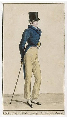
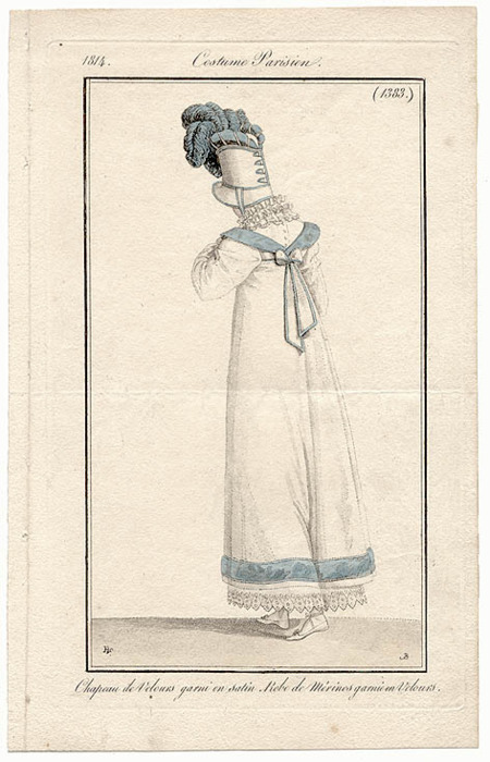
But the answer to my question above is actually not Japanese at all – it is Chinese nankeen, stencilled and dyed in an indigo bath. Originally, the word nankeen was used to indicate the very dense and unrefined hand-woven cotton fabric itself, but over time has come to be used interchangeably with its patterned and colored counterpart. Often referred to as blue calico, it was the main component of peasant clothing in China for centuries and in its plain form came to be an important export. A staple of British clothing from the late 18th century onwards, any Jane Austen fans among my readers will recognize it as a common fabric used for half boots worn for walking, as well as for mens breeches and pantaloons – the modern-day equivalent of chinos. Even its signature pale yellow color is often mentioned.

Nankeen_Trousersournal des Dames et des Modes, 1814

Ironically, while the upper classes in Europe were wearing nankeen, in China it was the fabric of the rice farmers, who used it for warm padded winter clothing. In Indigo Textiles: Technique and History, Gosta Sandberg writes “The jacket of the Chinese rice-farmer has been coloured with indigo since time immemorial. The reason for this is said to be that cloth dyed with indigo is many times stronger than undyed cloth and that it keeps insects and snakes at a distance, which is a considerable advantage for those working in open fields.” I don’t know if that is actually true, but it is consistent with work clothes in many cultures around the world, including our very own Levi’s.

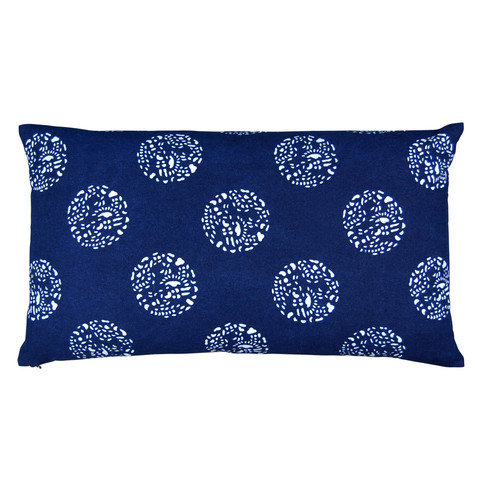
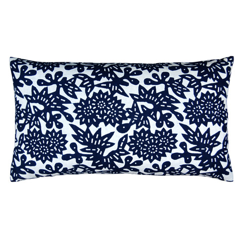
Enter into our story – and there is nothing I like better than a good old-fashioned expat tale - Claire Russo and Liza Serratore, the founders and designers of LuRu Home, a new-ish textile based home design company working with modern versions of nankeen, based out of Shanghai. Selling pillows, napkins, place mats, tea towels and bags, all made from the custom hand dyed fabric in their versions of traditional Chinese patterns, it is good to see others taking up the banner of preservation, while innovating at the same time.

slideshow_7

Liza and Claire had been friends since high school and kept in touch, planning to go abroad for work in response to the poor economy in the United States. After a few twists and turns, both ended up in Shanghai. One day they came across bits of old blue and white Chinese fabrics that they found in a tiny shop at end of long alley way – one of those magical moments that if we are lucky, we stumble across a version of, sometime in our own lives. The store was jam-packed with textiles, many sun bleached around the edges, and they came home with a few individual meters, recent but vintage.  Their original impetus was to make things for their own apartment, and then for gifts, and from there the demand began to grow. They found they had passion for the fabric and as they investigated the printing process, a desire to rejuvenate the industry and bring patronage back to the artist.

Fabric Hanging in Yard

The technique for making nankeen is a rice paste stencil resist technique almost identical to that of Japanese katazome. Just like the two countries currently arguing over the Senkaku Islands, they also argue over whose technique it was first. Frankly, I think it truly originates elsewhere in Asia, but I am not about to enter the scrum.

 Antique Chinese nankeen…

Antique table cloth patchAntique Nankeen

Does it look familiar? Antique Japanese katazome.

katazome

Both techniques use a paste glue to cover the open patterned area of a stencil, keeping it from absorbing the dye. In Japanese these stencils are called katagami – and I have written about them as decorative devices as well as a functional ones before. The Chinese nankeen artists do all their screen cutting by hand using simple craft paper that has been oiled. I can’t help but hear their Japanese counterparts whispering in my ear “They just use plain craft paper?” and the Chinese reply being “Why do they bother glueing all those layers of washi paper together with persimmon extract? Boy, that is a laborious waste of time!” While the Japanese use rice paste, the Chinese use soybean and lime paste mixed with water.

Paper Screen : Paste on Fabric

The base cotton is no longer hand loomed, but it is still very size limited based on the traditionally sized dying vats. It is also quite difficult to work with screens beyond a certain length so the largest screen possible is 32 inches and the rolls of fabric are 12 meters long. This automatically insures that all LuRu Home’s pieces are small batch made and variations are part and parcel of the product, depending upon the whims of the dyer and even the weather for drying.

Nankeen dye dipping

The fabric is finished by using frosting-style knives to scrape away the paste after printing and then the fabric is put through a wash cycle with no soap and dried.

Scraping the paste post-dye

Their patterns have been inspired by historical patterns in An Overall Collection of China Blue Calico Vein Patterns compiled by Wu Yuan Xi, although not everything in the book is a traditional pattern (zebra anyone?). While Claire and Liza want to starting designing their own prints, the nankeen artisans will have none of it until the women build up more guanxi (relationship currency).

Wu Yuanxin 11cropWu Yuanxin 8crop

They have been extrapolating and changing the old prints and ironically that has helped them build guanxi as it shows their respect and appreciation for the process. A perfect example is the Flower pattern, which was too small and tight as it appeared originally. They enlarged the size and added white space to up its graphic punch. So for now, they are going to continue playing with tradition and plan to introduce a new pattern every season, which is twice a year, by adding one and pulling one, keeping 6-7 prints available at all times.

Flower Prints

Their gorgeous website shows all their products and they also have a lovely lookbook with great styled shots. This outdoor view, also shown above previously, is my favorite.

Table Setting 2

I’m dying for a few of the adorable tea towels, pun untended! They make great gifts too.

DSC_9252

So now for the fun part! Liza ad Claire have generously offered one 13 x 22 lumbar pillow (insert included!) in one of their four most popular patterns On The Fence, Babyteeth, Dot Dot Dot and Flower - the giveaway winner’s choice. All you need to do to enter the giveaway is leave a comment below. If you like LuRu Home on Facebook, I will enter you in the giveaway a second time, doubling your chance to win. They can ship to the winner anywhere in the world as they have stock in both the USA and China. The giveaway closes Monday night at 12 EST. I am crushed, of course, that I can’t enter myself!

on the fence pillowbabyteeth pillow

dot dot dot pillowflower pillow

Their pillows look great styled with other indigo and blues, as seen here at Nicky Kehoe

luru at Nicky Kehoe

…as well as with an assortment of other colors, like here at Black & Spiro.

luru at Black & Spiro

Although record prices are being set for fine antique at auctions by wealthy Chinese looking to repatriate lost treasures, the locals LuRu works with are a bit bewildered by the women’s’ fascination with nankeen. Anything folk art based is undesirable these days in China. Louis Vuitton or (even Luois Vitton) is what is hot. But Claire and Liza have stiff competition from other buyers in procuring their fabric. From whom, you may ask? Can you guess?

The Japanese!

Image credits: All images credited to LuRu Home or the publications listed with the exception of #2 (me) and the 19th century fashion plates from Lady’s Repository Museum.

About these ads

Read Full Post »

For the last few days I have been here at our beach house in New Jersey pondering the age-old question “Do you throw good money after bad?” which really is a tough one to answer. Consider the following…a brand new master bathroom, with nothing “officially wrong with it” other than the fact that I hate it. For those of you unfamiliar with my house, it is a simple Victorian beach cottage, full of pale soft colors, vintage furniture and thick white original moldings. The previous owners carved out 2 bathrooms upstairs from what may have been only one. The hall bath is simple white subway tiles and small blue and white checkerboard floor, with white fixtures – just right for the period of the house and my taste. I have also renovated the downstairs bathroom in a similar fashion, with white hexagons and a vintage pedestal sink. The connundrum of this post is what to do about the master bath. For me, it has major problems of both form and function. The photo is from the sale listing almost two years ago now. While the bland colors and finishes are there, it is harder to see the silliness of the design, so I am going to try to draw a literal and a verbal picture for you. First, in terms of function, there is an unnecessarily small vanity with no counter space and about six inches of unused and therefore wasted space on either side. It has 3 ridiculous little drawers, each cut out in the center to accommodate the plumbing, so no real storage to speak of, even though it is a reasonable size cabinet. This photo is taken looking straight down into the drawer – you can see the space for the plumbing cut out – and the storage gets less and less as you move down.

Added to that is an oversized modern mirror/medicine cabinet that projects out from the wall, rather than being set in and recessed. It sticks out so far it actually makes a shadow over the sink and you bump your head into in when you lean over to spit out toothpaste.

Next take a look at the floor plan. You have to open the door inwards to enter the bathroom, then move all the way towards the shower in order to close it to get near the toilet. Now this bathroom was entirely new construction, so there were other options when building it, such as a pocket door. While I am no real fan of the pocket door, if ever a space called for one, than this is it. I hit my head on the door edge all the time, when turning from the sink to move towards the toilet, and not realizing the door is partially open. This architectural change is a must, whether or not I visually tweak the bathroom.

If you are not a floorplan lover, the photos below give a sense of the awkwardness.

And finally, the aesthetic part, which shouldn’t matter so much to me, but it does. The vanity is the worst kind of “faux French” and could not be less in sync with the style of the house. Stylistically, the modern mirror looks all wrong with the ornate vanity. The color in the room is all an unpalatable pinky peachy beige – the tiles, the walls, the ceiling – everything. Now, I love pink, and actually the master bedroom outside the door is painted Farrow & Ball’s Calamine, a wonderful dull grayed pink, as soft as it is pretty. But when it comes to bathrooms, I am a white tile and fixture kind of girl and I have just not been nor continue to be sure what to do with this mish mash. There is simply no way to pull it all out as it is new and clean. I just have to find a way to make some functional and cosmetic fixes. But the big question is when do “small” fixes cross the line in effort and expense? Would I be better off leaving it and living with it and going whole hog at some later date?

My actual fantasy bathroom is this well-known “English Bohemian” one from the beloved defunct Domino. But as the budget doesn’t call for a full gut and frankly, I can’t make the square footage materialize out of thin air, I’ll just sigh and file it away. (I will note that my bedroom has 2 beautiful threadbare Laver Kirman rugs, much like the one on the floor here.)

I had stewed on it endlessly, but still had no ideas on how to manage some kind of smaller improvement to the space. And then, voilà, just like that, I stumbled across this photo in my files of a bathroom decorated by the renowned Phoebe Howard and it gave me just what I needed. So here is the usual pitch I always give people – save inspiration photos whenever you find them. You just never know when you will need them. They give visual language to unformed ideas and can clarify and communicate thoughts that would otherwise be impossible to relate.

For me, there are a few key components here. The French mirror, pinky Indian inspired wallpaper, and jewelry faucet. I have to skip the mounted bowl sink as it is powder room friendly, not master bath friendly, and sweet husband has used his rare veto. Frankly, it doesn’t go with the house either. But I am not looking to slavishly copy this photo anyway, just to use it for exactly what I have named it for – inspiration.

First, the French mirror.

This turned put to be an easy fix thanks to a gift from a friend. Her mom runs a small antique shop in the old icehouse attached to The Gatehouse Country Inn in Shawnee on Delaware, PA. The mirror is in great condition – the circle in the center is just from the flash. In this photo you can really see clearly how silly the vanity is and how much space is wasted. (And I know some of you are thinking it is pretty, but trust me, in person, it truly is not!). One of the immediate practical improvements is the mirror sits directly against the wall and does not get in your way or cast a shadow. And if nothing else, it goes stylistically with the vanity below, unlike the former modern mirror. What is humorous though, is how the French mirror feels right – it feels eclectic – while the faux French vanity still feels wrong.

Next Wallpaper.

I keep thinking I can ignore the floor and shower tiles and think of them as a neutral background, which would work, except for the fact that they come around and line the area behind the sink, rising high to about 4 feet. In trying to simply ignore the tile work, I need a wallpaper with a white background, and some soft pink. Since the whole house has a bit of “Out of India” meets “The Orient Express” what better than spying Les Indiennes‘ new Madame de Montreuil wallpaper in a Vogue feature in February of 2010, soon after we had bought the house. I carried the photo around all winter and ran right into John Derian‘s as soon as I got home to see it in person. Loved it!

Here you can it featured in a room on remodelista. I just adore the feel of this and think it might actually look OK with that tile.

But alas, my sweet husband was a spoil sport. Our first priority upon taking possession of our house last summer just could not be wallpapering a perfectly good bathroom. There were serious things to fix first, including changing the bathroom door to a pocket one, which does actually involve tearing out the sheet rock and would need to be done before the wallpapering. His further point centered on the practicality of very expensive wallpaper in a bathroom with no window or ventilation.

I was not discouraged though! My new budget plan was to make my own woodblock print “wallpaper” by stamping directly onto the walls. I had long admired the hand printed canopy the talented Lauren Liess of Pure Style Home had made for her son’s nursery. I believe it was actually a stencil, but somewhat the same idea.

And everyone had been talking about stencils including the second issue of newish online shelter magazine House of Fifty. Courtney over at Style Court had actually block printed a pillow by herself, and it came out beautifully.

So while in Singapore on my “evacuation vacation” last spring I made sure to buy a few pretty floral woodblocks, a bit like those in the Les Indiennes’ wallpaper. I had huge dreams of the best DIY project and post for the summer of 2011 but life got in the way. And as we still hadn’t put in the pocket door…

I also came across this extremely pretty Nichola wallpaper by Mally Skok, which feels both 18th century and modern at the same time and is less expensive than the Les Indiennes paper. I adore Skok’s entire line of fabrics and wallpapers and promise a full post in the new year!

Definitely Change the Vanity

From both the form and function point of view, the vanity has to be changed. If I wanted to stay with dark wood, something like this simple Schuyler Samperton elegance would be ideal. (Note another favorite of mine – the butler’s trolley.) But in this photo, the lovely wallpaper extends behind and around the vanity. In my bathroom, the tile work extends up the wall behind and to the side, so ideally I would like to remove it. When I checked with the contractor, assuming it would be easy, he pointed out that it created a chain of events, all the way to having to take out the shower doors, cut new tiles and locate some extra bullnose tiles. That seems to be getting awfully close to actually re-doing the bathroom, which is what I was trying to avoid in the first place.

So what about an antique piece like this? The softly colored marble might neutralize the ugly tile work on the wall, although it doesn’t provide the practical storage I need.

But if I don’t take down the tiles, is a dark wood cabinet the answer? Is it different enough from what is there already to make the effort? Might a smarter choice be a neutral painted cabinet that blended into the tile? Well, if I had the answer to that one, then I’d be showing you a photo here. From an aesthetic point of view, I could finally pull out the Annie Sloan Chalk Paint I have been recommending to everyone and use it to paint the vanity, but that wouldn’t change the fact that I can’t store anything taller than 4 inches in those drawers.

The fun and the ease of decorating the room lies in the details. Additional design ideas include using my bits of pink lusterware and pink depression glass that I have managed to acquire over the years. These lustreware displays are from my files, I assume from Martha Stewart Living, but I can’t find the credit.

Luckily for me, there is no tile on the far side of the bathroom behind or around the toilet!

Here’s a little mock-up of the area over the toilet with the Nichola wallpaper sample and some pink lusterware cups on a vintage display shelf alongside my favorite Jo Malone Red Roses summer mixers.

So I am at a loss. To sum up, I need to change the door to a pocket door – that has to be done no matter what – and needs to be done before any other work. I need to change the wall treatment, whether with wallpaper or a DIY block print project. I can add cute accessories. But do I change the vanity? Do I tear out the tile? Do I gut the whole thing and start over? I wrote this post, more for myself than you dear readers, in the hope that it would clarify these issues, but I am still unsure. I would absolutely relish comments!!!

On another note. I am loving Mally Skok’s Nichola so much that I am considering fabric in another colorway for the renovated downstairs bathroom. The aqua/sand color has such a different feel, almost coral-like, a bit like the Min Hogg fabrics and papers I had considered for there too.

Don’t you think it would be perfect for a soft roman blind in here?

And while the shelves are not fully built yet, I couldn’t resist styling a few accessories for a sneak peek in there.

This is truly a plea for help! I hope someone out there has the bit of inspiration I need!

Related Post:
Renovation Report…”Oldating” the Beach House Bathroom

Read Full Post »

Thanks to K, I can report that others out there besides myself and my readers are katagami (rice paste stencils) crazy. None other than Crate & Barrel is working with artist Robin Bradford to produce a series of five new stylized framed katagami.

Interesting, but not the same at all. Don’t you agree?

For more on this topic, see my previous post Katagami…Perfect Thank You Present Found. And feel free to contact me if you want assistance in purchasing some antique originals…

Read Full Post »

Follow

Get every new post delivered to your Inbox.

Join 406 other followers

%d bloggers like this: