Feeds:
Posts
Comments

Posts Tagged ‘quilts’

So I’ve been making lots of teasing comments about koi and kasuri lately, with a very good reason. This year, our annual quilt for The American School in Japan Gala fundraiser is a deep indigo pool made of kasuri, with three charming carp frolicking in the rain. Koi are the beloved ornamental varieties of common carp that are kept as pets in ponds and the word koi is itself a homophone for another Japanese word that means “affection” or “love”; koi are therefore symbols of love and friendship in Japan. The name of the quilt, Carpe “Triem”, reminds us to seize the day (or seize the quilt!) and is a play on our trio of friends. Inspiration came in many forms, from modern woodblock prints, like this one, ‘Pillow Talk” by Daniel Kelly

2011 Daniel Kelly prints Pillow Talk

…to ‘Whisper whisper 7′ amongst others from Kaneko Kunio.

Kaneko Kunio Whisper

Koinobori, meaning ‘carp streamer’ in Japanese, are carp-shaped wind socks traditionally flown to celebrate Boy’s Day (now called Children’s Day), which falls on May 5th every year. The carp has become the symbol of Boys’ Day because the Japanese consider it the most spirited of fish—so full of energy and power that it can fight its way up swift-running streams and cascades. Because of its strength and determination to overcome all obstacles, it stands for courage and the ability to attain high goals.

koinobori

We also had high goals for ourselves as quilters, wanting to create a very individual and special quilt while at the same time longing to do another boro (rag) background quilt, featuring vintage indigo textiles, a bit reminiscent of the beloved Dragon quilt of 2007. I was lucky enough to come across a few great pieces of kasuri, the Japanese form of ikat, in which the thread is dyed prior to weaving. Kendra had some other gorgeous pieces in her stash and we were easily able to assemble the patchwork background from a myriad of pieces and patterns.

kasuri quilt background

Using some photos of real koi, Julie drew our koi on graph paper free hand – she is so amazing!

IMG_0597

I figured once we were using such gorgeous fabric for the background, there was no chance modern fabric could hold up its head against it. So back out to the shrine sales I went, in search of antique and vintage shibori (Japanese tie-dye), brocades and other silks. While the fabric would be gorgeous I knew the quilters would be hating me a bit as silks are so hard to work with.

orange shiboriorange shibori

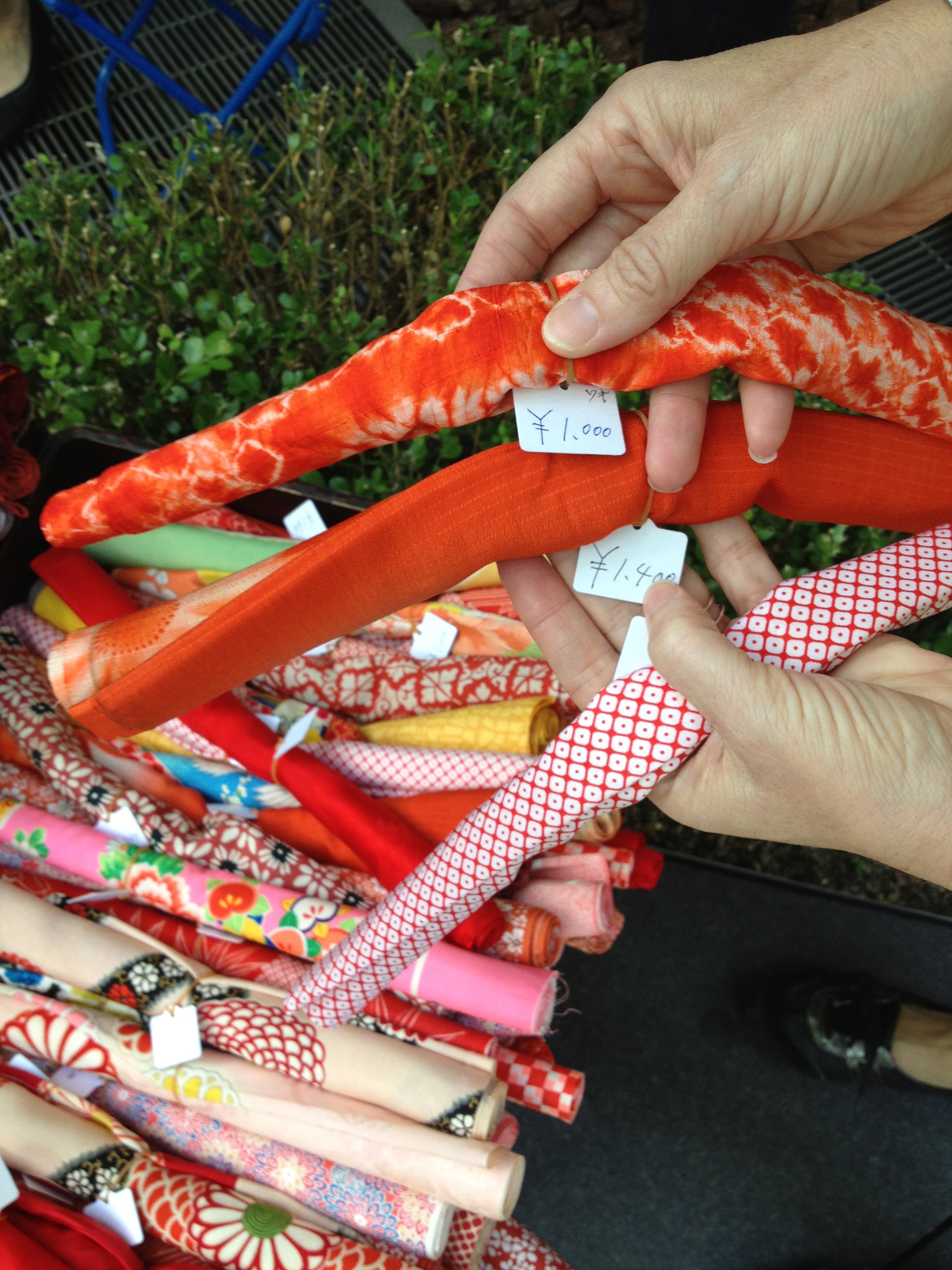
The patterns in the shibori was perfect in giving almost a literal effect of scales. And the bold colors – oranges, yellows and golds – against the deep indigo was spectacular. Just trying it out by draping a fish shape had us all excited.

IMG_0535

As we started late this year and the Gala was a week earlier than normal and we planned for the koi to exuberantly overlap the borders, we had to work a bit out-of-order this year and put the borders on early.

IMG_0600

Julie’s husband enlisted the local copy shop to blow up the hand sketched koi, one graph paper square to one inch and we were able to use them as patterns.

IMG_0935

The day we spent cutting the fabrics to create the fish was my favorite quilt day in all nine years I have been working on the ASIJ quilts.

yellow koi

With each fabric we tried to bring out its innate nature…

orange koi fabrics

…and have the details suggest the very details found on the fish.

orange koi

We used iron-on stabilizer to give the pieces some weight and make them opaque.

black white orange koi

We basted the quilt top to a simply patterned dark blue background and placed the fish into their new home in the pond.

basted quilt

As we loved the echo quilting we did last year, we decided to do it again – this time as raindrops on the pond. Here you can see the circles marked out at one inch intervals. If you look closely you can also see the detailed quilting in the fish fins.

echo quilting marking

I just love this detail shot with the shibori circles reading as fish scales and the rain drops quilted into the kasuri.

orange carp 001

The crowning touch was finding a perfect silky orange binding – I don’t know how we got so lucky! Not a perfect frontal photo, but the slight angle brings out the details of the echo quilted raindrops.

2013 ASIJ quilt

This quilt, with its evocative design and meticulous craftsmanship, masterfully captures and conveys our long-lasting affection for Japan.
More in-progress details can be found over at My Quilt Diary and A Quilter By Night.

Related Posts:
Coming Full Circle…A History of the ASIJ Gala Quilt
The ASIJ Quilt…Summer Breezes: Furin in the Rock Garden

About these ads

Read Full Post »

Indigo abounds here in Tokyo, and while I love it, not everything can be blue. Finding porcelain, like the pieces in yesterday’s post, or textiles, like the one in this post, in other colors tends to be more unusual. So lucky me found this amazing pieced and sashiko-stitched blanket recently, in the most unusual colors of pink and grey. The blanket is a four block grid, over stitched in white thread. I brought it home and changed out our duvet for summer. Ironically, for all that it is Japanese, it looks so much like an American quilt, even an Amish one. And perhaps even funnier, I have it on a very French bed.

It’s perfect simplicity really is reminiscent of late 19th and early 20th century Amish quilts, like this one from an old Christie’s auction.

Kinda apropos with this pillow, isn’t it? Not just color, but the mix of American quilt block and Japanese obi, all on a French settee.

And the room already had another mash-up, with a late Federal American birds-eye maple and cherry dresser, paired with sconces and a pastel portrait from the Paris flea market.

Nothing like a little multiculturalism, is there?

Related Posts:
A Not Quite DIY…An Obi and Quilt Block Pillow Tale
Quick and Easy DIY…Trimming a Lamp Shade with Ribbon
Artist Spotlight…Kazuko Yoshiura and Sashiko Fever


Read Full Post »

Every year for the past 7 years I have been part of a core team of women who get together to design and hand sew a special quilt for the American School in Japan’s Gala auction. The quilts have been worked on by scores of women (and a few men) over the years and they are always a big hit, both in terms of community spirit and fundraising. This post is an attempt to chronicle the process and history of the quilts as well as celebrate their making.

This year’s quilt fits a queen size bed generously. It is composed of yukata pattern blocks, yukata being cotton summer kimono, the traditional Japanese robe.  The alternate navy blue blocks are hand quilted, each with a different kamon (family crest), a device we have used in many of our quilts. Made from the casual blue and white yukata fabric that gives it its name, highlighted with red obi (sashes) and bordered by a blue and white checkerboard, the quilt is a graphic triumph, feeling cool and polished. More details on its making will be found below, after a chronological history of the quilts that came before.

The title of the post, “Coming Full Circle,” refers to the fact that this quilt is an updated version of the very first ASIJ auction quilt. In 2004, before I arrived in Japan, this handmade quilt was made by a group of current students’ moms, including Kendra Morgenstern and master quilter Julie Fukuda, whose kids had graduated from ASIJ many years before. Very few photos exist for this twin size block quilt, also made of yukata patches with alternating quilted kamon patches. This was the first of a series of “American” style quilts, made with “Japanese” fabrics. As this pattern is one of the most charming and nostalgic, we have always wanted to revisit it.

In 2005 I joined the team and we once again made a block quilt, composed of a Japanese motif, the fan. Fans have not traditionally figured in American cotton quilts, but they were popular in Victorian crazy quilts. In our quilt, each fan was composed of a bright Japanese patterned cotton, paired with a complimentary solid in this twin/double size quilt.

Each piece of the fan was “stitched in the ditch,” meaning it was quilted right at the seam’s edge. Sashiko style quilted white lines completed the fans exoskeletons.  The solid navy background was quilted with dark thread in a karakusa (arabesque vine) pattern for a subtle effect.

The border was ingeniously quilted in a scrolling fan pattern, as a compliment to the fans in the center. This was the beginning of our thematic border choices and we always tried to relate the border to the quilt as a whole in all future quilts. I think it is one of the features that makes them so visually satisfying.

In 2006 we decided to make a queen size quilt and enlarged the size of the blocks. The design had some features we had used before, such as blue and white yukata fabrics…

But this quilt added a new skill to the repertoire – applique. Japanese motifs, cut from variety of yukata fabrics were appliqued onto white circles which had in turn been appliqued on navy squares. Alternating blue diamonds were set into a tightly patterned karakusa background and quilted kamon in their centers were planned.

This quilt never started out in the design phase as being an homage to karakusa, but perhaps the background of the fan quilt had subconsciously influenced us. Karakusa is the most quintessential of all Japanese patterns, appearing on everything, but particularly on blue and white china.

Choosing the large-scale white karakusa fabric for the outer border and yet another mid size karakusa for the border edging truly brought this quilt together.

This close detail photo shows all three patterns and the quilted kamon.

By 2007 we had a hankering to do something different…very different. We had traditionally made typical American-style block quilts, using typical Japanese fabrics. This time we wanted to make a quintessentially Japanese quilt, using antique and vintage fabrics, in an irregular pattern. Vintage Japanese boro textiles such as this futon cover and kotatsugake, provided some of the initial inspiration. A quilt comprised of seemingly random patchwork, highlighting the beauty of the fabric, was our starting point.

This was an early view of the process, which was spontaneous and quite organic.  We gathered everything from vintage kasuri (Japanese style ikat) to modern quilting fabrics. While we were using the color blue again, we were not using pure whites, instead, creamy lights helped add to the vintage feel. When this was shown to the PTA and school director in its early phases, there was a bit of nervousness, but they decided to have faith.

As a nod to the American tradition, we included a few square in a square blocks and strips of flying geese.

Square in a Square Example

Flying Geese Example


The logo for the Gala materials was a dragon and we decided to add to the quilt by overlaying and appliqueing a dragon on the abstract background pattern. In Asian art, mythical dragons traditionally chase a night shining pearl, which we also added. Ironically, dragons are actually a Chinese motif, not a Japanese one.

The final result was another generous queen size quilt and it was a huge success. We appliqued the kanji for dragon in the lower left corner and used a dragon patterned fabric in two colorways for the border.

Our dragon was the classic long scaly shape, with the horns of a deer and the eyes of a demon – at least we tried to make him look unfriendly. He was further spiffed up with golden trapunto stitching.

In 2008 there were a number of changes to the Gala auction, one being that the date was moved forward on the calendar significantly, cutting into our working time. Once again, we were interested in a change and decided a smaller wall hanging quilt would be fun and easier. Our inspiration was immediate as the theme for the gala was sakura (cherry blossoms) and we decided to create a traditional byobu, better known in English as a screen.

The design included the all the traditional structures of a screen. It would be made of individual panels, linked and bordered by a brocade and “lacquer” frame (to be made with a dark brown fabric). As it would never be used for sleeping, the wall hanging freed us to use materials that could not be washed, such as antique silks and brocades. For the background we used traditional indigo fabrics laid out in a more regular pattern, but still boro inspired. Branches, petals and the moon would be appliqued and details would be embroidered.

Lighter blues were used under and around the moon, to represent the cast of the moonlight. A softly patterned pinky brocade was used for the moon as it seemed to emit its own light. This luminescence gave a feeling of depth to the quilt. The sakura petals, cut from various fabrics, including antique kimono silks, were hand-appliqued petal by petal onto the quilt — 439 petals in all, and then hand-embroidered. The petal work alone was hundreds of hours of work – so much for an easier quilt.

These photos show the details of the appliqued branches and petals with French knots as the stamens.

The 2009 quilt was another instantaneous choice.  The theme for the year at ASIJ and for the gala was “Going Green” and green we went! This original sketch was dreamed up at the PTA Welcome Coffee at the very beginning of the year! While it looks a bit scribbly, all the major components of the “Four Seasons” quilt are there.

Like the dragon quilt, this one would rely on an irregular patchwork background. Running clockwise around the quilt would be flowers and plants that represented the four seasons.  Instead of traditional flying geese, we dreamed up flying ginkgo leaves. This later sketch shows more of the planned details and decisions.

Using large craft paper we laid out the full size design.

Again, fabric selection was quite spontaneous.

One problem that needed to be solved was how to make a quilt with so much difficult applique work, but still have enough tasks for new members of the group whose sewing skills were more limited. Our solution was to create a border made of strips, inspired by the border on this crazy quilt. This created a lot of cutting and straight sewing for the newer members of the group to work on. We set up a kind of “border bar” where people could choose from a variety of fabrics and start to sew “random” combinations together.

More difficult work included tons of pattern making and many detailed fabric choices for the flowers that then needed to be painstakingly appliqued.

Here you can see the pieces slowly coming together. You will find the auspicious trio of pine, bamboo and plum (sho-chiku-bai), as well as iris, camellia, chrysanthemum, and wisteria.

The fully finished quilt top prior to the borders being added. The changing seasons are emphasized by the colors of the “flying” ginkgo leaves (the symbol of Tokyo) that travel up, around and down the quilt.

Here you can see the quilt basted and ready to be quilted. Basting day is always fun, as many people too afraid to stitch on the quilt for real turn up because they know the basting stitches don’t count and will all be removed.

The final quilt! I am using this angled photo instead of a frontal one as it shows the incredible detailed quilting. We had placed that large plain dark rectangle of green next to the pine in the lower right, hoping to put something scenic like the teahouse in.

Other gorgeous detail included additional blossoms and branches shadow quilted in, and some special friends like these two darling sparrows. Sitting on the plum branch is a Japanese white-eye (mejiro), a small green friendly bird we often see in Tokyo.  Quilted into the background you will find many surprises such as a pair of mandarin ducks hiding in the waters near the iris. Julie really outdid herself on the quilting.

In our never-ending quest for change, in 2010 we turned back to the idea of an American style patchwork quilt, but this time an optical illusion all-over pattern, often referred to as a kaleidoscope pattern. The theme of the gala was Saturday Night Fever and we saw it as a quilt that danced before your eyes. Made with one hundred octagons of different blue and white fabrics, both antique and new, some of which were used in previous blue and white quilts, and many which were shared from our quilters’ personal collections, all part of the quilting tradition of trading and sharing fabrics.  You will find dragonflies, fans, umbrellas, dragons, butterflies, kamon, and a myriad of other designs. It was inspired by a smaller earlier quilt that Julie had made.

What is so unusual about this pattern is that it looks as if there are circles in the quilt, when actually every piece is straight! The blocks are just octagons, made of alternating dark and light triangles. They are matched to an opposite octagon (light meets dark, and dark meets light) and then linked by a small square (held on an angle like a diamond) made of a medium blue fabric.

In this photo we are getting ready to baste the quilt top to the batting and the backing.

We don’t often photograph the back of the quilt, which is usually a single simple fabric, but in this case we did and it allows us to see the beautiful quality of the hand sewing.  This represents the stitches of multiple volunteers.

This quilt was featured on the blog Quilt Inspiration. They wrote, ”it is one of the most beautiful blue quilts – and kaleidoscope quilts – we’ve seen!” They also specifically complimented the border, a wild yukata fabric pattern of circles, chosen to highlight the circular theme. All the white lines of the circles in the border were individually quilted, and every other single piece was quilted in the ditch.

After six years we decided we wanted to give the yukata quilt another go. People had been clamouring for us to do it again and I had never personally had a chance to work on one. We had many new committee members and everyone was excited by the possibility of improving on a classic.

Each blue and white yukata fabric was paired with a contrasting red fabric for its obi. We used templates to cut all 30 yukata, each one being made up of 7 pieces. An additional 6 pieces of white fabric were cut to complete each block. Everything had to be sewn together in the proper order.

Here we have a little more than two-thirds of the yukata blocks finished. We laid them out to be sure we were getting a good balance of combinations – light and dark, linear and pictorial, etc.

To balance all the right angles we chose very rounded kamon and avoided any that felt sharp-edged. Using a kamon dictionary, we blew the individual kamon up on a photocopier and then traced them onto the navy squares.

Once again, our border found our quilt immediately.  We stopped into Blue & White for a look at the yukata fabric and for a chat with Amy Katoh,  its lovely proprietor, and the checkerboard was the perfect graphic counterpart to the square block diamonds. A red inner border, created from a soft homespun looking cloth, was also an obvious choice to pull the red from the obi. If you look very closely at this photo you can see the traced, but not yet quilted kamon.

The final binding went though a few incarnations. First we tried a very narrow dark red binding tape, but it was too shiny and red did not give the closure needed. We thought about adding another yukata fabric to the outside edge, but it competed with the simple graphics of the quilt.  In the end we chose a straightforward navy border and made sure to line up the checkerboard perfectly.

Bamboo leaves are quilted in the outer triangles and ginkgo leaves in the quilt corners. I can’t resist sharing another photo that highlights these amazing quilted kamons…

…and one more close-up.

I think bidding will be active next Saturday night and I am looking forward to it!

A heartfelt thank you goes out to everyone who has ever participated or supported us in any way. These quilts have been labors of love and friendship.

A special thank you goes to Kendra and Julie for their help in preparing this post and for everything else too!

Photo credits are way too hard to sort out, so I am not even going to try. The two boro textiles are from Sri Threads and the Japanese screen photo is from Okura Oriental Art.

Read Full Post »

What do Victorian crazy quilts sewn in America and antique Japanese porcelain have in common? Well, like the face that launched 1000 ships, Japanese art and wares displayed in the 1876 Centennial Exposition in Philadelphia launched an almost instantaneous and frenzied fad among American quilters.

While trading with the East had gone on for centuries, most of that trade centered on China.  Only the Dutch and the Portuguese had access to Japan and even that was quite limited to a small port at Nagasaki. In 1854, that all changed with the arrival of Commodore Perry and the opening of Japan to the West.  While this event radically transformed every aspect of Japanese society, the result in the US was a jumpstart to the American imagination. The effect was truly profound and hard to imagine for us here in 2010 as we are bombarded with new ideas instantly and constantly. The Japanese aesthetic, with its hand work, asymmetry and natural motifs had simply never been seen before by the average person. The quality of the Japanese items at the Centennial also contrasted so strongly with the new shoddy industrial made products of the US and other Western countries.

The fascination with these exotic new ideas translated into the decorative arts almost overnight and there is no better example than the craze over crazy quilts. It is believed that the term “crazy” quilt comes from the “crazing” of the porcelain glaze. The word “crazy” at that time would have also meant broken and irregular. The pattern design comes from a well-known Japanese pattern called “cracked ice”. Quilting designs had always been based on uniform and regularly shaped pieces of fabric, sewn into repeating patterns and then quilted in a uniform pattern as well. For the first time asymmetric and irregular patches of fabric were being cut and sewn and decorated along their seams.

Examples of cracked ice patterns abound in Japanese porcelain.  Sometimes the pattern stands on its own, as in the covered bowl above, with shadings of color and decorative patterns highlighting each block. Make sure to take note of the little pattern painted inside the rim of the lid and compare it to the feather stitch used extensively on the quilt below.

This plate is even simpler, with just the lines of the cracking ice painted in.

Often it is overlayed with ume (plum blossom) or even sakura (cherry blossom) to symbolize the coming of spring and the breaking of the ice.

This 1880s crazy quilt from New York State is a near perfect example of the American craft. Made of 20 square blocks, with a sawtooth border, it has all the typical aspects one would expect to find.

Unlike earlier (and later) quilts, crazy quilts were not made with a sense of thrift or recycling, even though it may seem so as they utilize bits and pieces of valuable fabrics such as silks and velvets.   Nor were they made for warmth as they do not typically have a batting layer in between the top and the back. Crazy quilts were originally made by well-to-do women in the middle and upper classes to demonstrate their needlework skills and show that they had the leisure time to make completely ornamental pieces.  The use of the word quilt is a misnomer -  crazy quilts were not used as quilts at all – nobody slept with them. They were made to be displayed.

While irregularly shaped patches of silk, velvet, brocade, satin – anything ornamental or textured – were cut to make the quilt, it was usually too difficult to make the entire quilt completely “crazy” and the pieces were organized into square blocks, a necessary compromise.

The fabric was pieced together and decorated along the seams with embroidery stitches of all kinds, including feather stitch, chain stitch, lazy daisy, herringbone, chevron, blanket stitch and others.  Detailed pictures and scenes, monograms and messages were added too.

In addition, there was a fascination with Japanese motifs. In crazy quilting this was particularly noticeable with fans and many quilts have fans in all four corners, like this one.

Unfortunately, manufacturers of the day rinsed the fabrics in metals to make them heavier and this has caused them to deteriorate extensively. In the fan below, the peach silk has rotted away, leaving only the cotton backing and the embroidery.

Crazy quilting mania trickled down the social ladder as womens’ magazines of the day ran articles and how-tos. Fancy scraps were recycled, but as the craze progressed, it was possible to buy kits with a variety of fabrics – some of which were even embroidered in advance. Cigarettes and other products were sold with bits of leftover silk as a perk of purchase. Ornamental trims like lace and beads were added. Below, you can see a Masonic Lodge ribbon from 1871 that was saved and used and if you scroll back to the full-sized photo you can see a political ribbon for Vice President used in the second block on the top.

While the 1870s and 1880s were the heyday of American fascination with the exotic, the craze for crazy quilts died down by 1910.  By then, cracked ice patterns and many other Japanese motifs had fueled the Aesthetic Movement and helped to launch Art Nouveau and later Modernism.

Out of prevailing fashion, crazy quilts were usually folded up and put away, only to reappear 100 years later. The success of the 1971 Whitney Museum of American Art exhibit,  Abstract Design in American Quilts, elevated quilts to the status of “real art” and launched a wave of quilt mania that built up until the 1976 Bicentennial.  Since then, quilts have been collected, displayed and valued, and occasionally, as seen below, used in iteresting ways.  For a modern take on an old art form, designer Steven Gambrel used pieces of a 19th century crazy quilt to upholster a chair.

A Few Hours Later…

Rather than pack for camping, I was procrastinating and reading a few blogs. One of the things I need to do is make a list of blog resources — there are some great sites about Japanese textiles/art/history etc. out there. But my favorite blogs are the decorating and design ones – they have so much eye candy for a magazine starved person like myself.  This photo from Abbey Goes Design Scouting cracked me up and I had to post it. She calls it an “unapologetic interior”! Talk about crazy quilt-a-mania…


Image Credits: 1. Philly History Blog, 2-13. me, 14. House and Garden, April 2002 15. Vogue Guide to Patchwork and Quilting Vintage

Read Full Post »

Follow

Get every new post delivered to your Inbox.

Join 406 other followers

%d bloggers like this: