What does a girl do with unmade decisions hanging over her head? Sulk? Panic? Nope! Fantasy decorate is the answer!

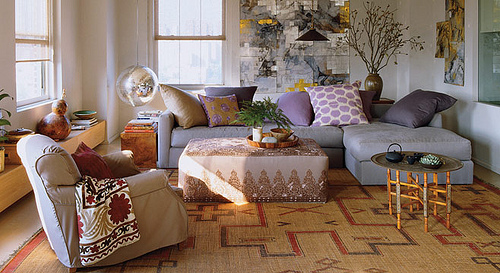
Ever since this time last year, I have been obsessed with designer May Daouk’s Beirut home, which was featured in Architectural Digest, stunningly photographed by Simon Watson. The luminescent lavender living room, chock-a-block with blue and white porcelain, comfy seating and that divine 19th century Oushak spoke eloquently to me. And those arched windows – those windows! – maybe I really need to go back and start with them. The fact that her home was in the Middle East didn’t particularly register with me at the time and only came to seem like an important point much later. While I am only showing the living room in this post, the entire space is fantastic so click here to see the slide show over at AD. And please be sure to click on the photos themselves in this post to see the enlarged versions which truly show the spectacular details.

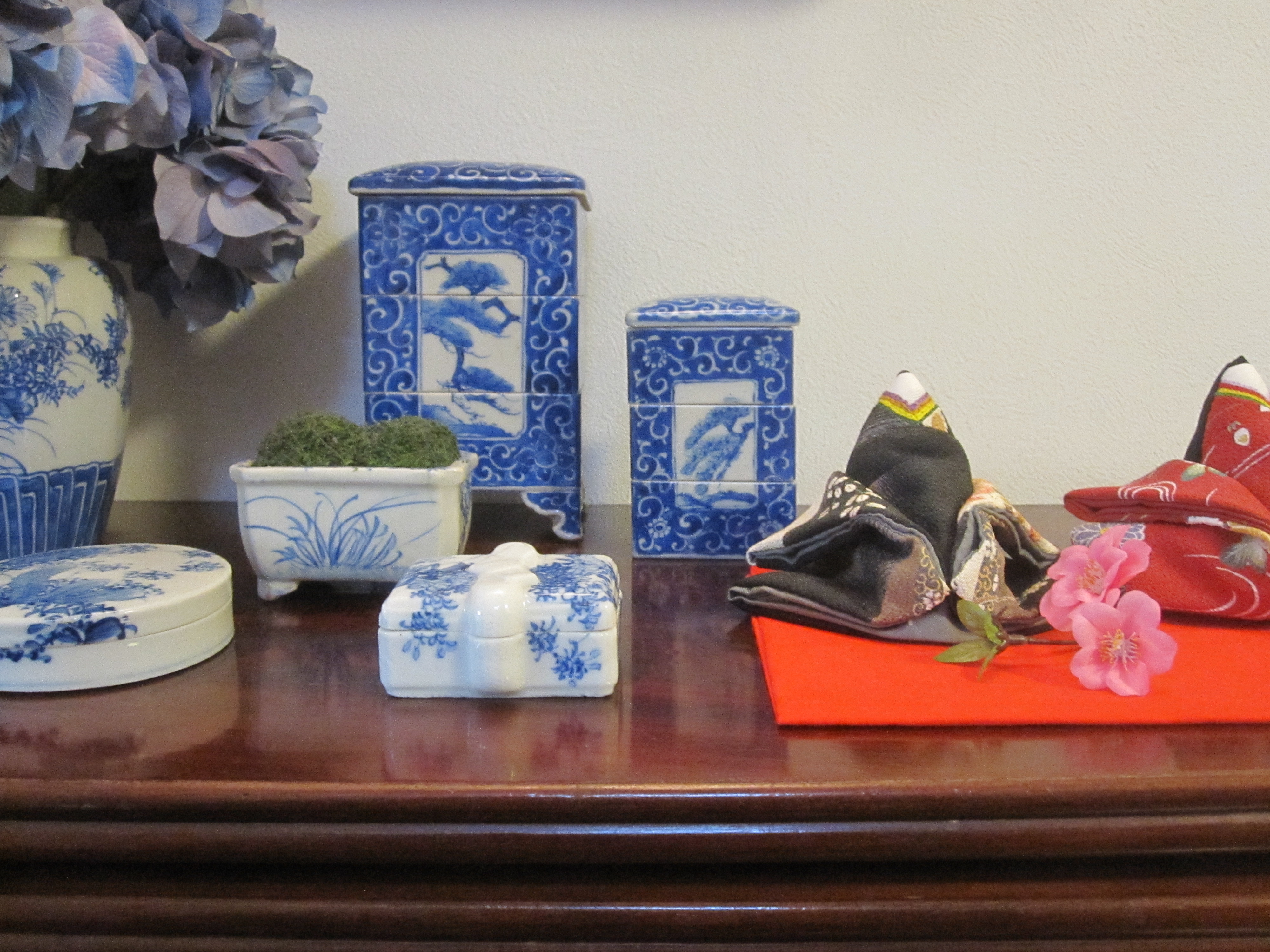
I might not have imagined trying to apply the wonder of this space to my life before, even though it is my favorite color and holds so many favorite things. But it got me thinking…Many houses that I looked at in Doha had arched windows and large rectangular living spaces – granted not quite like this – but lovely nonetheless. So what in this photo don’t I already have? Neutral linen covered sofa? Check! A pair of velvet armchairs? Check? A big dark trestle table like the ones along the side of the room? Check! (That one is down in the garage for those of you wondering). Antique global textiles turned into pillows or throws? Check! Gobs and gobs of blue and white porcelain? Check! 19th century carpets? Check! (Although much smaller ones that could be laid over jute or seagrass perhaps). Could I be happy in Doha if I lived in a room like this? Somehow I think the answer to that is Yes!

I’ve even got a pair of antique slipper chairs with a bullion fringe and their original coral pink velvet fabric – definitely in the same spirit as these. And you all know I’ve got a gorgeous blue & white garden stool – just got to get it there. Should I be sure to put an IKEA Rand black and white striped dhurrie in my shipment? No, because IKEA opened in Doha just a month or so ago. Check!

Before you start scratching your head and thinking I am off my rocker, let me show you a few more inspiration examples, like this Alberto Pinto Moroccan fantasy from the late Domino magazine. Remember those pink chairs I just mentioned? And how divine is all that inlaid furniture? (More on that below). But the pièce de résistance has to be that armless settee upholstered a la suzani!

Instead of blue & white, painted and glazed earthenware is featured. That would be a chance to start a whole new collection!

Perhaps a new collection isn’t the answer – after all I do love my porcelain. Maybe going a bit more formal – soft with a bit of whimsy actually – with the lavender and blue in the space would be lovely, just like at Aerin’s place?

Tufted Chesterfield? Check! Queen Anne tea table? Check! (That one is in the garage too!)

Katie Ridder gets the formal but whimsical combo down just right too.

Another choice would be to use the fresh slate to steer off in a more modern direction. This is not my usual style but speaks to me nonetheless. The mix is outstanding! Orangey-toned tribal carpet? Check! Moroccan side table? Check!
It seems as if the flea market gods are having their say as well. Speaking of Moroccan side tables, I found this one at the market last week and had to buy it. Trying to decide if it should go to the beach or if I should take it with me.

Kinda seems like carrying coals to Newcastle, no?
And breaking news…In the time it took me to write this post I got a fresh email in my inbox with my elder daughter’s acceptance into school in Doha. Looks like the pendulum may be swinging that way. Hello lavender!
Related Posts:
Major Life Changes Ahead…Shall We Let the Architecture Decide?
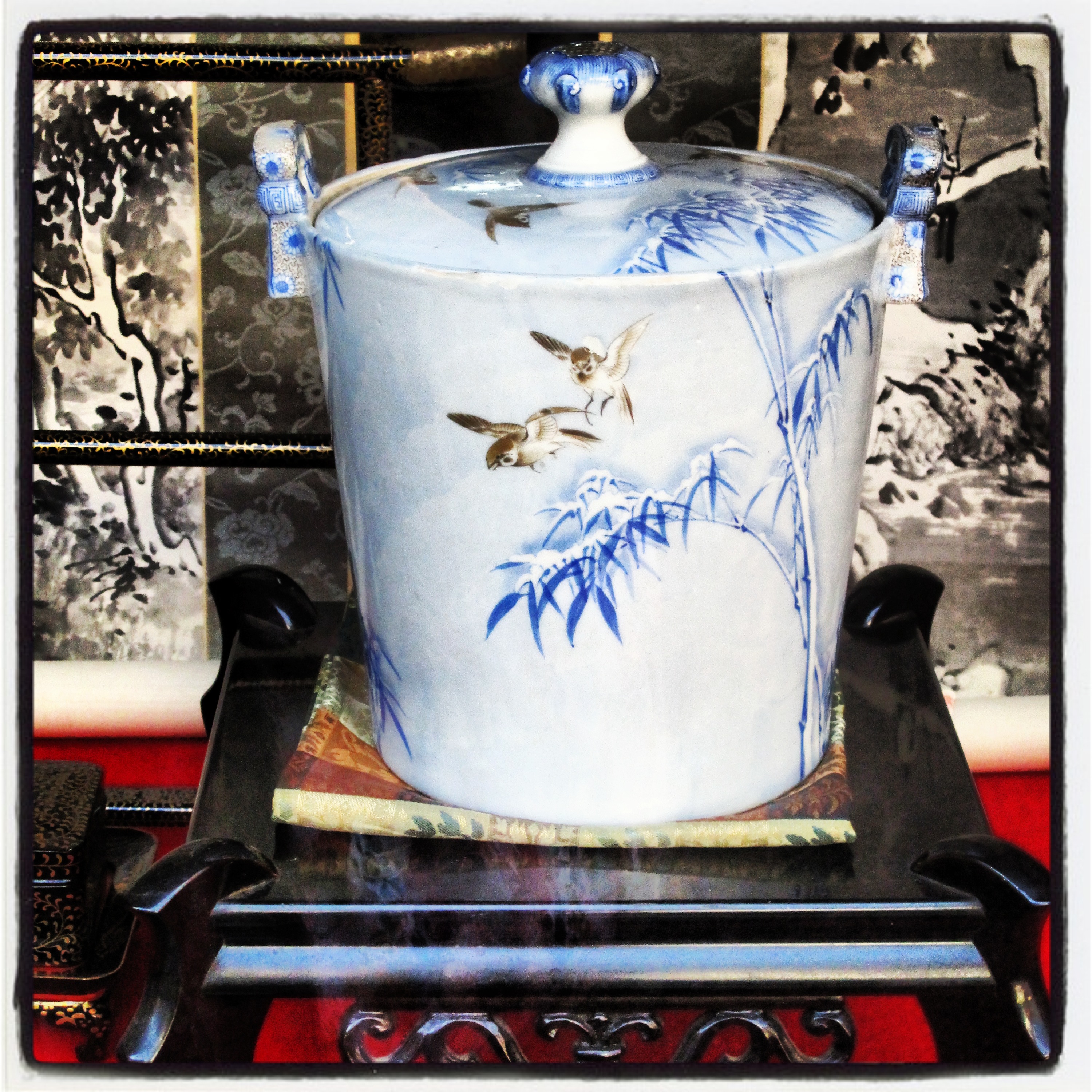
Colors of the Rainbow…Blue and White Porcelain is Neutral
Lavender Love…John Saladino and Me
Image credits: 1, 3-4. Architectural Digest May 2012, photo credit: Simon Watson, 2. via Simon Watson, 5-6. Domino magazine, further credit unknown, 7. Aerin Lauder in Elle Decor July 2009, photo credit: Simon Upton, 8. Aerin Lauder in Vogue, via Habitually Chic, 9. Katie Ridder via Galbraith & Paul, 10. via Coco & Kelley, 11. me.