I’ve been down and out with a bit of a stomach bug the last few days but luckily I’ve had Frederick Harris’s book Ukiyo-e: The Art of the Japanese Print which has been eminently digestible. Harris was a fifty year plus veteran of life in Japan, having come there after serving in the Korean War and staying on to pursue his artistic ambitions. I was lucky enough to know him through the Tokyo American Club before he passed away in 2010.
Ukiyo-e, traditional Japanese prints, have existed since before the 17th century but truly flowered during the Edo period (1603-1868). They were mass-produced and created for mass-consumption by the common man – in effect the postcards and the Instagrams of the day. A four-part team of artist, carver, printer and publisher worked together to produce these images of ‘the floating world’ – impermanent places of pleasure. Geisha and courtesans, kabuki actors and sumo wrestlers, were all common subjects, along with landscape series, flora and fauna and the more unusual shunga (erotic prints) and Yokohama-e (prints with foreigners). Illustrated with only the choicest selections, Harris’s book arranges them by subject rather than chronology or artist, breaking down what can be a very confusing area of work, and highlighting the key issues and players.
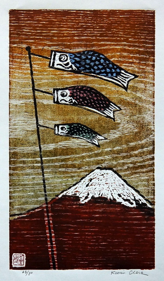
He neatly spells out the three great H’s of Japanese scenic prints, Hokusai, Hiroshige and Hasui, spanning a 100 year period. I was not that familiar with Hokusai’s waterfall series which while not as famous as his Mount Fuji series, Harris believed to be his masterpieces. “They are the most contemporary of all his compositions, embracing abstract qualities that do not appear in world art until the twentieth century.” I think he has a point there! Harris highlights the dynamism of what is – in theory – a landscape print by Hiroshige by wondering where the viewer would actually have to be standing to view this Boy’s Day carp streamer. And in Hasui’s shin hanga print, designed to appeal to a Western customer, with its romantic and nostalgic views of Japan, we see a level of craftsmanship and emotional content not seen before. To really appreciate the details, be sure to click and enlarge the images.

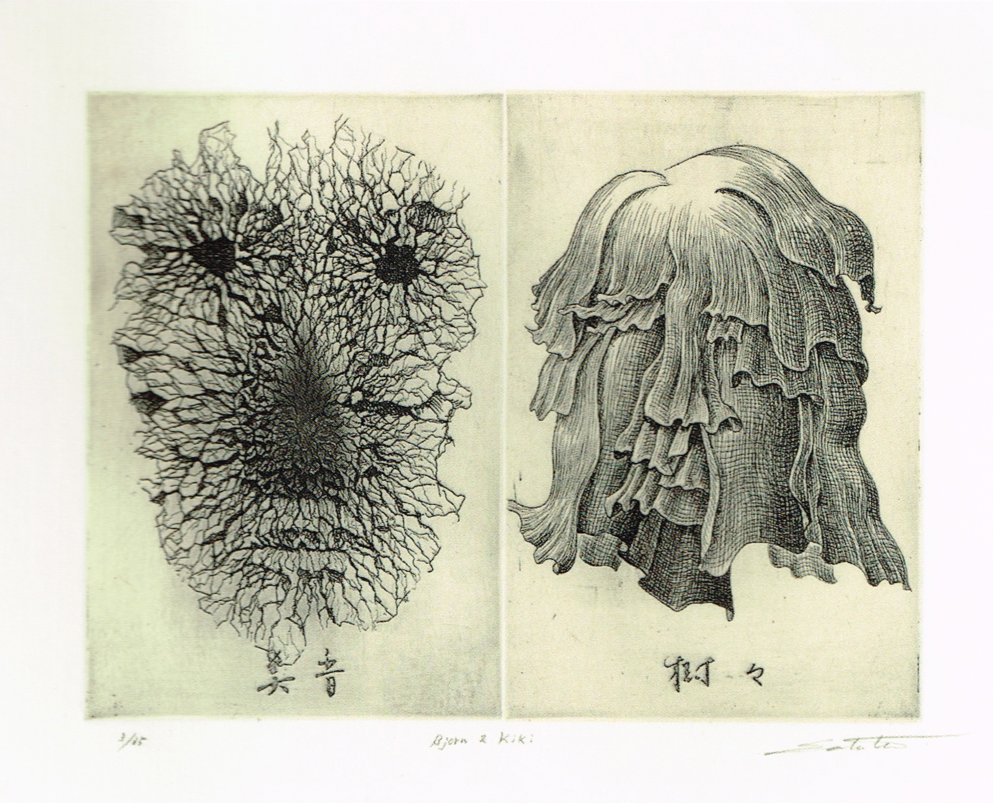
Harris is sure to include a chapter on ukiyo-e books, an area that is both dear to my heart and often overlooked. From simple but powerful sumi ink illustrations by the ‘father” of ukiyo-e, Hishikawa Moronobu, in the 1650s to delicate asymmetrical compositions from Watanabe Seitei influenced by European paintings after the turn of the 20th century, Harris’s book is full of numerous rare images from the author’s collection.

The final chapter is on Yokohama-e, prints about foreigners in Japan and the way in which Japanese artists imagined and portrayed them. Other than the Dutch, who were kept at far arms length, Japan was effectively closed to foreigners from the 1630s until the mid 19th century, until Commodore Perry and the Treaty of Kanagawa forced the opening of the country to outsiders. By far the most interesting image for me in this chapter is Utagawa Yoshitora’s Trial Balloon Launch at the Naval Academy Training Ground at Tsukiji from 1870. Normally a triptych (three sheet print image) I have cropped it to two for a bit of comparison. In it we see a few Western women, in quite accurate dress for 1870, watching the launch of an exciting technical invention new to Japan – the hot air balloon.

Besides being fascinated by this era in Japanese history and the cross-fertilization happening, I have also had the luck to have seen and held two of the three panels of this print in my hands. Take a few moments to really examine and compare these photos and see if you can find the fascinating major differences, besides some of the obvious coloring in the dresses, between them.

These images give you a real sense of the complexity of learning about and collecting ukiyo-e as many of the most popular prints went through multiple printings and sometimes continue to be printed today. Harris makes excellent points about getting educated and using your eye and common sense when buying. Remember, if it is in absolute perfect condition and a bargain, most likely it’s a modern-day reprint.
So? What did you spot? Did you notice how all the flags on the balloons were changed from Japanese flags to American flags? According to Wikipedia, the Japanese officially decreed the Nisshōki or Hinomaru (sun flag) as the national emblem in 1870, although it was already accepted as the de facto flag of Japan. The print itself is from 1870, which makes the timing quite interesting. In all the other examples of this print in museum collections around the world, the flags are American as in my example. Harris’s example is courtesy of the Mita Arts Gallery, a very respected ukiyo-e gallery in Japan. I may have to write to them and see if they have more information. What else? The seals and stamps are quite different – if anyone’s Japanese is good enough to shed some light on them it would be very appreciated. Other small details include the stairs and walkway in the lawn in the background and the gazebo shape in the trees. I’m sure my eagle-eyed readers will spot many more!
Now on to the good part – the GIVEAWAY!! Tuttle Publishing has kindly offered 2 copies of Ukiyo-e: The Art of the Japanese Print for me to offer to my readers. They will send them anywhere in the world, so everyone can enter. All you need to do is comment on this post, ideally after visiting Tuttle Publishing online and taking a look at their outstanding offerings in Art, Architecture & Design, with a real focus on Asia, and telling me what other books you’d like to see me discuss (and possibly have available for future giveaways :-))
The giveaway closes a week from tomorrow on Friday, September 19 at midnight EST. Winners will be announced the following week.
Related Posts:
Hanga 101…a Quick Primer on Japanese Prints
An Artistic Reflection…The 1860 Japanese Envoy to America and Yokohama-e
Artist Spotlight…Van Gogh: The Adventure of Becoming an Artist
Artist Spotlight…Dancers, Degas and the Demi-Monde in Yokohama
Japanesque: The Japanese Print in the Era of Impressionism
Battledores and Badminton…A History Of Hanetsuki Through Ukiyo-e
Artist Spotlight…58th CWAJ Print Show