So the movers showed up promptly this morning and it was a whirlwind. I have so many fragile and precious items that we planned for a special internal tri-wall container in our container for breakables. So last week I had moved things from the staid and orderly…

…to over the top exuberant, by grouping like items with like. I hadn’t quite realized the sum total of blue and white porcelain I had collected over the years – and this still doesn’t represent all of it!

In under an hour, the movers had reduced it (or built it, depending on your point of view) to this. Someone commented on how neatly it was all stacked – c’mon, this is Japan after all.

I haven’t had a moment to blog, but at my final Kawagoe shrine sale a friend asked if there was anything I regretted not buying. Out of the blue I replied that I wished I had bought a blue and white benki – a vintage toilet. Lo and behold, the last dealer I went to had one for a bargain price. Stay tuned to see what I am planning on doing with it in Doha. You can see it tucked in there among the hibachi.

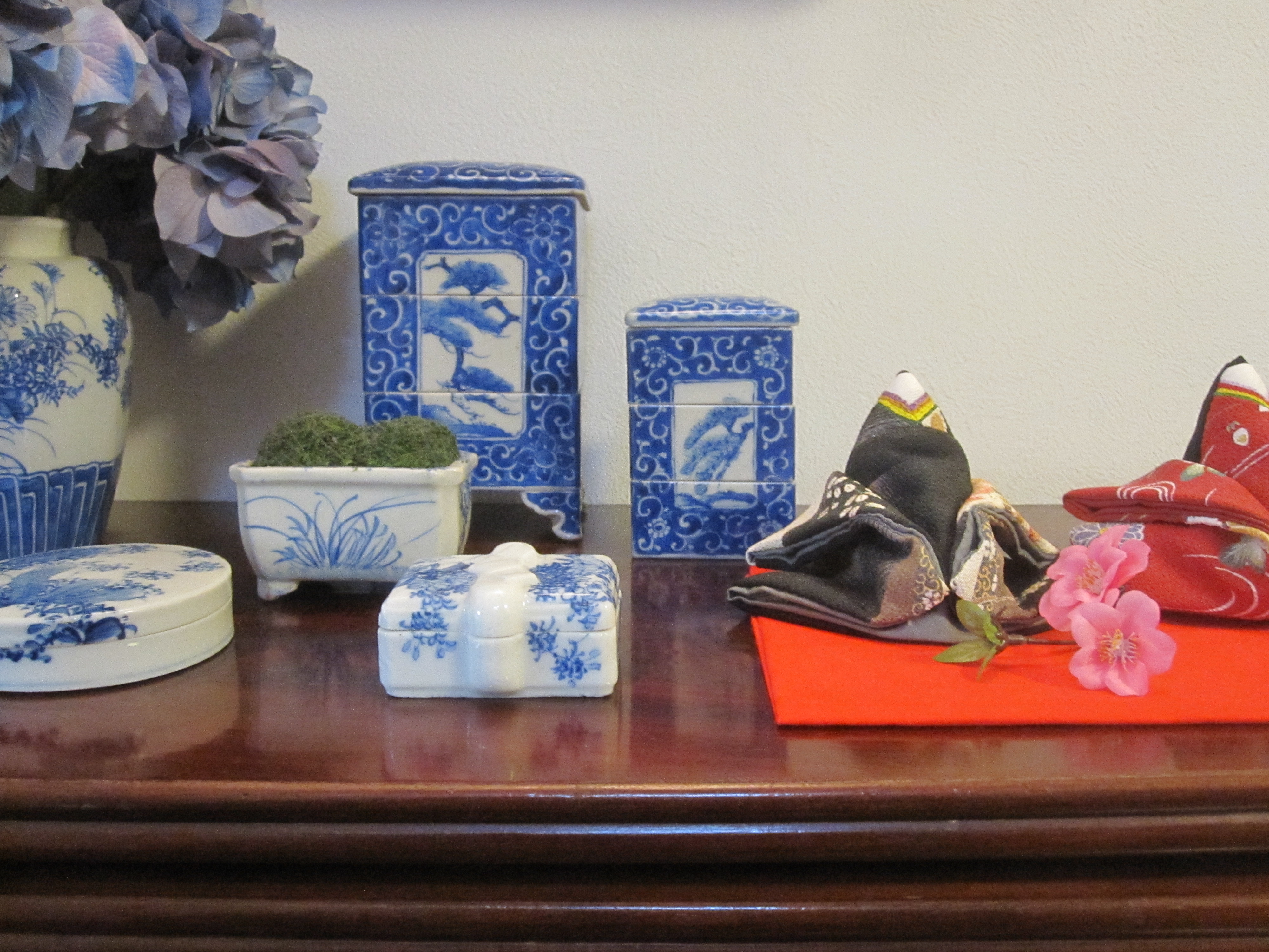
Details of some favorite Seto porcelain…

…including another last-minute purchase from Tomioka Hachiman, a Seto jubako, as if I needed another.

How long have I been promising a post on Kutani porcelain? At least two years! I promise to get to it one of these days. A little Imari snuck into this photo too.

Candlesticks galore…

…and the cream of a glass fishing float and bottle collection.

Not everything that needs to be packed originated here. I came with quite a few collections!

Lavender Staffordshire, better known as transferware, has been a lifelong passion. A rare color and quite difficult to find, I have been buying floral and neoclassical patterns since I was a teen. Mine was made in England (and in a few cases France) in the late 19th century as a shortcut to hand painting china. It actually has a reciprocal relationship with Asian porcelain if you think about it this way – Japanese inban is also transfer printed (they got the idea from the West) but many of the European transfer patterns (think Blue Willow for example) are based on Asian hand painted pieces. More about this here, here and here.

When we moved to Tokyo I knew it might be for 3-5 years – didn’t expect 9 – and we planned to rent out our apartment so we moved everything we owned including a few major antiques like this painted 19th century armoire. It has gorgeous flowers and birds on a background of that perfect French green-grey and its original bevelled mirror. You can see the campaign bed I wrote about the other day reflected and it has been in my daughter’s room since she was a baby. Typically, her bedroom in NY didn’t have a closet!

Our bedroom had another beautiful French piece, an antique Louis Philippe rosewood armoire – with its original mirror, sparkly with age. Luckily our wonky shaped Japan bedroom had an area with a raised ceiling or it would not even have fit.

When we moved to Tokyo originally, our container went at the beginning of summer although I didn’t travel there with the kids until late August. My husband took care of arranging the move in and we slept in our own beds the very first night we got there, which is actually quite unusual. What he didn’t tell me for months afterwards was that in order to get my beloved armoire into the bedroom, it had to be hoisted up through the window. I have to say I was happy to have missed it and just found it safely where it belonged when I arrived. So I went into today knowing that the only way out was the same as the way in and I was dreading it. Truth be told – and you can watch it on the video yourself – it was a non-event as the movers here are so great. Although, there are a few moments of drama around minute one.
A much more important truth to tell is that at the end of the day, the only truly precious cargo is the one reflected in the mirror, not the mirror itself.

But cross your fingers and wish my stuff luck anyway!