THE POMEGRANATE
Once when I was living in the heart of a pomegranate, I heard a seed saying, “Someday I shall become a tree, and the wind will sing in my branches, and the sun will dance on my leaves, and I shall be strong and beautiful through all the seasons.” Then another seed spoke and said, “When I was as young as you, I too held such views; but now that I can weigh and measure things, I see that my hopes were vain.” And a third seed spoke also, “I see in us nothing that promises so great a future.” And a fourth said, “But what a mockery our life would be, without a greater future!” Said a fifth, “Why dispute what we shall be, when we know not even what we are.” But a sixth replied, “Whatever we are, that we shall continue to be.” And a seventh said, “I have such a clear idea how everything will be, but I cannot put it into words.” Then an eighth spoke – -and a ninth — and a tenth — and then many — until all were speaking, and I could distinguish nothing for the many voices. And so I moved that very day into the heart of a quince, where the seeds are few and almost silent.
-Khalil Gibran
 I’m sad to step away from inlay and the Orientalists, but I am sure I’ll be back. In the meantime, I’ll use this 1875 portrait by William-Adolphe Bouguereau as a gentle segway to today’s post, full of rumination on my passion for pomegranates, both real and decorative.
The pomegranate originally came from Persia and the western Himalayas and has been cultivated for millennia throughout the Middle East, Mediterranean and European regions. Traders carried it along the Silk Road and spread it through China and Southeast Asia. The name itself is a play on Medieval Latin for ‘seeded apple’ and many believe that the forbidden fruit in the Garden of Eden was perhaps instead a pomegranate, not an apple. Sacred to all religions and referenced in many ancient texts from the Book of Exodus, the Quran, the Homeric Hymns and the Mesopotamian records, to name a few, it has traditionally been seen as a symbol of abundance and posterity. Supposedly, Muslims believe that every pomegranate contains an aril that came from the garden of paradise, so they must all be eaten to be sure you get that one.
Pomegranates have become a common motif in our lives here in the Middle East. They are featured in the recipes and juices we eat all the time and I buy containers of the little arils (individual seeds) in the supermarket for snacks and to throw in salads. If they are as healthy as everyone says, then we are turning into superhumans. Throughout the region, I also keep noticing them as decorative ornaments, from the gates of the Armenian Church in the Old City of Jerusalem…

…carved in the paneling of the Church of the Nativity in Bethlehem…

…on an exquisite antique embroidered coverlet in a favorite antique shop here in Doha.

But my favorite place to find the motif is on old Khotan carpets – a passion I have written about before. There is just something about the perfection of balance in their design, the best being in the pieces I call ‘pomegranate vase’ or ‘scrolling pomegranate’.

I don’t need an excuse to effuse over two of the newest fabric designs by ZAK+FOX, both of which were inspired by pomegranates and my beloved East Turkestan carpets. The first is simply called Khotan and it has all the warmth and charm of its namesake. Textile designer Zak Profera finds “a lot of inspiration in rug patterns, perhaps because they often aren’t translated into fabric. [With Khotan] I wanted to create something that had a heritage feel, but wasn’t a true “document” piece. I also envisioned it more as a geometric and less of a floral — though I think the beauty of the design is due to the fact that it’s a balance of the two. The repeat is not complicated, but the embellishments — like the leaves and the young pomegranates — creates a wonderfully organic, rambling vine-like design which continues endlessly.”

Available in two colorways, Rubia and Goldwork, which really have spectacularly different feels, something I find quite unusual in a single fabric. The Rubia literally looks like a worn and faded Khotan carpet and is visually strong and graphic.

Goldwork is soft and incredibly aged and almost burnished looking. The fabric itself, made of thick 100% linen, has a rich tactile quality to it in person. “It was important to get the weight of the linen right for Khotan, otherwise the texture and depth of the design would fall flat,” says Zak.

If Khotan reaches out and grabs you instantaneously, Pom is more subtle as it works its way into your consciousness. Pom is influenced by the less common ‘cluster of three’ style Khotan carpet, with its simple stylized repeating pattern.

A versatile small-scale pomegranate print in Khaki, Rubia or…

…a deep grayed blue called Byzantine, it has such a variety of uses and a chameleon-like ability to work with anything. For Pom, Zak “wanted to create a small-scale pattern that would riff off of Khotan — they aren’t matchy-matchy, which I think is the kiss of death in design — but the border of Pom uses the same vine/leaf elements that Khotan carries.”

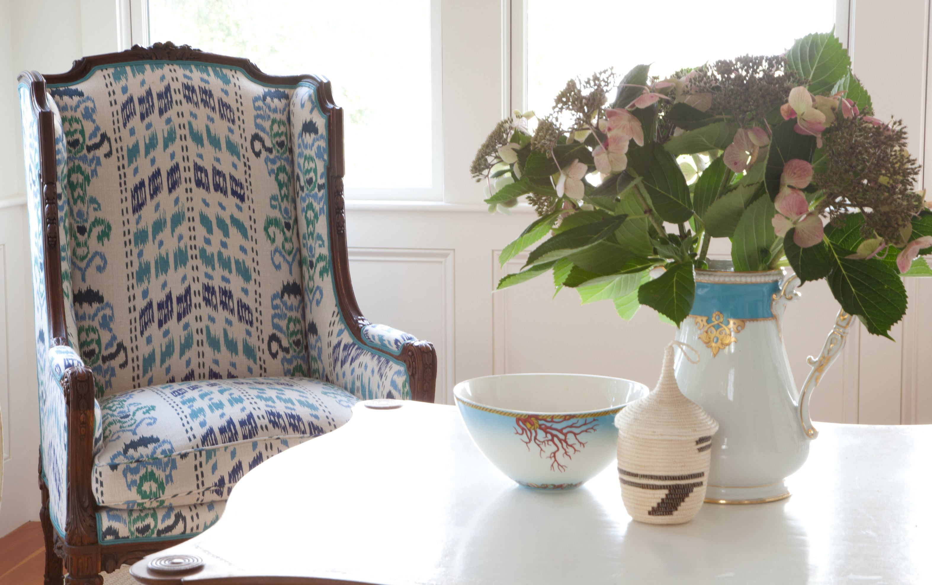
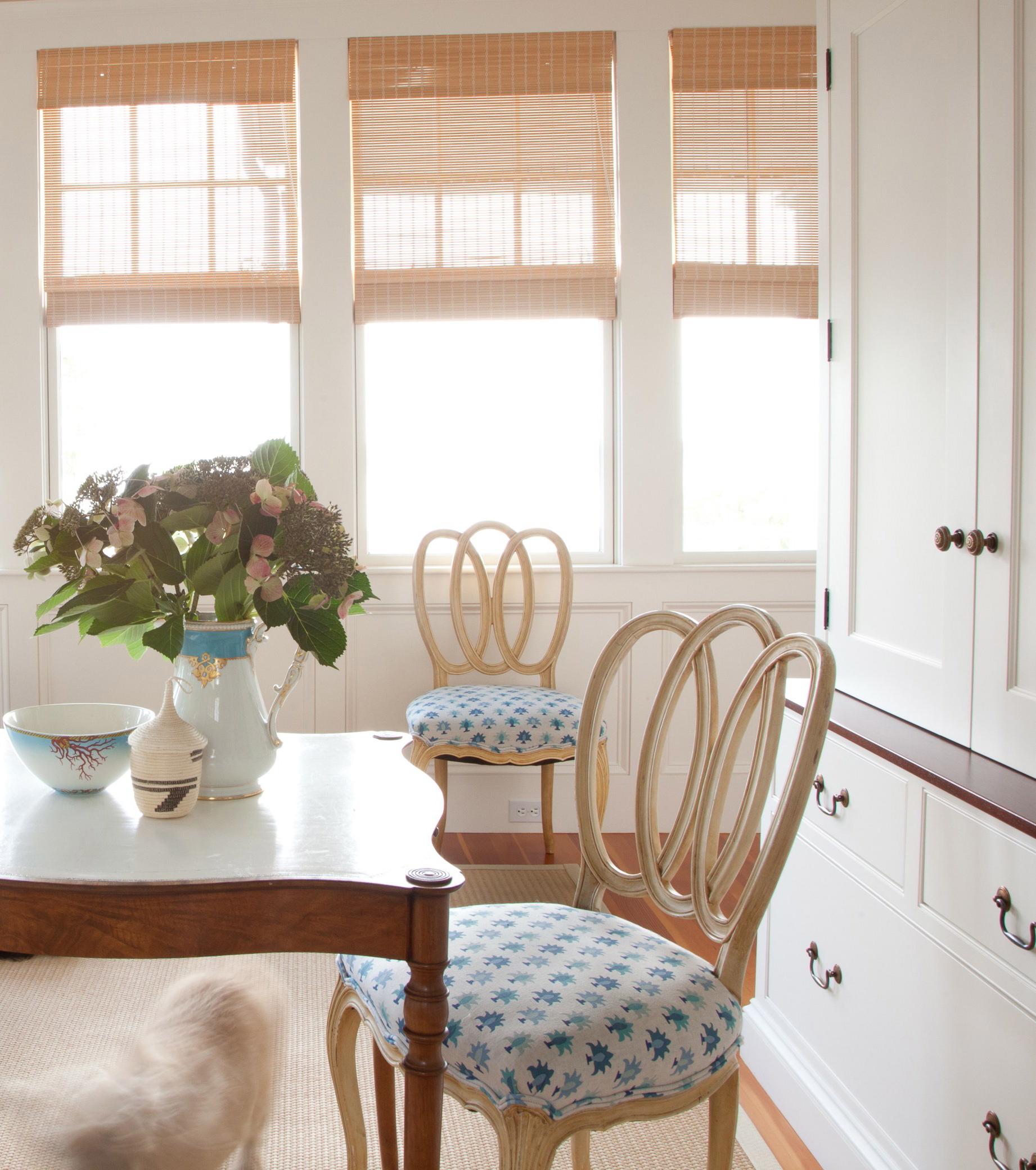
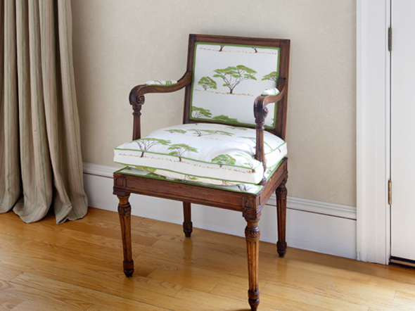
For Zak, Pom is “also my first border pattern — which I plan on creating a lot more of — because it allows for so much more when using it in application.” You all know about my long-standing obsession with bordered fabrics and the way I am putting many to good use in the house here. Courtney has the same fixation and she has used Pom perfectly in upholstering this chair cushion and using the border as the edge.

I’ve noticed both fabrics popping up on other Instagram feeds as well. Here Khotan in the Goldwork colorway and Pom in Byzantine plays well with a David Hicks fabric and some solids in a scheme by Emily C. Butler.

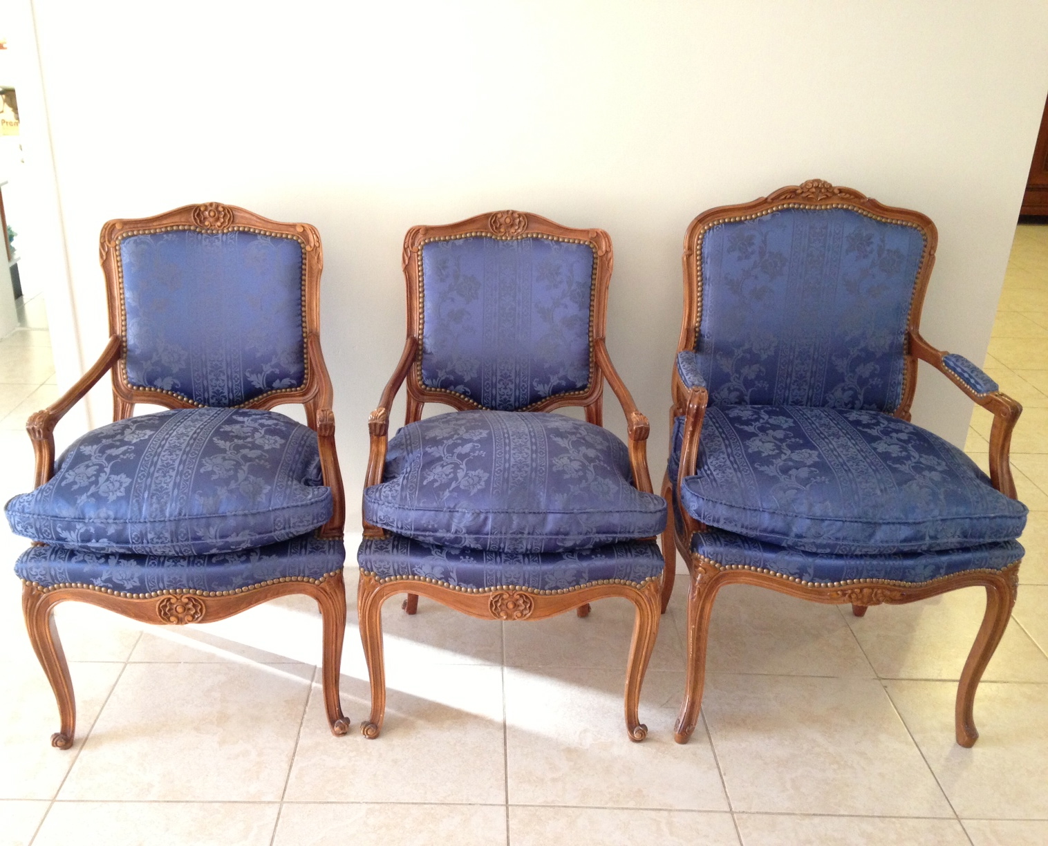
And Khotan in Rubia on the armchairs in this Lake Tahoe living room spotted on Taylor Jacobson’s feed, strikes an ideal cosy but exotic note.

And as for me, I am contemplating my own pomegranate schemes while getting ready to eat lunch.

The ZAK+FOX website has more spectacular photos of these fabrics as well as Zak’s other dreamy designs. My Japanophiles should be sure to see the Kiyohime collection and the amazing animated narrative that accompanies it.
Related Posts:
Preferring Patina Over Perfection…Chipped Porcelain, Threadbare Rugs and Old World Glamour at Tissus Tartares
Timeworn Rugs in Kitchens and Baths
ZAK + FOX…New Japanese Inspired Textiles and My First Real Giveaway
(Fabric) Bordering on Obsession