As simple as it sounds, the act of buying flowers for your apartment holds great significance and will heal your home on many levels.
-Maxwell Gillingham-Ryan

Apartment Therapy ran a January Cure this year to help readers get their home spaces under control, fresh, clean and organized. Since we had just recently moved in, I was in good shape (except for a few still lingering boxes) but I loved the idea. The biggest takeaway for me was the weekly purchase of flowers, ideally on Friday for full weekend enjoyment. I’ve always bought flowers intermittently, but I love my new weekly ritual and the simple pleasure they bring me.
A new friend gifted me with this small glass pitcher (and this first set of bright anemones) which has been living ever since on the dining room table. It’s the perfect size to put almost any kind of flower, being a bit tall and thin, and therefore budget friendly by not requiring too many stems. It also sits perfectly on my new Nada Debs tray, a Valentine gift from my sweet husband. I’ve been keeping something in rotation ever since.

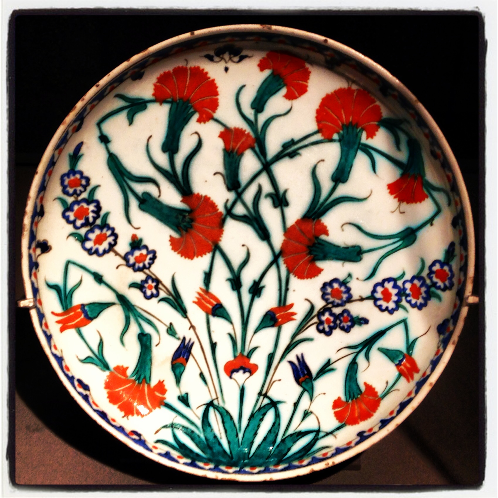
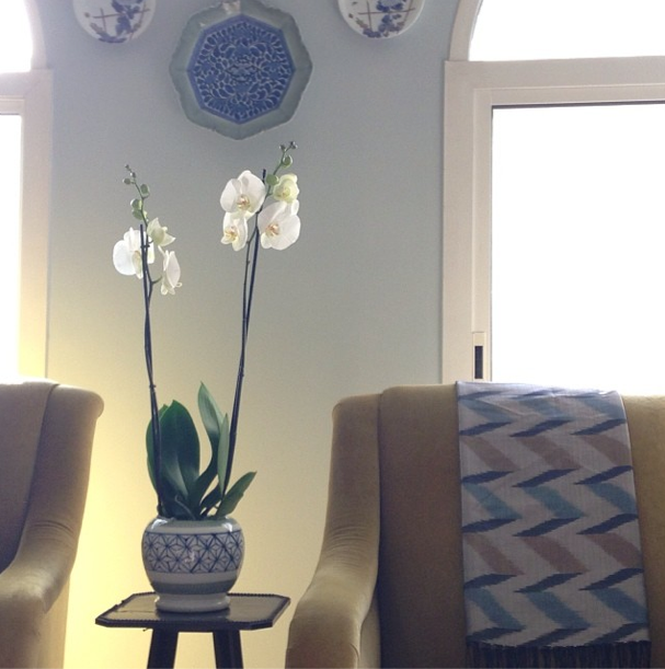
Other times, all my blue and white porcelain cries out for a little company, so larger stems usually go there on the altar table in the entry. It’s lovely to open the front door and be greeted immediately.

Jenny ran a great post on making the most from inexpensive grocery store flowers the other day, although in the desert there are no inexpensive flowers to be had. But I just adored the way she repurposed this sake set in her Instagram feed using them. Sake sets are something I see at shrine sales all the time but never really have a purpose for. Not so anymore!

Speaking of shrine sales, that small hibachi with the asa-no-ha pattern that I showed in my last post turns out to be the perfect size for an orchid. And to think I almost decided it was too heavy to bother carrying back! Whew!
Today’s hyacinths are blush pink and not yet fully opened, a sure sign of spring. Imported from somewhere of course – I think the temperature might have started to push 90 in the sun today so I am not sure it qualifies as spring here anymore.

I wish there was a smell function on the blog so their heady fragrance could waft right out of your computer.
Do you buy flowers regularly? Are there other small home rituals you love? I’d love to hear about them. While I’m not really on the mindfulness bandwagon, I do find my life here smaller and more tied to home, so the little things matter. Follow my Friday flowers on Instagram #godisinthedetails.