Sometimes you just need a full on vacation. For the first time in four years I took one – from the blog, from social media (well, there was a bit of instagramming), from the kitchen renovation that’s just not quite getting off the ground, from everything. I took a physical one as well, traveling out to Flathead Lake in Montana with 27 other members of our family for a week of kicking back, riding horses and extraordinary sunsets. But the net result of the relaxing is that here we are at mid-summer and there is much to do and much to fill you in on.
An absolutely brutal winter here on the East Coast left gardens decimated. Mine fared better than most, but everything still suffered, most importantly the hydrangeas which bloom on the previous years’ wood. Unlike some neighbors, mine survived, but had very few flowers – no comparison with last year or even the year before!

The new Aleppo (Leila) inlaid tables from Serena & Lily (which arrived after we had left last summer) look amazing in the master bedroom.

A few local finds and a change of vintage duvet have been keeping things fresh.

I tried out a beautiful silk lampshade made from a vintage sari – Robert Kime style – from Xenomania in the East Village, but it was too big and matchy-matchy. By luck, I stopped into Just Shades on Spring Street on the day I was bringing it back and walked out with the perfect simple green shade instead, for about a tenth of the cost.

With my mind on the move to Doha, I never shared a few of the things that got accomplished right at summer’s end last year. The Bennison ticking trimmed valances in my elder daughter’s room, for example, which came out more beautifully than I could have imagined…

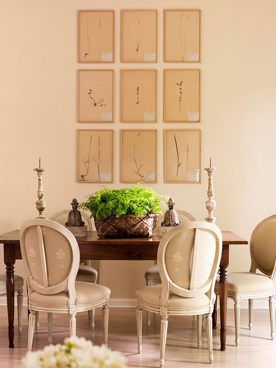
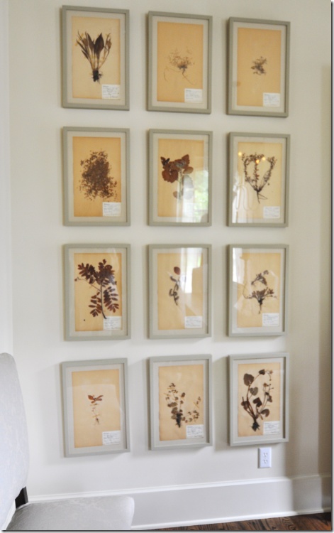
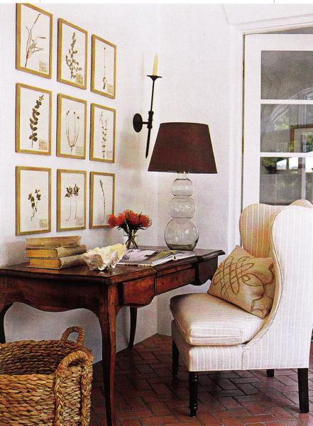
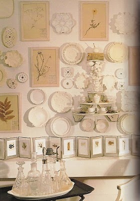
…or the sweet art wall developing in the blue hall bathroom.

It’s more than a year later and I am still kicking myself for passing up a $15 wicker headboard at a garage sale for my younger daughter’s bedroom. That’s all she needs, along with something like this Maine style pine painted cottage dresser. If you see either on Craig’s list or at your favorite shop, be sure to let me know!

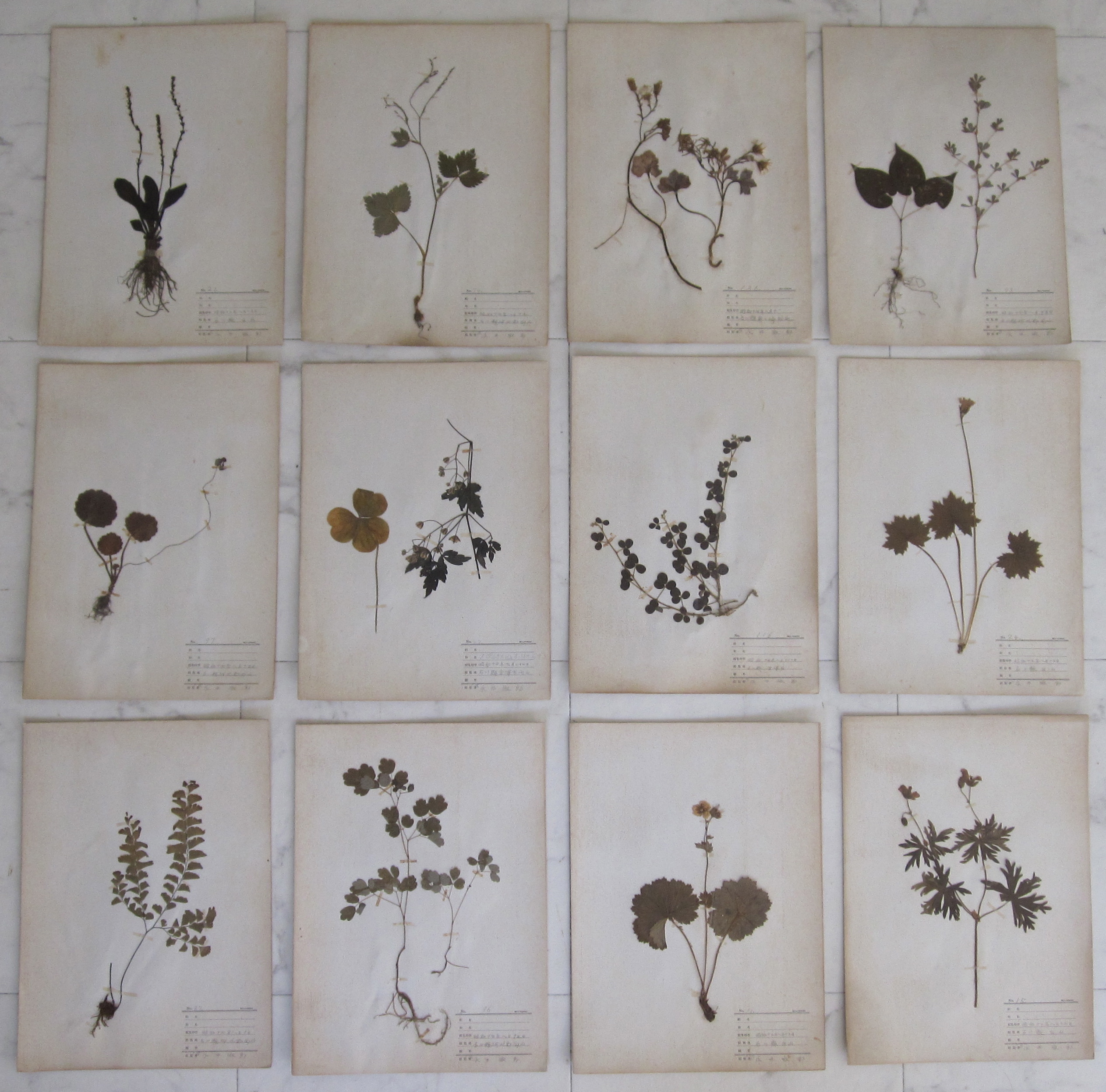
Local antique stores here haven’t been as rich with goodies as normal and many have gone under, their land being redeveloped into condos or strip malls. I find it depressing but the truth is that the house needs very little outside of these few specific pieces so it hasn’t been a personal tragedy. I have stumbled into a new shop I quite liked, finding a great pair of 1855 Morris Gull prints (which will probably be added to the blue bathroom art wall)…

…as well as an amazing antique lidded Seto porcelain dish (because of course, as one Instagram friend put it, I need MORE blue and white porcelain)…

…and a salvaged mantel shelf that might be perfect for over the stove in the upcoming kitchen renovation (which hopefully will get started).

At the end of the day, the house here is so tiny that even an extra chair can’t fit. Found this diminutive charmer at my Brooklyn favorite Fork & Pencil, but it is going to have to make its way to a client’s house. There is simply nowhere to put it!

And speaking of chairs, I’ve seen a pair of bergères her in New Jersey that look like they might be worth shipping back to Doha to replace the ones so unceremoniously taken from me.

On a negative note, my vintage sink in the downstairs bath developed a rust bubble over the winter. I am in desperate need of advice on how I might repair/reglaze it. If you have any suggestions, please let me know!

I’ll be looking for more input on upcoming posts, including major decisions needed on new exterior paint colors. I’ll also be having a giveaway for a beautiful book on ukiyo-e by Fred Harris. In the meantime, I hope you are enjoying your summer!