So I am going to add my bit to the numerous blog posts and newspaper articles proliferating out there in response to the publication of designer Howard Slatkin’s new book, Fifth Avenue Style: A Designer’s New York Apartment, some 240 pages devoted to the finest details of one of the mostly finely conceptualized spaces I can remember. Beautifully photographed by Tria Giovan, the book explores Howard’s 6000 square foot Manhattan apartment – which is more reminiscent of an 18th century palazzo than a New York City home. Rather than say much more about it myself, I would send you over to read the many features that have cropped up in this past week since the launch, from Sara Ruffin Costello’s profile in T Magazine, with great additional photos by Simon Watson and a video tour to Mark D. Sikes, Little Augury and Quintessence‘s varied posts.
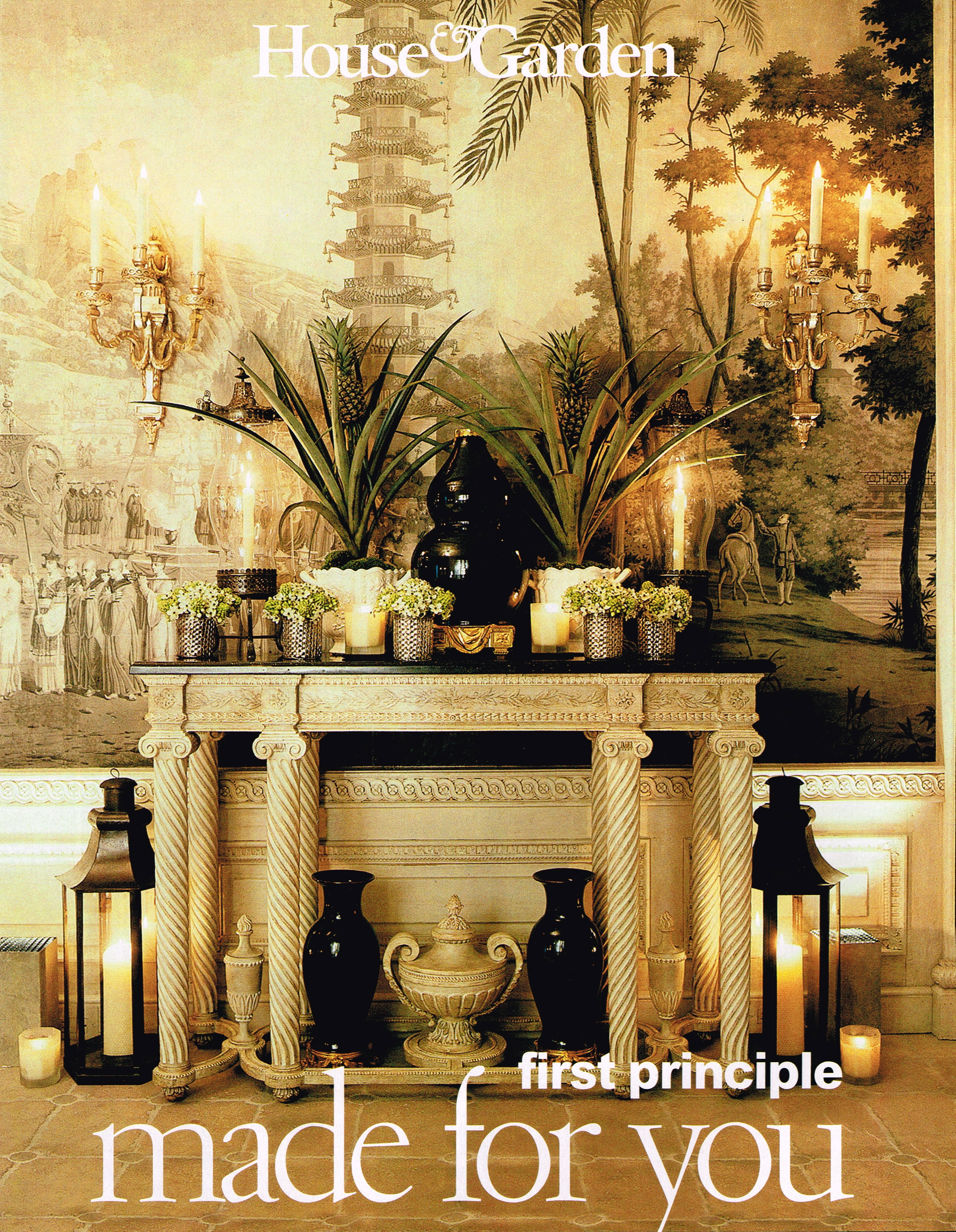
While I have been following Howard on Instagram for quite some time now, my first experience with his apartment comes from a 1999 issue of House & Garden. I can remember poring over the issue, studying the exquisite details and promptly tearing it out for my files. The space was extraordinary and the idea that it was a current creation and not a restoration blew my mind. Usually my Then and Now posts are all about change but not so in this case. Perhaps when you spend three years building your masterpiece, you are loath to change even the small details. While the entryway shown above, with its antique French grisaille wallpaper panels is literally exactly the same now as in 1999, I did find a few small changes here and there elsewhere in the apartment. And it is always fun to explore differences in styling, placement and photography, so please excuse the damaged center folds and enjoy this trip down memory lane.
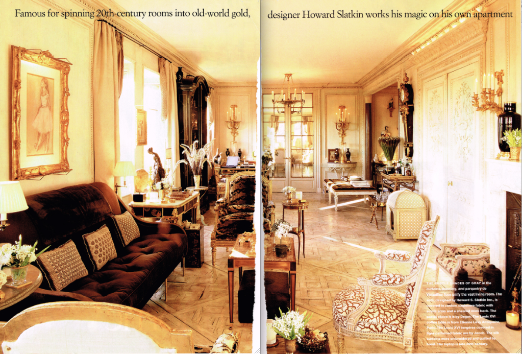
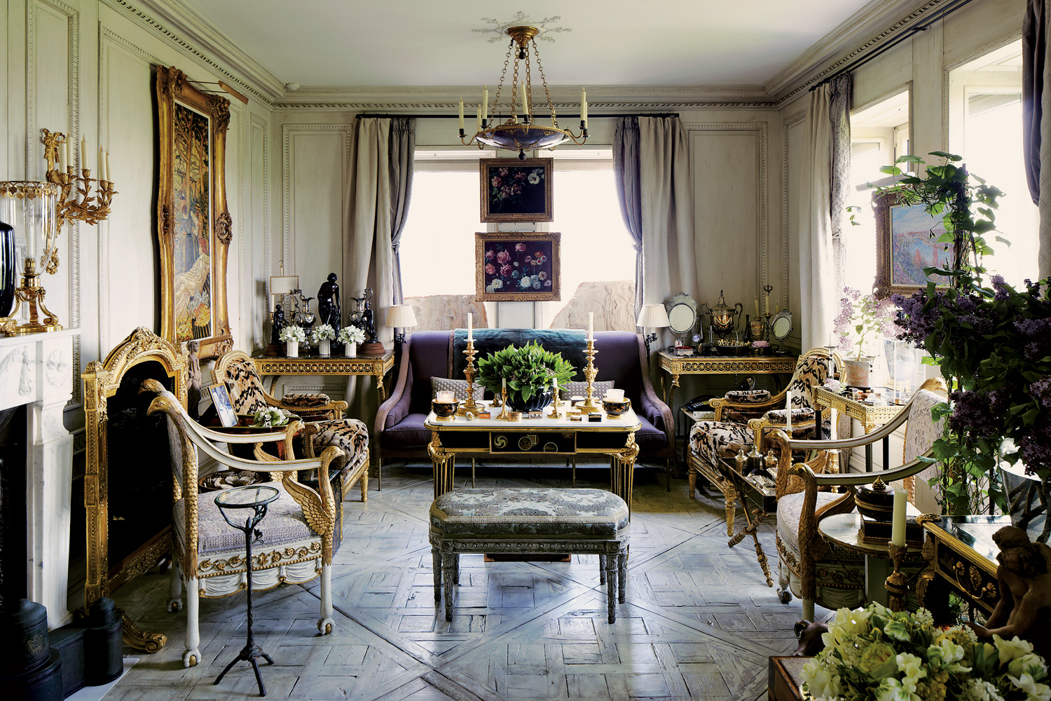
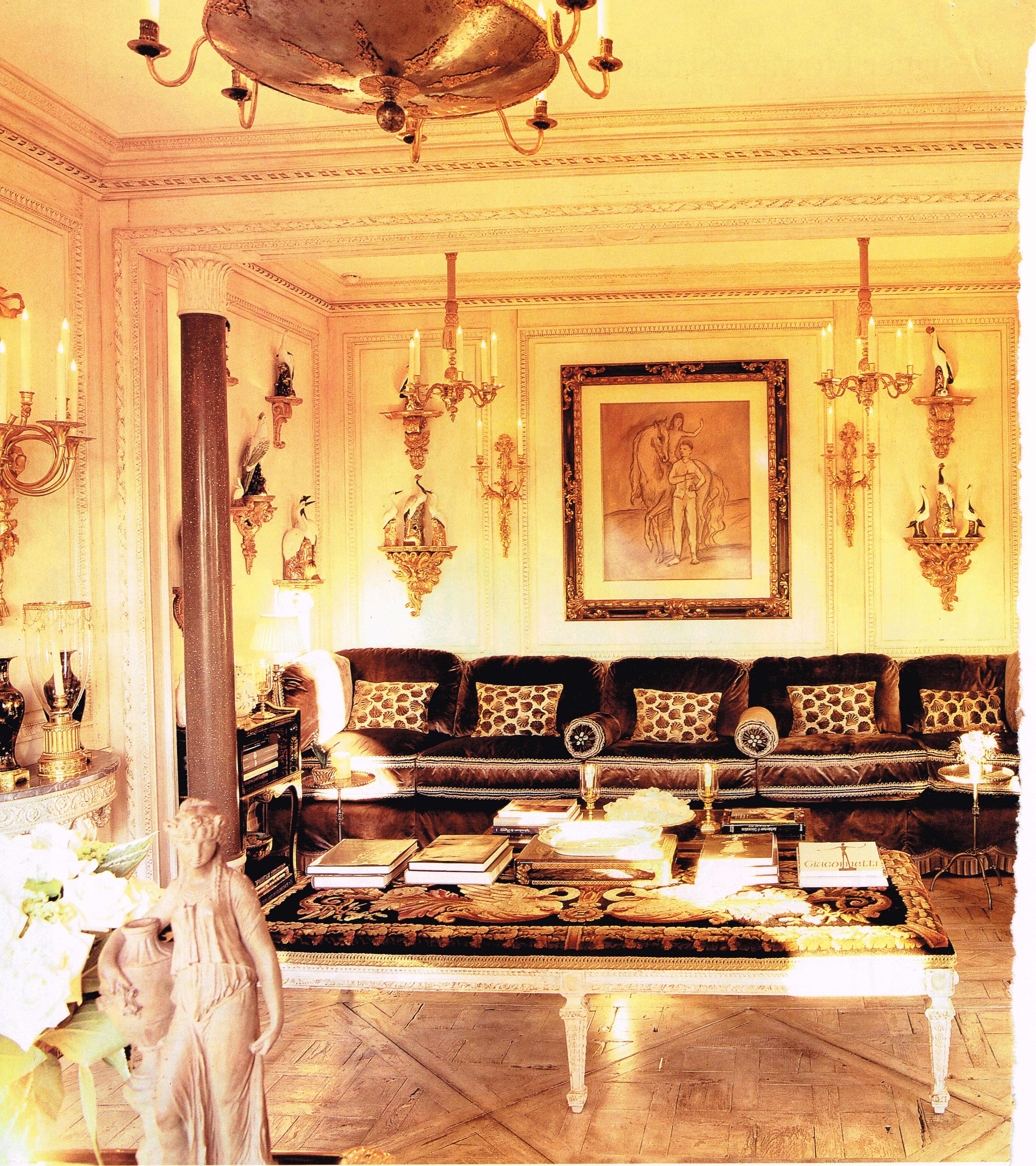
While the 46 foot long living room – his “bowling alley” as Howard calls it – retains the same furniture, it has been rearranged. In 1999, the sofa with inset mink panel (yes I did just type that!) was set against the long wall with the tiger velvet armchairs on either side. Definitely click for details.
Now the sofa and chairs sit in that far window, perpendicular to their previous placement.
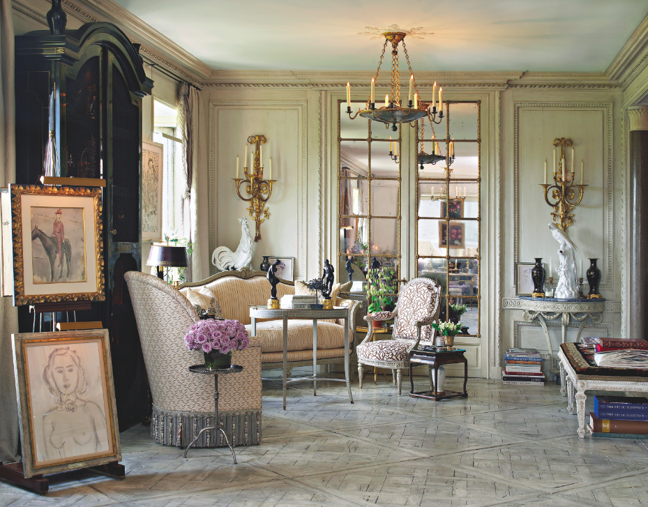
A canapé is now the back left corner of the room and that fabulous painted fauteuil with the brown and white upholstery has been moved there as well. You may even spot some other small details that have changed. But by far the most noticeable difference is in the style of the interior photography. The 1999 photos by Pieter Estersohn are all golden and streaming with sun, while the current ones are cooler and more about accurate color. I’m not a photographer, but it seems to me that this must be an extraordinarily challenging apartment to photograph. In 1999 digital images were not yet the norm, so I think you had to go for mood sometimes. Also, warmer colors were in style in 1999 and gray was not the rage as it is today. Perhaps highlighting that incredible gray glaze and finish on the Parquet de Versailles floors wasn’t as important. But trust me, people are going to be swooning about that floor!
More photos from the 1999 spread include the living room nook, which just needs a pasha lounging to make it complete…
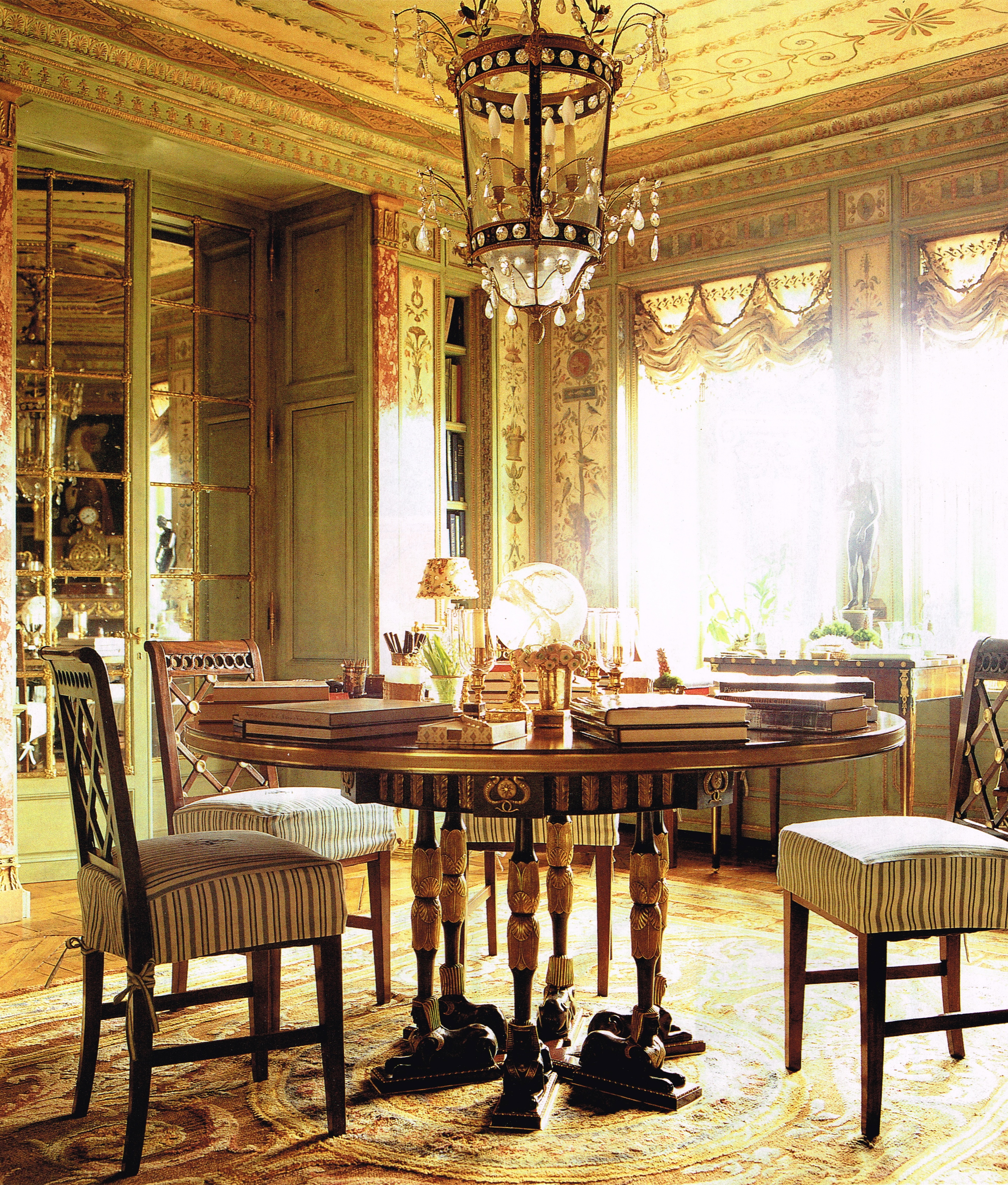
…the jewel box of a dining room…
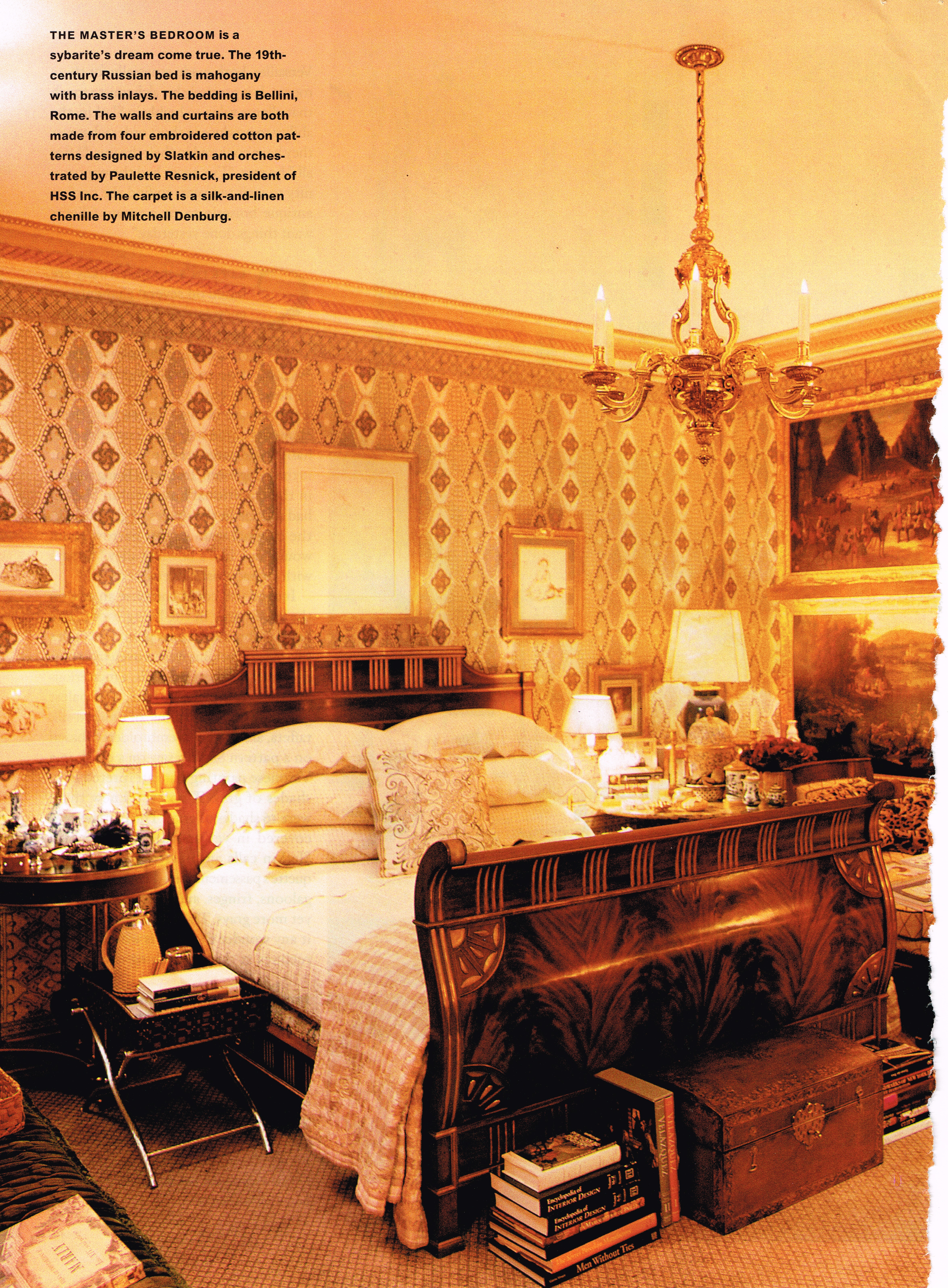
…and the main bedroom, all of which remain very similar today…
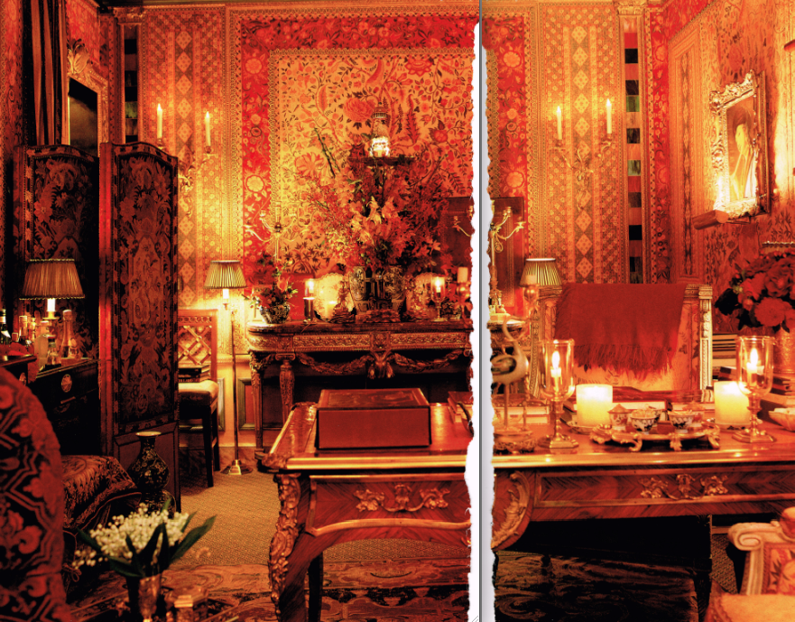
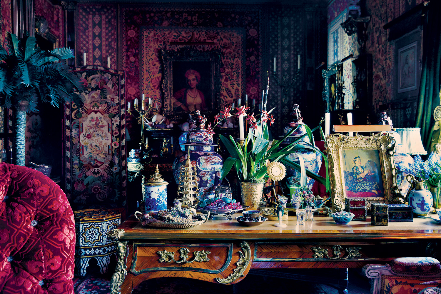
…and the divinely over-the-top Orientalist screening room, which I believe has had some changes.
A current photo of this room shows quite a bit of tweaking in the art and accessories and substantial accumulation on the desk. If this was a different apartment, I might have said that was all there for photo styling purposes, but my instincts in this case are that it is permanent display.
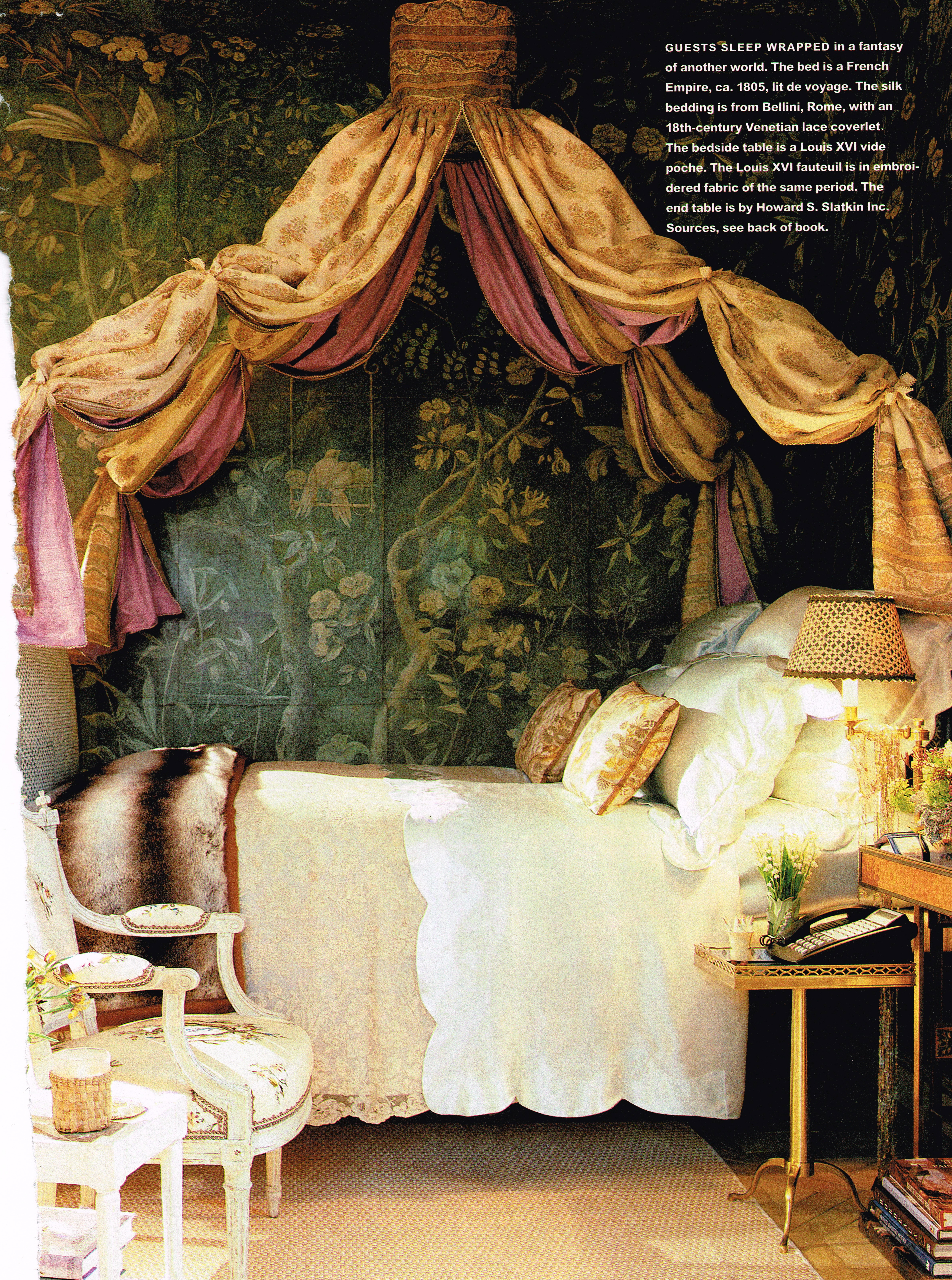
I think my favorite room by far has to be the guest room. According to the H&G article, it took 5 months for artists to paint additional wallpaper to match the 18th century Chinese originals, and 2 months to make the washi to paint it on. I think you’d have magical dreams sleeping in that bed.
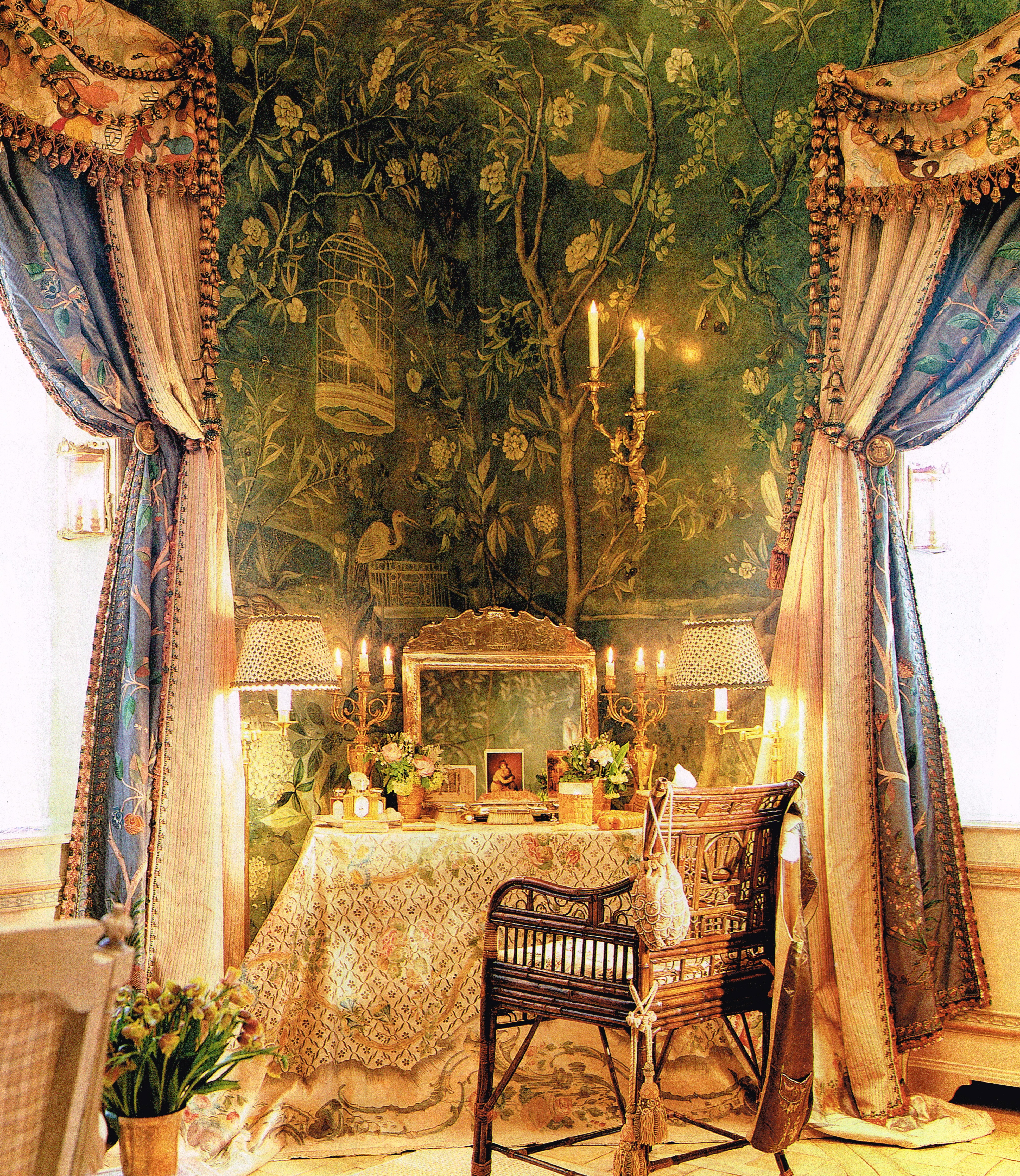
The dressing table corner highlights the layers and passementerie of the bedroom curtains and a few standout images in the wallpaper, like the birdcage.
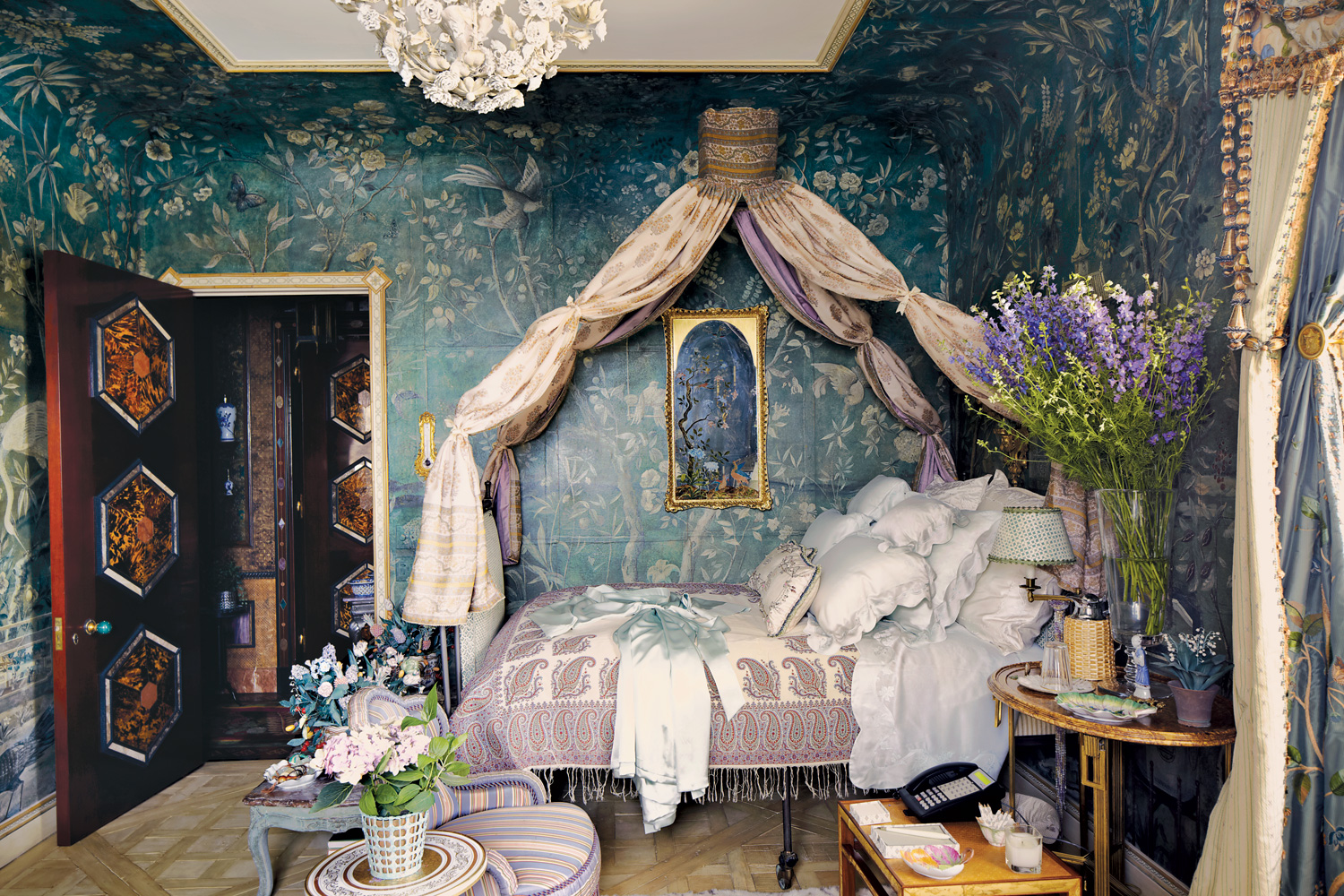
In a current photo, the bed is styled with a divine paisley coverlet. I’ve always loved paisleys but hadn’t given them much thought recently and now I have been hankering for one. Notice again the cooler light in the recent photo versus the warmer light in the older ones.
But the real reason I kept the spread was the close-up photos. There was so much to study, so much to learn and be inspired from, even though I wasn’t possibly going to recreate any of it. Artisans in fields like these don’t really exist anymore – at least outside of Slatkin’s studio. In the book, he is very clear on giving his collaborators credit for their work, which I love.
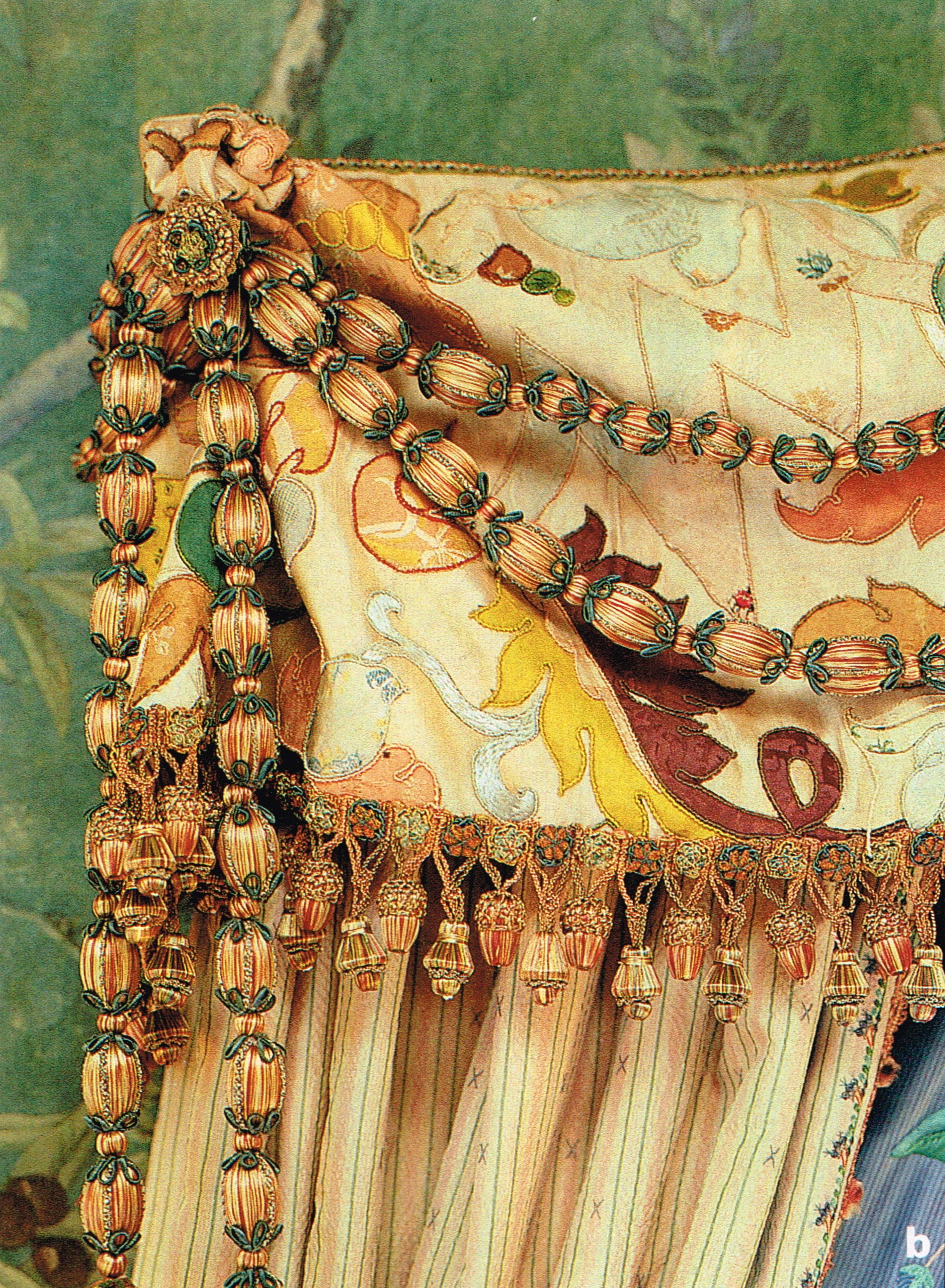
Eighteenth century inspired details in the guest room curtains…
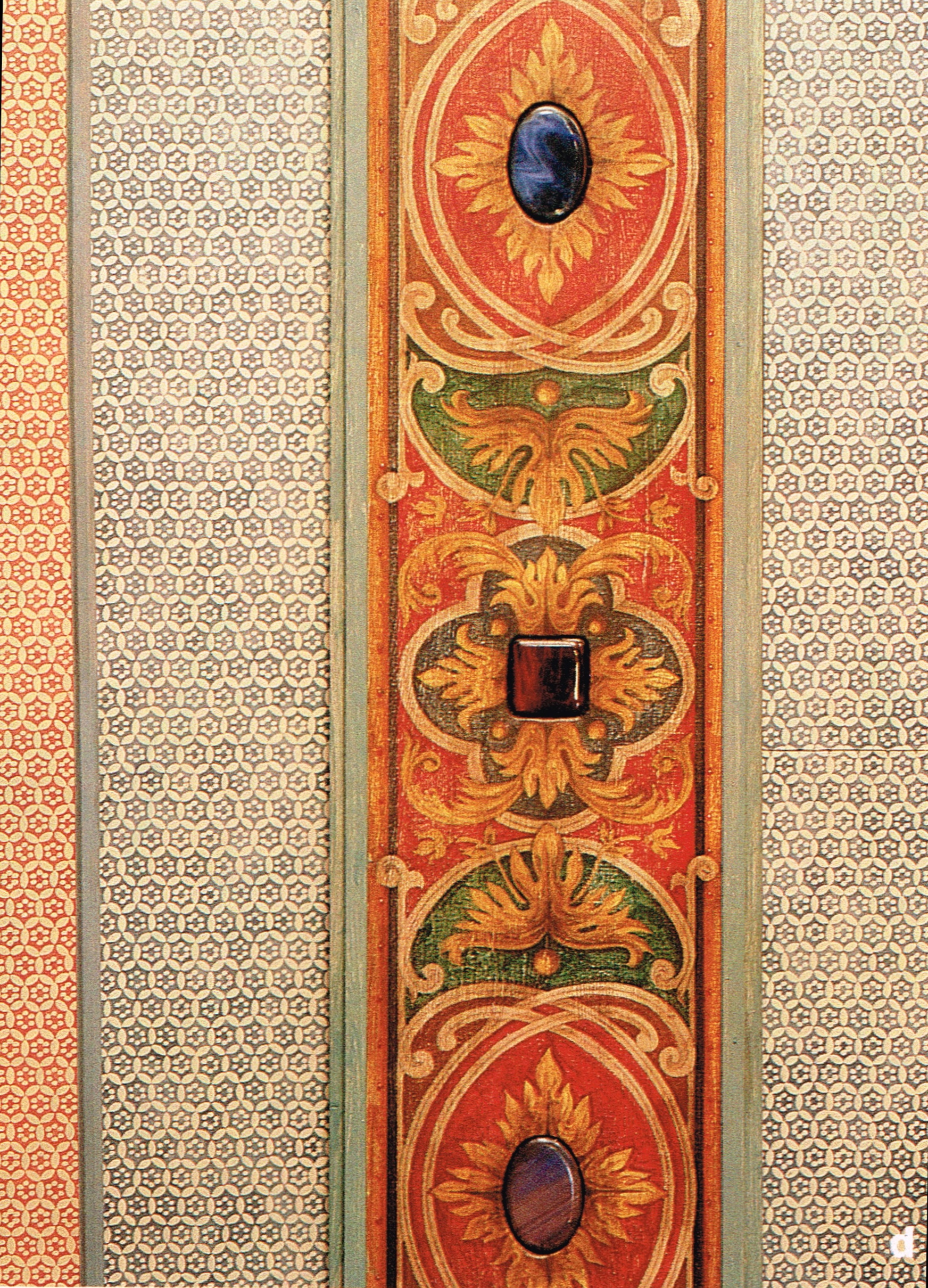
…17th century inspiration conceals 21st century technology – a hidden projector and screen in the screening room…
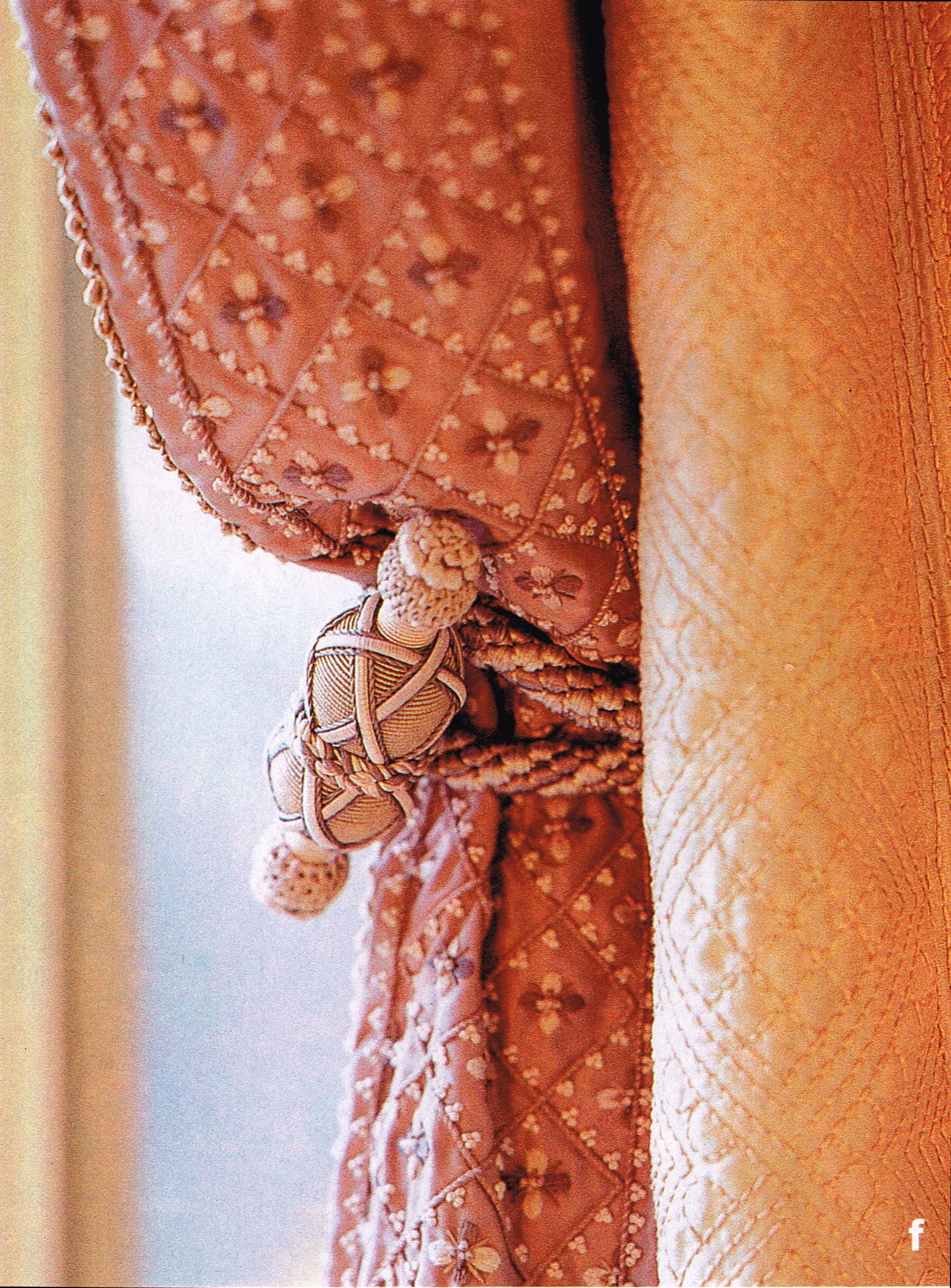
…a tieback based on one of Marie Antoinette’s…
…a technique new to me – schatzkammer – a three-dimensional effect created by hand painting, stenciling and handmade paper appliques…
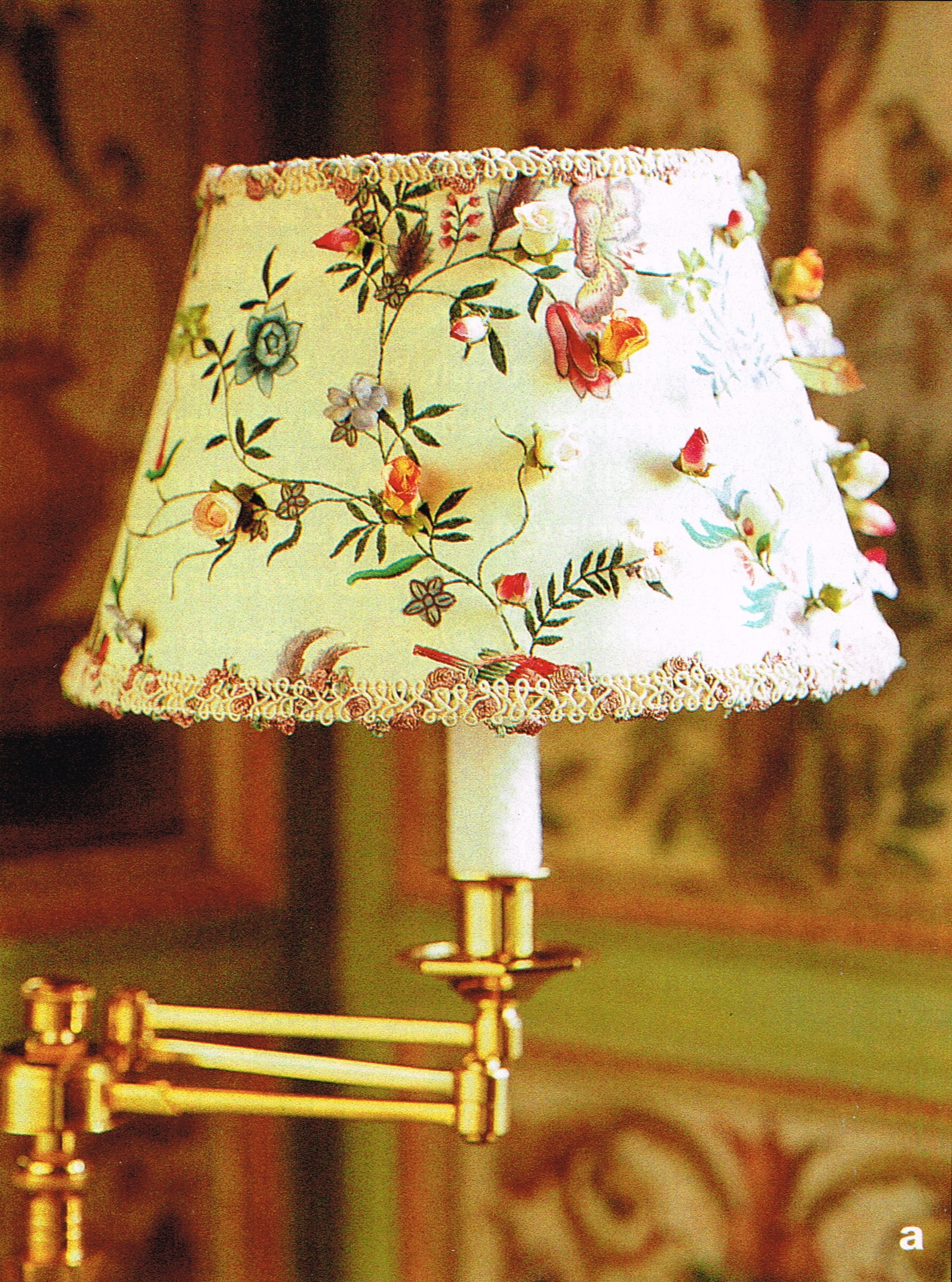
…and a lampshade made of 18th century Chinese silk adorned with hand painted silk flowers made by the artisans in Slatkin’s atelier. You know I live for a good patterned lampshade!
Thinking about this apartment, having just come from Rome too, has set me to musing about the loss of fine craftsmanship in a modern world. It’s part of the reason why I always advise people to buy antique when they can. In Japan too, artisanal ways have become increasingly rare and economically unsustainable. I think the take away lesson from Howard is figure out what you love and support those who can help you make it look that way.

I’ve seen this so much on the blogasphere lately, I think I might just have to give in and order it.
Appreciation to my father who informed me on the topic
of this website, this website is truly amazing.
If you start running you will only invite the bear to a race you can´t
win. The famous character was found 54 years ago at the
Paddington Station in London with a tag around his neck that simply read, Please take care of this bear.
Now you see the degree of desire needed in this
situation.