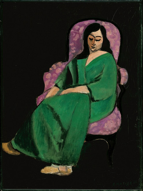
We celebrated the New Year with a visit to that most holiest of temples, The Metropolitan Museum of Art, where we saw among many other things, the extraordinary Matisse: In Search of True Painting. The Japanese influence that started with the Impressionists is apparent in much of Matisse’s work, particularly his pared down and simplified paintings, which are flattened and rendered into line and color reminiscent of traditional woodblock prints. But much has been written about that elsewhere and is easy to google, so that is not what this post is about, even though you’ll notice it in all the paintings now that I have mentioned it. Walking through the exhibit ended up feeling incredibly personal and familiar and what struck me is how much color and pattern remain vitally important to me, whether it be in designing interiors or simply getting dressed in the morning.
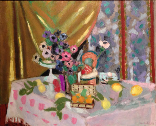
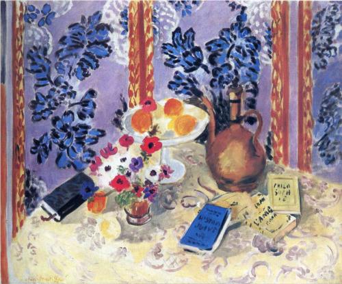
Ironically, by the 20’s, Matisse was often seen as dated in his subject matter of still lifes and interiors, but they have always been my favorites. His anemone paintings, set against patterned tablecloths and papered folding screens make me feel so happy with their vibrancy. I can see how he wasn’t considered “modern” at that moment, but joy is in the beholding no matter the prevailing theory of the day. Modernity in all its forms has its good points, but there is something to be said for comfort, clutter and the classic things in life.
It’s a theory I have held to in the Brooklyn brownstone project I have been working on piecemeal for years. While not slavishly holding to period, we have filled it with beautiful antiques, rich colors and tactile textiles.
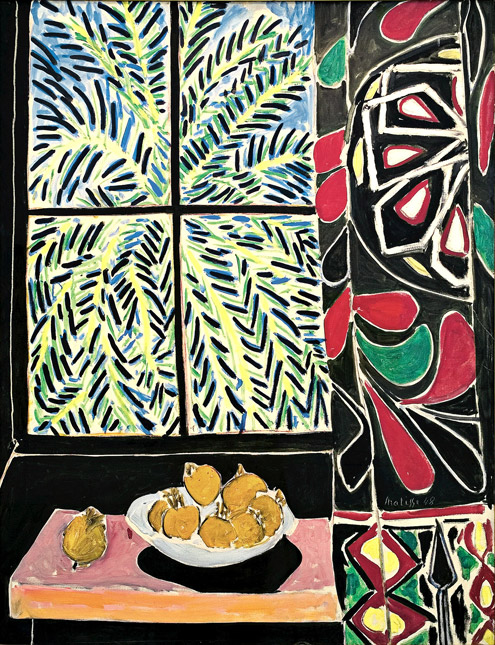
Perhaps my favorite Matisse (ever?) but certainly in The Met’s exhibition is his 1948 Interior with an Egyptian Curtain. The curators focus is always on the quality of light and the incredible way Matisse “used black to create light” in his paintings, but I am completely hung up on the decorative use of that suzani hanging as a window curtain. I think the furoshiki above would look amazing used the same way.
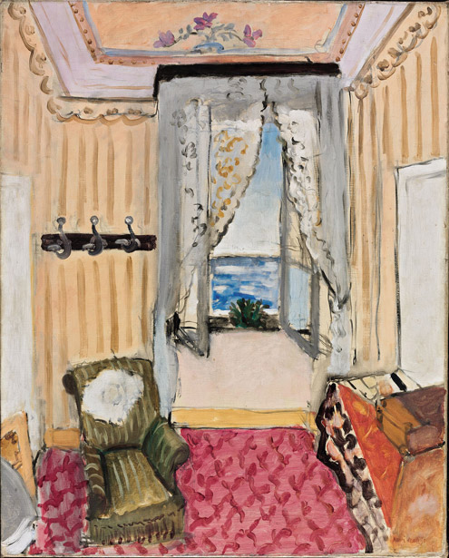
Interior at Nice (Room at the Hôtel Beau-Rivage) has many of the details and furnishings of a turn of the century hotel room – all so infinitely pretty in the clear south of France light.
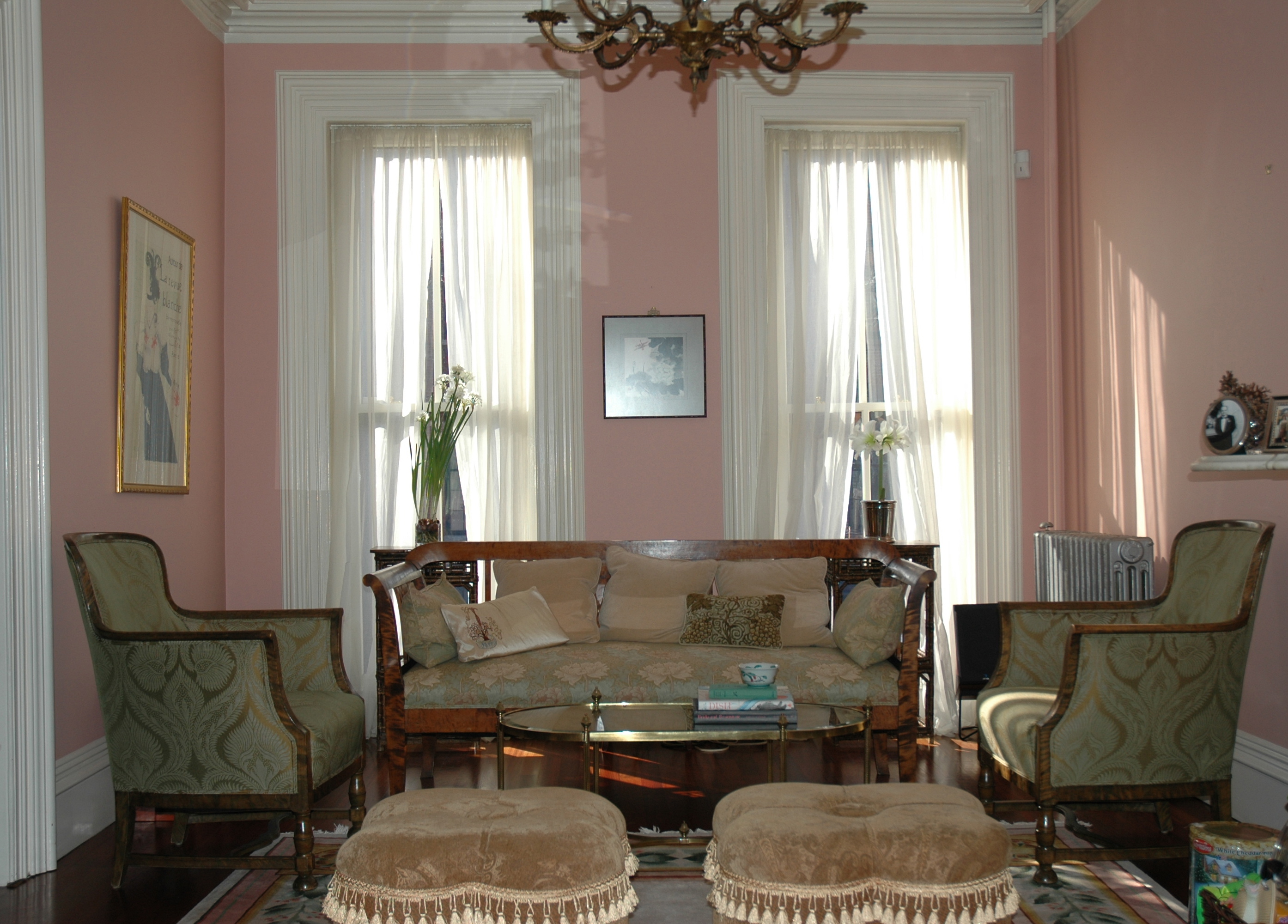
I have tried to keep a sense of soft and pretty in the brownstone living room, full of a collection of Biedermeier furniture we have put together over the years. The south facing windows create a spectacular kind of light in the room, filtered through soft sheers.
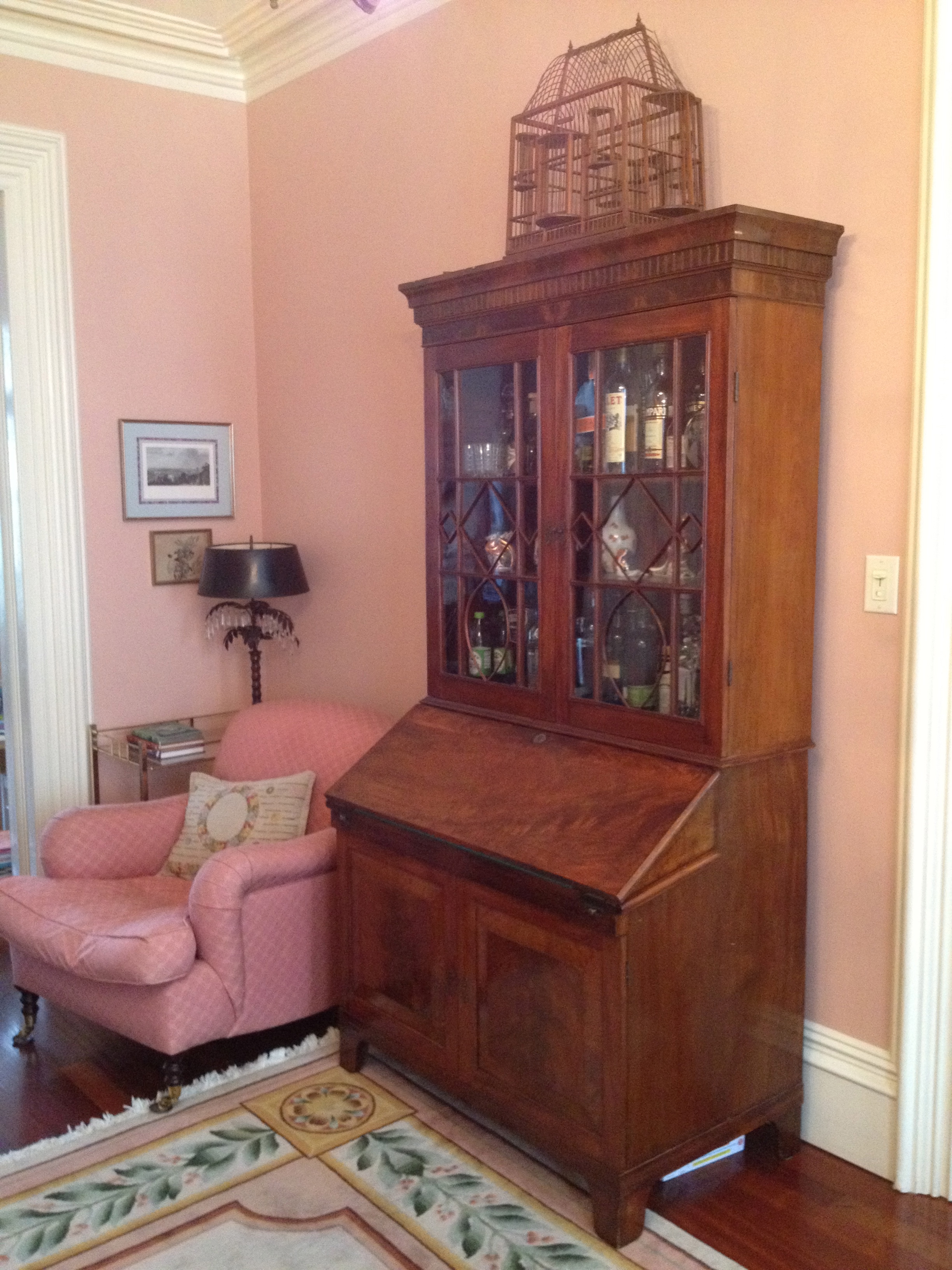
Since the owner has small children an American secretary is used as the bar now, in lieu of the drinks cart tucked in the corner. A comfy George Smith armchair (found at one of my favorite Brooklyn haunts, Fork & Pencil, to be featured in an upcoming “Shop Talk” post) anchors a spot her girls fight over for comfy reading. (Please do excuse the lack of styling post-Christmas tree and the bits of presents and other detritus found lurking in the corners of the photos. One of my main resolutions for 2013 is to get a very good camera, and more importantly, to work on my photography skills.)
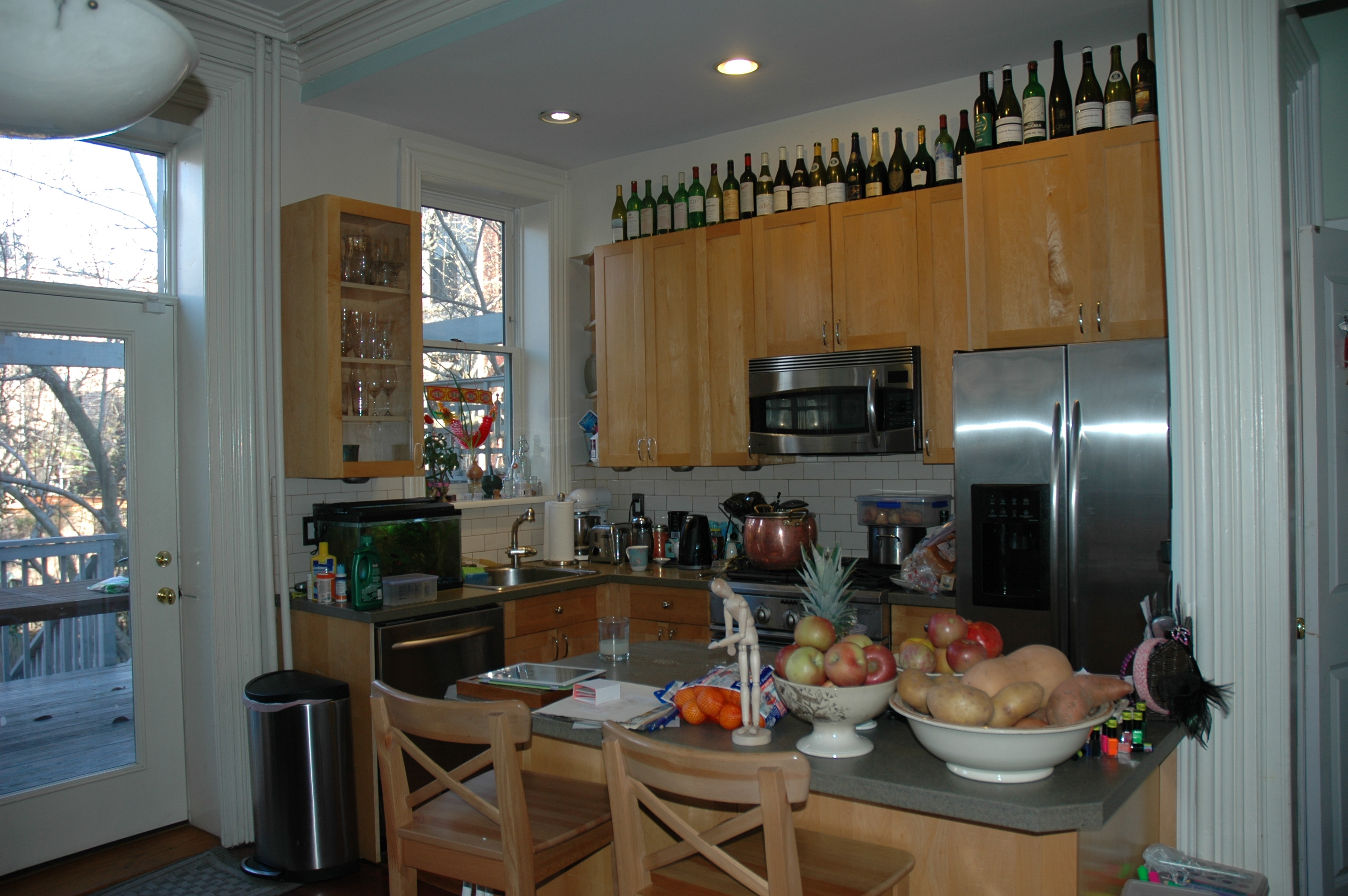
While the main rooms are all close to being finished, the big upcoming task on this project is a full kitchen remodel. While not in any way egregious, the current kitchen, opposite the dining room in the back parlor, is open to the entire first floor and needs cabinets and surfaces more in keeping with the period of the house. Increased storage and updated appliances are needed too. I’ll have lots of questions for readers in the coming month about some of the popular products out there that we are thinking about using.
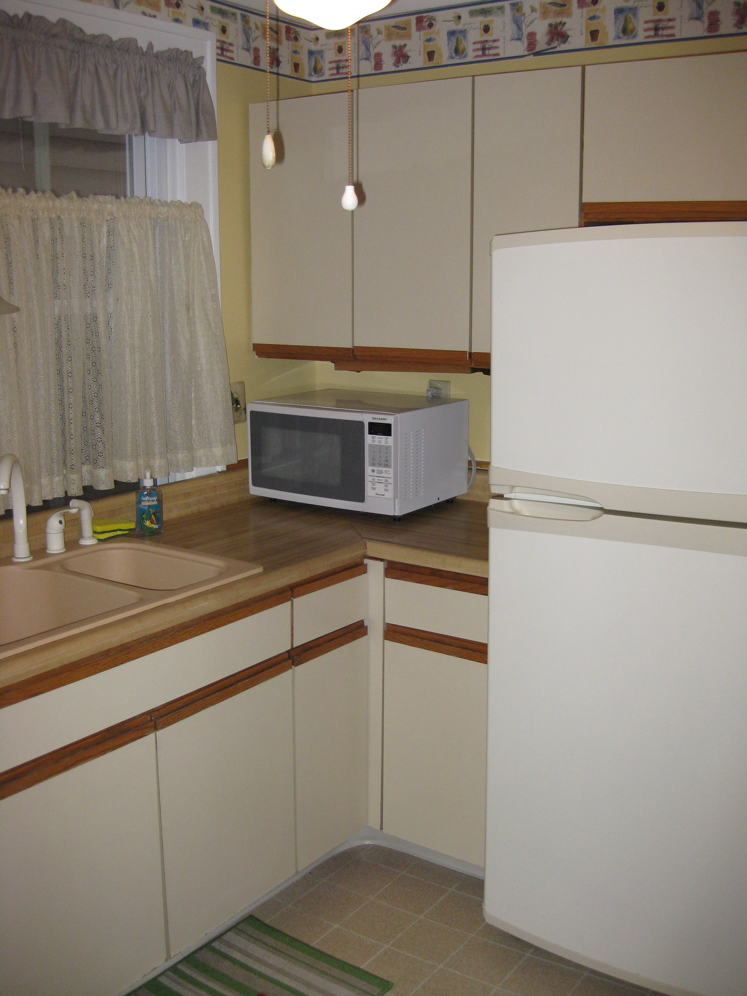
And while we are talking about kitchens in Brooklyn, I also plan to flesh out my own “cheap and cheerful” kitchen renovation at the beach house. After hemming and hawing about whether it is worth the effort if I plan to gut renovate it soon, I have come to the conclusion that soon may be quite far off in the future. That said, I find that hammering out my ideas in a post usually helps me clarify my own vision and I always look forward your to comments. I’ll be hoping for input from you all in an upcoming inspiration and planning post. To give you a sense of how bad the “before” is…
You can see I’ll have my work cut out for me!
Happy New Year!
Related Posts:
Thoughts for 2012…We Are The New Victorians
Some Resolutions for 2011 and Bamboo in January

Living room looks great!!! I can’t wait to see how the kitchen plan develops. I’m voting for cream cabinets and I think there are good alternatives to carrara. I didn’t know until I went looking at stone yards myself. I didn’t take notes but I did see many slabs that I was told were much harder than marble and not as busy as granite There’s not so much counter space in the kitchen that a nice stone would be out of the question; one of the postives of the rowhouse kitchen!!. Glad this is your baby, not mine. Sitting on the floor waiting for delivery of cabinet doors this morning!
Next post will detail design inspiration and after that details on materials – you hit the nail on the head as we are looking for stone alternatives!