Feeds:
Posts
Comments

Archive for January, 2013

IMG_3147

IMG_3158
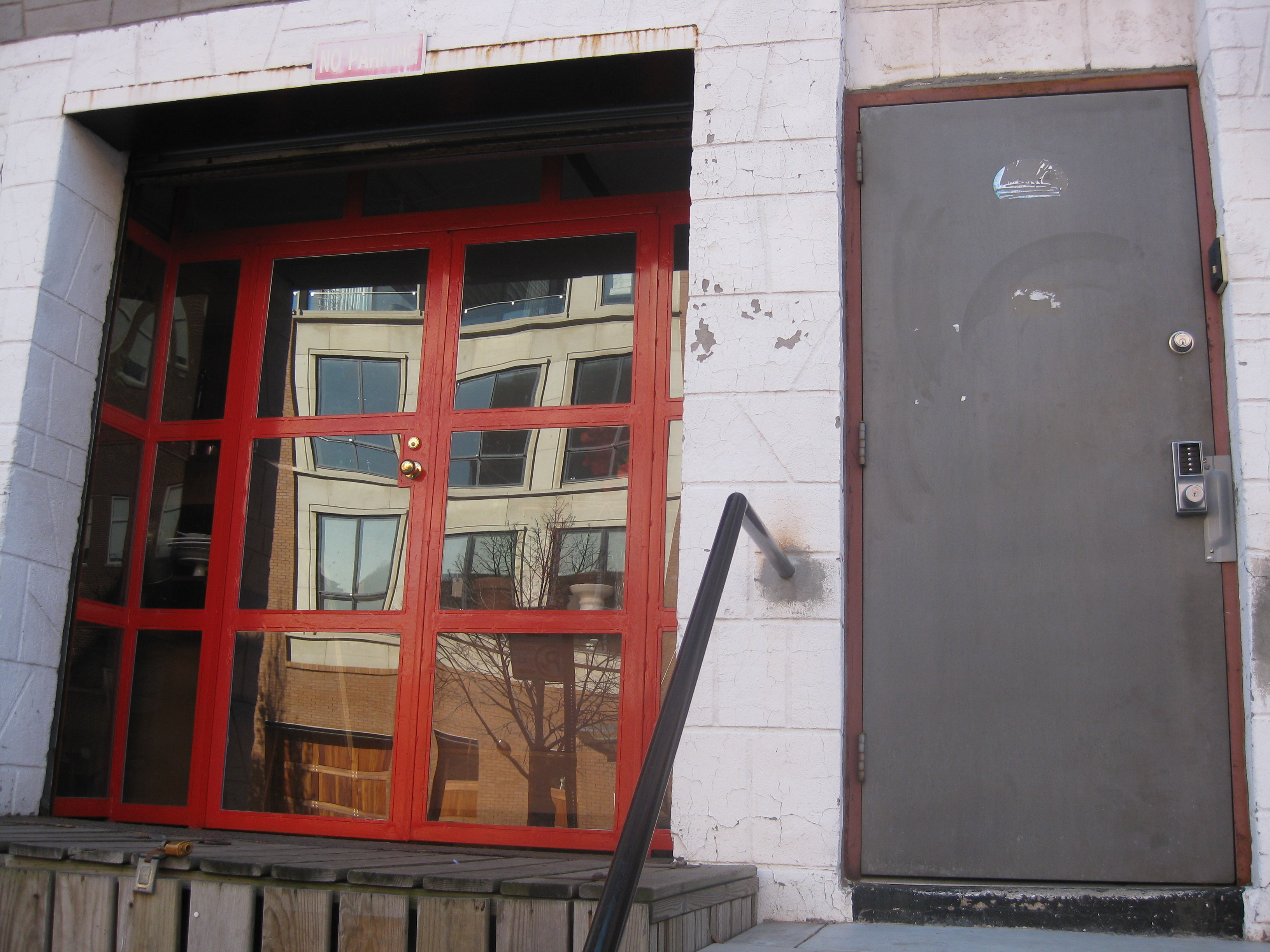
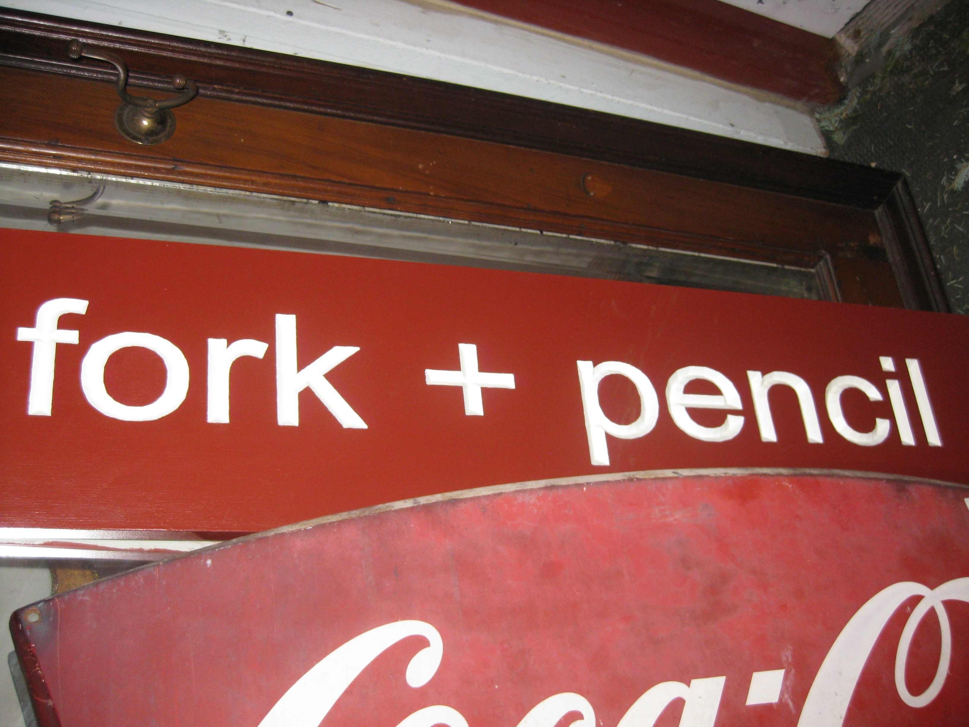
On Bergen Street between Smith and Court Streets, hidden up a few stairs and behind a nondescript door, lies one of my favorite Brooklyn antique shops, Fork + Pencil. It is not the flagship location – which is right around the corner on Court Street – instead it is the newer warehouse store, focusing on furniture and artwork. And theoretically, it is not actually an antiques shop, but officially a consignment shop. The mix is eclectic, but there is always something interesting to be found. What makes the place special is the owner Alex and its mission – all profits after expenses go to charity. While this is good unto itself, I think it creates a unique shopping experience and better quality merchandise gets consigned there – people like to see their goods doing good.

The main floor is always a mix of large items with accessory displays covering every horizontal surface, artwork and mirrors on all the walls and chandeliers hanging everywhere. Eras and styles are all jumbled together in a highly enjoyable smorgasbord.

fork and pencil 1

Intriguing arched shelving unit mounted on a console table.

photo

Mid-century mixes with colonial.

fork and pencil 2

Such a variety of lamps, like the pottery one above and this book stack one below…

stack of books lamp

…and this nicely miss-matched pair of cobalt bottles can be found everywhere.

cobalt blue glass bottle lamps

One of F + P’s specialties is porcelain and pottery. Lots of Staffordshire, Asian ceramics, like the big Imari bowl here, lustreware, Sevres and other French porcelain, and the list goes on.

fork and pencil imari

A favorite find is this giant polychrome transferware bowl. Birds and blossoms in the same place!

IMG_0575

Their other great strength is art – etchings, engravings and all kinds of small works on paper, priced so well as to be worth more even than just their frames.

fork and pencil rose

Loved these antique carriage prints. Very Georgette Heyer!

photo

The basement is more of an adventure than the upstairs and usually looks something like this, but there are always treasures to be unearthed with a little effort.

fork and pencil basement

photo

A case in point – it doesn’t get better than this – a George Smith standard armchair found nestled in a back corner…

IMG_3154

…and now nestling right here. Fresh from a Southampton estate, that chair lists for somewhere in the $6000 range new and even on sale rings up around $4000. Planning to re-cover it, but for now it looks great.

IMG_0868

The artwork finds have been outstanding, including this Brooklyn view with its charming French mat and the small Chinese gouache below.

IMG_0573

And an art triple play over just 2 visits yielded these…

photo

…and this…

photo

…and these…

photo

…which mixed with this new offering from Dash & Albert, the Garden Path runner, and some beautiful antique lace curtains, has created an instantly decorated laundry room for about $500.

Garden Path Dash Albert hooked rug

There is a nice article about Alex and the founding of the stores in the South Brooklyn Post. And the original store around the corner is well worth checking out – many of the valuable “smalls” end up there.

Fork + Pencil
Warehouse: 18 Bergen Street
Main Store: 221a Court Street
Brooklyn New York 11201
718 488 8855  |  info@forkandpencil.com
Tuesday – Sunday 11 – 7

About these ads

Read Full Post »

New cabinets = giant chunk of kitchen renovation budget. There is no escaping that equation. But no matter how big or small the kitchen is, one still needs a dishwasher, range, refrigerator, etc. so the relative ratio of expense for cabinets is lower in a small kitchen like the one I am working on. One of the good things about a small kitchen is that there simply aren’t that many cabinets involved, so it helps to keep the price down. That said, the existing cabinets are not that bad, so there needs to be a real improvement in space, organization and looks to make the change worthwhile.

It’s easy to pick out images that I know represent my client’s dream kitchen. Over and over again, it’s simple white Shaker-style cabinets with white stone counters. Invariably, the kitchens we love have inset doors on the cabinets – if you go back to the previous posts on this project you’ll see that is almost always the case. For those of you not familiar with this term, it means the cabinet doors are inset into the cabinet box, framed, like a piece of furniture, rather than attached over and covering the cabinet box. Sometimes the door hinges are hidden, like the ones in Michelle’s Mill Valley kitchen here.

Michelle Mill Valley kitchen on remodelista

michelle mill valley kitchen

Other times the hinges are visible on the inset doors like these here…

white kitchen glass cabinets via decor pad muse interiors

…and here. The Sheila Bridges kitchen has inset doors with exposed hinges too.

Carol Lalli kitchen HB

So what’s the conundrum here you ask? The problem is that inset doors on cabinets can cause you to lose space – not a lot – just an inch here or there – but considering the size of the kitchen we are working with – we feel like we can’t afford to lose any! The drawer units in particular lose width space from the framing, while the door units less so, although they do lose a bit of depth. Inset doors also tend to me more expensive – many are custom – but again price isn’t so much the issue as the kitchen is small. Space is the real issue we keep returning to.

In general we never like the overlay doors. Overlay doors tend to look like they came from box stores to me – ready made and much less like real furniture. The owner’s current kitchen has blond wood overlay cabinets – here’s the photo to remind you. These are at least “full overlay” in which you don’t see any of the cabinet box peeking out from the doors. I’m not going to even mention “partial overlay” cabinet doors – it would give us all some bad 1970s nightmares.

Brooklyn kitchen

In trying to justify overlay panels we keep returning to Molly Frey’s portfolio. She routinely uses overlay doors and in fact, all the kitchens of her designs that I’ve seen use the same exact white cabinets.

white ktichen with right faucets and sink reeded inset panels on drawer door

See how the overlay doors almost touch and you see none of the surrounding framework? Some people prefer this look, particularly in modern design kitchens. You can also see that it maximizes the available space. I think the key to overlay doors is purchasing high-grade cabinets with a really nice paint finish. One thing to be cautious of with overlay panels is some of the mechanisms, for instance soft-close drawers, can be set in deeply on the sides, causing a loss of space. It would be depressing if we chose them for space reasons, only to be sabotaged by deeply set in drawers.

Molly Frey kitchen

I did have what I thought was a genius idea, but it turns out many others have had it too. Why not use inset doors on the upper cabinets for style reasons – those are the ones that really get looked at and the space loss is minimal – and overlay panels on all the lower units, which are predominantly drawers? It’s definitely something to consider.

One of the inspiration kitchens we love is Joan’s New Hampshire kitchen here, which seems to have some sort of hybrid between overlay and inset doors.  No surprise that these were custom built by a cabinet maker – if only we could get him to move from New Hampshire to Brooklyn.

Joan's kitchen

Joan's kitchen glass door cabinets

So the big questions are whether we care more about looks or space. What say you all? Form or function?

Related Posts:
Form Versus Function…White Marble Countertops? Really?
Form Versus Function…A Farmhouse Sink and That Perrin & Rowe Bridge Mixer Faucet
Brownstone Kitchen Inspiration From Sheila Bridges

Thoughts for 2013…Matisse at The Met, Comfort and Kitchens

Read Full Post »

One of the main components of the Brooklyn kitchen renovation I am working on is white stone countertops of some sort. In the Sheila Bridges inspiration photos, heck, all of our inspiration photos, the counters are white marble. My clients are amazing cooks – or shall we say “he” is an amazing cook – a hard working and hard wearing cook – who doesn’t always worry about spills along the way. Their current counter is a dark man-made material, so there has been no need to worry about wiping up that turmeric right away or stressing over the coffee and red wine served daily. That said, spills against a dark surface don’t show so you don’t feel as prompted to wipe them up immediately. The “she” of the household is a wonderful baker and marble counters are perfect for rolling out dough. So while we love the look of white marble countertops, and know they are great for baking, we worry whether they are actually functional for cooking? Won’t they stain, etch, show every little imperfection? Don’t they demand slavish care?

In the home decorating world these questions rank up there with other biggies like “What is the meaning of life?”

As a result, many have addressed this topic already and addressed it very well. The folks over at Apartment Therapy have wrestled with it numerous times and have hundreds of pro and con comments on their site. A low-key looking site called The Garden Web is an outstanding source of information with numerous threads on the topic (for instance here,). Searching the web I found amazing posts such as the one from Greg at The Petch House (he’s restoring an 1895 Victorian) in which he tests a piece of marble, both sealed and unsealed, with the its classic nemeses – red wine, acidic fruit and tomato sauce. Two years later, he reports that his counters have held up extremely well without a lot of special care.

petch house marble test

So while white marble has a bad rap as being hard to care for, my instincts tell me that while this can be true, it can’t be the whole truth. Marble has been used for centuries for counters, tables and floors and held up extremely well during that time. Personally, a little patina makes everything better in my book. Research around the web, particularly the many first hand accounts in this vein on Garden Web…

You need to do a search on Marble threads in this forum – there are MANY of us who have marble countertops (mostly honed) and LOVE them and have no staining issues at all.”

…make me optimistic about considering a white marble. Marble is simply calcium carbonate, just like chalk, but in a compressed and crystallized form. It’s the calcium in it that makes it easily etched by acid. But it does seem that sealants have come a long way in the last few years in preventing etching and staining.  Honing the counter which is the matte finish I prefer, rather than polishing it to a shine, also helps in the battle against marks.

In terms of choosing what type of marble, trust Joni at Cote de Texas to have covered the choices pretty exhaustively in her post on the subject. She chose Calacutta Ora for her remodel.

joni kitchen marble

But before we rush into the choice, it’s a big enough decision that full research is necessary. As I am not a geologist, it has taken me a while to understand the differences between marble, granite, quartzite and manmade quartz materials such as Silestone, Cambria and Caesarstone. Granite is the hardest of the stones and the most resistant to staining and etching. But it doesn’t come in a true white and tends to be very busy and speckled, as opposed to veined. Quartzite is a metamorphic rock formed from sandstone and tends to be white and greys. It is more stain resistant than marble, but has been known to etch if calcium is present and it is unsealed. That said, when sealed it looks to be a very good option. The different brands of engineered quartz all seem good and hold up to the staining and etching tests, but they look artificial to my eye, certainly in a more traditional kitchen. Cate at Girl Cooks World has done a fantastic (and very recent) post comparing many of the stone and stone like options currently available out there, but we will need to go see them all in person ourselves.

Marble-Alternative-Quartzes-copy1-640x488

Even after choosing the material we want, in the end, the choice will come down to seeing the exact slab for this kitchen. The variations in the marbles and quartz are so extreme that samples are only indicative, not conclusive. One Garden Web forum poster chose to use Bianco Macabus quartzite because of this exact slab at their stone yard. I can see why.

White Macabus quartzite

I’ll keep you up to date on what we discover, but I am hoping to hear from all of you too. The comments on my previous post about the sink and faucet were so helpful.

Related Posts:
Form Versus Function…A Farmhouse Sink and That Perrin & Rowe Bridge Mixer Faucet
Brownstone Kitchen Inspiration From Sheila Bridges

Read Full Post »

Today was a crisp and very cold day at the Oedo market at the International Forum, but as usual there was lots to see and plenty to buy. I have been wanting to find a way to start sharing what I am seeing at the markets every week, but when there isn’t a theme or cohesive feeling about the merchandise I find it fairly boring to post about. I have been thinking that real-time photos of what I am buying, both for myself and for sale, might be more fun and more interesting for both me and for my readers. So as of today, my plans are to start instagramming (is that a verb yet?) while I am out and about at shrine sales and antique shows. So if you would like to keep up with me, you can follow me on Instagram on your mobile device here.

One of the fun parts of Instagram if you haven’t tried it is playing with the filters and the framing to add special effects to your photos. Typical me, I like all the filters that give an aged feel…

IMG_0993

…and I am a sucker for those old-fashioned photo borders…

IMG_0994

…or burned edges.

IMG_0996

I already made a faux pas in editing this photo down so that it didn’t fit the Instagram format.  Won’t make that mistake again.

IMG_0997

The photos have the perfect format for a blog post – a nice big square. There is also a very effective exposure button, used to fun effect here.

IMG_0998

This art deco mirror glows like a jewel using one of the filters.

IMG_0999

Kasuri kimonos seem lit from within.

IMG_1001

As usual Oedo was full of European goods, these lace patterns being some of my favorites.

IMG_1002

No lack of British goods either. This collection rivals any I’ve seen in English antique shops.

IMG_1003

Couldn’t resist these door knockers – just for Steve at An Urban Cottage.

IMG_1004

And you know you want it…If you see items you want to buy, just let me know via email.

IMG_1005

I made a couple of wonderful scores for myself, including this handmade folksy heart chair. It has a beautiful grey-blue wash paint and is soooo much prettier than it looks in this photo – the only find of the day that the Instagram filters failed to enhance.

IMG_0992

I know just where this sweet little baby is going to go…

beach house living room

I have also been finding the most irresistible and inexpensive art lately which deserves a post of its own. But this little oval print (nothing better than a few art pieces with circles or ovals to break up a lot of rectangles) is headed to my youngest daughter’s room at the beach…

IMG_0995

…along with this chiyogami you may remember from here. She begged me to hold it back for her from the sale so I did.

chiyogami 5

Won’t they look so sweet in here?

miss p beach bedroom

I am going to try to add the Instagram button to my sidebar, probably right below the Pinterest one. But I am including the link here again, in case I am not successful.

Related Posts:
Like La Brocante…French Day at Oedo Antiques Fair
Paper for a Thousand Years…Vintage Chiyogami

Read Full Post »

sink and faucet

My client in the Brooklyn kitchen project has had an over counter stainless steel sink that they really dislike – no sweeping crumbs from the counter right in – as bits of food get stuck in the edges all around. The faucet is corner mounted, not centered, and not pretty. The “she” part of the pair is dying for the farmhouse sink/faucet look, while the “he” part wants better functionality and more sink space. Both want the easier clean-up that comes with an undermounted sink.

A pair of icons in the kitchen renovation world these days are the Shaws fireclay farmhouse sink and the Perrin & Rowe bridge mixer faucet. If you are a design enthusiast this is not news, but even if not, you are sure to have noticed them as they have become a standard feature in many new kitchens designed to have a look of the past. There is a fair amount of debate out there as to whether this look is trendy, but as I have always loved it, I vote that it has moved into the category of classic, much like subway tiles and beadboard.

The gooseneck bridge mixer faucet with lever handles is most commonly seen, like the one here. The expression “bridge mixer” refers to the fact the hot and cold water are mixed together over the counter, in the “bridge” before it comes up the faucet. The high arching gooseneck means it is easy to fill pots. It has a separate sprayer and soap dispenser in this photo, and there are numerous other accessories. The farmhouse or apron front sink is a seamless clay bowl set on top of the cabinet and under the edge of the counter on either side – not sure if this is actually a Shaws brand one or not.

16257-farmhouse-sink-perrin-rowe-bridge-faucet-white-glass-front-kitchen_531x331

A similar faucet crowns a real Shaws sink here. You can see the Shaws diamond-shaped trademark stamped in the bowl of the sink.

perrin rowe faucet shaws farmhouse sink

This bridge faucet has old-fashioned cross handles instead of levers. I adore these grey cabinets, but they are a bit too country for this renovation. Perhaps for the beach house?

perrin row gooseneck with cross handles

The faucet in question.

perrin rowe goosneck

Another version of the Perrin and Rowe faucet has a scrolled Provence shaped neck in lieu of the high arch. It seems to be almost as popular. It really stands out in Joni’s kitchen renovation. You can see she has a Shaws brand sink too.

Cote de Texas kitchen sink

I worry the high gooseneck might be very splashy and that this one may be easier to use. I also find it a bit dressier.

bridge provence faucet

The Provence shaped version.

kitchen-taps-perrin-rowe-4756_600-250x250

Now here is my major faucet question and I put it out there for all to answer, especially if you have experience with this issue, but even if you don’t and just want to offer an opinion. As lovely and pleasing to the eye as these faucets are, in a modern world, are we actually going to use a faucet that requires two hands or two turns to get the water to its desired temperature? This would not be hard for me to answer for myself, as I was all set to keep the original single taps on my vintage bathroom sink. But as my current client has a single lever faucet, can they ever be happy going back in time to turning two levers to mix the water temperature? Is this actually a big issue? Is it something that is easy to get used to? Or will the “he” of the project (who does most of the cooking) be annoyed with the “she” (and me) forever?

The solution perhaps, lies in this or a similar single lever version of the Perrin and Rowe faucet. While there is some visual compromise, the overall styling and functionality of the single lever might be the solution.

rohl perrin rowe single lever faucet

It looks beautiful in this kitchen by Molly Frey Design, especially with the addition of the hand sprayer, soap dispenser and filtered water dispenser (which will be much-needed if we cover the refrigerator with a cabinet panel and no longer have a door mounted water dispenser). I keep returning to this photo over and over again and find myself satisfied every time. What about you?

white ktichen with right faucets and sink reeded inset panels on drawer door

Perrin & Rowe faucets have a very hefty price tag and there are numerous lower priced versions of these faucets produced by other manufacturers.  As we hammer out the budget over the next few days, where to skimp and where to splurge will become part of the equation.  For me, the faucet is the jewelry of the room, so I want it to be just right. I’ll report back on what we decide.

As for the sink, the Shaws fireclay is the gold standard and again the price tag reflects that. Fireclay sinks are made of clay and fired at an intense heat of over 2000 degrees Fahrenheit. This causes the clay to become very hard, producing a durable and nonporous material that is ideally useful as sink material. The simple shape and deep rectangular bowl is visually satisfying and maximizes sink space while its placement under the edge of the counter means it is easy to do a clean sweep straight into the sink.

Rohl-RC2418BS-Shaws-Original-Fireclay-Apron-Kitchen-Sink---Biscuit-(Pictured-in-White)

Moving progressively down the price scale is this Franke version

Franke MHK110-24 Manor House 24 Inch Apron Front Single Bowl

…even less expensive options include this Barclays fireclay sink

Barclays fireclay sink

…and the Belle Foret fireclay sink.

belle foret fireclay sink

These are all examples of plain styles, which is what we are shopping for, but they are also available with fluted and patterned inserts and overhanging lips. What I have yet to discover is whether there is a difference in actual quality between the brands or is it simply a matter of small differences in the styling and the name brand. The Shaws website states:

“Our ceramic kitchen sinks are manufactured with a hand applied, durable glaze and are resistant to scratches, stains and chips. We stringently test the integrity and durability of our sinks to exhaustion so there’s virtually no need to ever replace one of our sinks as a result damage sustained during normal domestic use.”

Dish-protector-rackDoes this hold true for them all? Have you had any experience with stains, chips or other issues? I’m going to troll the google universe later and see what the reports are, but I’d love first hand feedback. I assume a sink protector rack is a good thing to buy as I always recommend them for any porcelain type sink.

Hand in glove with the sink decision is the countertop material decision. More on that next, as well as debates on appliances and possibly (?) adding color.

Related Posts:
Brownstone Kitchen Inspiration From Sheila Bridges


Read Full Post »

179 Bergen StreetNew York row houses or brownstones, as they are so commonly called (even when they are made of brick and not actually brownstones at all) have a basic standard shape. Usually 3-5 stories high and rectangular, being 16-25 feet wide (on average 20) and either double parlored (about 40 feet deep) or triple parlored (in the case of later deep ones), there are only so many ways to arrange the rooms inside them. This typical 1860-70s brick row house in Brooklyn is quite similar to the one I have been working on for the last few years and is about 20 feet wide and four stories tall. You’ll note the three windows across, with the parlor floor being the first floor up the steps and the “English basement” being the ground floor (most brownstone have even an additional lower level cellar or true basement for mechanicals and storage below).

One layout choice is to have the kitchen fill the back or the front of that ground floor, with the dining room in the opposite end and the double parlor floor above used as formal and casual living rooms, as shown below.  (This house is actually Katherine Hepburn’s Turtle Bay brownstone)

brownstone kitchen in front

Some people don’t like this arrangement and want kitchen/dining/living all on one floor especially as separate dining spaces can end up being totally unused these days. Modern people don’t have servants to do the cooking, so why spend most of your time on the ground floor which gets less light? Also it’s very common to have the English basement floor renovated as a distinct income earning apartment. So the kitchen is often tucked into one of the corners of the back room on the grander parlor floor, sharing the space with the dining table. Usually an island is added for extra workspace and as a room divider. (This is a very nice but unknown persons house in Park Slope, Brooklyn).

brownstone floorplan2

This is the current situation of the kitchen we are preparing to renovate and as major structural changes are out of the question, we won’t be expanding the square footage. Luckily a project by designer Sheila Bridges from the June 2011 Elle Decor has been the perfect visual aid to help us imagine what the space will look like. When both the home owner and I saw the issue, we were grabbed by how similar the two spaces were – the kitchen perhaps only in our mind’s eye – but certainly the dining area, in terms of layout, materials and overall feel.

I don’t have a perfect flat front view of my project’s kitchen, but you can see it is an L shaped kitchen with the sink under the back right window. The stove is in the middle of the side wall, with an island opposite. The middle window embrasure has become a door out onto the deck. The high ceiling creates space above the tops of the cabinets.

Brooklyn kitchen

In the Sheila Bridges’ kitchen, the layout is very similar and I am assuming the fridge is on the right just out of view of the photos.  There is a an island opposite the stove. This Manhattan brownstone is actually bigger than the Brooklyn one above – both wider and longer. Not only does it have a similar layout, but it has just about exactly the cabinets and fittings we want for our kitchen. Simple white inset door cabinets, with a few glass fronts, subway tile backsplash, polished nickel bin pulls, farmhouse sink, what looks to be a Perrin & Rowe bridge faucet, white marble? (more on that next post) and wood countertops.

sheila bridges kitchen white paned upper cabinets doors subway tile backsplash cococozy

In this photo taken facing the back of the house, you see the kitchen sink under the window and the dishwasher covered in a cabinet panel to the left. I believe the island hides the microwave in addition to storage. The center window is also a door out to a deck.

sheila-bridges-decorating-ed-0611-03-lgn

I don’t have such a nice long view camera, but you can see it is basically the same set-up. You can also see why a counter depth refrigerator is absolutely vital for this kitchen. I am thinking since the room is so small and exposed to a fairly formal dining area, both the refrigerator and most definitely the dishwasher will need to be covered with a seamless cabinet panel, like the one above, for visual calm.

DSC_0216

In Sheila Bridges’ dining area the table is in front of the fireplace flanked by two antique vitrine cabinets opposite the main kitchen wall.

sheila-bridges-decorating-ed-0611-02-lgn

Our set up is incredibly similar. (Note the gorgeous ceiling details in both photos!)

DSC_0247

Additional photos from Bridges’ portfolio show a wide-angle view of the entire dining and kitchen area. Make sure to notice that the table has been turned 90 degrees and pushed back from the way it was positioned in the Elle Decor photos.

sheila bridges kitchen dining area traditional carved molding high ceiling butcher block counter light grey

Here’s a somewhat similar shot of the Brooklyn kitchen. The paint isn’t actually bright like this – more of a soft sea foam color with lots of grey in it. The Venetian mirror is 18th century and full of gorgeous patina (read dark spots and small breaks). The alabaster chandelier is from Eileen Lane Antiques. Who else out there besides us remembers the days of their shop on Thompson Street in Soho?

DSC_0239

Here’s the wall opposite the main cabinet wall in the kitchen in the Sheila Bridges project.  This is the photo that show how much bigger this house is, with its pair of matched three door vitrines on either side of an original marble fireplace and room for an armchair tucked in each corner. Again, back to the Elle Decor photos, I prefer the table turned this way, parallel to the fireplace.

sheila-bridges-decorating-ed-0611-14-lgn

We also have a pair of glass door display cabinets with solid bottoms on both sides of the original marble mantel and our table runs the same way in front of the fireplace. I should have gone to the trouble to style this photo a bit, but I was rushing and just wanted to be sure to get the layout details down.  To see this table set beautifully for New Year’s Eve, just peek back here.

DSC_0236

This room is wide enough that the table can be turned perpendicular to the cabinets. We can’t do that.

sheila bridged dining area detail corner drapery drapes curtains silk long to the floor hutch display cabinet cococozy

You can get a peek at some of the contents of the vitrines in this shot – glassware, Aesthetic Movement polychrome transferware, more of the Mottahedah Famille Verte from that New Year’s table and even a few Japanese pieces…Wonder who brought those?

DSC_0214

Ironically, that very Elle Decor issue also featured another brownstone, this one in Brooklyn. Owned by actress Kerri Russell and her husband, it is just down the block and very similar to the house I am working on.  The kitchen is extremely similar in size and layout (a mirror image), quite different in style, but I can’t help including it here.

03-keri-russell-kitchen-pc William Waldron

I imagine this house long ago lost its marble fireplace and the two single windows have been expanded to make a wall of glass doors.  There is also a glass doored cabinet tucked in the nook to the side of the fireplace. I’d love to know if she has a pair just like the two houses above.

04-keri-russell-dining-room-lgn

And there is one other kitchen we have been turning to for inspiration, although it was not in that issue, nor is it New York, although it looks like it could be! It’s the kitchen of Dave DeMattei and Patrick Wade in an Edwardian house in San Francisco. The layout is just so similar to our brownstone kitchen. Of course I adore those open shelves, but this client family is just not cut for that kind of overt visual commitment.  I’ll have to save that desire for my kitchen renovation at the beach.

SF home Dave DeMattei and Patrick Wade pc Peter DaSilva

The corner window is extra special and simple not possible in a row house. But the fireclay farm sink and the bridge faucet are there, as well as the super thick marble counter. Lots of transferware too, including vegetables piled in footed compotes…

SF Dave DeMattei and Patrick Wade

…just much neater than back in Brooklyn.

IMG_0574

Dealing with the clutter of these clients may need a post of its very own, because the truth is, you can’t change a dog’s spots.  But hopefully I can give them “spots” to stash it!

My next post will be full of the “form versus function” conundrums we are facing on this project – including sink, faucet and countertop materials.

Related Posts:
Thoughts for 2013…Matisse at The Met, Comfort and Kitchens
Brooklyn Belle from Hilary Robertson and Alastair McCowan

Image Credits: Sheila Bridges photos from Elle Decor June 2011, photo credit: Pieter Estersohn or via her portfolio, Kerri Russell photos from Elle Decor June 2011, photo credit: William Waldron, Dave DeMattei and Patrick Wade photos from San Francisco Chronicle April 1, 2010, photo credit: Peter DaSilva. All photos of my Brooklyn project taken by me and floorplans via real estate listings.

Read Full Post »

Henri Matisse (French, 1869–1954) Laurette in a Green Robe, Black Background, 1916

We celebrated the New Year with a visit to that most holiest of temples, The Metropolitan Museum of Art, where we saw among many other things, the extraordinary Matisse: In Search of True Painting. The Japanese influence that started with the Impressionists is apparent in much of Matisse’s work, particularly his pared down and simplified paintings, which are flattened and rendered into line and color reminiscent of traditional woodblock prints. But much has been written about that elsewhere and is easy to google, so that is not what this post is about, even though you’ll notice it in all the paintings now that I have mentioned it. Walking through the exhibit ended up feeling incredibly personal and familiar and what struck me is how much color and pattern remain vitally important to me, whether it be in designing interiors or simply getting dressed in the morning.

Ironically, by the 20′s, Matisse was often seen as dated in his subject matter of still lifes and interiors, but they have always been my favorites. His anemone paintings, set against patterned tablecloths and papered folding screens make me feel so happy with their vibrancy. I can see how he wasn’t considered “modern” at that moment, but joy is in the beholding no matter the prevailing theory of the day. Modernity in all its forms has its good points, but there is something to be said for comfort, clutter and the classic things in life.

Henri Matisse, Still Life with Yellow Curtain, Anemones and Fruit, 1925

Henri Matisse Still Life Histoire Juives

It’s a theory I have held to in the Brooklyn brownstone project I have been working on piecemeal for years. While not slavishly holding to period, we have filled it with beautiful antiques, rich colors and tactile textiles.

Here’s the New Years table, with hydrangea instead of anemone, laid on a giant vintage furoshiki (Japanese wrapping cloth) being used as the tablecloth. The bold scrolling karakusa pattern, mixed with Mottahedah Famille Verte, golden pumpkin soup and some dramatic blood orange Mimosas could be straight out of a painting. (Note the flattened Japanese angle to the photo too!)

dining table karakusa

Perhaps my favorite Matisse (ever?) but certainly in The Met’s exhibition is his 1948 Interior with an Egyptian Curtain. The curators focus is always on the quality of light and the incredible way Matisse “used black to create light” in his paintings, but I am completely hung up on the decorative use of that suzani hanging as a window curtain.  I think the furoshiki above would look amazing used the same way.

Henri Matisse (French, 1869–1954) Interior with an Egyptian Curtain, 1948

Interior at Nice (Room at the Hôtel Beau-Rivage) has many of the details and furnishings of a turn of the century hotel room – all so infinitely pretty in the clear south of France light.

Henri Matisse (French, 1869–1954) Interior at Nice (Room at the Hôtel Beau-Rivage), 1918

I have tried to keep a sense of soft and pretty in the brownstone living room, full of a collection of Biedermeier furniture we have put together over the years. The south facing windows create a spectacular kind of light in the room, filtered through soft sheers.

DSC_0209

Since the owner has small children an American secretary is used as the bar now, in lieu of the drinks cart tucked in the corner. A comfy George Smith armchair (found at one of my favorite Brooklyn haunts, Fork & Pencil, to be featured in an upcoming “Shop Talk” post) anchors a spot her girls fight over for comfy reading. (Please do excuse the lack of styling post-Christmas tree and the bits of presents and other detritus found lurking in the corners of the photos. One of my main resolutions for 2013 is to get a very good camera, and more importantly, to work on my photography skills.)

IMG_0868

While the main rooms are all close to being finished, the big upcoming task on this project is a full kitchen remodel. While not in any way egregious, the current kitchen, opposite the dining room in the back parlor, is open to the entire first floor and needs cabinets and surfaces more in keeping with the period of the house. Increased storage and updated appliances are needed too. I’ll have lots of questions for readers in the coming month about some of the popular products out there that we are thinking about using.

Brooklyn kitchen

And while we are talking about kitchens in Brooklyn, I also plan to flesh out my own “cheap and cheerful” kitchen renovation at the beach house.  After hemming and hawing about whether it is worth the effort if I plan to gut renovate it soon, I have come to the conclusion that soon may be quite far off in the future.  That said, I find that hammering out my ideas in a post usually helps me clarify my own vision and I always look forward your to comments. I’ll be hoping for input from you all in an upcoming inspiration and planning post. To give you a sense of how bad the “before” is…

beach house kitchen before

You can see I’ll have my work cut out for me!

Happy New Year!

Related Posts:
Thoughts for 2012…We Are The New Victorians
Some Resolutions for 2011 and Bamboo in January

Read Full Post »

Follow

Get every new post delivered to your Inbox.

Join 424 other followers

%d bloggers like this: