Ticking stripes have been on my mind for a while – actually for at least 15 years if not more – but it was only with the unearthing of this great back issue of Elle Decor that I could finally complete a post on it. It contains photos of Marjorie Wollan’s apartment that had lived in my mind as one of the first great “undecorated” spaces I had seen at the time. I am happy to report that the entire apartment lives up to my memories, but more than anything else, it was always this ticking stripe Chesterfield sofa on the cover that blew me away.
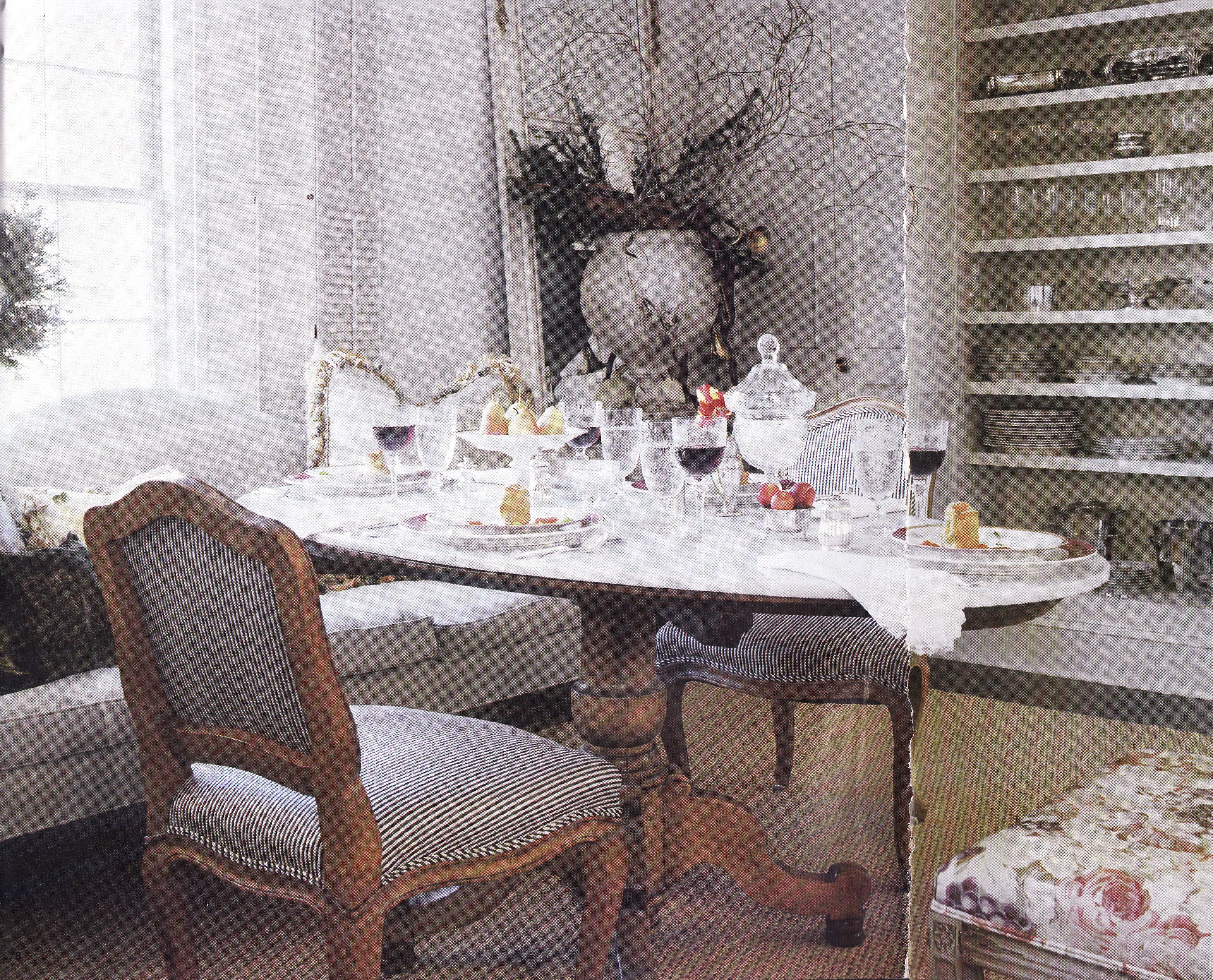
Humble ticking, traditionally used to cover mattresses, is tightly woven to keep feathers and straw inside where it belongs. As a result, it is also great for upholstery projects. My favorite use is on formal furniture like that Chesterfield, and more particularly on those pieces with a wood or gilt frame, such as Louis XV and XVI or Sheraton style pieces. The ticking makes “important” furniture look more casual and approachable and thus more modern. Designer Jan Roden does it here with another of my influential old tear sheets, using ticking on the French chairs, lending a relaxed feel to the room. You can see another favorite of mine – a Bennison roses print – on the chair in the corner.
Imagine this ornate piece without the casual stripes…
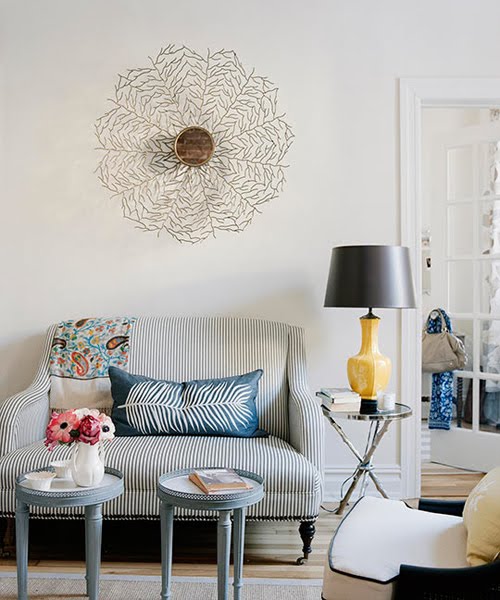
One of ticking’s biggest successes was in this hugely popular photo of the Odette Sofette from Mitchell Gold that Good Bones, Great Pieces author Suzanne McGrath used in her daughter Lauren’s first apartment. I think every blogger out there has it saved in their files. I think I was extra partial to it because I already have two Odette chairs in my living room!
I have an entire Pinterest board devoted to moody blue libraries, but I think this one designed by Nate Berkus is by far my favorite! The gallery wall yes, and also the white frame sofa upholstered in blue and white ticking!
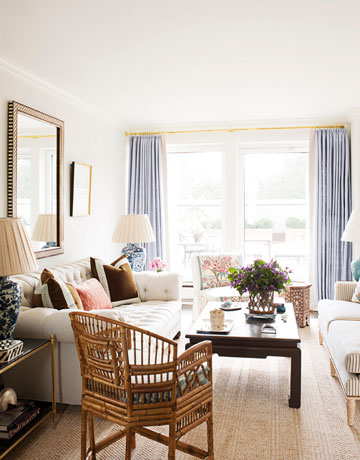
And to quote House Beautiful directly: “Natural linen on the tufted sofa and ticking stripe on the settee keep the living room of this New York apartment from being ‘too stuffy or precious,’ says designer Ashley Whittaker.” You can just see the ticking stripe peeking out on the framed sofa on the right. This is one of those spaces you just know would be comfy to live in.
Another incredibly relaxed space from the late Chessy Rayner’s Southampton home has a stripe covered settee among an eclectic variety of furnishings. More photos from this lovely home can be found here.
Ticking is also great at balancing ethereal whites and florals in the bedroom. Here it anchors a Louis XVI style settee in this dreamy bedroom.
And it looks fabulous scalloped with the stripes playing off the curved edge – either directionally with the stripes or against them. In this Jane Moore designed space the scallops on the coverlet run in the same direction as the stripes – which by the way, play off a Bennison floral once again. I know I have another great image of a scallop edged coverlet that runs in the other direction, but no matter how much I have looked for it I can’t find it. Bummer!
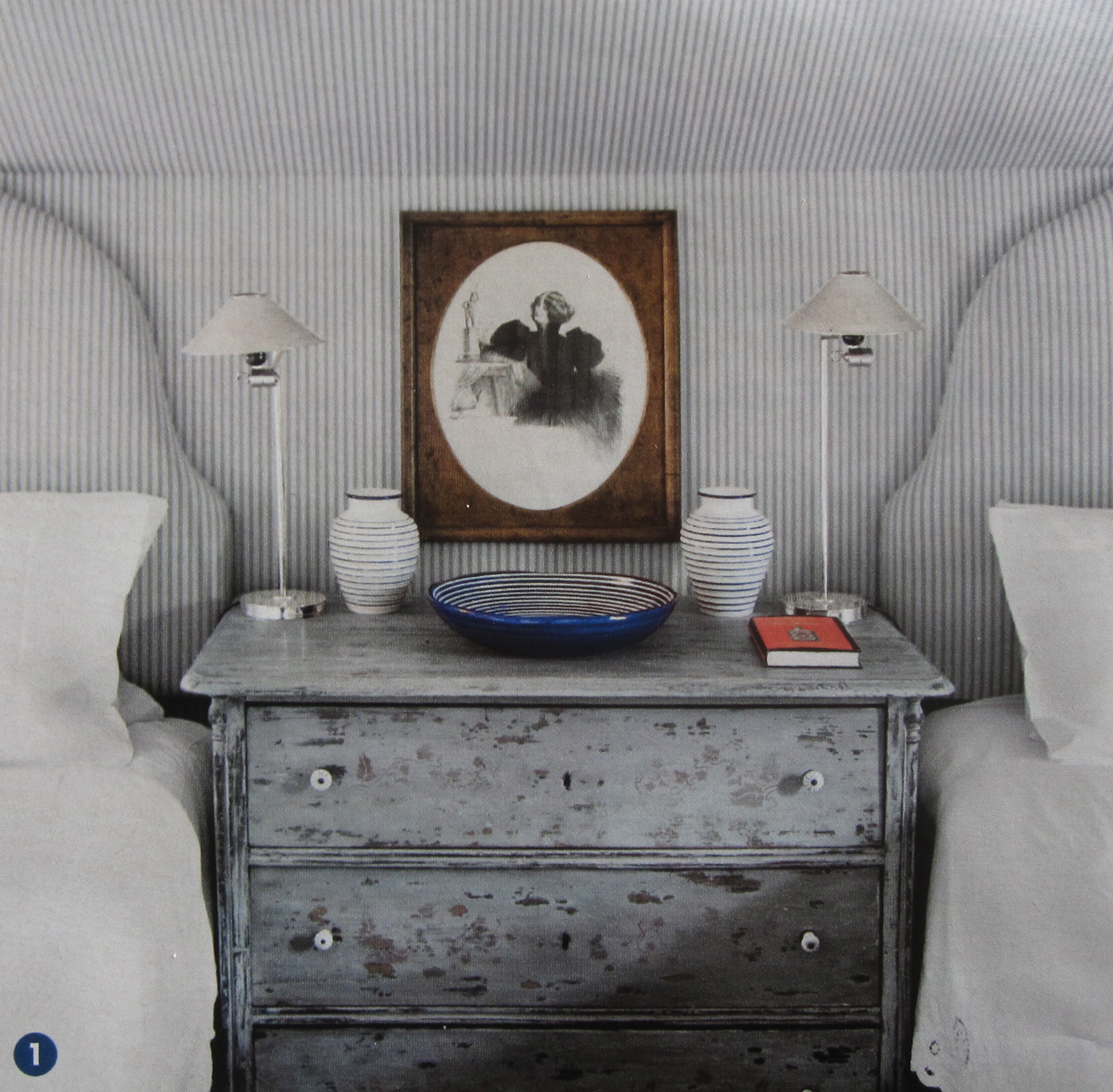
In this bedroom by Lars Bolander the narrow ticking stripes trace the curves well – like giant scallops!
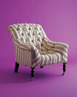
The closest piece to Marjorie Wollan’s sofa that I ever came across is this Ralph Lauren Mayfair tufted chair. But I think it would be relatively easy to find a vintage tufted piece and have it recovered in ticking.
See! Ticking really does take the stuffiness out!
I loved this regency chaise with its tiny ticking stripe – another one of those things I wanted to buy but had no room for!
Camille over at The Vintique Object just had great posts on the Odette Sofette and on ticking too – take a look!
Related Posts:
A Windsor Smith Revival…Camel-Back and Sheraton Style Sofas
Image credits: 1. Elle Decor Feb/Mar 1996, 2. House Beautiful December 2003, 3. House & Home October 2007, photo credit: Virginia Mcdonald, 4. Traditional Home, photo credit: Max Kim-Bee, 5. Elle Decor March 2010, photo credit: William Waldron, 6. House Beautiful February 2010, photo credit: Francesco Lagnese, 7. via One Kings Lane, photo credit: Thibault Jeanson, 8-9. via Cote de Texas, 10. Country Living, October 2012, 11. Elle Decor March 2008, photo credit: Kang Kim, 12. via Chiarabelle’s Flickr account, 13. credit unknown.








Definitely into the less stuffy or destuffiness great approach to outlining too, subtly defined head boards look divine, in the Lars Bolander bedroom, love the subtle grey too.
Great post, great rooms – thanks for the inspiration.
I’m with you… love stripes and LOVE ticking. I have a wonderful pea green ticking on a pillow on the front porch (with down insert) that I just love. There is just something so soft and special about ticking.
xxjoan
Certain things always look good! It is a classic!
Funny how the cover of the mag says “goodbye clutter” back in ’96! And we are still decluttering everywhere……….?!? (lol.) Lovely pics!
There will always be clutter!
you know I love stripes! just bought a sham of blue ticking for one of my upstairs rooms….will take pics when i’ve got it put together 😉
i adore ticking, i like simple fabrics only – and taffetta! i love checks i n linen and cotton just as much as ticking. im doing my library and the only fabric i want to use is checks with fortuny pillows – the high and low. great article!!
going to add you to my blog roll, love your blog!
HI Joni- I always love the way you mix checks and stripes with the fancier stuff – and I have been following the library progress closely. Thank you so much for adding me to your blog roll – it means the world to me! And I am still so depressed about the Bait n Switch over in Ojai! Cheers!
Jacqueline
________________________________
Oh goodness, goodness, goodness. That exactly describes this post! Love what you said about ticking taking the stuffiness out. That is an excellent observation and one I’m tucking away in this ol’ brain of mine.