“There’s No Cultural Divide When It Comes To Design”
–House Beautiful, December/January 2012
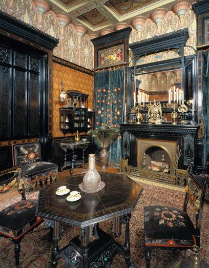
The word Victorian has been rolling around my mind for months, but only partially because that is the official period in which our beach house was built. As an adjective, Victorian means buttoned up and prudish. For most people, when they hear it, they think of ornate embellished houses and furniture, but for me, the word has a different connotation, as seen from a design history perspective. After “trying on” many revivals – Medieval, Gothic, Rococo, Renaissance – in the early Victorian period, the opening of Japan in 1854 , the discoveries of archaeologists in Egypt and an interest in all things exotic and foreign created dramatic new styles in interior design. The Aesthetic Movement in the later part of the 19th century highlighted art in the production of furniture and design for the home, partially as a response against the Industrial Revolution. Maybe it is a stretch to make the comparison, but I feel that for the last decade or so, interior design has been traveling down this same path, only with a much paler and lighter color scheme. For a while, I assumed the desire to weave an eclectic mix of objects from different time periods and nations stood out to me because I was living abroad and doing just that. But the overt prevalence of it everywhere has turned it into its very own style, whether in a modern or traditional context. Simultaneously, the recent movement towards homemade and authentic goods comes as a similar response to our consumer culture and poor economy.
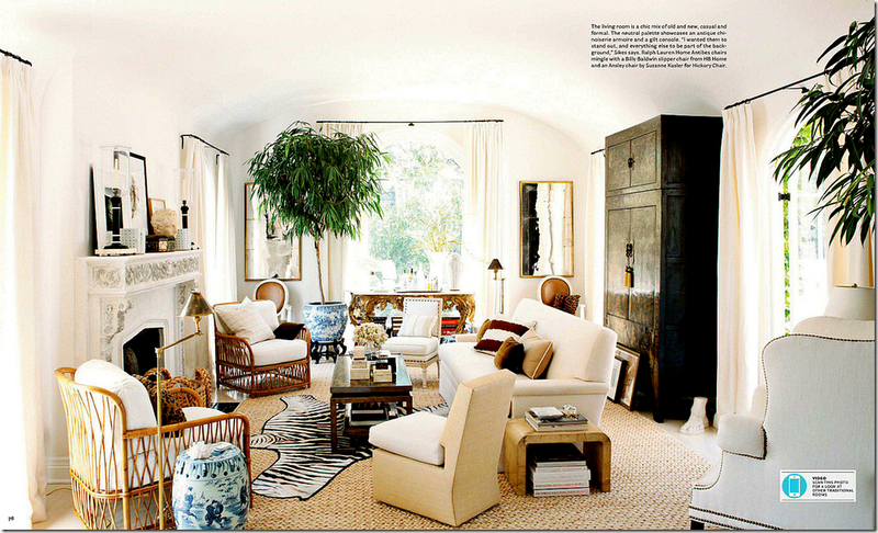
While not wanting to be overly literal about this idea, the much written about December/January 2012 issue of House Beautiful (the title, by the way, of an influential lecture given by the touring Oscar Wilde in 1882) makes this same point and can be used to illustrate it perfectly. Joni over at Cote de Texas, did an interesting post last month comparing the home below, designed by Mark Sikes and Michael Griffin, with her own (and I thank her for the photos as the magazine is not making them available online), but I am going to use it for my own comparative purposes. The living room, well worth clicking on and enlarging, has influences from around the globe. Blue and white porcelain abounds, from Chinese garden stools to Japanese hibachi as planter, African Zebra skin, French style chairs and a massive gilt console.. The giant antique Chinese lacquer cabinet is the kind of universally useful piece I always recommended purchasing back when they could still be easily found in Hong Kong and China. On that note, you’ll be hearing more from me on Chinese antiques later this month when I do a special series for Chinese New Year week.
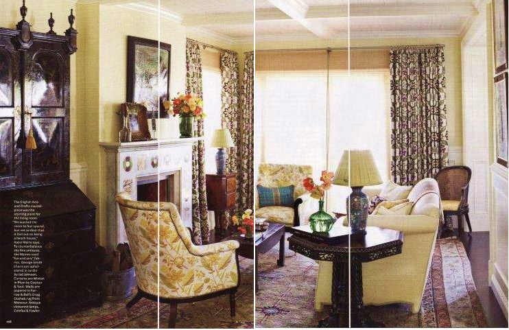
Just pages away is another spread, designed by Katie and Jason Maine, whose style proclaims them clearly Michael Smith alumnae, called “The New Global,” featuring an amazing English Japanned lacquer secretary from Therian, a piece that reads similarly to the Chinese cabinet above. Other worldwide influences include an English arts & crafts mantel, Oushak rug, and antique cloisonné lamps, and again, it is worth clicking the photo to see it in detail. Watch for an upcoming post on Japanned furniture too.
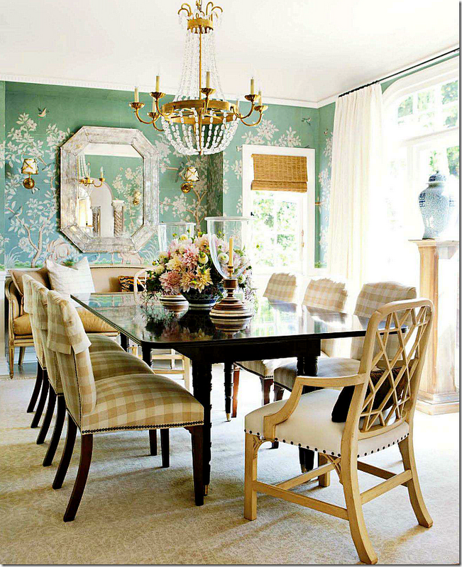
Their dining room is an absolute tour-de-force, featuring Indian motif wall panels by Iksel in lieu of…
…the slightly more expected Gracie or de Gournay paper seen just pages before in the Sikes/Griffin home. But in either case, both rooms are an extraordinary mix and actually quite similar in their details – extravagant wall covering, Chinoiserie chairs, statement making chandelier.
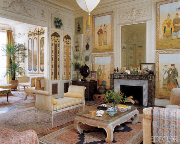
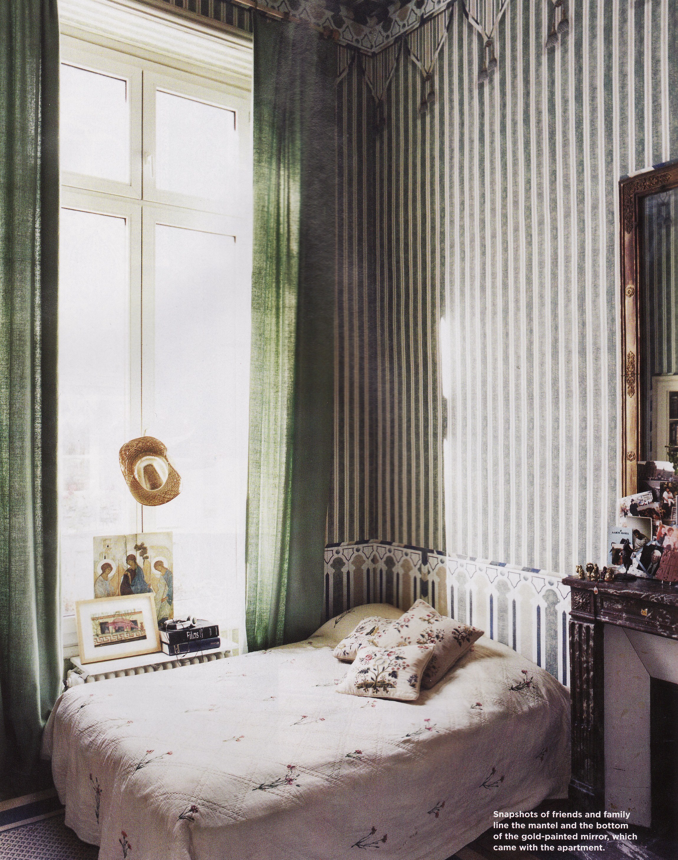
I have been following the work of the Iksels for a while, as they represent exactly the kind of cross-cultural trend I am talking about. The living room from their Paris apartment is almost a literal version of a Victorian space, only lighter and softer in color.
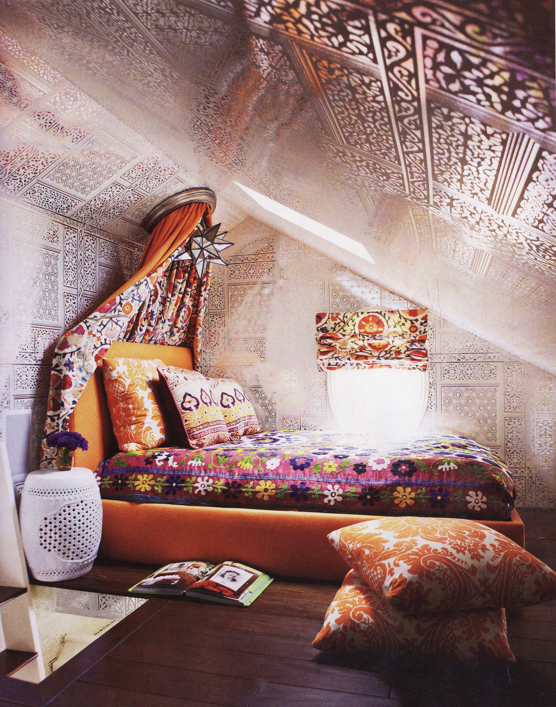
And I have always loved this tented bedroom from the apartment, and shown it before here.
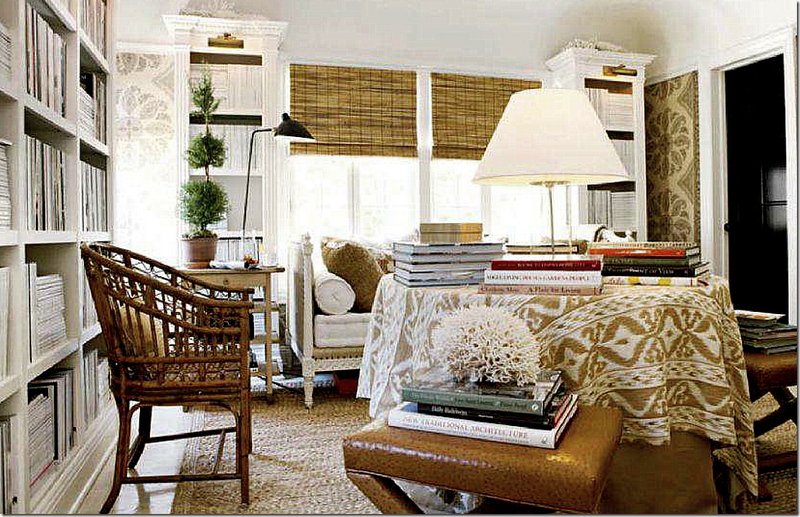
Ten years ago, few people had heard of ikat or suzanis. Now there is not a photo spread to be found without them or some other ethnic textile, whether in small doses…
…or large.
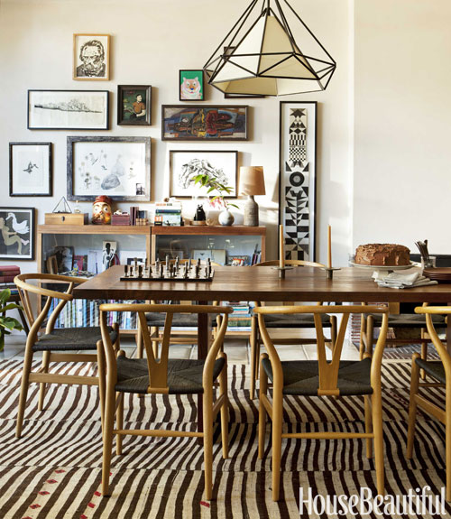
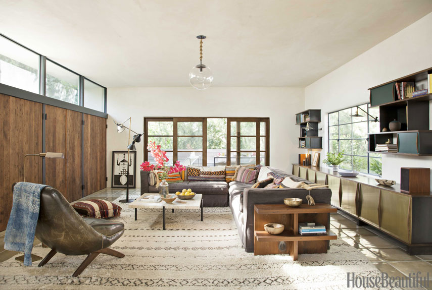
Modern design is not left out of the equation either in this project from by Pamela Shamshiri of Commune Design. While using a different set of diverse objects and styles, the mix is still there. It kind of cracked me up that the magazine has full on re-discovered the Japanese aesthetic of wabi-sabi, the beauty of things imperfect, impermanent, and incomplete, although in their desire to throw the term around (they use it at least three times) I am still not sure they truly understand the meaning. The house has the “weathered, organic” feeling they describe, but every detail is utterly and absolutely perfect. For some authentic local wabi-sabi, look back here. That said, the house is beautiful and there is as much going on in this dining room as those above.
For local folks, I’ll be tracking down some modern icons like the Wegner Wishbone chairs above in an upcoming “Shop Talk” post on the mid-century modern antiques and furniture available along Meguri-dori.
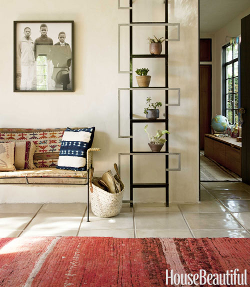
Again, the warm rugs, kilim pillows and other global textiles are the perfect counterpoint to all the wood.
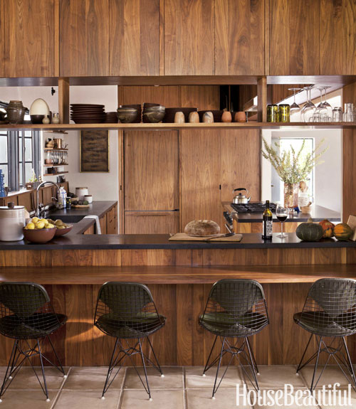
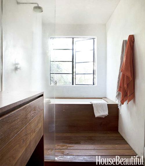
The rooms most directly referential to Japanese design are the kitchen (and if you like this you might want to look here)…
…and the bath.
For the full article with more photos, click here. Interestingly enough, this house is shown as being a 2008 project in their portfolio, making it not that new…And as for not that new, I am sure I saw the February issue already on the news stand as I ran through the airport two days ago.
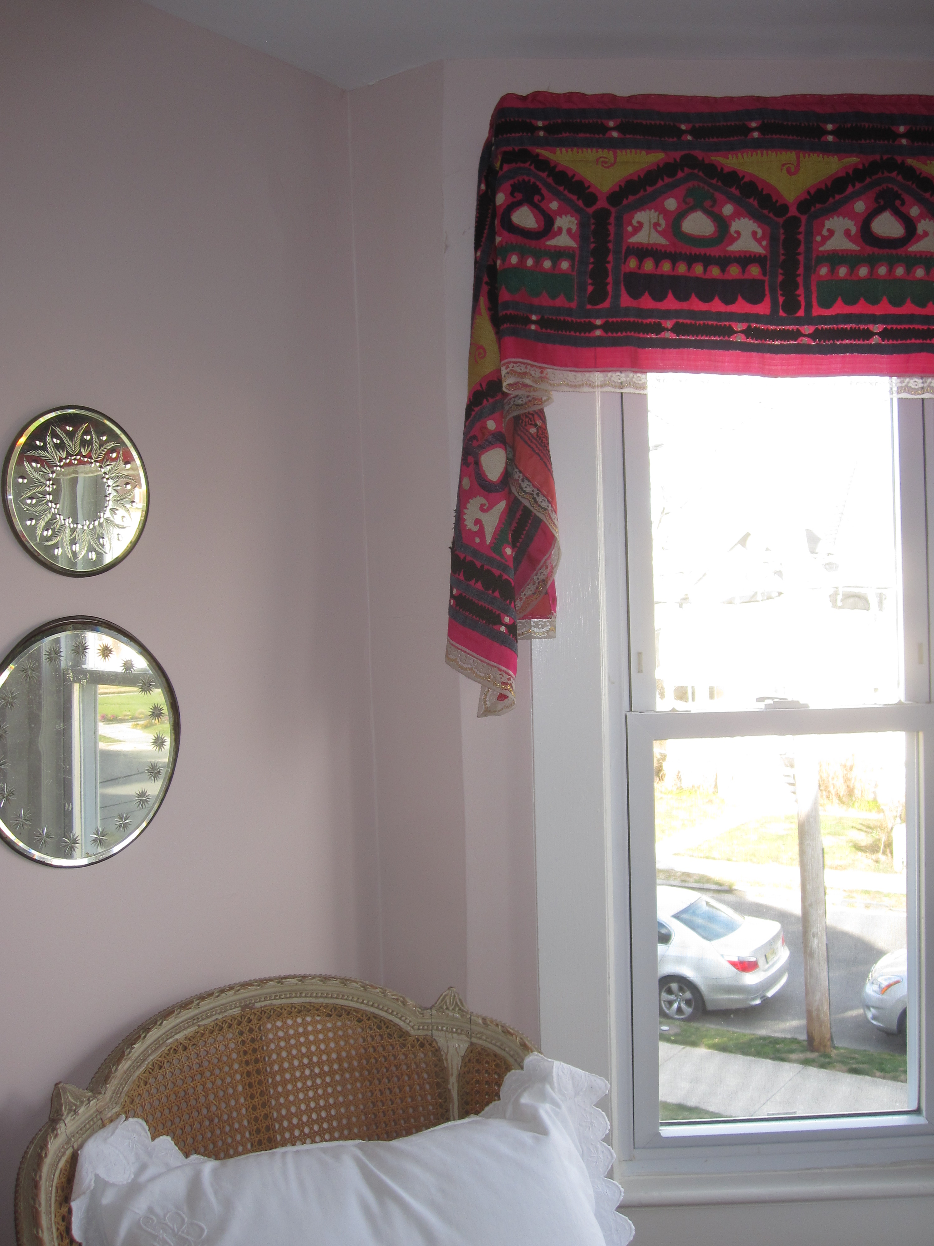
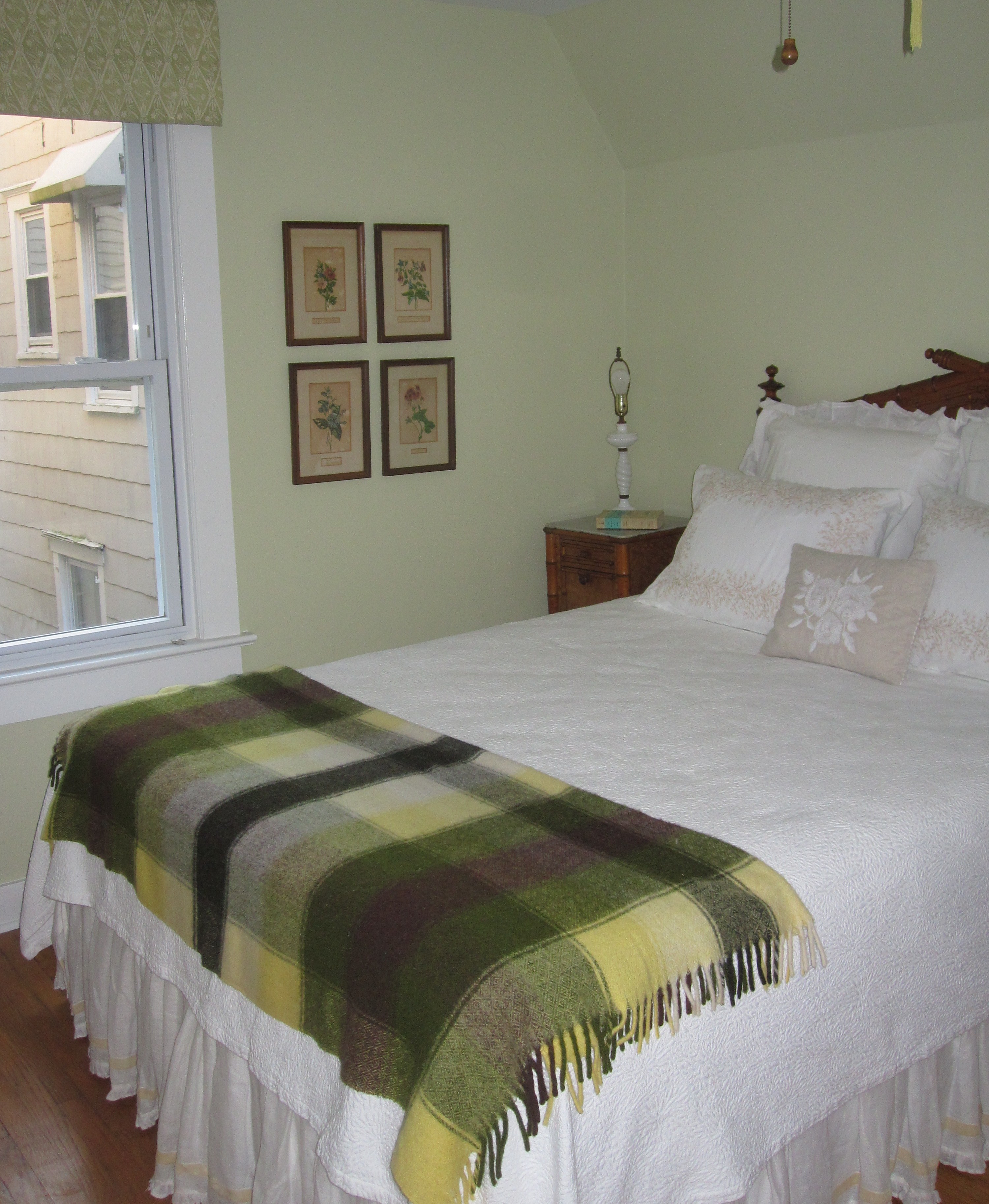
For me personally, this global aesthetic runs rampant through my Tokyo home and is definitely starting to appear in the beach house. I only had a few days in New Jersey over winter break, but managed to move a few projects along and here are a few sneak peaks. Our bedroom is shaping up – remember how I said there isn’t a photo spread without a suzani? We are using a long narrow one as a window valence.
The guest room is still waiting for its lampshades…
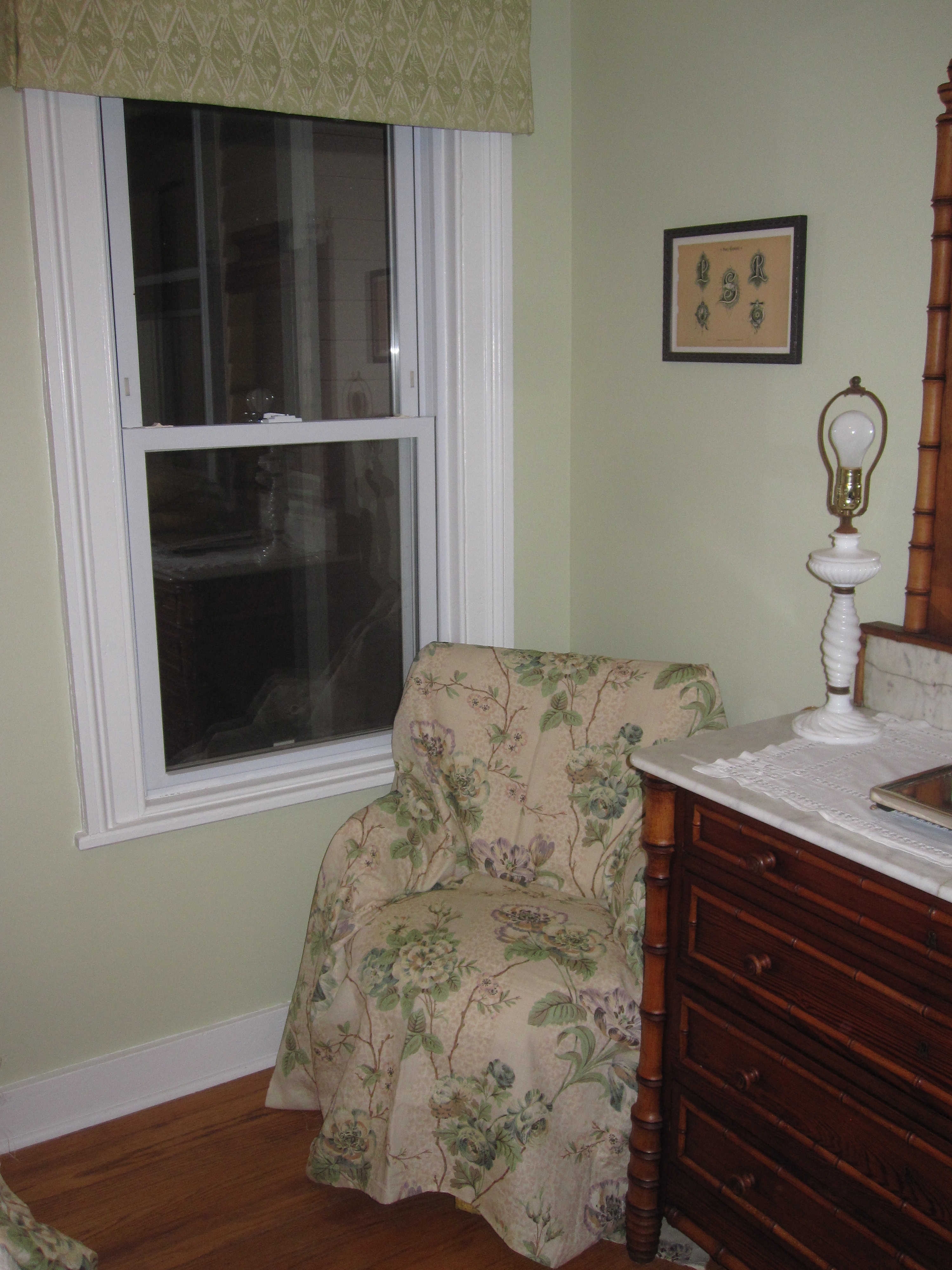
…but a bargain vintage find, sent off to be reupholstered will go from hideous yellow moire to lovely linen floral (draped for example in the photo). Guest room chair checked off my list!
Downstairs there is a little Belgian meets Scandinavian meets English floral prettiness going on, but it is temporary, as my Bunny Williams OKL purchase is slated for the kitchen.
I wish I had more to report on from the house, but three days right before Christmas is not a lot of time…More details on these rooms soon!
Here’s to 2012!
Related Posts:
Some Resolutions for 2011 and Bamboo in January
Image credits: 1. via Brooklyn Muesum, 1,4, & 7. House Beautiful December/January 2012, photo credit: Amy Neusinger, via Cote de Texas, 2-3, &8. House Beautiful December/January 2012, photo credit: Victoria Pearson, 5. Elle Decor December 2006, photo credit: Simon Upton, 6. Domino February 2008, photo credit: unknown, 9-13. House Beautiful December/January 2012, photo credit: Amy Neusinger, 16-18. me.



Love this post!
Love the loft teen bedroom of course!!
xoxo
amazing post. i printed out so many photos to start my own wish book for moving home. thanks for sharing j!
Thanks!!! Are you pinning these days? I have been trying to avoid the allure of it – it is a time suck!
________________________________
It’s been a constant challenge to keep my assemblage from looking too museum-y, too formal, too elderly. Mixing ethnic textiles in, as you show, has been one way to keep it approachable, even upholstering a 1920s French wing chair. Large mineral and fossil specimens, and a child-size Renaissance revival corner chair change up the scale. Your photos always have something fresh and something familiar!
More photos please Margaret! I want to see that wing chair…I have done one in scrolling crewelwork that I love.
________________________________
Great post Jacqueline as always. It is interesting how designers use “global” items, some I really love, others I think are hideous and overly done, getting the balance just right is no easy task. I agree with you about the House Beautiful article referring to wabi-sabi, I can’t really see how they can use this term in that context, but to those who really don’t understand it……
I so agree with you Angela!
________________________________
The beach house looks beautiful.
Mark Sikes recently started a fashion blog in which he sometimes posts some inspirational rooms as well. You two would get along very well. He did a fun series room color. You probably saw it.
http://www.markdsikes.com/
The posts are buried under: Archive by category, Glamorous Places, My Favorite Room.
I added a link to his blog in the post – thanks!!
________________________________
Where has your blog been all my life? I really enjoyed this post. We both, it appears, are big fans of Mark Sikes.
Unfortunately on WordPress!! That’s another thing I’d like to talk about – the fact that trackbacks don’t go through to blogger – which is where all the deisgn blogs seem to be!
________________________________