After the post on Michael Smith interiors the other day, I received a couple of requests for the photos of the early homes of Cindy Crawford and James Belushi. The world was so different in the days before digital images and if these have not been published elsewhere, then they are not out there in cyberspace.
Cindy Crawford had owned her apartment for a number of years before she decided to enlist her friend Michael Smith to decorate it. Built in 1909 and converted to condos in 1987, this “exuberant Edwardian Baroque” Police Headquarters Building at 240 Centre Street is at the meeting point of Soho/Little Italy/Chinatown. The architects carved out a variety of apartments, many of which have giant windows, high ceilings, lofts and unusual architectural details. Cindy’s apartment appears to have a large double height living room/dining room and some sort of loft area bedroom, although I can’t be sure from the photos.
The cover photo shows the dining area with its signature Michael Smith large check on the wing chair and a mix of seating – both chairs and a banquet. Smith describes her as an old-fashioned heroine, but also pegs her taste as somewhat masculine in that she likes substantial wood pieces. I do love that patchwork pillow!
This is the shot that leads me to believe there is a loft or mezzanine floor over one side of the living room. My apartment in New York is in a converted school building and has much the same kind of architectural challenges (and advantages) as this building.
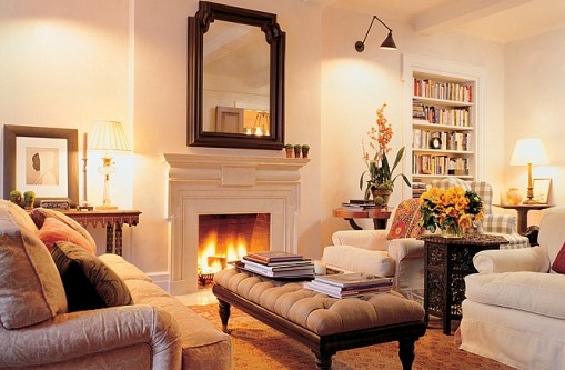
The corner of the living room shows a close-up of the simple upholstery.
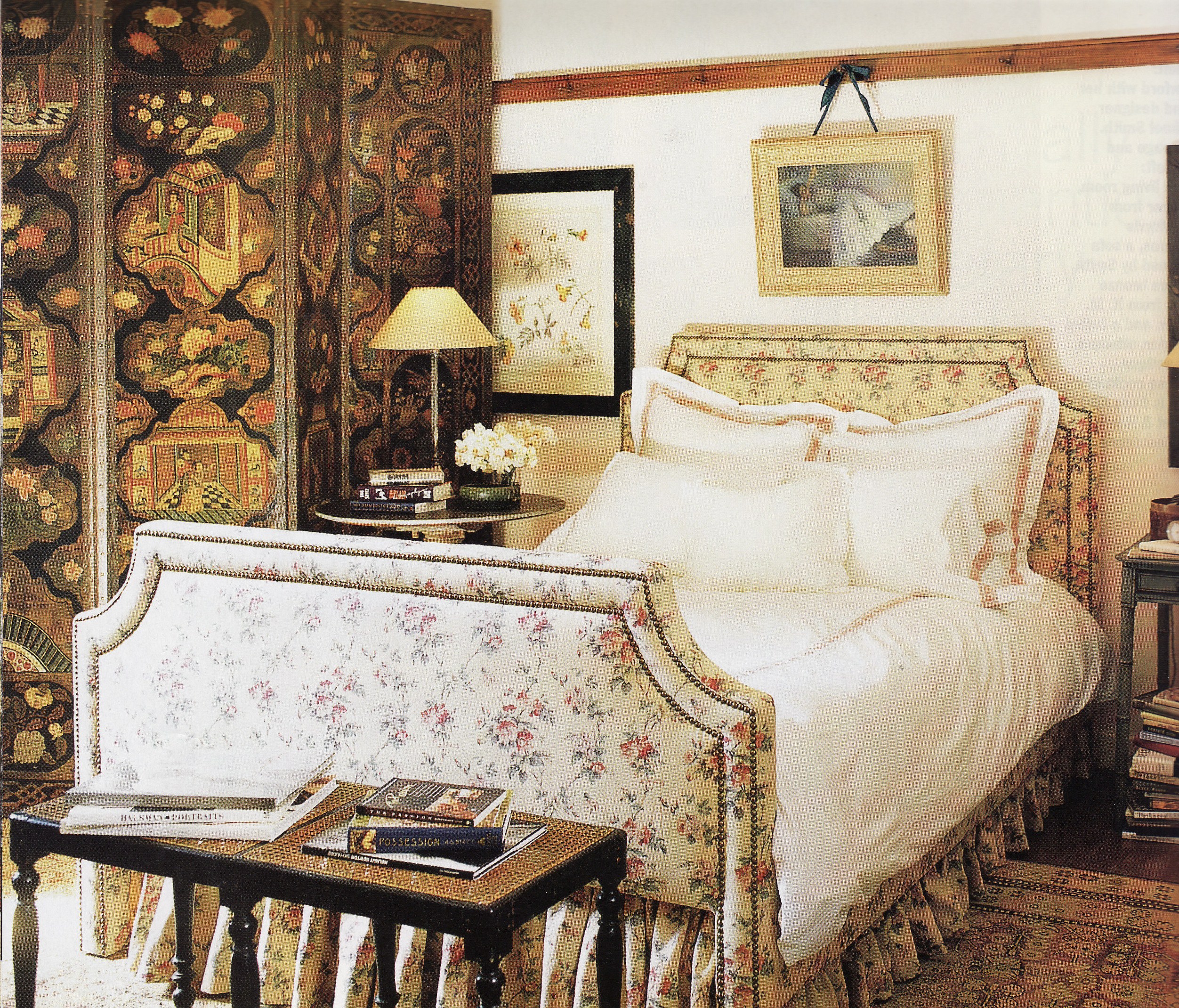
This view of the bedroom highlights her Bennison upholstered bed and a fantastic leather screen.
After marrying Randy Gerber and having her son, Cindy moved to the Upper East Side into a classic pre-war apartment in 2001. Smith came and helped her decorate, but she showed great practicality and re-used most of her furniture. You can see the couch, armchairs, small Moroccan table and even the green check wing chair from the old apartment peeking out in this living room.
Her beautiful bed is reused in the guest room, with a strong striped wallpaper and a suzani. Even the nightables and lamps are the same!
In contrast to Crawford’s “masculine” taste, James Belushi unabashedly admits to liking very feminine bedrooms. I couldn’t find the rest of his house in my files, but I did find the master bedroom and guest room. Again, I am unsure of the original publication date on these, but I would think they are from similar time period (later 1990s) as the ones above. Belushi’s decorating mandate was no “gaudy Louis stuff” and colors and feelings you get from “Italian paintings”. Smith delivers in this softly romantic master bedroom. Still, it is hard to picture Belushi sleeping there…
Stucco walls throughout the house have carefully thought out colors and finishes, like the lime green in this guest bedroom, inspired by an 19th century Venetian damask. The overall feel is pan-Europe, a little heavier on the Italian side.
Like Crawford’s apartment, the dining room has a mix of bench seating and chairs, Indian chintz and a similar check on the chair cushions. It all feels very relaxed and casual.
Belushi’s new house is built from the ground up on a double plot in Brentwood Park. Less obvious re-use of furniture to be found, but this project is at least a decade later than the photos above. He did keep with a similar Italian/European villa feel in the architecture and the interior design, but I also see a lot of Michael Smith’s more recent style peeking through, particularly in the palette change in the bedroom. Unfortunately, most of the photos are not available digitally, so I had to scan these too.
Smith specifically mentions re-using many of their existing furniture on the lower level, like this games table and chairs.
The rug in the dining room looks familiar and even if it is not the exact same one, it is very similar in color and style to those used in his earlier home.
One more thing to check out if you are interested is Cindy Crawford’s Malibu home, designed by Smith too. It has a great pan-Asian/Balinese vibe. The photos can be found in the March 2006 Elle Decor.
Image credits: 1. nyc-architecture, 2-5. Elle Decor October/November 1997 photo credit: Thibault Jeanson, 6-7. Architectural Digest March 2001 photo credit: Scott Frances, 8-10. credit unknown, but possibly Architectural Digest, 11-13 Architectural Digest November 2010 photo credit: Scott Frances


